


 本文介绍了CSS3的新特性,包括::is()和:where()伪类函数,fill-available、max-content、min-content、fit-content四个自适应关键字,min-block-size属性,以及颜色渐变、滤镜、backdrop-filter和flex弹性布局等。详细解释了这些特性的用法和区别,是前端开发者的重要参考资料。
# 新的 CSS 伪类函数 :is() 和 :where()
## :is()
/* 旧的写法  */
h1 > b, h2 > b, h3 > b, h4 > b, h5 > b, h6 > b {
  color: hotpink;
}


/* 新的写法:伪类  :is */
:is(h1,h2,h3,h4,h5,h6) > b {
  color: hotpink;
}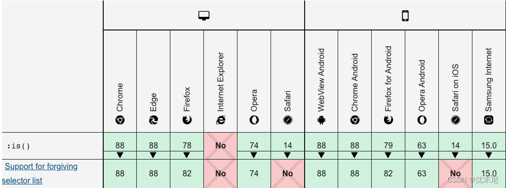
## :where()
:where() 伪类函数与:is()功能相同,仅仅选择器权重不同
/* at the beginning */
:where(h1,h2,h3,h4,h5,h6) > b {
  color: hotpink;
}

/* in the middle */
article :is(header,footer) > p {
  color: gray;
}

/* at the end */
.dark-theme :where(button,a) {
  color: rebeccapurple;
}

/* multiple */
:is(.dark-theme, .dim-theme) :where(button,a) {
  color: rebeccapurple;
}

/* stacked */
:is(h1,h2):where(.hero,.subtitle) {
  text-transform: uppercase;
}

/* nested */
.hero:is(h1,h2,:is(.header,.boldest)) {
  font-weight: 900;
}
CSS3四个自适应关键字——fill-available、max-content、min-content、fit-content
[注意]IE浏览器不支持,webkit内核浏览器需添加-webkit-前缀
fill-available
表示撑满可用空间:
例 width:-webkit-fill-available;
登高布局:height:-webkit-fill-available;
CSS中width:fill-available和width:100%的区别?
区别:一旦跟padding/margin结合一起使用的时候,width:100%会撑破布局,而width:fill-available却不会。
fit-content
将元素宽度收缩为内容宽度
width:fit-content可以实现元素收缩效果的同时,保持原本的block水平状态,于是,就可以直接使用margin:auto实现元素向内自适应同时的居中效果了
类似地,高度也有此特性,但不常用
div{
  width:-webkit-fit-content;
  margin:auto;
}
min-content
width:min-content表示采用内部元素最小宽度值最大的那个元素的宽度作为最终容器的宽度
<div style="width:-webkit-min-content;">
  <div style="height:10px;width:100px;"></div>
  <div style="">hehe</div>
</div>
max-content
width:max-content表示采用内部元素宽度值最大的那个元素的宽度作为最终容器的宽度。如果出现文本,则相当于文本不换行
<div style="width:-webkit-max-content;">
  <div style="height:10px;width:100px;"></div>
  <div style="">hehe</div>
</div>
min-block-size
min-block-size:length| percentage| auto| none| min-content| max-content| fit-content| inherit| initial| unset;
CSS中的min-block-size属性用于创建元素的最小水平或垂直大小。如果写入方向为水平,则min-block-size等效于min-height属性,如果写入方向为垂直模式,则等于min-width属性。
- length:它设置以px,cm,pt等为单位的固定值。也可以使用负值。其默认值为0px。
- 百分比(%):它与长度相同,但是大小是根据窗口大小的百分比设置的。
- auto:当需要浏览器确定block-size时使用。
- none:当您不想限制包装盒的尺寸时使用。
- max-content:当您在包装盒尺寸上首选min-width时使用。
- min-content:当您在包装盒尺寸上首选min-width时使用。
- fit-content:当您在包装盒尺寸上首选exact-width时使用。
- initial:它用于将min-block-size属性的值设置为其默认值。
- inherit:当需要该元素从其父元素继承min-block-size属性时使用。
- unset:用于取消设置默认的mix-block-size。
css :root 和var()
非IE及ie8及以上浏览器都支持,在:root中声明相当于全局属性,只要当前页面引用了:root segment所在文件,都可以使用var()来引用
:root {
  --main-bg-color: pink;
}

body {
  background-color: var(--main-bg-color);
}
常规css
filter(滤镜)(通常是<img>)
filter 属性定义了元素(通常是<img>)的可视效果(例如:模糊与饱和度)。
filter: none | blur() | brightness() | contrast() | drop-shadow() | grayscale() | hue-rotate() | invert() | opacity() | saturate() | sepia() | url();
| Filter | 描述 |
|---|---|
| none | 默认值,没有效果。 |
| blur(px) | 给图像设置高斯模糊。"radius"一值设定高斯函数的标准差,或者是屏幕上以多少像素融在一起, 所以值越大越模糊;如果没有设定值,则默认是0;这个参数可设置css长度值,但不接受百分比值。 |
| brightness(%) | 给图片应用一种线性乘法,使其看起来更亮或更暗。如果值是0%,图像会全黑。值是100%,则图像无变化。其他的值对应线性乘数效果。值超过100%也是可以的,图像会比原来更亮。如果没有设定值,默认是1。 |
| contrast(%) | 调整图像的对比度。值是0%的话,图像会全黑。值是100%,图像不变。值可以超过100%,意味着会运用更低的对比。若没有设置值,默认是1。 |
| drop-shadow(h-shadow v-shadow blur spread color) | 给图像设置一个阴影效果。阴影是合成在图像下面,可以有模糊度的,可以以特定颜色画出的遮罩图的偏移版本。 函数接受<shadow>(在CSS3背景中定义)类型的值,除了"inset"关键字是不允许的。该函数与已有的box-shadow box-shadow属性很相似;不同之处在于,通过滤镜,一些浏览器为了更好的性能会提供硬件加速。
|
| grayscale(%) | 将图像转换为灰度图像。值定义转换的比例。值为100%则完全转为灰度图像,值为0%图像无变化。值在0%到100%之间,则是效果的线性乘子。若未设置,值默认是0; |
| hue-rotate(deg) | 给图像应用色相旋转。"angle"一值设定图像会被调整的色环角度值。值为0deg,则图像无变化。若值未设置,默认值是0deg。该值虽然没有最大值,超过360deg的值相当于又绕一圈。 |
| invert(%) | 反转输入图像。值定义转换的比例。100%的价值是完全反转。值为0%则图像无变化。值在0%和100%之间,则是效果的线性乘子。 若值未设置,值默认是0。比如《svg》是白色的 filter: invert(1);显示为黑色 |
| opacity(%) | 转化图像的透明程度。值定义转换的比例。值为0%则是完全透明,值为100%则图像无变化。值在0%和100%之间,则是效果的线性乘子,也相当于图像样本乘以数量。 若值未设置,值默认是1。该函数与已有的opacity属性很相似,不同之处在于通过filter,一些浏览器为了提升性能会提供硬件加速。 |
| saturate(%) | 转换图像饱和度。值定义转换的比例。值为0%则是完全不饱和,值为100%则图像无变化。其他值,则是效果的线性乘子。超过100%的值是允许的,则有更高的饱和度。 若值未设置,值默认是1。 |
| sepia(%) | 将图像转换为深褐色。值定义转换的比例。值为100%则完全是深褐色的,值为0%图像无变化。值在0%到100%之间,则是效果的线性乘子。若未设置,值默认是0; |
| url() | URL函数接受一个XML文件,该文件设置了 一个SVG滤镜,且可以包含一个锚点来指定一个具体的滤镜元素。例如: |
颜色渐渐变浅
css3:linear-gradient
background: -webkit-linear-gradient(red, blue); /* Safari 5.1 - 6.0 */
background: -o-linear-gradient(red, blue); /* Opera 11.1 - 12.0 */
background: -moz-linear-gradient(red, blue); /* Firefox 3.6 - 15 */
background: linear-gradient(red, blue); /* 标准的语法 */
ie-filter
linear-gradient 在 ie9 以下是不支持的,所以对于 ie6 - ie8 我们可以使用滤镜来解决,代码如下:
filter: progid:DXImageTransform.Microsoft.gradient( startColorstr='#000000', endColorstr='#ffffff',GradientType=0 );由于 filter 是 ie 的私有属性,所以我们需要针对 ie9 单独处理滤镜效果,代码如下:
:root {filter:none;}综合
.lalla{
    background: #000000;
    background: -moz-linear-gradient(top,  #000000 0%, #ffffff 100%);
    background: -webkit-gradient(linear, left top, left bottom, color-stop(0%,#000000), color-stop(100%,#ffffff));
    background: -webkit-linear-gradient(top,  #000000 0%,#ffffff 100%);
    background: -o-linear-gradient(top,  #000000 0%,#ffffff 100%);
    background: -ms-linear-gradient(top,  #000000 0%,#ffffff 100%);
    background: linear-gradient(to bottom,  #000000 0%,#ffffff 100%);
    filter: progid:DXImageTransform.Microsoft.gradient( startColorstr='#000000', endColorstr='#ffffff',GradientType=0 );
}
:root .gradient{filter:none;}
backdrop-filter(毛玻璃)
backdrop-filter CSS 属性可以让你为一个元素后面区域添加图形效果(如模糊或颜色偏移)。 因为它适用于元素背后的所有元素,为了看到效果,必须使元素或其背景至少部分透明。
/* 关键词值 */
backdrop-filter: none;

/* 指向 SVG 滤镜的 URL */
backdrop-filter: url(commonfilters.svg#filter);

/* <filter-function> 滤镜函数值 */
backdrop-filter: blur(2px);
backdrop-filter: brightness(60%);
backdrop-filter: contrast(40%);
backdrop-filter: drop-shadow(4px 4px 10px blue);
backdrop-filter: grayscale(30%);
backdrop-filter: hue-rotate(120deg);
backdrop-filter: invert(70%);
backdrop-filter: opacity(20%);
backdrop-filter: sepia(90%);
backdrop-filter: saturate(80%);

/* 多重滤镜 */
backdrop-filter: url(filters.svg#filter) blur(4px) saturate(150%);

/* 全局值 */
backdrop-filter: inherit;
backdrop-filter: initial;
backdrop-filter: unset;
例子:
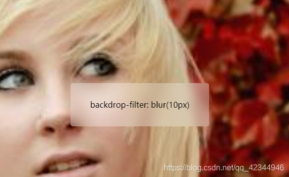
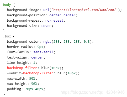
backdrop-filter 和 filter的区别
backdrop-filter
可以让你为一个元素后面区域添加图形效果(如模糊或颜色偏移)。 因为它适用于元素背后的所有元素,为了看到效果,必须使元素或其背景至少部分透明。
blur()使得出现毛玻璃效果,只会模糊背景,
filter
blur()使得出现毛玻璃效果,内容和背景都会模糊,
想要做出毛玻璃效果,需要两层div,一个加了filter的,一个内容层
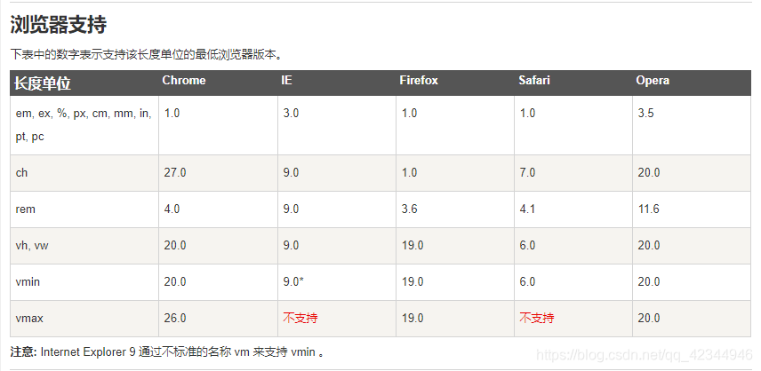
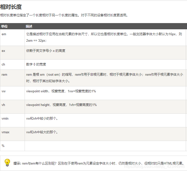
css3自适应布局单位
根据CSS3规范,视口单位主要包括以下4个:
1.vw:1vw等于视口宽度的1%。
2.vh:1vh等于视口高度的1%。
2.vm:相对于视口的宽度或高度中较小的那个。
3.vmin:选取vw和vh中最小的那个。
4.vmax:选取vw和vh中最大的那个。
5.ex: 相对于字符“x”的高度。通常为字体高度的一半。
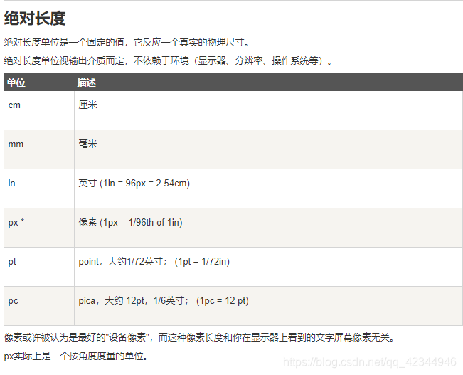
6.px(像素):1in = 2.54cm = 25.4 mm = 101.6q = 72pt = 6pc = 96px
7.q:1/4毫米。绝对长度单位。
8.in:英寸。绝对长度单位。
9.pt:点。绝对长度单位。
10.pc:派卡。绝对长度单位。相当于我国新四号铅字的尺寸
11.ch:数字0的宽度
文字下划线
.f{
    text-underline-offset: 0rem;
    text-decoration: underline;
}
颜色
hsla
HSLA 即色相、饱和度、亮度、透明度(英语:Hue, Saturation, Lightness, Alpha )。
hsla(hue, saturation, lightness, alpha)- 色相(H)是色彩的基本属性,就是平常所说的颜色名称,如红色、黄色等。定义色相 (0 到 360) - 0 (或 360) 为红色, 120 为绿色, 240 为蓝色
- 饱和度(S)是指色彩的纯度,越高色彩越纯,低则逐渐变灰,取 0-100% 的数值。定义饱和度; 0% 为灰色, 100% 全色
- 亮度(L) 取 0-100%,增加亮度,颜色会向白色变化;减少亮度,颜色会向黑色变化。定义亮度 0% 为暗, 50% 为普通, 100% 为白
- 透明度(A) 取值 0~1 之间, 代表透明度。定义透明度 0(透完全明) ~ 1(完全不透明)
16进制
不区分大小写
16进制和rgb互相转还有色卡
旧的弹性盒子 box
通过使用 box-align and box-pack 属性,居中 div 框的子元素:
box-align类似:align-items
box-pack类似: justify-content| 默认值: | stretch |
|---|---|
| 继承性: | no |
| 版本: | CSS3 |
| JavaScript 语法: | object.style.boxAlign="center" div.style.MozBoxAlign="center" div.style.webkitBoxAlign="center" ; |
box-align: start|end|center|baseline|stretch;| start | 对于正常方向的框,每个子元素的上边缘沿着框的顶边放置。对于反方向的框,每个子元素的下边缘沿着框的底边放置。 | 测试 |
| end | 对于正常方向的框,每个子元素的下边缘沿着框的底边放置。对于反方向的框,每个子元素的上边缘沿着框的顶边放置。 | 测试 |
| center | 均等地分割多余的空间,一半位于子元素之上,另一半位于子元素之下。 | 测试 |
| baseline | 如果 box-orient 是inline-axis或horizontal,所有子元素均与其基线对齐。 | 测试 |
| stretch | 拉伸子元素以填充包含块(默认值) |
div{
width:350px;
height:100px;
border:1px solid black;

/* Firefox */
display:-moz-box;
-moz-box-pack:center;
-moz-box-align:center;

/* Safari、Opera 以及 Chrome */
display:-webkit-box;
-webkit-box-pack:center;
-webkit-box-align:center;

/* W3C */
display:box;
box-pack:center;
box-align:center;
}


 扫一扫
扫一扫


 1万+
1万+

 被折叠的 条评论
为什么被折叠?
被折叠的 条评论
为什么被折叠?
 到【灌水乐园】发言


