


python 填充
颜色填充

import matplotlib.pyplot as plt
import pandas as pd

labels = ['吉祥物公仔','校服','文化摆件','实用工具','纪念日产品','其他']
y1 = [19.3,19.3,17.96,24.93,16.09,2.41]
y2 = [32.97,12.03,12.67,20.43,21.2,0.71]
y3= [11.32,13.21,18.87,24.53,30.19,1.89]
plt.rcParams['font.family'] = ['Times New Roman']
fig,ax = plt.subplots(1,1,figsize=(8,4.5))

x = np.arange(len(labels)
width = 0.35  #每根柱子宽度

label_font = {
    'weight':'bold',
    'size':14,
    'family':'simsun'
}


# tick_params参数刻度线样式设置
# ax.tick_params(axis=‘x’, tickdir=‘in’, labelrotation=20)参数详解
# axis : 可选{‘x’, ‘y’, ‘both’} ,选择对哪个轴操作,默认是’both’
# which : 可选{‘major’, ‘minor’, ‘both’} 选择对主or副坐标轴进行操作
# direction/tickdir : 可选{‘in’, ‘out’, ‘inout’}刻度线的方向
# color : 刻度线的颜色,我一般用16进制字符串表示,eg:’#EE6363’
# width : float, 刻度线的宽度
# size/length : float, 刻度线的长度
# pad : float, 刻度线与刻度值之间的距离
# labelsize : float/str, 刻度值字体大小
# labelcolor : 刻度值颜色
# colors : 同时设置刻度线和刻度值的颜色
# bottom, top, left, right : bool, 分别表示上下左右四边,是否显示刻度线,True为显示
ax.tick_params(which='major',direction='in',length=5,width=1.5,labelsize=11,bottom=False)
# labelrotation=0 标签倾斜角度
ax.tick_params(axis='x',labelsize=11,bottom=False,labelrotation=0)


ax.set_xticks(x)
ax.set_ylim(ymin = 0,ymax = 40)
# 0 - 1800 ,200为一个间距
ax.set_yticks(np.arange(0,41,10))
ax.set_ylabel('(占比)',fontdict=label_font)

ax.set_xticklabels(labels,fontdict=label_font)
#ax.legend(markerscale=10,fontsize=12,prop=legend_font)
ax.legend(markerscale=10,fontsize=12)

'''
# 设置有边框和头部边框颜色为空right、top、bottom、left
ax.spines['right'].set_color('none')
ax.spines['top'].set_color('none')
'''

# 上下左右边框线宽
linewidth = 2
for spine in ['top','bottom','left','right']:
    ax.spines[spine].set_linewidth(linewidth)


# Add some text for labels, title and custom x-axis tick labels, etc.
def autolabel(rects):
    for rect in rects:
        height = rect.get_height()
        ax.annotate('{}'.format(height),
                    xy=(rect.get_x() + rect.get_width() / 2, height),
                    xytext=(0, 3),  # 3 points vertical offset
                    textcoords="offset points",
                    ha='center', va='bottom')

autolabel(rects1)
autolabel(rects2)
fig.tight_layout()


plt.savefig(r'C:\Users\Administrator\Desktop\p1.png',dpi=500)
填充
hatch 关键字可用来设置填充样式,可取值为: / , \ , | , - , + , x , o , O , . , *
rects1 = ax.bar(x - width/2, y1, width, label='学生',ec='k',color='white',lw=.8,
               hatch='...')
rects2 = ax.bar(x + width/2 + .05, y2, width, label='教师',ec='k',color='white',
                lw=.8,hatch='***')

rects1 = ax.bar(x - width/2, y1, width, label='学生',ec='k',color='white',lw=.8,
               hatch='xxx')
rects2 = ax.bar(x + width/2 + .05, y2, width, label='教师',ec='k',color='white',
                lw=.8,hatch='//')

填充颜色
rects1 = ax.bar(x - width/2, y1, width, label='学生',ec='k',color='#FFCCFF',lw=.8,
               hatch='xxx')
rects2 = ax.bar(x + width/2 + .05, y2, width, label='教师',ec='k',color='#CCFFFF',
                lw=.8,hatch='//')

给每一根柱子设置不同的颜色
RGB颜色
rects1 = ax.bar(x - width/2, y1, width, label='学生',ec='k',color='w',lw=.8,
               hatch='xxx')
rects2 = ax.bar(x + width/2 + .05, y2, width, label='教师',ec='k',color='RGB',
                lw=.8,hatch='//')

或者,更好看点的
colors = ['#9999FF','#58C9B9','#CC33CC','#D1B6E1','#99FF99','#FF6666']

rects1 = ax.bar(x - width/2, y1, width, label='学生',ec='k',color='w',lw=.8,
               hatch='xxx')
rects2 = ax.bar(x + width/2 + .05, y2, width, label='教师',ec='k',color=colors,
                lw=.8,hatch='//')

描边
rects1 = ax.bar(x - width/2, y1, width, label='学生',ec='r', ls='--', lw=2,color='#99FF99')
rects2 = ax.bar(x + width/2 + .05, y2, width, label='教师',ec='k',color='w',
                lw=.8,hatch='//')

在添加一个并列条形图

import matplotlib.pyplot as plt
import pandas as pd

labels = ['吉祥物公仔','校服','文化摆件','实用工具','纪念日产品','其他']
y1 = [19.3,19.3,17.96,24.93,16.09,2.41]
y2 = [32.97,12.03,12.67,20.43,21.2,0.71]
y3= [11.32,13.21,18.87,24.53,30.19,1.89]
fig,ax = plt.subplots(1,1,figsize=(8,4.5))

x = np.arange(len(labels))

total_width, n = 0.8, 3
width = total_width / n
x = x - (total_width - width) / 2

label_font = {
    'weight':'bold',
    'size':14,
    'family':'simsun'
}

colors = ['#9999FF','#58C9B9','#CC33CC','#D1B6E1','#99FF99','#FF6666']

rects1 = ax.bar(x, y1, width, label='学生',ec='k',color='w',lw=.8,
               hatch='xxx')
rects2 = ax.bar(x + width, y2, width, label='教师',ec='k',color='w',
                lw=.8,hatch='//')
rects3 = ax.bar(x + width * 2, y3, width, label='校友',ec='k',color='w',
                lw=.8,hatch='---')


# tick_params参数刻度线样式设置
# ax.tick_params(axis=‘x’, tickdir=‘in’, labelrotation=20)参数详解
# axis : 可选{‘x’, ‘y’, ‘both’} ,选择对哪个轴操作,默认是’both’
# which : 可选{‘major’, ‘minor’, ‘both’} 选择对主or副坐标轴进行操作
# direction/tickdir : 可选{‘in’, ‘out’, ‘inout’}刻度线的方向
# color : 刻度线的颜色,我一般用16进制字符串表示,eg:’#EE6363’
# width : float, 刻度线的宽度
# size/length : float, 刻度线的长度
# pad : float, 刻度线与刻度值之间的距离
# labelsize : float/str, 刻度值字体大小
# labelcolor : 刻度值颜色
# colors : 同时设置刻度线和刻度值的颜色
# bottom, top, left, right : bool, 分别表示上下左右四边,是否显示刻度线,True为显示
ax.tick_params(which='major',direction='in',length=5,width=1.5,labelsize=11,bottom=False)
ax.tick_params(axis='x',labelsize=11,bottom=False,labelrotation=0)


ax.set_xticks(range(len(labels)))
ax.set_ylim(ymin = 0,ymax = 40)
# 0 - 1800 ,200为一个间距
ax.set_yticks(np.arange(0,41,10))


ax.set_ylabel('(占比)',fontdict=label_font)
ax.set_xticklabels(labels,fontdict=label_font)
ax.legend(prop =label_font)

'''
# 设置有边框和头部边框颜色为空right、top、bottom、left
ax.spines['right'].set_color('none')
ax.spines['top'].set_color('none')
'''

# 上下左右边框线宽
linewidth = 2
for spine in ['top','bottom','left','right']:
    ax.spines[spine].set_linewidth(linewidth)


# Add some text for labels, title and custom x-axis tick labels, etc.
def autolabel(rects):
    for rect in rects:
        height = rect.get_height()
        ax.annotate('{}'.format(height),
                    xy=(rect.get_x() + rect.get_width() / 2, height),
                    xytext=(0, 3),
                    textcoords="offset points",
                    ha='center', va='bottom')

autolabel(rects1)
autolabel(rects2)
autolabel(rects3)
fig.tight_layout()

# plt.savefig(r'C:\Users\Administrator\Desktop\p1.png',dpi=500)
对于一个条形图

import matplotlib.pyplot as plt
import pandas as pd
plt.rcParams['font.sans-serif']=['KaiTi']
plt.rcParams['axes.unicode_minus']=False
labels = ['吉祥物公仔','校服','文化摆件','实用工具','纪念日产品','其他']
y1 = [19.3,19.3,17.96,24.93,16.09,2.41]
fig,ax = plt.subplots(1,1,figsize=(8,4.5))
label_font = {
    'weight':'bold',
    'size':14,
    'family':'simsun'
}
x = np.arange(len(labels))
rects1 = ax.bar(range(len(y1)), y1,label='学生',ec='k',color='w',lw=.8,hatch='//')
ax.set_xticks(range(len(labels)))
ax.set_xticklabels(labels,fontdict=label_font)
ax.legend(prop =label_font)
R语言 patternplot包填充
patternplot包,提供了丰度的图形可视化填充选项
安装
install.packages("patternplot")
示例来源:https://zhuanlan.zhihu.com/p/147754076
示例1:
library(patternplot)
library(png)
library(ggplot2)
data <- read.csv(system.file("extdata", "vegetables.csv", package="patternplot"))
data $pct
数据

使用前可以查看帮助文档
? patternpie
#--填充样式
pattern.type<-c('hdashes', 'vdashes', 'bricks')
# 绘图
pie1<-patternpie(
  group=data$group,
  pct=data$pct,# 饼图分组名称
  label=data$label, # 标签
  pattern.type=pattern.type,
)
pie1

示例2:
#--填充样式
pattern.type<-c('hdashes', 'vdashes', 'bricks')
pie1<-patternpie(
  group=data$group,
                 pct=data$pct,# 饼图分组名称
                 label=data$label, # 标签
                 label.size=4, #标签大小
                 label.color='black', # 标签颜色
                 label.distance=1.3, # 标签距离
                 pattern.type=pattern.type, #填充样式
                 pattern.line.size=c(10, 10, 2), # 设置填充的线尺寸
                 frame.color='red', # 每个部分边框颜色
                 frame.size=1,# 边全部框的粗细
                 pixel=12, # 分辨率,图形的
                 density=c(8, 8, 30)# 设置填充的密度
                 #
                 )
pie1<-pie1+ggtitle('(A) Black and White with Patterns') # 加个标题
pie1

示例3:全部黑白 中文期刊格式
#--填充样式
pattern.type<-c('hdashes', 'vdashes', 'bricks')
pie1<-patternpie(
  group=data$group,
                 pct=data$pct,# 饼图分组名称
                 label=data$label, # 标签
                 label.size=4, #标签大小
                 label.color='black', # 标签颜色
                 label.distance=1.3, # 标签距离
                 pattern.type=pattern.type, #填充样式
                 pattern.line.size=c(10, 10, 2), # 设置填充的线尺寸
                 frame.color='black', # 每个部分边框颜色
                 frame.size=1.5,# 边全部框的粗细
                 pixel=12, # 分辨率,图形的
                 density=c(8, 8, 10)# 设置填充的密度
                 #
                 )
pie1<-pie1+ggtitle('(A) Black and White with Patterns') # 加个标题
pie1

示例4:
- pattern.color:设置每种模式的颜色
- background.color:设置每块背景颜色
pattern.type<-c('hdashes', 'vdashes', 'bricks')
pattern.color<-c('red3','green3', 'white' )
background.color<-c('dodgerblue', 'lightpink', 'orange')
pie2<-patternpie(group=data$group,
                 pct=data$pct,
                 label=data$label,
                 label.distance=1.3,
                 pattern.type=pattern.type,#设置样式
                 pattern.color=pattern.color,# 设置颜色
                 background.color=background.color,
                 pattern.line.size=c(10, 10, 2),
		   frame.color='grey40',
			frame.size=1.5,
			pixel=12,
			density=c(8, 8, 10))
pie2<-pie2+ggtitle('(B) Colors with Patterns')
pie2

示例5:使用grid进行拼图
library(gridExtra)
grid.arrange(pie1,pie2,  nrow = 1)

示例6:使用自定义图形进行填充
library(patternplot)
library(ggplot2)
library(jpeg)
Tomatoes <-  readJPEG(system.file("img", "tomatoes.jpg", package="patternplot"))
Peas <- readJPEG(system.file("img", "peas.jpg", package="patternplot"))
Potatoes <-  readJPEG(system.file("img", "potatoes.jpg", package="patternplot"))

#Example 1
data <- read.csv(system.file("extdata", "vegetables.csv", package="patternplot"))

pattern.type<-list(Tomatoes,Peas,Potatoes)
imagepie(group=data$group,
         pct=data$pct,
         label=data$label,
         pattern.type=pattern.type,
         label.distance=1.3,
         frame.color='burlywood4',
         frame.size=0.8,
         label.size=6,
         label.color='forestgreen')+ggtitle('Pie Chart with Images')

可以用自己图片
比如
pic1

pic2

pic3

运行代码
# 自己的图片
pic1 <-  readJPEG('C:\\Users\\Administrator\\Desktop\\1.jpg')
pic2 <-  readJPEG('C:\\Users\\Administrator\\Desktop\\2.jpg')
pic3 <-  readJPEG('C:\\Users\\Administrator\\Desktop\\3.jpg')
# 数据
data <- data.frame(a=c('教师','学生','校友'),b=c(45,35,20),c=c('教师 \n 45%','学生 \n 30%','校友 \n 25%'))
# 绘图
pattern.type<-list(pic1,pic2,pic3)
imagepie(group=data$a,
         pct=data$b,
         label=data$c,
         pattern.type=pattern.type,
         label.distance=1.3,
         frame.color='burlywood4',
         frame.size=0.8,
         label.size=6,
         label.color='forestgreen')+ggtitle('Pie Chart with Images')

示例7:patternring1函数用于环状饼图绘制
(1)
group1<-c('New_England', 'Great_Lakes','Plains',  'Rocky_Mountain', 'Far_West','Southwest', 'Southeast',  'Mideast')
pct1<-c( 12, 11, 17, 15, 8, 11,  16,  10)
#--设置标签分行
label1<-paste(group1, " \n ", pct1, "%", sep="")
#---设置填充模式
pattern.type1<-c("hdashes", "blank", "grid", "blank", "hlines", "blank", "waves", "blank")
#--中间空
pattern.type.inner<-"blank"
#-颜色为白色
pattern.color1<-rep("white", 8)
#--背景颜色设置
background.color1<-c("darkgreen", "darkcyan", "chocolate", "cadetblue1", "darkorchid", "yellowgreen", "hotpink", "lightslateblue")
density1<-rep(11.5, length(group1))
pattern.line.size1=c(10, 1, 6, 1, 10, 1, 6, 1)

g<-patternring1(group1,
                pct1,
                label1,
                label.size1=4,
                label.color1='black',
                label.distance1=1.35,
                pattern.type1,
                pattern.color1,
                pattern.line.size1,
                background.color1,
                frame.color='black', # 框架的颜色
                frame.size=1.5, # 框架的大小
                density1, # 密度 每个都一样
                pixel=13, # 像素 不要设太高了

                pattern.type.inner="blank",
                pattern.color.inner="white",
                pattern.line.size.inner=1,
                background.color.inner="white",
                pixel.inner=10,
                density.inner=2,
		   # 半径
                r1=2,
                r2=4
                )
# 圆环中间的文字
g<-g+annotate(geom="text", x=0, y=0, label="2019 Number of Cases \n N=1000",color="black", size=3)+scale_x_continuous(limits=c(-7, 7))+scale_y_continuous(limits=c(-7, 7))
g

(2)
library(patternplot)
library(png)
library(ggplot2)
?pattern
location<-gsub('\\','/',tempdir(), fixed=T)
pattern(type="blank", density=1, color='white', pattern.line.size=1, background.color="darkgreen", pixel=8, res=8)
FarWest<-readPNG(paste(location,'/',"blank",".png", sep=''))
pattern(type="blank", density=1, color='white', pattern.line.size=1, background.color="darkcyan", pixel=8, res=8)
GreatLakes<-readPNG(paste(location,'/',"blank",".png", sep=''))
pattern(type="blank", density=1, color='white', pattern.line.size=1, background.color="chocolate", pixel=8, res=8)
Mideast<-readPNG(paste(location,'/',"blank",".png", sep=''))
pattern(type="blank", density=1, color='white', pattern.line.size=1, background.color="cadetblue1", pixel=8, res=8)
NewEngland<-readPNG(paste(location,'/',"blank",".png", sep=''))
pattern(type="blank", density=1, color='white', pattern.line.size=1, background.color="darkorchid", pixel=8, res=8)
Plains<-readPNG(paste(location,'/',"blank",".png", sep=''))
pattern(type="blank", density=1, color='white', pattern.line.size=1, background.color="yellowgreen", pixel=8, res=8)
RockyMountain<-readPNG(paste(location,'/',"blank",".png", sep=''))
pattern(type="blank", density=1, color='white', pattern.line.size=1, background.color="hotpink", pixel=8, res=8)
Southeast<-readPNG(paste(location,'/',"blank",".png", sep=''))
pattern(type="blank", density=1, color='white', pattern.line.size=1, background.color="lightslateblue", pixel=8, res=8)
Southwest <-readPNG(paste(location,'/',"blank",".png", sep=''))

group1<-c('New_England', 'Great_Lakes','Plains',  'Rocky_Mountain', 'Far_West','Southwest', 'Southeast',  'Mideast')
pct1<-c( 12, 11, 17, 15, 8, 11,  16,  10)
label1<-paste(group1, " \n ", pct1, "%", sep="")

pattern.type1<-list(NewEngland, GreatLakes,Plains,  RockyMountain, FarWest,Southwest, Southeast,  Mideast)
pattern.type.inner<-readPNG(system.file("img", "USmap.png", package="patternplot"))

g<-imagering1(group1,
              pct1,
              pattern.type1,
              pattern.type.inner,
              frame.color='black',
              frame.size=1.5,
              r1=3,
              r2=4,label1,
              label.size1=4,
              label.color1='black',
              label.distance1=1.3)
g

说一下,这段代码是在干嘛
pattern(type="blank", density=1, color='white', pattern.line.size=1, background.color="darkgreen", pixel=8, res=8)
FarWest<-readPNG(paste(location,'/',"blank",".png", sep=''))

...

pattern(type="blank", density=1, color='white', pattern.line.size=1, background.color="lightslateblue", pixel=8, res=8)
Southwest <-readPNG(paste(location,'/',"blank",".png", sep=''))
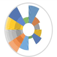
我的理解是,通过pattern,可以在后台新创建一个图片,这个图片可以是纯颜色的,也可以是填充色的,通过type="blank"来控制,如果type="bricks",则生成的图片是由砖块填充的
例如这样

其次,通过 pattern 还可以指定密度、颜色、背景颜色、像素等,每次运行一个
pattern(type="blank", density=1, color='white', pattern.line.size=1, background.color="darkgreen", pixel=8, res=8)
FarWest<-readPNG(paste(location,'/',"blank",".png", sep=''))
就会把生成的图片赋给新的变量,代表要填充的图片,然后下一次又运行同样的类型时,会把前面的给覆盖调
比如我运行上面一段代码,类型是纯色blank,背景颜色是darkgreen,于是我的文件夹中会出现

如果我指定类型为bricks,背景颜色为red,还要调节密度为10,看看效果
pattern(type="bricks", density=10, color='white', pattern.line.size=1, background.color="red", pixel=8, res=8)
FarWest<-readPNG(paste(location,'/',"bricks",".png", sep=''))

至于中间的图片,可以 修改
下面我修改
FarWest 用红砖填充
pattern(type="bricks", density=10, color='white', pattern.line.size=1, background.color="red", pixel=8, res=8)
FarWest<-readPNG(paste(location,'/',"bricks",".png", sep=''))
还有
pattern.type.inner<-readJPEG('C:\\Users\\Administrator\\Desktop\\3.jpg')
图片效果

(3)
#Example 1
library(patternplot)
library(png)
library(ggplot2)

# 组1 内环
group1<-c("Wind", "Hydro", "Solar", "Coal", "Natural Gas", "Oil")
pct1<-c(12, 15, 8, 22, 18, 25)
label1<-paste(group1, " \n ", pct1 , "%", sep="")
location<-gsub('\\','/',tempdir(), fixed=T)

# 开始设置内环颜色

# 1 darkolivegreen1 浅绿色填充
pattern(type="blank", density=1, color='white', pattern.line.size=1, background.color="darkolivegreen1",  pixel=20, res=15)
Wind<-readPNG(paste(location,'/',"blank",".png", sep='')) # "C:/Users/ADMINI~1/AppData/Local/Temp/RtmpYfKFLK/blank.png"

# 2 white 白色填充
pattern(type="blank", density=1, color='white', pattern.line.size=1, background.color="white", pixel=20, res=15)
Hydro<-readPNG(paste(location,'/',"blank",".png", sep='')) # "C:/Users/ADMINI~1/AppData/Local/Temp/RtmpYfKFLK/blank.png"


# 3 indianred 有点深红
pattern(type="blank", density=1, color='white', pattern.line.size=1, background.color="indianred",  pixel=20, res=15)
Solar<-readPNG(paste(location,'/',"blank",".png", sep=''))

# 4 gray81 灰色
pattern(type="blank", density=1, color='white', pattern.line.size=1, background.color="gray81",  pixel=20, res=15)
Coal<-readPNG(paste(location,'/',"blank",".png", sep=''))

# 5 这一个我自己指定,用#FF66FF 紫色
pattern(type="blank", density=1, color='white', pattern.line.size=1, background.color="#FF66FF",  pixel=20, res=15)
NaturalGas<-readPNG(paste(location,'/',"blank",".png", sep=''))

# 6 sandybrown 橘色
pattern(type="blank", density=1, color='white', pattern.line.size=1, background.color="sandybrown",  pixel=20, res=15)
Oil<-readPNG(paste(location,'/',"blank",".png", sep=''))

# 把填充的类型放到一个列表
pattern.type1<-list(Wind, Hydro, Solar, Coal, NaturalGas, Oil)


# 组2 就是外环
group2<-c("Renewable", "Non-Renewable")
pct2<-c(35, 65)
label2<-paste(group2, " \n ", pct2 , "%", sep="")

# 外环的颜色设置 类型为grid 颜色为seagreen 绿色
pattern(type="grid", density=12, color='white', pattern.line.size=5, background.color="seagreen", pixel=20, res=15)
Renewable<-readPNG(paste(location,'/',"grid",".png", sep=''))
# 另外一个用纯色 blank  背景颜色用deepskyblue 蓝色
pattern(type="blank", density=1, color='white', pattern.line.size=1, background.color="deepskyblue",  pixel=20, res=15)
NonRenewable<-readPNG(paste(location,'/',"blank",".png", sep=''))
# 同样的,把外环填充的放到列表
pattern.type2<-list(Renewable, NonRenewable)
# 中间的图片 这个可以自定义
pattern.type.inner<-readPNG(system.file("img", "earth.png", package="patternplot"))


g<-imagerings2(group1, # 组1
		    group2, # 组2
			pct1,# 数据1
			pct2, # 数据2
			label1,  # 标签1
			label2,
			label.size1=3,
			label.size2=3.5,
			label.color1='black',
			label.color2='black',
			label.distance1=0.7,
			label.distance2=1.3,
			pattern.type1,  # 组1填充
			pattern.type2,  # 组2填充
			pattern.type.inner,  # 中间的图片
			frame.color='skyblue',#框架颜色
			frame.size=1.5, # 框架大小
			 r1=2.2, # 三个半径
			r2=4.2,
			r3=5)
#scale_x_continuous# 连续变量可以更改标度
g<-g+scale_x_continuous(limits=c(-7, 7))+scale_y_continuous(limits=c(-7, 7))
g

更改颜色
找自己喜欢的颜色
http://tool.chinaz.com/Tools/onlinecolor.aspx

# 另外一个用纯色 blank  背景颜色用deepskyblue 蓝色
pattern(type="bricks", density=10, color='white', pattern.line.size=1, background.color="deepskyblue",  pixel=20, res=15)
NonRenewable<-readPNG(paste(location,'/',"bricks",".png", sep=''))

# 中间的图片 这个可以自定义
pattern.type.inner<-readJPEG('C:\\Users\\Administrator\\Desktop\\3.jpg')

继续修改
# 数据
group1<-c("Blautia", "Roseburia", "Lachnospira", "Coprococcus", "Extibacter")
pct1<-c(12, 6, 12, 11, 13)
label1<-paste(group1, " \n ", pct1 , "%", sep="")

# 填充类型、颜色准备
location<-gsub('\\','/',tempdir(), fixed=T)
pattern(type="blank", density=1, color='white', pattern.line.size=1, background.color="darkolivegreen1",  pixel=20, res=15)
Wind<-readPNG(paste(location,'/',"blank",".png", sep=''))

pattern(type="blank", density=1, color='white', pattern.line.size=1, background.color="white", pixel=20, res=15)
Hydro<-readPNG(paste(location,'/',"blank",".png", sep=''))

pattern(type="blank", density=1, color='white', pattern.line.size=1, background.color="indianred",  pixel=20, res=15)
Solar<-readPNG(paste(location,'/',"blank",".png", sep=''))

pattern(type="blank", density=1, color='white', pattern.line.size=1, background.color="gray81",  pixel=20, res=15)
Coal<-readPNG(paste(location,'/',"blank",".png", sep=''))

pattern(type="blank", density=1, color='white', pattern.line.size=1, background.color="#FFFF99",  pixel=20, res=15)
NaturalGas<-readPNG(paste(location,'/',"blank",".png", sep=''))


# 把填充的类型加入到列表
pattern.type1<-list(Wind, Hydro, Solar, Coal, NaturalGas)

# 外环
group2<-c("Main Genera", "Others")
pct2<-c(54, 46)
label2<-paste(group2, " \n ", pct2 , "%", sep="")
# 填充准备
pattern(type="grid", density=12, color='white', pattern.line.size=5, background.color="seagreen", pixel=20, res=15)
Renewable<-readPNG(paste(location,'/',"grid",".png", sep=''))

pattern(type="blank", density=1, color='white', pattern.line.size=1, background.color="deepskyblue",  pixel=20, res=15)
NonRenewable<-readPNG(paste(location,'/',"blank",".png", sep=''))

pattern.type2<-list(Renewable, NonRenewable)

# 中间图片
pattern.type.inner<-readPNG(system.file("img", "earth.png", package="patternplot"))


#绘图
g<-imagerings2(
		group1,
		group2,
		pct1,
		pct2,
		label1,
		label2,
		label.size1=3,
		label.size2=3.5,
		label.color1='black',
		label.color2='black',
		label.distance1=0.7,
		label.distance2=1.3,
		pattern.type1,
		pattern.type2,
		pattern.type.inner,
		frame.color='skyblue',
		frame.size=1.5,
		r1=2.2, r2=4.2, r3=5)

g<-g+scale_x_continuous(limits=c(-7, 7))+scale_y_continuous(limits=c(-7, 7))
g

示例8:patternbar函数模式填充柱状图
library(patternplot)
library(png)
library(ggplot2)

#数据
data <- read.csv(system.file("extdata", "monthlyexp.csv", package="patternplot"))
data<-data[which(data$Location=='City 1'),]
'''
       Type Location Amount
1   Housing   City 1   2500
2 Childcare   City 1   2000
3      Food   City 1   1000
'''

# 因子
x<-factor(data$Type, c('Housing', 'Food',  'Childcare'))
y<-data$Amount


# 填充类型
pattern.type1<-c('hdashes', 'bricks', 'crosshatch')
# 填充颜色
pattern.color=c('black','black', 'black') # 比如类型是 // ,则是//的颜色
# 背景颜色
background.color=c('#CCFFFF','white', '#FFCCFF')
# 密度
density<-c(20, 20, 10)

barp1<-patternbar(
		data,
		x,
		y,
		group=NULL,
		ylab='Monthly Expenses, Dollars',
		pattern.type=pattern.type1,
		hjust=0.5,
            pattern.color=pattern.color,
		background.color=background.color,
		pattern.line.size=c(5.5, 1, 4),
            frame.color=c('black', 'black', 'black'),
		density=density)+scale_y_continuous(limits = c(0, 2800))+ggtitle('(A) Black and White with Patterns')


#Example 2

# 填充类型
pattern.type2<-c('grid', 'bricks', 'waves')
pattern.color=c('black','white', 'grey20')
background.color=c('#FFFF99','#FFCC66', 'chocolate')
# 密度
density2<-c(12, 20, 10)
barp2<-patternbar(
		data,
		x,
		y,
		group=NULL,
		ylab='Monthly Expenses, Dollars',
		pattern.type=pattern.type2,
		hjust=0.5,
            pattern.color=pattern.color,
		background.color=background.color,
		pattern.line.size=c(5.5, 1, 4),
            frame.color=c('black', 'black', 'black'),
		density=density2)+scale_y_continuous(limits = c(0, 2800))+ggtitle('(B) Colors with Patterns')

# 使用grid进行拼图 并列
library(gridExtra)
grid.arrange(barp1,barp2,  nrow = 1)

示例9:imagebar函数图像填充的柱状图
data1 <- data.frame(
		aa = c('教师','教师','学生','学生','校友','校友'),
		b=c(2500,1000,2000,2200,2300,800),
		c=c('组1','组2','组1','组2','组1','组2')
)
data1<-data1[which(data1$c=='组1'),]
x<-factor(data1$aa, c('教师', '学生','校友'))
y<-data1$b


# 自己的图片
pic1 <-  readJPEG('C:\\Users\\Administrator\\Desktop\\1.jpg')
pic2 <-  readJPEG('C:\\Users\\Administrator\\Desktop\\2.jpg')
pic3 <-  readJPEG('C:\\Users\\Administrator\\Desktop\\3.jpg')

pattern.type<-list(pic1,pic2,pic3)
imagebar(
	   data1,
         x,
	   y,
	   group=NULL,
	   pattern.type=pattern.type,
	   vjust=-1,
	   hjust=0.5, # hjust控制水平对齐和vjust控制垂直对齐。
         frame.color='black',# 框架颜色
         ylab='数量'#y轴标签
	 )+ggtitle('imagebar函数图像填充的柱状图')#标题

data1 <- data.frame(
		aa = c('教师','教师','学生','学生','校友','校友'),
		b=c(2500,1000,2000,2200,2300,800),
		c=c('组1','组2','组1','组2','组1','组2')
)
group<-factor(data1$aa, c('教师', '学生','校友'))
y<-data1$b
x<-factor(data1$c, c('组1', '组2'))

# 自己的图片
pic1 <-  readJPEG('C:\\Users\\Administrator\\Desktop\\1.jpg')
pic2 <-  readJPEG('C:\\Users\\Administrator\\Desktop\\2.jpg')
pic3 <-  readJPEG('C:\\Users\\Administrator\\Desktop\\3.jpg')

pattern.type<-list(pic1,pic2,pic3)
imagebar(
	   data1,
         x,
	   y,
	   group,
	   pattern.type=pattern.type,
	   vjust=-1,
	   hjust=0.5, # hjust控制水平对齐和vjust控制垂直对齐。
         frame.color='black',# 框架颜色
         ylab='数量'#y轴标签
	 )+ggtitle('imagebar函数图像填充的柱状图')#标题


 被折叠的 条评论
为什么被折叠?
被折叠的 条评论
为什么被折叠?
 到【灌水乐园】发言


