


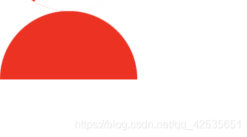
css中绘画半圆形:
    <div class="semi-sector"></div>

	 .semi-sector {
      height: 50px;
      width: 100px;
      border-radius: 50px 50px 0 0; /* border-radius 要等于圆的半径*/
      background-color: red;
    }
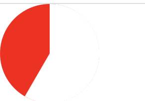
css绘画任意角度的扇形:
思路:
先画一个圆,然后再用 absolute 绝对布局画两个半圆,然后 rotate 旋转两个半圆,注意使用 transform-origin 设置好圆心。
    <div class="circle"></div>
    <div class="sector1"></div>
    <div class="sector2"></div>

    body {
      margin: 0;
    }
    .circle {
      width: 100px;
      height: 100px;
      border-radius: 100px;
      background-color: red;
    }
    .sector1 {
      transform-origin: 50px 50px;
      transform: rotate(90deg);
      position: absolute;
      top: 0px;
      left: 0px;
      width: 100px;
      height: 50px;
      background-color: white;
      border-radius: 50px 50px 0 0;
    }
    .sector2 {
      transform-origin: 50px 50px;
      transform: rotate(120deg);
      position: absolute;
      top: 0px;
      left: 0px;
      width: 100px;
      height: 50px;
      background-color: white;
      border-radius: 50px 50px 0 0;
    }


 949
949


 被折叠的 条评论
为什么被折叠?
被折叠的 条评论
为什么被折叠?
 到【灌水乐园】发言


