


直接上图

实现思路:
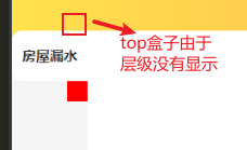
每一个item项都增加两个盒子,将盒子通过定位分别放在item项的右上和右下角,如图
			<view class="left">
				<scroll-view scroll-y="true" class="left-sc">
					<view class="scrollItem" :class="[currentIndex==index?'active':'']" v-for="(item,index) in list" :key="index" @click="addClass(index)">
						<view class="top-ra"> //top盒子
							<text></text>
						</view>
						{{item}}
						<view class="bottom-ra"> //bottom盒子
							<text></text>
						</view>
					</view>
				</scroll-view>
			</view>
样式
					.active{
						position: relative;
						background-color: #fff;
						font-weight: 800;
						border-top-left-radius: 20rpx;
						border-bottom-left-radius: 20rpx;
						.top-ra{
							position: absolute;
							top: -40rpx;
							right: 0rpx;
							width: 40rpx;
							height: 40rpx;
							background-color: yellow;
						}
						.bottom-ra{
							position: absolute;
							bottom: -40rpx;
							right: 0;
							width: 40rpx;
							height: 40rpx;
							background-color: red;
						}

					}
然后给上下盒子分别设置上右圆角和下右圆角
 border-top-right-radius: 30rpx;
别忘了view里面的text
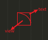
下面说说view里text的作用,先让text宽高等于view,如图,此时的view是扇形,text是矩形,现在把扇形的背景颜色改为未激活的颜色,text的颜色改为激活的颜色就可以了
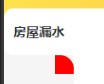
效果:

代码:
			.left{
				.left-sc{
					width: 150rpx;
					height: 1000rpx;
					background-color: #f5f5f5;
					border-top-left-radius: 20rpx;
					.scrollItem{
						position: relative;
						height: 100rpx;
						line-height: 100rpx;
						width: 100%;
						text-align: center;
					}
					.active{
						position: relative;
						background-color: #fff;
						font-weight: 800;
						border-top-left-radius: 20rpx;
						border-bottom-left-radius: 20rpx;
						z-index: 1;
						.top-ra{
							position: absolute;
							top: -40rpx;
							right: 0rpx;
							width: 40rpx;
							height: 40rpx;
							background-color: #f5f5f5;
							border-bottom-right-radius: 30rpx;
							text{
								position: absolute;
								top: 0;
								right: 0;
								width: 100%;
								height: 100%;
								display: inline-block;
								background-color: #fff;
								z-index: -1;
							}
						}
						.bottom-ra{
							position: absolute;
							bottom: -40rpx;
							right: 0;
							width: 40rpx;
							height: 40rpx;
							background-color: #f5f5f5;
							border-top-right-radius: 30rpx;
							text{
								position: absolute;
								top: 0;
								right: 0;
								width: 100%;
								height: 100%;
								display: inline-block;
								background-color: #fff;
								z-index: -1;
							}
						}

					}
				}
			}
方法很繁琐,但是没有想到其他办法了,有更好方法欢迎评论


 397
397


 被折叠的 条评论
为什么被折叠?
被折叠的 条评论
为什么被折叠?
 到【灌水乐园】发言


