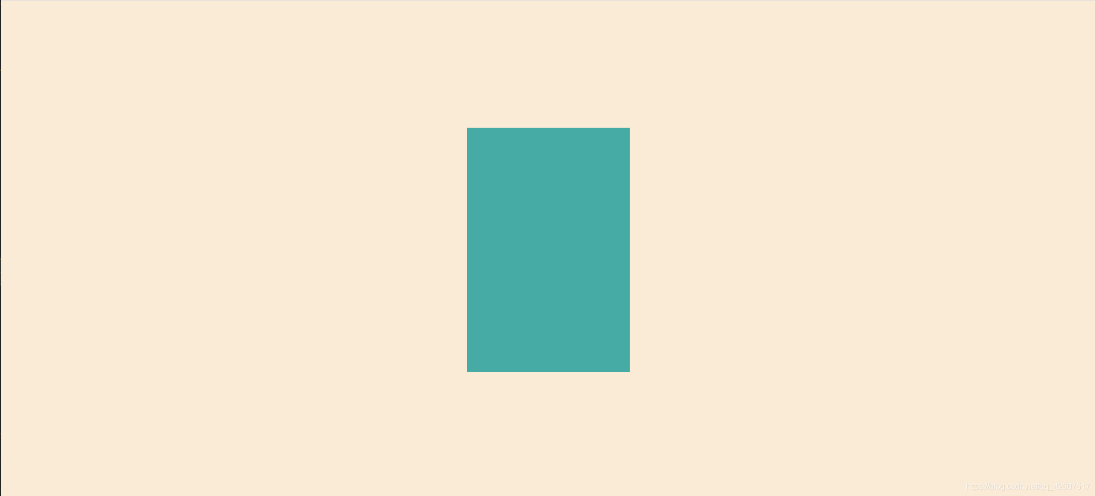
方法一 :使用css3的transform来实现
<div class="parent">
    <div class="child">
      <p></p>
    </div>
</div>
       .parent {
            width: 100%;
            height: 100%;
            background-color: antiquewhite;
        }
        .child {
            position: absolute;
            top: 50%;
            left: 50%;
            transform: translate(-50%, -50%);
        }
        .child p {
     		width: 300px;
      		height: 400px;
      		background-color: rgb(78, 151, 211);
    	}
方法二:flex 布局
<div class="parent">
    <div class="child"></div>
</div>
.parent{
display: flex;
justify-content: center;
align-items: center;
width: 100%;
height:100%;
background-color: antiquewhite;
}
.parent .child{
width: 200px;
height: 300px;
background-color: rgb(78, 151, 211);
}


 260
260


 被折叠的 条评论
为什么被折叠?
被折叠的 条评论
为什么被折叠?
 到【灌水乐园】发言


