


css页面布局
按住Alt键同时选中多个div分区
标准流–Div是块间元素(
display:block),默认情况下占一行浮动流:
float:left/right混合流:一般页面布局为从上至下标准流,从左至右浮动流(无限极为例) 原Footer(最底部)栏向上浮动:
clear: both;//如果自己的宽高设计不够精确就可能出现这个问题,则需要清除浮动实例一无限极框架(文末附代码及效果图)
5.1 Nav:导航,
crtl+d:复制当行5.2
.nav a{}//只有nav里的class a 有作用,称之为后代选择器(孩子或孙子)
5.3text-decoration:下边线none;text-algin:center;//字居中line-heght:字高
5.4 行内元素给高看不到效果,则display:inline-block;//给固定宽(都是四字或二字等);另一种情况字数不等通过padding-left和padding-right调整
5.5修改鼠标hover效果,.nav a:hover{color;//字体变化background:字体背景颜色(不合适,需要调整高度-如6.3)};修改字体:font-weight:bold;//黑体
5.6使用ul-li
1>去掉样式list-style
2>字体居中:计算后给.nav ul li:first-of-type{margin-left:50px;}//只调整最左侧的左边距
5.7修改鼠标点击上去的效果高度:display:block;float:left;height:40px;//先修改为浮动
6.案例一—baolijituan(保利集团文末附代码及效果图)
6.1 <a href=“#”> #为空连链接
6.2 !important//强制提高优先级<—想要的效果没有实现
6.3 height:显示想要的高度背景;line-height:控制字高(在框中的位置)
6.4 box-sizing:border-box;//h5新规定的盒子模型—border和padding变大时content-width自动变小(调整图片padding)
6.5 span—行内元素,没有实际意义;
padding-left:缩进1em;
圆角:border-radius:5px;//当圆角为百分之50时表示圆;
6.6 文本溢出处理(必须同时使用):
    white-space//禁止换行;
     overflow//溢出隐藏,
	text-overflow:ellipis//省略号代替或者
	text-overflow:clip//文本截断
6.7 -webkit-line-clamp:10//10行后省略 {四种内核的使用:webkit谷歌 o 火盆 ms微软 moz火狐
6.8 属性选择器
6.9 cursor:pointer:鼠标悬停变成手状
- 溢出文本省略:
p{
            width:150px;
            height:30px;
            line-height: 30px;
            white-space: nowrap;
            overflow: hidden;
            text-overflow:ellipsis;
//单行省略效果
        }
// 多行效果,注意浏览器兼容性,
        div{
            width:100px;
            height:60px;
            line-height: 20px;
            white-space: normal;
            overflow: hidden;
            text-overflow: ellipsis;
            -webkit-line-clamp: 3;
            -webkit-box-orient: vertical;
            display: -webkit-box;
            }
无限极网页效果图
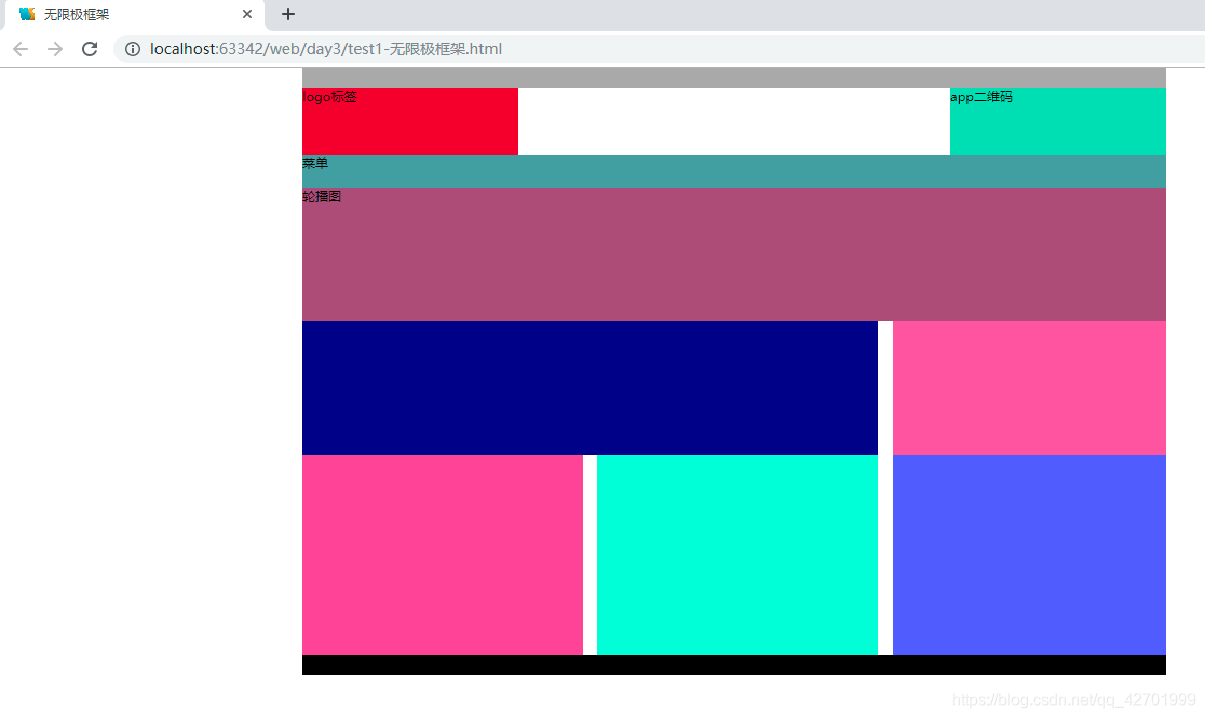
代码如下:
<!DOCTYPE html>
<html>
<head lang="en">
    <meta charset="UTF-8">
    <title>无限极框架</title>
    <style>
        *{
            margin: 0;
            padding: 0;
        }
        .top{
            width:1200px;
            height:30px;
            background:#aaa;
            margin:auto; /*居中*/
        }
        .header{
            width:1200px;
            height:100px;
            margin:auto;
        }
        .logo{
            width:300px;
            height:100px;
            background: crimson;
            float:left;
        }
        .app{
            width:300px;
            height:100px;
            background: #6adcb1;
            float:right;
        }
        .menu{
            width:1200px;
            height:50px;
            background: cadetblue;
            margin:auto;
        }
        .banner{
            width:1200px;
            height:200px;
            background: #a0517b;
            margin:auto;
        }
        .content{
            width:1200px;
            height:100px;
            margin:auto;
        }
        .news{
            width:800px;
            height:200px;
            background: darkblue;
            float:left;
        }
        .info{
            width:380px;
            height:200px;
            background: #f660a7;
            float:right;
        }
        .content1{
            width:1200px;
            height:100px;
            margin:auto;
        }
        .content_left{
            width:390px;
            height:300px;
            background: #ff54a0;
            float:left;
        }
        .content_main{
            width:390px;
            height:300px;
            float:left;
            background: #7dffd1;
            margin-left: 20px;
            margin-right: 20px;
        }
        .content_right {
            width:380px;
            height:300px;
            background: #595cff;
            float:right;
        }
        .footer{
            width:1200px;
            height:30px;
            background: black;
            margin:auto;
            clear: both;
        }
    </style>
</head>
<body>
<div class="top">
</div>
<div class="header">
    <div class="logo">logo标签</div>
    <div class="app">app二维码</div>
</div>
<div class="menu">菜单</div>
<div class="banner">轮播图</div>
<div class="content">
    <div class="news"></div>
    <div class="info"></div>
</div>
<div class="content1">
    <div class="content_left"></div>
    <div class="content_main"></div>
    <div class="content_right"></div>
</div>
<div class="footer"></div>
</body>
</html>
保利集团效果图如下:
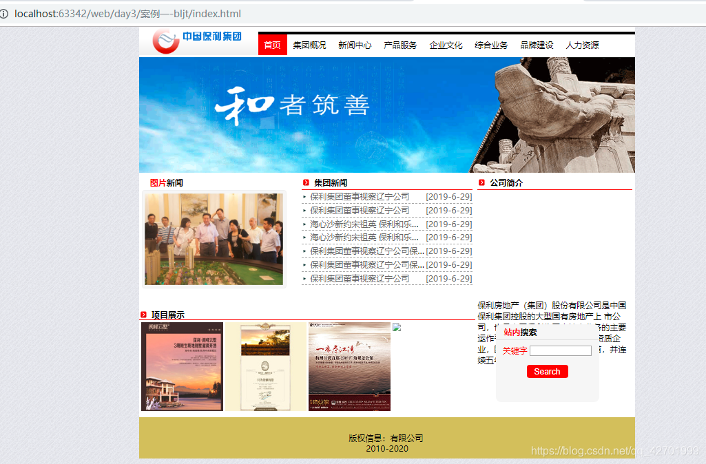
index.html代码如下:
<!DOCTYPE html>
<html>
<head lang="en">
<meta charset="UTF-8">
<title>bljt</title>
<link rel="stylesheet" href="css/index.css"/>
</head>
<body>
<!--头部-导航栏-->
<div id="top">
<div class="logo fl">
<a href="#"><img src="images/logo.gif"></a>
</div>
<div class="nav fr">
<a href="#" class="selected">首页</a>
<a href="#">集团概况</a>
<a href="#">新闻中心</a>
<a href="#">产品服务</a>
<a href="#">企业文化</a>
<a href="#">综合业务</a>
<a href="#">品牌建设</a>
<a href="#">人力资源</a>
<a href="#">国际合作</a>
</div>
</div>
<div id="banner">
<img src="images/banner.gif" alt=""/>
</div>
<div id="news">
<div class="news-left fl">
<h4><span>图片</span>新闻</h4>
<a href="#"><img src="images/20110716114749_22.jpg"></a>
</div>
<div class="news-main fl">
<h4 class="title">集团新闻</h4>
<ul>
<li><a href="#"><span>[2019-6-29]</span>保利集团董事视察辽宁公司</a></li>
<li><a href="#"><span>[2019-6-29]</span>保利集团董事视察辽宁公司</a></li>
<li><a href="#"><span>[2019-6-29]</span>海心沙新约宋祖英 保利和乐中国完美落幕</a></li>
<li><a href="#"><span>[2019-6-29]</span>海心沙新约宋祖英 保利和乐中国完美落幕</a></li>
<li><a href="#"><span>[2019-6-29]</span>保利集团董事视察辽宁公司保利集团董事视察辽宁公司</a></li>
<li><a href="#"><span>[2019-6-29]</span>保利集团董事视察辽宁公司保利集团董事视察辽宁公司</a></li>
<li><a href="#"><span>[2019-6-29]</span>保利集团董事视察辽宁公司</a></li>
</ul>
</div>
<div class="news-right fr">
<h4 class="title">公司简介</h4>
<p><img src="images/company_02.jpg" class="fr">
保利房地产(集团)股份有限公司是中国保利集团控股的大型国有房地产上
市公司,也是中国保利集团房地产业务的主要运作平台,国家一级房地产开
发资质企业,国有房地产企业综合实力榜首,并连续五年蝉联央企房地产第一名。</p>
</div>
</div>
<div id="showlist">
<div class="show fl">
<h4 class="title">项目展示</h4>
<p>
<a href=""><img src="images/1.jpg"/></a>
<a href=""><img src="images/2.jpg"/></a>
<a href=""><img src="images/3.jpg"/></a>
<a href=""><img src="images/4.jpg"/></a>
</p>
</div>
<div class="search fl">
<h4><span>站内</span>搜索</h4>
<p><span>关键字</span> <input type="text"/></p>
<p><input type="button" value="Search"></p>
</div>
</div>
<div id="footer">
版权信息:有限公司 <br/>2010-2020
</div>
</body>
</html>
css样式代码如下:
/*公用样式*/
*{
    margin:0;
    padding:0;
    box-sizing: border-box;
}
.fl{
    float:left;
}
.fr{
    float:right;
}
.clear{
    clear:both;
}
ul,li{
    list-style: none;
}
a{
    text-decoration: none;
}

/*index页面样式*/
body{
    font-size: 14px;
    background:url(../images/body.gif) ;
}
#top,#banner,#news,#showlist,#footer{
    width:960px;
    margin:0 auto;
    background: #fff;
}
#top{
    height:54px;
}
.logo{
    width:230px;

}
/*导航样式*/
.nav{
    width:730px;
    height:40px;
    line-height: 40px;
    border-top:solid 5px #000;
    margin-top: 9px;
}
.nav a{
    padding:0 12px;
    color:#000;
    display: block;
    float:left;
    height:40px;
}
.nav a:hover,.selected{
    background: #f00;
    color:#fff !important;
}
/*新闻模块*/
#news{
    height:260px;
    padding:0 5px;
}
.news-left{
    width:300px;
    height:260px;
}
.news-main{
    width:330px;
    margin:0 10px;height:260px;
}
.news-right{
    width:300px;height:260px;
}
#news h4{
    height:30px;
    line-height: 30px;
    padding-left: 1em;
}
.news-left h4 span,.search span{
    color:red;
}
.news-left a img{
    width:280px;
    border-radius: 5px; /*圆角状态,当圆角为50%,表示圆*/
    padding:5px;
    border:solid 1px #eee;
    background: #f5f5f5;
}
h4.title{
    border-bottom:solid 1px #f00;
    background:url(../images/ico5.gif) no-repeat left center;
    padding-left: 1.5em!important;
}
.news-main ul li{
    line-height: 26px;
    border-bottom: dashed 1px #aaa;
    background: url(../images/ico1.gif) no-repeat left center;
    padding-left: 1em;
    white-space: nowrap;/*禁止换行*/
    overflow: hidden;/*举出隐藏*/
    text-overflow: ellipsis;/*文本溢出  ellipsis用省略号代替  clip文本截断 */

}
.news-main ul li span{
    float: right;
}
.news-main ul li a{
    color:#666;

}
.news-main ul li:hover a{
    color:red;
}
.news-right p img{
    height:212px;
}
.news-right p{
    line-height: 22px;
    white-space: normal;
    overflow: hidden;
    text-overflow: ellipsis;
    -webkit-line-clamp: 10;
    -webkit-box-orient: vertical;
    display: -webkit-box;
    /*
    -webkit-
    -o-
    -ms-
    -moz-
    */
}

#showlist{
    height:210px;
    background: #fff;
}
.show{
    width:650px;
    margin-right: 10px;
}
.search{
    width:300px;

}
.show img{
    width:158px;
}
.show p a{
    float:left;
    margin:4px 0 0 4px; /*上右下左*/
}
.search{
    width:200px;
    height:150px;
    background: #f5f5f5;
    border-radius: 10px;
    margin:30px 0 0 30px;
}
.search h4{
    height:30px;
    line-height: 30px;
    padding-left: 1em;
    border-bottom: solid 1px #e1e1e1;
}
.search p{
    text-align: center;
    line-height:40px;
}
.search input[type="text"]{/*属性选择器*/
    display: inline;
    width:120px;height:20px;
}
.search input[type="button"]{/*属性选择器*/
    background: #f00;
    color:#fff;
    width:80px;
    height:25px;
    border-radius: 5px;
    border:none;
    cursor: pointer;/*鼠标悬停变成手状*/
}
#footer{
    text-align: center;
    height:80px;
    background: #cec05a;
    line-height: 20px;
    padding-top: 30px;
}


 3678
3678


 被折叠的 条评论
为什么被折叠?
被折叠的 条评论
为什么被折叠?
 到【灌水乐园】发言


