


 本文介绍了如何使用CSS Grid布局实现从右到左的反向填充,以解决在显示多个按钮时的对齐问题。在Flexbox中可以通过`flex-direction`属性轻松实现,但在Grid中需借助`direction: rtl`属性来达到类似效果。内容详细展示了相关CSS代码及最终实现的布局样式。
问题:需要实现的效果,如下图:


说明:总共有7种不同操作的按钮,最多出现三个。有三个按钮的时候两端对齐,两个按钮的时候如图所示,一个按钮的时候右对齐。如果使用flex弹性盒子,就需要指定元素(按钮)一个宽度33.3%,“flex:1”不行。用grid网格布局实现的话会很简单,因为它可以直接将元素分成最多显示3列,超出的自动换行,不过最后实现的只能是从左到右的填充方式。
grid网格布局本身是没有反向填充的css属性,没有像弹性盒子flex的flex-direction属性,
比如:
flex-direction:row-reverse(水平排列相反的顺序)、row-reverse(垂直排列相反的顺序)。
我们可以利用css的‘ direction’属性实现这个效果。不过垂直排列的反向依然实现不了。
代码:
.grid-btn{
display: grid;
grid-template-columns:1fr 1fr 1fr;
grid-auto-flow:row;
direction: rtl; //反向填充
}
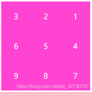
实现效果:
全部代码:
<!DOCTYPE html>
<html lang="en">
<head>
    <meta charset="UTF-8">
    <meta name="viewport" content="width=device-width, initial-scale=1.0">
    <title>Document</title>
    <style>
        .grid{
            display: grid;
            grid-template-columns:1fr 1fr 1fr;
            grid-auto-flow:row;
            direction:rtl;
            width:300px;
            height:300px;
        }
        .a{
            direction:ltr;
            background: rgb(253, 80, 216);
            width:100px;
            height:100px;
            font-size: 25px;
            color:white;
            display: flex;
            align-items: center;
            justify-content: center;
        }
    </style>
</head>
<body>
    <div class="grid">
        <div class="a">1</div>
        <div class="a">2</div>
        <div class="a">3</div>
        <div class="a">4</div>
        <div class="a">5</div>
        <div class="a">6</div>
        <div class="a">7</div>
        <div class="a">8</div>
        <div class="a">9</div>
    </div>
</body>
</html>


 扫一扫
扫一扫


 1292
1292

 被折叠的 条评论
为什么被折叠?
被折叠的 条评论
为什么被折叠?
 到【灌水乐园】发言


