


 本文详细介绍如何在WPF中自定义ComboBox的样式,包括创建带提示文本的ComboBox和实现多选功能。通过修改资源字典和添加自定义控件,可以完全控制ComboBox的外观和行为。
WPF 自定义ComboBox样式和实现带提示的ComboBox
一.自定义ComboBox样式
效果:

先添加一个Styles文件夹,在里面添加一个资源字典ComboBox.xaml,代码如下:
<ResourceDictionary xmlns="http://schemas.microsoft.com/winfx/2006/xaml/presentation"
xmlns:x="http://schemas.microsoft.com/winfx/2006/xaml"
xmlns:local="clr-namespace:WPFDemo"
xmlns:controls="clr-namespace:WPFDemo.Controls">
<!--ComboBox-->
<!--ComBoBox项选中背景色-->
<SolidColorBrush x:Key="ComboBoxSelectdBackground" Color="#007ACC"/>
<!--ComBoBox项鼠标经过背景色-->
<SolidColorBrush x:Key="ComboBoxMouseOverBackground" Color="DarkGray"/>
<!--ComBoBox项选中前景色-->
<SolidColorBrush x:Key="ComboBoxSelectedForeground" Color="White"/>
<!--ComBoBox项鼠标经过前景色-->
<SolidColorBrush x:Key="ComboBoxMouseOverForegrond" Color="White"/>
<ControlTemplate x:Key="ComboBoxToggleButton" TargetType="{x:Type ToggleButton}">
<Grid Height="25" HorizontalAlignment="Stretch">
<Grid.ColumnDefinitions>
<ColumnDefinition Width="*"/>
<ColumnDefinition Width="30"/>
</Grid.ColumnDefinitions>
<Border Background="White" Grid.ColumnSpan="2" Opacity="0"/>
<Path x:Name="Arrow" Grid.Column="1" Data="M 0 0 6 6 12 0 Z" VerticalAlignment="Center" HorizontalAlignment="Center" Stretch="None" Fill="#999" />
</Grid>
<ControlTemplate.Triggers>
<Trigger Property="IsChecked" Value="true">
<Setter TargetName="Arrow" Property="RenderTransform">
<Setter.Value>
<RotateTransform CenterX="6" CenterY="3" Angle="180"></RotateTransform>
</Setter.Value>
</Setter>
<Setter TargetName="Arrow" Property="Margin" Value="0 0 0 2"/>
</Trigger>
</ControlTemplate.Triggers>
</ControlTemplate>
<Style TargetType="{x:Type ComboBox}">
<Setter Property="ItemContainerStyle">
<Setter.Value>
<Style TargetType="ComboBoxItem">
<Setter Property="Height" Value="20"/>
<Setter Property="Template">
<Setter.Value>
<ControlTemplate TargetType="{x:Type ComboBoxItem}">
<Grid Height="{TemplateBinding Height}" Width="{TemplateBinding Width}">
<Border x:Name="_borderbg" Background="Transparent"/>
<TextBlock Margin="3 0 3 0" VerticalAlignment="Center" x:Name="_txt" Foreground="#333" Text="{Binding Content,RelativeSource={RelativeSource TemplatedParent}}"/>
<Border x:Name="_border" Background="White" Opacity="0"/>
</Grid>
<ControlTemplate.Triggers>
<Trigger Property="IsSelected" Value="true">
<Setter TargetName="_borderbg" Property="Background" Value="{StaticResource ComboBoxSelectdBackground}" />
<Setter TargetName="_txt" Property="Foreground" Value="{StaticResource ComboBoxSelectedForeground}"/>
</Trigger>
<MultiTrigger>
<MultiTrigger.Conditions>
<Condition Property="IsSelected" Value="false"/>
<Condition Property="IsMouseOver" Value="true"/>
</MultiTrigger.Conditions>
<Setter TargetName="_borderbg" Property="Background" Value="{StaticResource ComboBoxMouseOverBackground}" />
<Setter TargetName="_txt" Property="Foreground" Value="{StaticResource ComboBoxMouseOverForegrond}"/>
</MultiTrigger>
</ControlTemplate.Triggers>
</ControlTemplate>
</Setter.Value>
</Setter>
</Style>
</Setter.Value>
</Setter>
<Setter Property="Template">
<Setter.Value>
<ControlTemplate TargetType="{x:Type ComboBox}">
<Grid>
<Grid.ColumnDefinitions>
<ColumnDefinition Width="0.7*"/>
<ColumnDefinition Width="0.3*" MaxWidth="30"/>
</Grid.ColumnDefinitions>
<Border Grid.Column="0" Grid.ColumnSpan="2" BorderThickness="1" BorderBrush="{TemplateBinding BorderBrush}" CornerRadius="1,0,0,1"/>
<ContentPresenter HorizontalAlignment="Left" Margin="3,3,0,3" x:Name="ContentSite" VerticalAlignment="Center" Content="{TemplateBinding SelectionBoxItem}" ContentTemplate="{TemplateBinding SelectionBoxItemTemplate}" ContentTemplateSelector="{TemplateBinding ItemTemplateSelector}" IsHitTestVisible="False"/>
<!--ToggleButton 已数据绑定到 ComboBox 本身以切换 IsDropDownOpen-->
<ToggleButton Grid.Column="0" Grid.ColumnSpan="2" Template="{StaticResource ComboBoxToggleButton}" x:Name="ToggleButton" Focusable="false" IsChecked="{Binding Path=IsDropDownOpen, Mode=TwoWay, RelativeSource={RelativeSource TemplatedParent}}" ClickMode="Press"/>
<!--必须将 TextBox 命名为 PART_EditableTextBox,否则 ComboBox 将无法识别它-->
<TextBox Visibility="Hidden" BorderThickness="0" Margin="2 0 0 0" x:Name="PART_EditableTextBox" VerticalAlignment="Center" Focusable="True" Background="Transparent" IsReadOnly="{TemplateBinding IsReadOnly}"/>
<!--Popup 可显示 ComboBox 中的项列表。IsOpen 已数据绑定到通过 ComboBoxToggleButton 来切换的 IsDropDownOpen-->
<Popup IsOpen="{TemplateBinding IsDropDownOpen}" Placement="Bottom" x:Name="Popup" Focusable="False" AllowsTransparency="True" PopupAnimation="Slide">
<Grid MaxHeight="150" MinWidth="{TemplateBinding ActualWidth}" x:Name="DropDown" SnapsToDevicePixels="True">
<Border x:Name="DropDownBorder" BorderBrush="#e8e8e8" BorderThickness="1 0 1 1"/>
<ScrollViewer Margin="1" SnapsToDevicePixels="True" HorizontalScrollBarVisibility="Auto" VerticalScrollBarVisibility="Auto" CanContentScroll="True">
<!--StackPanel 用于显示子级,方法是将 IsItemsHost 设置为 True-->
<StackPanel IsItemsHost="True" KeyboardNavigation.DirectionalNavigation="Contained" Background="White"/>
</ScrollViewer>
</Grid>
</Popup>
</Grid>
<ControlTemplate.Triggers>
<Trigger Property="IsEditable" Value="true">
<Setter TargetName="PART_EditableTextBox" Property="Visibility" Value="Visible" />
</Trigger>
</ControlTemplate.Triggers>
</ControlTemplate>
</Setter.Value>
</Setter>
</Style>
<!--MultiComboBox普通样式-->
<Style TargetType="{x:Type controls:MultiComboBox}">
<Setter Property="Width" Value="200" />
<Setter Property="HorizontalContentAlignment" Value="Stretch" />
<Setter Property="VerticalContentAlignment" Value="Center" />
<Setter Property="SnapsToDevicePixels" Value="True" />
<Setter Property="MaxDropDownHeight" Value="400" />
<Setter Property="Template">
<Setter.Value>
<ControlTemplate TargetType="{x:Type controls:MultiComboBox}">
<Grid>
<Border x:Name="Bg" SnapsToDevicePixels="{TemplateBinding SnapsToDevicePixels}" Width="{TemplateBinding Width}" Height="{TemplateBinding Height}" BorderBrush="#eaeaea" BorderThickness="1" >
<Grid x:Name="PART_Root">
<Grid x:Name="PART_InnerGrid" Margin="0">
<Grid.ColumnDefinitions>
<ColumnDefinition Width="*" />
<ColumnDefinition Width="0.3*" MaxWidth="30" />
</Grid.ColumnDefinitions>
<ListBox x:Name="PART_ListBoxChk" SelectionMode="Multiple" BorderThickness="0" ScrollViewer.VerticalScrollBarVisibility="Disabled">
<ListBox.ItemsPanel>
<ItemsPanelTemplate>
<VirtualizingStackPanel Orientation="Horizontal" VirtualizingStackPanel.IsVirtualizing="True" />
</ItemsPanelTemplate>
</ListBox.ItemsPanel>
<ListBox.ItemContainerStyle>
<Style TargetType="ListBoxItem">
<Setter Property="BorderThickness" Value="0"/>
<Setter Property="IsSelected" Value="True"/>
<Setter Property="Template">
<Setter.Value>
<ControlTemplate TargetType="ListBoxItem">
<CheckBox BorderThickness="0" VerticalAlignment="Center" HorizontalAlignment="Center" Content="{Binding ViewName}" IsChecked="{Binding Path=IsSelected,RelativeSource={RelativeSource TemplatedParent},Mode=TwoWay,UpdateSourceTrigger=PropertyChanged}"/>
</ControlTemplate>
</Setter.Value>
</Setter>
</Style>
</ListBox.ItemContainerStyle>
</ListBox>
<!--下拉按钮-->
<ToggleButton x:Name="PART_DropDownToggle" IsTabStop="False"
IsChecked="{Binding IsDropDownOpen, Mode=TwoWay, RelativeSource={RelativeSource TemplatedParent}}"
Grid.Column="1" Template="{StaticResource ComboBoxToggleButton}" />
</Grid>
</Grid>
</Border>
<!--弹出多选列表-->
<Popup x:Name="PART_Popup" AllowsTransparency="True" Focusable="False" StaysOpen="False"
IsOpen="{Binding IsDropDownOpen, RelativeSource={RelativeSource TemplatedParent}}"
PopupAnimation="{DynamicResource {x:Static SystemParameters.ComboBoxPopupAnimationKey}}" Placement="Bottom">
<Grid Width="{Binding ActualWidth, RelativeSource={RelativeSource TemplatedParent}}" MaxHeight="{Binding MaxDropDownHeight, RelativeSource={RelativeSource TemplatedParent}}" >
<ListBox x:Name="PART_ListBox" SelectionMode="Multiple" BorderThickness="1 0 1 1" Background="White" ItemsSource="{Binding ItemsSource,RelativeSource={RelativeSource TemplatedParent}}"
MaxHeight="{TemplateBinding MaxDropDownHeight}" BorderBrush="#eaeaea" >
<ListBox.ItemContainerStyle>
<Style TargetType="ListBoxItem">
<Setter Property="Template">
<Setter.Value>
<ControlTemplate TargetType="{x:Type ListBoxItem}" >
<Grid Height="22">
<Border x:Name="bg" BorderBrush="#eaeaea" BorderThickness="0"/>
<ContentPresenter x:Name="content" />
<Border Background="White" Opacity="0"/>
</Grid>
<ControlTemplate.Triggers>
<Trigger Property="IsSelected" Value="True">
<Setter TargetName="bg" Property="Background" Value="#ADD6FF" />
</Trigger>
<MultiTrigger>
<MultiTrigger.Conditions>
<Condition Property="IsMouseOver" Value="true" />
<Condition Property="IsSelected" Value="false"/>
</MultiTrigger.Conditions>
<Setter TargetName="bg" Property="Background" Value="#009BDB" />
<Setter TargetName="bg" Property="Opacity" Value="0.7"/>
<Setter Property="Foreground" Value="White" />
</MultiTrigger>
<Trigger Property="IsEnabled" Value="False">
<Setter TargetName="bg" Property="Opacity" Value="0.3" />
<Setter Property="Foreground" Value="Gray" />
</Trigger>
</ControlTemplate.Triggers>
</ControlTemplate>
</Setter.Value>
</Setter>
</Style>
</ListBox.ItemContainerStyle>
<ListBox.ItemTemplate>
<DataTemplate>
<Grid>
<CheckBox x:Name="chk" Visibility="Hidden" IsChecked="{Binding IsCheck,Mode=TwoWay}" VerticalAlignment="Center"/>
<CheckBox VerticalAlignment="Center" Foreground="{Binding Foreground,RelativeSource={RelativeSource AncestorType=ListBoxItem}}" IsChecked="{Binding RelativeSource={RelativeSource AncestorType=ListBoxItem},Path=IsSelected,Mode=TwoWay}" Content="{Binding Path=ViewName}" />
</Grid>
<DataTemplate.Triggers>
<DataTrigger Binding="{Binding RelativeSource={RelativeSource AncestorType=ListBoxItem},Path=IsSelected}" Value="true">
<Setter TargetName="chk" Property="IsChecked" Value="true"/>
</DataTrigger>
<DataTrigger Binding="{Binding RelativeSource={RelativeSource AncestorType=ListBoxItem},Path=IsSelected}" Value="false">
<Setter TargetName="chk" Property="IsChecked" Value="true"/>
</DataTrigger>
</DataTemplate.Triggers>
</DataTemplate>
</ListBox.ItemTemplate>
</ListBox>
</Grid>
</Popup>
</Grid>
</ControlTemplate>
</Setter.Value>
</Setter>
</Style>
</ResourceDictionary>
添加一个Controls文件夹,里面添加一个类:
using System;
using System.Collections.Generic;
using System.Collections.ObjectModel;
using System.Linq;
using System.Text;
using System.Windows;
using System.Windows.Controls;

namespace WPFDemo.Controls
{
    public class MultiComboBox : ComboBox
    {
        static MultiComboBox()
        {
            DefaultStyleKeyProperty.OverrideMetadata(typeof(MultiComboBox), new FrameworkPropertyMetadata(typeof(MultiComboBox)));
        }


        private static void OnPropertyChanged(DependencyObject d, DependencyPropertyChangedEventArgs e)
        {
            d.SetValue(e.Property, e.NewValue);
        }

        /// <summary>
        /// 选中项列表
        /// </summary>
        public ObservableCollection<MultiCbxBaseData> ChekedItems = new ObservableCollection<MultiCbxBaseData>();

        /// <summary>
        /// ListBox竖向列表
        /// </summary>
        private ListBox _ListBoxV;

        /// <summary>
        /// ListBox横向列表
        /// </summary>
        private ListBox _ListBoxH;

        public override void OnApplyTemplate()
        {
            base.OnApplyTemplate();
            _ListBoxV = Template.FindName("PART_ListBox", this) as ListBox;
            _ListBoxH = Template.FindName("PART_ListBoxChk", this) as ListBox;
            _ListBoxH.ItemsSource = ChekedItems;
            _ListBoxV.SelectionChanged += _ListBoxV_SelectionChanged;
            _ListBoxH.SelectionChanged += _ListBoxH_SelectionChanged;

            if (ItemsSource != null)
            {
                foreach (var item in ItemsSource)
                {
                    MultiCbxBaseData bdc = item as MultiCbxBaseData;
                    if (bdc.IsCheck)
                    {
                        _ListBoxV.SelectedItems.Add(bdc);
                    }
                }
            }
        }

        private void _ListBoxH_SelectionChanged(object sender, SelectionChangedEventArgs e)
        {
            foreach (var item in e.RemovedItems)
            {
                MultiCbxBaseData datachk = item as MultiCbxBaseData;

                for (int i = 0; i < _ListBoxV.SelectedItems.Count; i++)
                {
                    MultiCbxBaseData datachklist = _ListBoxV.SelectedItems[i] as MultiCbxBaseData;
                    if (datachklist.ID == datachk.ID)
                    {
                        _ListBoxV.SelectedItems.Remove(_ListBoxV.SelectedItems[i]);
                    }
                }
            }
        }

        void _ListBoxV_SelectionChanged(object sender, SelectionChangedEventArgs e)
        {
            foreach (var item in e.AddedItems)
            {
                MultiCbxBaseData datachk = item as MultiCbxBaseData;
                datachk.IsCheck = true;
                if (ChekedItems.IndexOf(datachk) < 0)
                {
                    ChekedItems.Add(datachk);
                }
            }

            foreach (var item in e.RemovedItems)
            {
                MultiCbxBaseData datachk = item as MultiCbxBaseData;
                datachk.IsCheck = false;
                ChekedItems.Remove(datachk);
            }
        }

        public class MultiCbxBaseData
        {
            private int _id;
            /// <summary>
            /// 关联主键
            /// </summary>
            public int ID
            {
                get { return _id; }
                set { _id = value; }
            }

            private string _viewName;
            /// <summary>
            /// 显示名称
            /// </summary>
            public string ViewName
            {
                get { return _viewName; }
                set
                {
                    _viewName = value;
                }
            }

            private bool _isCheck;
            /// <summary>
            /// 是否选中
            /// </summary>
            public bool IsCheck
            {
                get { return _isCheck; }
                set { _isCheck = value; }
            }
        }
    }
}
在App.xaml中引用资源字典:
<Application x:Class="WPF0417.App"
             xmlns="http://schemas.microsoft.com/winfx/2006/xaml/presentation"
             xmlns:x="http://schemas.microsoft.com/winfx/2006/xaml"
             xmlns:local="clr-namespace:WPF0417"
             StartupUri="MainWindow.xaml">
    <Application.Resources>
        <ResourceDictionary>
            <ResourceDictionary.MergedDictionaries>
                <ResourceDictionary Source="Styles/ComboBox.xaml"></ResourceDictionary>
            </ResourceDictionary.MergedDictionaries>
        </ResourceDictionary>
    </Application.Resources>
</Application>
主窗体xaml中引用:
<ComboBox x:Name="combobox"  Width="150" Margin="10" IsEditable="False" BorderBrush="#e8e8e8">
                            <ComboBoxItem Content="数据一" ></ComboBoxItem>
                            <ComboBoxItem Content="数据二" ></ComboBoxItem>
                            <ComboBoxItem Content="数据三" ></ComboBoxItem>
                            <ComboBoxItem Content="数据四" ></ComboBoxItem>
                        </ComboBox>
二.实现带提示的ComboBox
一.添加一个文件夹Converters,在里面添加一个转换器的类tringIsEmptyConverter,代码如下:
using System;
using System.Collections.Generic;
using System.Linq;
using System.Text;
using System.Threading.Tasks;
using System.Windows.Data;

namespace WPF0316c.Converters
{
    public class StringIsEmptyConverter : IValueConverter
    {
        #region IValueConverter 成员

        public object Convert(object value, Type targetType, object parameter, System.Globalization.CultureInfo culture)
        {
            return string.IsNullOrEmpty(System.Convert.ToString(value));
        }

        public object ConvertBack(object value, Type targetType, object parameter, System.Globalization.CultureInfo culture)
        {
            return null;
        }

        #endregion
    }
}
二.添加两个自定义控件:ZToggleButton 和 ZComboBox,代码如下:
ZToggleButton类:
using System;
using System.Collections.Generic;
using System.Linq;
using System.Text;
using System.Threading.Tasks;
using System.Windows;
using System.Windows.Controls;
using System.Windows.Controls.Primitives;
using System.Windows.Data;
using System.Windows.Documents;
using System.Windows.Input;
using System.Windows.Media;
using System.Windows.Media.Imaging;
using System.Windows.Navigation;
using System.Windows.Shapes;

namespace WPF0316c
{

    public class ZToggleButton : ToggleButton
    {
        #region Private属性

        #endregion

        #region 依赖属性定义
        public static readonly DependencyProperty CornerRadiusProperty = DependencyProperty.Register("CornerRadius"
            , typeof(System.Windows.CornerRadius), typeof(ZToggleButton));
        /// <summary>
        /// 边框圆角
        /// </summary>
        public System.Windows.CornerRadius CornerRadius
        {
            get { return (System.Windows.CornerRadius)GetValue(CornerRadiusProperty); }
            set { SetValue(CornerRadiusProperty, value); }
        }
        #endregion

        #region Constructors
        static ZToggleButton()
        {
            DefaultStyleKeyProperty.OverrideMetadata(typeof(ZToggleButton), new FrameworkPropertyMetadata(typeof(ZToggleButton)));
        }
        #endregion

        #region 依赖属性set get

        #endregion

        #region Override方法

        #endregion

        #region Private方法

        #endregion
    }
}
ZComboBox类:
using System;
using System.Collections.Generic;
using System.Linq;
using System.Text;
using System.Threading.Tasks;
using System.Windows;
using System.Windows.Controls;
using System.Windows.Data;
using System.Windows.Documents;
using System.Windows.Input;
using System.Windows.Media;
using System.Windows.Media.Imaging;
using System.Windows.Navigation;
using System.Windows.Shapes;

namespace WPF0316c
{
    public class ZComboBox : ComboBox
    {
        #region Private属性

        #endregion

        #region 依赖属性定义
        public static readonly DependencyProperty CornerRadiusProperty = DependencyProperty.Register("CornerRadius"
            , typeof(System.Windows.CornerRadius), typeof(ZComboBox));
        /// <summary>
        /// 边框圆角
        /// </summary>
        public System.Windows.CornerRadius CornerRadius
        {
            get { return (System.Windows.CornerRadius)GetValue(CornerRadiusProperty); }
            set { SetValue(CornerRadiusProperty, value); }
        }

        public static readonly DependencyProperty WatermarkProperty = DependencyProperty.Register("Watermark"
            , typeof(string), typeof(ZComboBox));
        /// <summary>
        /// 文本输入框的水印
        /// </summary>
        public string Watermark
        {
            get { return (string)GetValue(WatermarkProperty); }
            set { SetValue(WatermarkProperty, value); }
        }
        #endregion

        #region Constructors
        static ZComboBox()
        {
            DefaultStyleKeyProperty.OverrideMetadata(typeof(ZComboBox), new FrameworkPropertyMetadata(typeof(ZComboBox)));
        }
        #endregion

        #region 依赖属性set get

        #endregion

        #region Override方法
        public override void OnApplyTemplate()
        {
            base.OnApplyTemplate();

        }
        #endregion

        #region Private方法

        #endregion
    }
}
Themes/Generic.xaml代码:
<ResourceDictionary
xmlns="http://schemas.microsoft.com/winfx/2006/xaml/presentation"
xmlns:x="http://schemas.microsoft.com/winfx/2006/xaml"
xmlns:local="clr-namespace:WPF0316c"
xmlns:Converters="clr-namespace:WPF0316c.Converters">
<Converters:StringIsEmptyConverter x:Key="StringIsEmptyConverter" />
<Color x:Key="Color.Light.Border.Normal">#D7DDE4</Color>
<Color x:Key="Color.Light.Border.MouseOver">#5CADEF</Color>
<!--<SolidColorBrush x:Key="Light.Border.Normal" Color="#D7DDE4" />
<SolidColorBrush x:Key="Light.Border.MouseOver" Color="#5CADE" />-->
<SolidColorBrush x:Key="Light.Border.Normal" Color="#ACACAC" />
<SolidColorBrush x:Key="Light.Border.MouseOver" Color="#ACACAC" />
<SolidColorBrush x:Key="Light.Border.Pressed" Color="#5CADFF" />
<SolidColorBrush x:Key="Light.Border.Disabled" Color="#D7DDE4" />
<SolidColorBrush x:Key="Brush.Item.MouseOver.Background" Color="#E2E2E2" />
<SolidColorBrush x:Key="Brush.Item.Selected.Background" Color="#47A3FF" />
<SolidColorBrush x:Key="Brush.Item.MouseOver.Foreground" Color="#000000" />
<SolidColorBrush x:Key="Brush.Item.Selected.Foreground" Color="#FFFFFF" />
<SolidColorBrush x:Key="Light.Triangle.Fill" Color="#9EA7B4" />
<PathGeometry x:Key="IsSelectedIcon" Figures="M416.058904 776.794805c-10.475586 0-20.951171-3.996011-28.943193-11.989055L131.272789 508.962827c-15.985066-15.985066-15.985066-41.901319 0-57.886385s41.901319-15.985066 57.886385 0l226.898707 226.898707 418.780899-418.780899c15.985066-15.985066 41.901319-15.985066 57.886385 0s15.985066 41.901319 0 57.886385L445.002097 764.80575C437.010075 772.797771 426.53449 776.794805 416.058904 776.794805z" />
<PathGeometry x:Key="Arrow.Down" Figures="M191.814654 383.980301 832.184323 383.980301 512 767.996418Z" />
<PathGeometry x:Key="Arrow.Up" Figures="M832.185 640.020h-640.37l320.184-384.016z" />
<SolidColorBrush x:Key="BorderColor" Color="#00D3D6DB" />
<SolidColorBrush x:Key="ComboBox.BorderBrush" Color="#ABADB3" />
<SolidColorBrush x:Key="ComboBox.Popup.BorderBrush" Color="#C8C8C8" />
<SolidColorBrush x:Key="ComboBox.Normal.Background" Color="#FFFFFF" />
<SolidColorBrush x:Key="ComboBox.Disabled.Foreground" Color="#888" />
<SolidColorBrush x:Key="ComboBox.Disabled.Background" Color="#00eeeeee" />
<SolidColorBrush x:Key="ComboBox.Disabled.BorderBrush" Color="#00888888" />
<SolidColorBrush x:Key="ComboBoxItem.MouseOver.Background" Color="#E2E2E2" />
<SolidColorBrush x:Key="ComboBoxItem.MouseOver.Foreground" Color="#000000" />
<DropShadowEffect x:Key="BorderShadow" BlurRadius="5" Opacity="0.2" ShadowDepth="0"
Color="Brown" />
<ControlTemplate x:Key="ComboBoxToggleButtonTemplate" TargetType="{x:Type local:ZToggleButton}">
<Grid Background="Transparent">
<Grid.ColumnDefinitions>
<ColumnDefinition Width="*" />
<ColumnDefinition Width="auto" />
</Grid.ColumnDefinitions>
<Border Grid.ColumnSpan="2" x:Name="ShadowBorder" CornerRadius="{TemplateBinding CornerRadius}"
Background="#FFFFFF" SnapsToDevicePixels="True" UseLayoutRounding="True">
<Border.Effect>
<DropShadowEffect BlurRadius="5" Opacity="0.2" ShadowDepth="0" Color="Transparent" />
</Border.Effect>
</Border>
<Border Name="Border" Grid.ColumnSpan="2"
Background="{StaticResource ComboBox.Normal.Background}"
BorderBrush="{StaticResource Light.Border.Normal}"
BorderThickness="1, 1, 1, 1"
CornerRadius="{TemplateBinding CornerRadius}"
SnapsToDevicePixels="True" UseLayoutRounding="True" />
<Border Name="ButtonBorder" Grid.Column="1" Margin="1, 1, 1, 1"
Background="{StaticResource ComboBox.Normal.Background}"
CornerRadius="{Binding CornerRadius,
ElementName=Border}"
Padding="5,0,8,0">
<Path Name="Arrow" Grid.Column="1" Width="10" HorizontalAlignment="Center"
VerticalAlignment="Center"
Data="{StaticResource Arrow.Down}"
Fill="{StaticResource ComboBox.BorderBrush}"
RenderTransformOrigin="0.5,0.5" SnapsToDevicePixels="True" Stretch="Uniform"
UseLayoutRounding="True">
<Path.RenderTransform>
<TransformGroup>
<ScaleTransform />
<SkewTransform />
<RotateTransform />
<TranslateTransform />
</TransformGroup>
</Path.RenderTransform>
</Path>
</Border>
<VisualStateManager.VisualStateGroups>
<VisualStateGroup x:Name="CheckStates">
<VisualState x:Name="Checked">
<Storyboard>
<DoubleAnimation Duration="0:0:0.2" Storyboard.TargetName="Arrow"
Storyboard.TargetProperty="(UIElement.RenderTransform).(TransformGroup.Children)[2].(RotateTransform.Angle)"
To="180" />
<ColorAnimation Duration="0:0:0.2" Storyboard.TargetName="ShadowBorder"
Storyboard.TargetProperty="(Border.Effect).(DropShadowEffect.Color)" To="Brown" />
</Storyboard>
</VisualState>
<VisualState x:Name="Unchecked">
<Storyboard>
<DoubleAnimation Duration="0:0:0.2" Storyboard.TargetName="Arrow"
Storyboard.TargetProperty="(UIElement.RenderTransform).(TransformGroup.Children)[2].(RotateTransform.Angle)"
To="0" />
<ColorAnimation Duration="0:0:0.2" Storyboard.TargetName="ShadowBorder"
Storyboard.TargetProperty="(Border.Effect).(DropShadowEffect.Color)" To="Transparent" />
</Storyboard>
</VisualState>
</VisualStateGroup>
</VisualStateManager.VisualStateGroups>
</Grid>
<ControlTemplate.Triggers>
<Trigger Property="IsMouseOver" Value="True">
<Setter TargetName="Border" Property="BorderBrush" Value="{StaticResource Light.Border.MouseOver}" />
</Trigger>
<MultiTrigger>
<MultiTrigger.Conditions>
<Condition Property="ToggleButton.IsChecked" Value="True" />
<Condition Property="IsMouseOver" Value="False" />
</MultiTrigger.Conditions>
<Setter TargetName="Border" Property="BorderBrush" Value="{StaticResource Light.Border.MouseOver}" />
</MultiTrigger>
<Trigger Property="UIElement.IsEnabled" Value="False">
<Setter TargetName="Border" Property="Panel.Background" Value="{StaticResource ComboBox.Disabled.Background}" />
<Setter TargetName="Border" Property="Border.BorderBrush" Value="{StaticResource ComboBox.Disabled.BorderBrush}" />
<Setter TargetName="ButtonBorder" Property="Panel.Background" Value="{StaticResource ComboBox.Disabled.Background}" />
<Setter TargetName="ButtonBorder" Property="Border.BorderBrush" Value="{StaticResource ComboBox.Disabled.BorderBrush}" />
<Setter Property="TextElement.Foreground" Value="{StaticResource ComboBox.Disabled.Foreground}" />
<Setter TargetName="Arrow" Property="Stroke" Value="#999" />
<Setter TargetName="Arrow" Property="StrokeThickness" Value="0" />
</Trigger>
</ControlTemplate.Triggers>
</ControlTemplate>
<Style x:Key="ComboBoxItemStyle" TargetType="{x:Type ComboBoxItem}">
<Setter Property="SnapsToDevicePixels" Value="True" />
<Setter Property="Padding" Value="10,5,15,5" />
<Setter Property="HorizontalContentAlignment" Value="{Binding HorizontalContentAlignment, RelativeSource={RelativeSource AncestorType={x:Type ItemsControl}}}" />
<Setter Property="VerticalContentAlignment" Value="{Binding VerticalContentAlignment, RelativeSource={RelativeSource AncestorType={x:Type ItemsControl}}}" />
<Setter Property="Background" Value="Transparent" />
<Setter Property="BorderBrush" Value="Transparent" />
<Setter Property="BorderThickness" Value="0" />
<Setter Property="FontSize" Value="{Binding FontSize, RelativeSource={RelativeSource AncestorType={x:Type ItemsControl}}}" />
<Setter Property="Template">
<Setter.Value>
<ControlTemplate TargetType="{x:Type ComboBoxItem}">
<Border x:Name="Bd"
Background="{TemplateBinding Background}"
BorderBrush="{TemplateBinding BorderBrush}"
BorderThickness="{TemplateBinding BorderThickness}"
Padding="{TemplateBinding Padding}"
SnapsToDevicePixels="true" UseLayoutRounding="True">
<ContentPresenter HorizontalAlignment="{TemplateBinding HorizontalContentAlignment}"
VerticalAlignment="{TemplateBinding VerticalContentAlignment}"
SnapsToDevicePixels="{TemplateBinding SnapsToDevicePixels}" />
</Border>
<ControlTemplate.Triggers>
<Trigger Property="IsEnabled" Value="False">
<Setter Property="TextElement.Foreground" Value="{DynamicResource {x:Static SystemColors.GrayTextBrushKey}}" />
</Trigger>
<Trigger Property="IsMouseOver" Value="True">
<Setter Property="Background" Value="{StaticResource Brush.Item.MouseOver.Background}" />
<Setter Property="Foreground" Value="{StaticResource Brush.Item.MouseOver.Foreground}" />
</Trigger>
<Trigger Property="IsSelected" Value="True">
<Setter Property="Background" Value="{StaticResource Brush.Item.Selected.Background}" />
<Setter Property="Foreground" Value="{StaticResource Brush.Item.Selected.Foreground}" />
</Trigger>
</ControlTemplate.Triggers>
</ControlTemplate>
</Setter.Value>
</Setter>
</Style>
<Style TargetType="{x:Type local:ZComboBox}">
<Setter Property="UIElement.SnapsToDevicePixels" Value="True" />
<Setter Property="ScrollViewer.HorizontalScrollBarVisibility" Value="Auto" />
<Setter Property="ScrollViewer.VerticalScrollBarVisibility" Value="Auto" />
<Setter Property="ScrollViewer.CanContentScroll" Value="True" />
<Setter Property="TextElement.Foreground" Value="#000000" />
<Setter Property="TextElement.FontSize" Value="12" />
<Setter Property="FrameworkElement.FocusVisualStyle" Value="{x:Null}" />
<Setter Property="MinHeight" Value="20" />
<Setter Property="ItemContainerStyle" Value="{StaticResource ComboBoxItemStyle}" />
<Setter Property="VerticalContentAlignment" Value="Center" />
<Setter Property="Padding" Value="5,0,0,0" />
<Setter Property="Watermark" Value="Please Select..." />
<Setter Property="CornerRadius" Value="3" />
<Setter Property="Control.Template">
<Setter.Value>
<ControlTemplate TargetType="{x:Type local:ZComboBox}">
<ControlTemplate.Resources>
<Storyboard x:Key="Storyboard_Open">
<DoubleAnimationUsingKeyFrames Storyboard.TargetName="DropDown" Storyboard.TargetProperty="(UIElement.Opacity)">
<EasingDoubleKeyFrame KeyTime="0" Value="0.0" />
<EasingDoubleKeyFrame KeyTime="0:0:0.2" Value="1" />
</DoubleAnimationUsingKeyFrames>
<DoubleAnimationUsingKeyFrames Storyboard.TargetName="DropDown" Storyboard.TargetProperty="(UIElement.RenderTransform).(TransformGroup.Children)[0].(ScaleTransform.ScaleY)">
<EasingDoubleKeyFrame KeyTime="0" Value="0.9" />
<EasingDoubleKeyFrame KeyTime="0:0:0.2" Value="1" />
</DoubleAnimationUsingKeyFrames>
</Storyboard>
<Storyboard x:Key="Storyboard_Close">
<DoubleAnimationUsingKeyFrames Storyboard.TargetName="DropDown" Storyboard.TargetProperty="(UIElement.Opacity)">
<EasingDoubleKeyFrame KeyTime="0" Value="1" />
<EasingDoubleKeyFrame KeyTime="0:0:0.2" Value="0" />
</DoubleAnimationUsingKeyFrames>
<DoubleAnimationUsingKeyFrames Storyboard.TargetName="DropDown" Storyboard.TargetProperty="(UIElement.RenderTransform).(TransformGroup.Children)[0].(ScaleTransform.ScaleY)">
<EasingDoubleKeyFrame KeyTime="0" Value="1" />
<EasingDoubleKeyFrame KeyTime="0:0:0.2" Value="0" />
</DoubleAnimationUsingKeyFrames>
</Storyboard>
</ControlTemplate.Resources>
<Grid Width="{TemplateBinding Width}">
<Grid.ColumnDefinitions>
<ColumnDefinition Width="auto" />
<ColumnDefinition Width="*" />
</Grid.ColumnDefinitions>
<Grid Grid.Column="1">
<local:ZToggleButton x:Name="ToggleButton" ClickMode="Press"
CornerRadius="{TemplateBinding CornerRadius}"
Focusable="False"
IsChecked="{Binding Path=IsDropDownOpen,
RelativeSource={RelativeSource TemplatedParent},
Mode=TwoWay}"
Template="{StaticResource ComboBoxToggleButtonTemplate}" />
<ContentPresenter Name="ContentSite" Margin="5, 3, 25, 3" HorizontalAlignment="Left"
VerticalAlignment="{TemplateBinding VerticalContentAlignment}"
Content="{TemplateBinding ComboBox.SelectionBoxItem}"
ContentTemplate="{TemplateBinding ComboBox.SelectionBoxItemTemplate}"
ContentTemplateSelector="{TemplateBinding ItemTemplateSelector}"
IsHitTestVisible="False" />
<TextBlock Margin="{TemplateBinding Padding}"
HorizontalAlignment="Left"
VerticalAlignment="{TemplateBinding VerticalContentAlignment}"
FontSize="{TemplateBinding FontSize}"
Opacity="0.4" IsHitTestVisible="False"
Text="{TemplateBinding Watermark}">
<TextBlock.Style>
<Style TargetType="{x:Type TextBlock}">
<Style.Triggers>
<MultiDataTrigger>
<MultiDataTrigger.Conditions>
<Condition Binding="{Binding Path=Content, ElementName=ContentSite, Converter={StaticResource StringIsEmptyConverter}}" Value="True" />
</MultiDataTrigger.Conditions>
<Setter Property="Visibility" Value="Visible" />
</MultiDataTrigger>
<MultiDataTrigger>
<MultiDataTrigger.Conditions>
<Condition Binding="{Binding Path=Content, ElementName=ContentSite, Converter={StaticResource StringIsEmptyConverter}}" Value="False" />
</MultiDataTrigger.Conditions>
<Setter Property="Visibility" Value="Collapsed" />
</MultiDataTrigger>
<MultiDataTrigger>
<MultiDataTrigger.Conditions>
<Condition Binding="{Binding Path=Text.IsEmpty, ElementName=PART_EditableTextBox}" Value="False" />
</MultiDataTrigger.Conditions>
<Setter Property="Visibility" Value="Collapsed" />
</MultiDataTrigger>
</Style.Triggers>
</Style>
</TextBlock.Style>
</TextBlock>
<TextBox Name="PART_EditableTextBox" Margin="5, 3, 25, 3" HorizontalAlignment="Stretch"
VerticalAlignment="Center" Background="Transparent" Focusable="True" IsReadOnly="False"
Visibility="Hidden" Text="{TemplateBinding ComboBox.SelectionBoxItem}">
<TextBox.Template>
<ControlTemplate TargetType="TextBox">
<Border x:Name="OuterBorder" Background="Transparent">
<ScrollViewer x:Name="PART_ContentHost" VerticalAlignment="Center" />
</Border>
</ControlTemplate>
</TextBox.Template>
</TextBox>
<!-- Popup showing items -->
<Popup Name="Popup"
MinWidth="{TemplateBinding FrameworkElement.ActualWidth}"
MaxHeight="{TemplateBinding ComboBox.MaxDropDownHeight}"
AllowsTransparency="True" Focusable="False" HorizontalOffset="-1"
IsOpen="{TemplateBinding IsDropDownOpen}"
Placement="Bottom" StaysOpen="False" VerticalOffset="1">
<Grid Name="DropDown"
Width="{TemplateBinding FrameworkElement.ActualWidth}"
MaxHeight="{TemplateBinding ComboBox.MaxDropDownHeight}"
Margin="10,0,10,10" RenderTransformOrigin="0.5,0" SnapsToDevicePixels="True">
<Grid.RenderTransform>
<TransformGroup>
<ScaleTransform />
<SkewTransform />
<RotateTransform />
<TranslateTransform />
</TransformGroup>
</Grid.RenderTransform>
<Border Background="#FFFFFF" CornerRadius="3" SnapsToDevicePixels="True" UseLayoutRounding="True">
<Border.Effect>
<DropShadowEffect BlurRadius="5" Opacity="0.2" ShadowDepth="0" Color="Brown" />
</Border.Effect>
</Border>
<Border Name="DropDownBorder" Background="#FFFFFF"
BorderBrush="{StaticResource ComboBox.Popup.BorderBrush}"
BorderThickness="1" CornerRadius="3" SnapsToDevicePixels="True" UseLayoutRounding="True" />
<ScrollViewer Margin="0,3,0,3" SnapsToDevicePixels="True"
Style="{DynamicResource AutoDisappearScrollViewerStyle}">
<ItemsPresenter KeyboardNavigation.DirectionalNavigation="Contained" />
</ScrollViewer>
</Grid>
</Popup>
</Grid>
</Grid>
<ControlTemplate.Triggers>
<Trigger SourceName="ToggleButton" Property="IsChecked" Value="True">
<Trigger.ExitActions>
<StopStoryboard BeginStoryboardName="Storyboard_Open_BeginStoryboard" />
</Trigger.ExitActions>
<Trigger.EnterActions>
<BeginStoryboard x:Name="Storyboard_Open_BeginStoryboard" Storyboard="{StaticResource Storyboard_Open}" />
</Trigger.EnterActions>
</Trigger>
<Trigger SourceName="ToggleButton" Property="IsChecked" Value="False">
<Trigger.ExitActions>
<StopStoryboard BeginStoryboardName="Storyboard_Close_BeginStoryboard" />
</Trigger.ExitActions>
<Trigger.EnterActions>
<BeginStoryboard x:Name="Storyboard_Close_BeginStoryboard" Storyboard="{StaticResource Storyboard_Close}" />
</Trigger.EnterActions>
</Trigger>
<Trigger Property="ItemsControl.HasItems" Value="False">
<Setter TargetName="DropDownBorder" Property="FrameworkElement.MinHeight" Value="100" />
</Trigger>
<Trigger Property="UIElement.IsEnabled" Value="False">
<Setter Property="TextElement.Foreground" Value="{StaticResource ComboBox.Disabled.Foreground}" />
<Setter TargetName="PART_EditableTextBox" Property="Foreground" Value="{StaticResource ComboBox.Disabled.Foreground}" />
</Trigger>
<Trigger Property="ItemsControl.IsGrouping" Value="True">
<Setter Property="ScrollViewer.CanContentScroll" Value="False" />
</Trigger>
<Trigger Property="ComboBox.IsEditable" Value="True">
<Setter Property="KeyboardNavigation.IsTabStop" Value="False" />
<Setter TargetName="PART_EditableTextBox" Property="UIElement.Visibility" Value="Visible" />
<Setter TargetName="ContentSite" Property="UIElement.Visibility" Value="Hidden" />
</Trigger>
<Trigger Property="Validation.HasError" Value="True">
<Setter Property="ToolTip" Value="{Binding RelativeSource={RelativeSource Self}, Path=(Validation.Errors)[0].ErrorContent}" />
</Trigger>
</ControlTemplate.Triggers>
</ControlTemplate>
</Setter.Value>
</Setter>
</Style>
</ResourceDictionary>
三.主窗体Xaml代码:
<Window x:Class="WPF0316c.MainWindow"
        xmlns="http://schemas.microsoft.com/winfx/2006/xaml/presentation"
        xmlns:x="http://schemas.microsoft.com/winfx/2006/xaml"
        xmlns:d="http://schemas.microsoft.com/expression/blend/2008"
        xmlns:mc="http://schemas.openxmlformats.org/markup-compatibility/2006"
        xmlns:local="clr-namespace:WPF0316c"
        mc:Ignorable="d"
        Title="MainWindow" Height="450" Width="800">
    <Grid>
        <local:ZComboBox Width="200" Height="30" x:Name="myCombox">
        </local:ZComboBox>
    </Grid>
</Window>
注:如果想允许输入:IsEditable=“True”
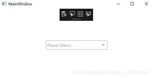
执行效果:


 扫一扫
扫一扫


 806
806

 被折叠的 条评论
为什么被折叠?
被折叠的 条评论
为什么被折叠?
 到【灌水乐园】发言


