


以下展示的菜单均为从各个地方收集整理而来
1.滑动菜单指示器特效
来自b站up主前端小智
1.offsetLeft和offsetTop的值是距上级有定位元素的相对位置
2.offsetWidth: 为元素的width+元素的padding+边框的宽度
3.querySelector只返回匹配的第一个元素,如果没有匹配项,返回null。
4.querySelectorAll返回匹配的元素集合,如果没有匹配项,返回空的nodelist(节点数组)。

<!DOCTYPE html>
<html lang="en">

<head>
  <meta charset="UTF-8">
  <meta http-equiv="X-UA-Compatible" content="IE=edge">
  <meta name="viewport" content="width=device-width, initial-scale=1.0">
  <title>Document</title>
  <style>
    * {
      margin: 0;
      padding: 0;
      box-sizing: border-box;
    }

    body {
      display: flex;
      align-items: center;
      justify-content: center;
      min-height: 100vh;
      background: #090a20;
    }

    nav {
      position: relative;
      display: flex;
    }

    nav a {
      position: relative;
      margin: 0 20px;
      font-size: 2em;
      color: #fff;
      text-decoration: none;
    }

    nav #marker {
      position: absolute;
      height: 4px;
      width: 0;
      background: #e35188;
      left: 0;
      bottom: -8px;
      transition: 0.5s;
      border-radius: 4px;
    }
  </style>
</head>

<body>
  <nav>
    <div id="marker"></div>
    <a href="#">Home</a>
    <a href="#">About</a>
    <a href="#">Service</a>
    <a href="#">Team</a>
    <a href="#">Contact</a>
  </nav>
  <script>
    let marker = document.querySelector('#marker')
    let item = document.querySelectorAll('nav a')
    function indictor(e){
      marker.style.left = e.offsetLeft + 'px'
      marker.style.width = e.offsetWidth + 'px'
    }
    item.forEach(val=>{
      val.addEventListener('click',e=>{
        console.log(evb2);
        indictor(e.target)
      })
    })
  </script>
</body>

</html>
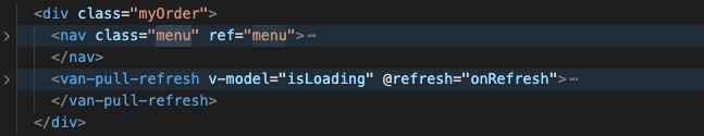
一般在移动端都要求是固定头部的,现将代码修改一下,不能用position:fixed,position:fixed会导致上面效果失灵
代码结构如下van-pull-refresh标签包裹的是要滚动的区域,nav标签是固定的菜单
.myOrder {
  display: flex;
  flex-direction: column;
  }
 .van-pull-refresh{
  	height:100%;
  	overflow: auto;
  	flex-grow: 1;
  }


 5228
5228


 被折叠的 条评论
为什么被折叠?
被折叠的 条评论
为什么被折叠?
 到【灌水乐园】发言


