


简言
在工作时有时会用到竖形手风琴效果的组件。
在此记录下实现代码和实现思路。
手风琴实现
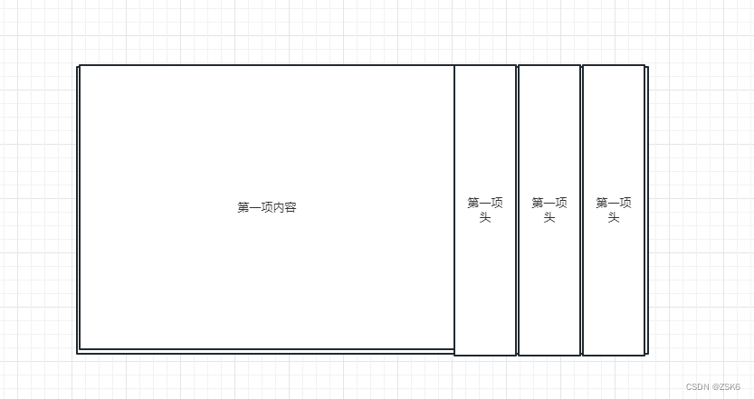
结构搭建
搭建结构主要实现盒子间的排列效果。
- 用flex布局或者其他布局方式将内容在一行排列
- 把每一项的内容和项头用盒子包裹, 内容就是这一项要展示的内容(content-box),项头就是可以点击显示这一项的盒子(title-box)。
- 默认第一项的context-box显示,即有宽度,其他项的content-box宽度为0.
- content-box加上过渡样式,这样就会有推拉的感觉。
- 由于是vue组件,那我们可以给它加上插槽,让组件可以自定义显示内容
功能搭建
- 点击项头显示 点击项的内容区域。由于我们已经将未显示的content-box宽度设为0,所以只需要添加一个变量将带有宽度的类样式赋给当前点击项即可显示。
- 宽度变化时,里面的内容样式可能会发生改动,所以我们需要给内容里的box加一个透明度的过渡效果,避免样式发生改变试被看到。
- 加插槽,插槽点随意,合理就行。
- 加属性,例如,当前显示项、当前显示项内容等。
代码
<template>
  <div class="accordion">
    <slot>
      <div class="item__box" v-for="(item, i) of list" :key="i">
        <div
          class="item__content"
          :class="[`item__content${i}`, { 'item__content-active': activeIndex === i }]"
        >
          <div class="item__content__detail">
            <slot :name="`item__content${i}`"> </slot>
          </div>
        </div>
        <div
          class="item__title"
          :class="[`item__title${i}`, { 'item__title-active': activeIndex === i }]"
        >
          <div class="item__title__detail" @click="() => tabChange(i)">
            <slot :name="`item__title${i}`">
              <img
                v-if="!!item.icon"
                :src="activeIndex === i ? getImageUrl(item.activeIcon  as string) : getImageUrl(item.icon)"
                alt=""
              />
              <div class="item__title__detail__text">{{ item.title }}</div>
            </slot>
          </div>
        </div>
      </div>
    </slot>
  </div>
</template>
<script lang="ts" setup>
import { reactive, toRefs, onBeforeMount, onMounted, ref } from 'vue'
import { getImageUrl } from '@/untils/index'

interface Item {
  icon?: string
  activeIcon?: string
  title: string
}

defineProps({
  list: {
    type: Array<Item>,
    default: () => []
  }
})

const activeIndex = ref(0)

const tabChange = (index: number) => {
  activeIndex.value = index
}
</script>
<style lang="scss" scoped>
.accordion {
  position: relative;
  width: 1181px;
  height: 512px;
  display: flex;
  color: #fff;
  background: url('@/assets/images/bg_shoufq.png');
  overflow: hidden;
}
.item__box {
  position: relative;
  display: flex;
  overflow: hidden;
  margin-left: 4px;
}
.item__content {
  flex-shrink: 0;
  width: 0;
  left: 1000px;
  overflow: hidden;
  transition: all 0.5s ease;
}
.item__title {
  width: 110px;
  flex-shrink: 0;
  background: #00398e;
}
.item__content__detail {
  width: 842px;
  height: 512px;
  opacity: 0;
  transition: opacity 0.5s ease;
}
.item__content-active {
  width: 842px;
  left: 0;
  .item__content__detail {
    opacity: 1;
  }
}
.item__title__detail {
  display: flex;
  flex-direction: column;
  justify-content: center;
  align-items: center;
  width: 100%;
  height: 512px;
  cursor: pointer;

  &__text {
    writing-mode: vertical-lr;
    height: 160px;
    font-size: 28px;
    font-family: PingFangSC-Semibold, PingFang SC;
    font-weight: 600;
    color: #ffffff;
    line-height: 40px;
    letter-spacing: 8px;
  }
}
.item__title-active {
  background: linear-gradient(180deg, #ffbb1a 0%, #f57c00 100%);
}

@keyframes moveInRight {
  from {
    transform: translateX(100%);
  }
  to {
    transform: translateX(0);
  }
}
</style>
使用
<template>
  <div class="container">
    <Accordion class="three__box__text" :list="dataOpenList">
      <template #item__content0>
        <div class="edu__gaikuang">11</div>
      </template>
      <template #item__content1>
        <div class="edu__gongbao">22</div>
      </template>
      <template #item__content2>
        <div class="edu_nianjian">33</div>
      </template>
    </Accordion>
  </div>
</template>
<script lang="ts" setup>
import { reactive, toRefs, onBeforeMount, onMounted } from 'vue'
import Accordion from '@/components/accordion.vue'

const dataOpenList = reactive([
  {
    // icon: 'icon/icon_edu_gk.png',
    // activeIcon: 'icon/icon_edu_gk_active.png',
    title: '教育概况'
  },
  {
    // icon: 'icon/icon_edu_nb.png',
    // activeIcon: 'icon/icon_edu_nb_active.png',

    title: '教育公报'
  },
  {
    // icon: 'icon/icon_edu_nj.png',
    // activeIcon: 'icon/icon_edu_nj_active.png',
    title: '教育年鉴'
  }
])
</script>
<style lang="scss" scoped></style>
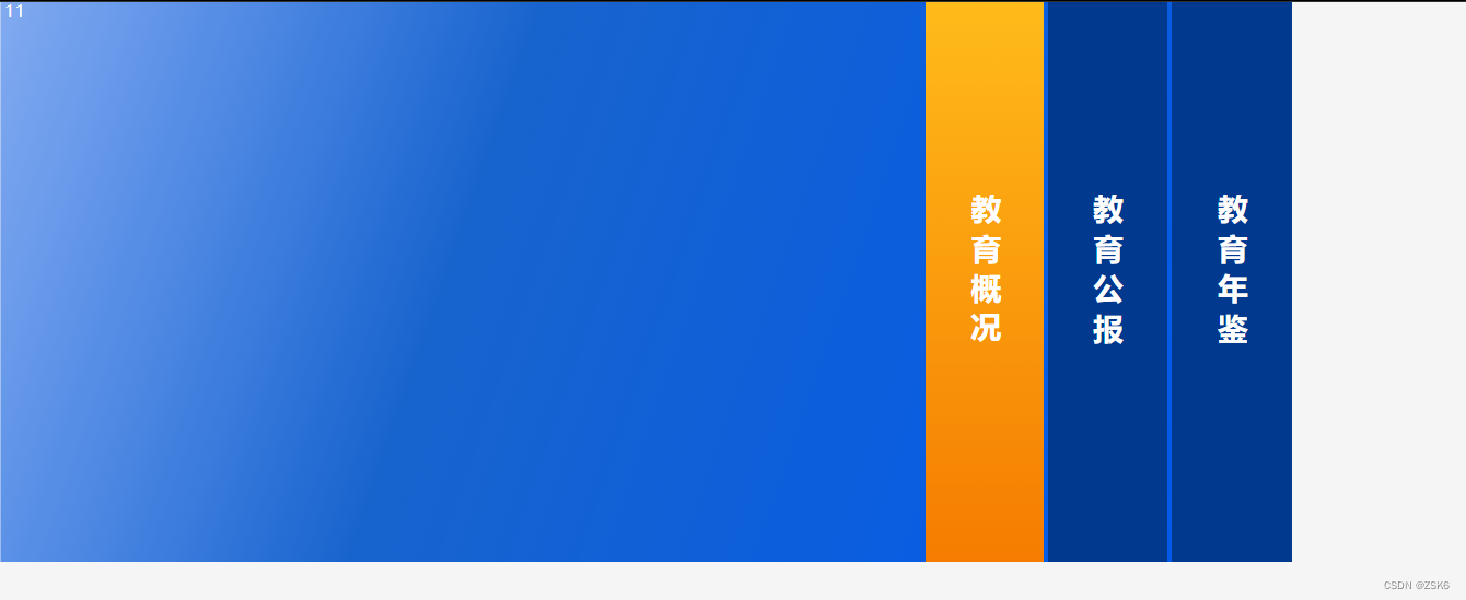
效果

结语
根据此思路,可以自己实现不同方向和不同排列方式的手风琴效果。


 499
499


 被折叠的 条评论
为什么被折叠?
被折叠的 条评论
为什么被折叠?
 到【灌水乐园】发言


