


一、定位position
Css的定位机制:普通文档流、浮动、定位
这里主要介绍CSS的定位属性:position:
1、定位原理:允许元素相对于正常位置、或者相对于父元素、浏览器窗口本上的位置
2、元素位置的调整: left|right属性、top|bottom属性 偏移属性实现元素的位置改变
3、定位偏移属性:
left:0; right:0; 水平方向偏移量设置
top:0; bottom:0; 垂直方向偏移量设置
1、定位属性:
1.1、静态定位position:static; 默认值
相当于没定位,元素出现在正常文档流当中
默认当我们不写position属性的时候,会按照正常文档流进行排版,块元素占一行,行内元素并排一行
1.2、相对定位position:relative;
1、相对于本身的位置进行定位、原来位置占位(不脱标,老家留坑,别人不会把他的位置挤掉);
2、作为绝对定位的参考元素一般用于元素的微调;
3、作为绝对定位的参考元素
例子:
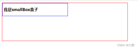
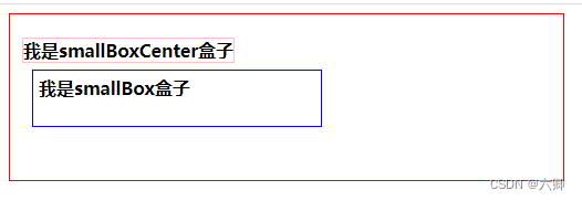
不使用相对定位
<!DOCTYPE html>
<html lang="en">

<head>
  <meta charset="UTF-8">
  <meta http-equiv="X-UA-Compatible" content="IE=edge">
  <meta name="viewport" content="width=device-width, initial-scale=1.0">
  <title>我的第一个页面</title>
  <style>
    .box1 {
      width: 500px;
      height: 150px;
      border: 1px solid red;
    }

    .smallBox {
      border: 1px solid blue;
      padding: 5px;
      width: 50%;
      height: 40px;
      line-height: 40px;
      font-weight: bold;
    }
  </style>
</head>

<body>
  <div class="box1">
    <div class="smallBox">
      我是smallBox盒子
    </div>
  </div>
</body>

</html>
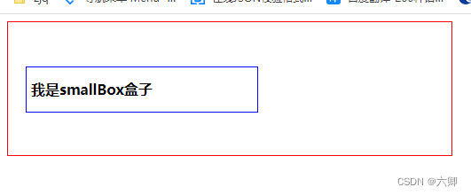
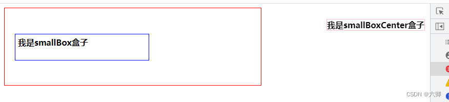
使用相对定位,向右偏移20px(left),向下偏移50px(top)
<!DOCTYPE html>
<html lang="en">

<head>
  <meta charset="UTF-8">
  <meta http-equiv="X-UA-Compatible" content="IE=edge">
  <meta name="viewport" content="width=device-width, initial-scale=1.0">
  <title>我的第一个页面</title>
  <style>
    .box1 {
      width: 500px;
      height: 150px;
      border: 1px solid red;
    }

    .smallBox {
      border: 1px solid blue;
      padding: 5px;
      width: 50%;
      height: 40px;
      line-height: 40px;
      font-weight: bold;

      position: relative;
      top: 50px;
      left: 20px;

    }
  </style>
</head>

<body>
  <div class="box1">
    <div class="smallBox">
      我是smallBox盒子
    </div>
  </div>
</body>

</html>
1.3、绝对定位position:absolute;
相对于最近的定位父级元素定位
特点:
1、使元素完全脱离正常文档流 不占位
2、有定位父级相当于定位父级发生偏移,如果没有父级,相对于整个文档发生偏移
3、使行级元素支持宽高;没有设置宽度的块级元素宽度自适应
4、提升层级
5、当定位偏移量(top:0;left:0;)是在父级的左上角
绝对定位步骤!!!: 子绝父相
1、为要做特殊定位的盒子(定位盒)添加position:absolute;
2、绝对定位设置初始位置,通过left|right属性、top|bottom属性:
3、为定位盒的父级盒(有固定宽度和高度的),添加position:relative;相对定位
4、回到定位盒,通过top|bottom、right|left 属性 做精确定位
相对定位 不脱离文档流 原来位置占位;绝对定位 脱离文档流 不占位;设置定位top|bottom、right|left 可以left:auto 自动 用于上一个已经总体定位 另一个auto
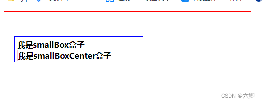
未使用绝对定位例子:
<!DOCTYPE html>
<html lang="en">

<head>
  <meta charset="UTF-8">
  <meta http-equiv="X-UA-Compatible" content="IE=edge">
  <meta name="viewport" content="width=device-width, initial-scale=1.0">
  <title>我的第一个页面</title>
  <style>
    .box1 {
      width: 500px;
      height: 150px;
      border: 1px solid red;
    }

    .smallBox {
      border: 1px solid blue;
      padding: 5px;
      width: 50%;
      height: 40px;
      font-weight: bold;

      position: relative;
      top: 50px;
      left: 20px;

    }

    .smallBoxCenter {
      border: 1px solid pink;
    }
  </style>
</head>

<body>
  <div class="box1">
    <div class="smallBox">
      我是smallBox盒子
      <div class="smallBoxCenter">
        我是smallBoxCenter盒子
      </div>
    </div>
  </div>
</body>

</html>
使用绝对定位例子:
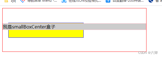
首先看看只设置绝对定位top为0的时候
 position: absolute;
 top: 0;
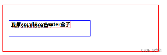
位置覆盖了原本的第一行文本说明当前盒子脱离文档流
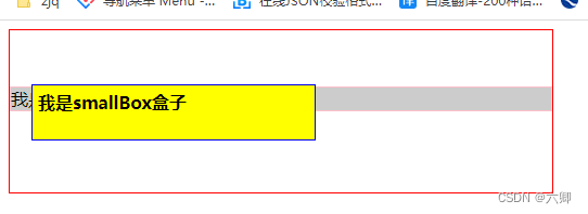
向上移动30px向左移动10px
<!DOCTYPE html>
<html lang="en">

<head>
  <meta charset="UTF-8">
  <meta http-equiv="X-UA-Compatible" content="IE=edge">
  <meta name="viewport" content="width=device-width, initial-scale=1.0">
  <title>我的第一个页面</title>
  <style>
    .box1 {
      width: 500px;
      height: 150px;
      border: 1px solid red;
    }

    .smallBox {
      border: 1px solid blue;
      padding: 5px;
      width: 50%;
      height: 40px;
      font-weight: bold;

      position: relative;
      top: 50px;
      left: 20px;

    }

    .smallBoxCenter {
      border: 1px solid pink;
      position: absolute;
      top: -30px;
      left: -10px;
    }
  </style>
</head>

<body>
  <div class="box1">
    <div class="smallBox">
      我是smallBox盒子
      <div class="smallBoxCenter">
        我是smallBoxCenter盒子
      </div>
    </div>
  </div>
</body>

</html>
1.4、固定定位position:fixed;
特点:
1、相对于浏览器窗口进行的定位
2、脱离正常文档流 不占位
3、始终相对于浏览器的四个角为原点进行定位。不会随页面内容滚动儿滚动
4、可以使行级元素支持宽高:没有设置宽度的块级元素宽度自适应
5、可以提升层级
例子:
<!DOCTYPE html>
<html lang="en">

<head>
  <meta charset="UTF-8">
  <meta http-equiv="X-UA-Compatible" content="IE=edge">
  <meta name="viewport" content="width=device-width, initial-scale=1.0">
  <title>我的第一个页面</title>
  <style>
    .box1 {
      width: 500px;
      height: 150px;
      border: 1px solid red;
    }

    .smallBox {
      border: 1px solid blue;
      padding: 5px;
      width: 50%;
      height: 40px;
      font-weight: bold;

      position: relative;
      top: 50px;
      left: 20px;

    }

    .smallBoxCenter {
      border: 1px solid pink;
      position: fixed;
      top: 30px;
      right: 10px;
    }
  </style>
</head>

<body>
  <div class="box1">
    <div class="smallBox">
      我是smallBox盒子
      <div class="smallBoxCenter">
        我是smallBoxCenter盒子
      </div>
    </div>
  </div>
</body>

</html>
总结:
绝对定位:元素不占位 相对于定位父级盒
固定定位:元素不占位置 相对于浏览器四个角来定位
相对定位:元素占位 相对于元素本身的位置来定位
静态定位:默认 相当于没有定位 元素占位
定位层级z-index
z-index属性:定位盒叠放次序的调整,z-index属性值越大。叠放次序越高值可能为:正整数 负整数 0(默认值)
注意:
1、只对定位元素生效;
2、数值越大叠放次序越高;
3、如果取值相同 则根据书写顺序 后来居上;
4、正值向上调整层级 负值向下调整层级;
5、属性值没有单位;
例子:
<!DOCTYPE html>
<html lang="en">

<head>
  <meta charset="UTF-8">
  <meta http-equiv="X-UA-Compatible" content="IE=edge">
  <meta name="viewport" content="width=device-width, initial-scale=1.0">
  <title>我的第一个页面</title>
  <style>
    .box1 {
      width: 500px;
      height: 150px;
      border: 1px solid red;
    }

    .smallBox {
      border: 1px solid blue;
      padding: 5px;
      width: 50%;
      height: 40px;
      font-weight: bold;
      position: relative;
      top: 50px;
      left: 20px;
      background-color: yellow;
    }

    .smallBoxCenter {
      border: 1px solid pink;
      position: relative;
      background-color: #ccc;
    }
  </style>
</head>

<body>
  <div class="box1">
    <div class="smallBox">
      我是smallBox盒子
    </div>
    <div class="smallBoxCenter">
      我是smallBoxCenter盒子
    </div>
  </div>
</body>

</html>
给被覆盖的盒子正价z-index属性
    .smallBox {
      border: 1px solid blue;
      padding: 5px;
      width: 50%;
      height: 40px;
      font-weight: bold;
      position: relative;
      top: 50px;
      left: 20px;
      background-color: yellow;
      z-index: 1;
    }


 161
161


 被折叠的 条评论
为什么被折叠?
被折叠的 条评论
为什么被折叠?
 到【灌水乐园】发言


