


黄色圆形加载动画
教程地址:原文地址(YouTube)
B站教程:原文转载(bilibili)
两个视频的内容相同,第二个为转载
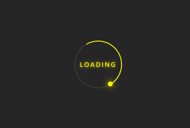
效果图
代码区
html
<div class="ring">
  Loading
  <span></span>
</div>
CSS
body {
  margin: 0; /* 外边距 */
  padding: 0; /* 内边距 */
  background-color: #262626; /* 背景颜色 */
}
/* Loading字符串 */
.ring {
  position: absolute; /* 绝对定位 */
  top: 50%; /* 距上部 */
  left: 50%; /* 距左部 */
  transform: translate(-50%, -50%); /* 相对于自身,x,y轴移动 */
  width: 150px; /* 宽 */
  height: 150px; /* 高 */
  background: transparent; /* 背景颜色透明 */
  border: 3px solid #3c3c3c; /* 边框 */
  border-radius: 50%; /* 边框圆角 */
  text-align: center; /* 字体水平居中 */
  line-height: 150px; /* 行高 */
  font-family: sans-serif; /* 字体样式 */
  font-size: 20px; /* 字体大小 */
  color: #fff000; /* 颜色 */
  letter-spacing: 4px; /* 字符间距 */
  text-transform: uppercase; /* 字体全大写 */
  text-shadow: 0 0 10px #fff000; /* 字体阴影 */
  box-shadow: 0 0 20 rgba(0, 0, 0, .5); /* 盒子阴影 */
  user-select: none; /* 无法选中 */
}
/* 黄色长线 */
.ring::before {
  content: ''; /* 内容 */
  position: absolute;
  top: -3px;
  left: -3px;
  width: 100%;
  height: 100%;
  border: 3px solid transparent;
  border-top: 3px solid #fff000;
  border-right: 3px solid #fff000;
  border-radius: 50%;
  animation: animateCircle 2s linear infinite; /* 动画:名称 时间 速率 重复 */
}

span {
  display: block;
  position: absolute;
  top: calc(50% - 2px);
  left: 50%;
  width: 50%;
  height: 4px;
  background: transparent;
  transform-origin: left; /* 动画开始位置 */
  animation: animate 2s linear infinite;
  transform: rotate(45deg);
}

span::before {
  content: '';
  position: absolute;
  width: 16px;
  height: 16px;
  border-radius: 50%;
  background: #fff000;
  top: -8px;
  right: -8px;
  box-shadow: 0 0 20px #fff000;
}

@keyframes animate {
  100% {
    /* 360+45 */
    transform: rotate(405deg);
  }
}

@keyframes animateCircle {
  0% {
    transform: rotate(0deg);
  }
  100% {
    transform: rotate(360deg);
  }
}
JS
教程地址:原文地址(YouTube)
B站教程:原文转载(bilibili)


 8万+
8万+


 被折叠的 条评论
为什么被折叠?
被折叠的 条评论
为什么被折叠?
 到【灌水乐园】发言


