


一、什么是BFC?(概念)
BFC 即 Block Formatting Contexts (块级格式化上下文),是W3C CSS2.1规范中的一个概念,决定了元素如何对其内容进行定位,以及与其他元素的关系和相互作用。它是一个独立的渲染区域,只有Block-level box参与,它规定了内部的Block-level Box如何布局,并且与外部毫不相干。通俗一点来讲,可以把BFC看成是一个985或者211的高校。
二、BFC的触发条件
- 根元素 html标签就是一个bfc
- float的值不为none
- overflow的值不为visible
- display的值为 inline-block/ table-cell/ table-caption/ flex/ inline-flex
- position的值为absolute或fixed
三、BFC特性及作用(应用场景)
1. Box垂直方向的距离由margin决定,属于同一个BFC的两个相邻box的margin会发生重叠
(应用:可以解释为什么margin上下回重叠,以及解决方法的原因)
###问题案例 1:margin重叠问题
margin塌陷问题:在标准文档流中,块级标签之间竖直方向的margin会以大的为准,这就是margin的塌陷现象。可以用overflow:hidden产生bfc来解决。
 <style>
        .box1{width: 100px;height: 100px;background: skyblue;margin-bottom: 50px;}
        .box2{width: 100px;height: 100px;background: pink;margin-top: 100px;}
    </style>
</head>
<body>
        <div class="box1"> </div>
        <div class="box2"></div>
</body>

###首先这不是 CSS 的 bug,我们可以理解为一种规范,如果想要避免外边距的重叠,可以将其放在不同的 BFC 容器中
<head>
    <style>
        .wrapper{overflow: hidden;}
        .box1{width: 100px;height: 100px;background: skyblue;margin-bottom: 50px;}
        .box2{width: 100px;height: 100px;background: pink;margin-top: 100px;}
    </style>
</head>
<body>
    <div class="wrapper">
        <div class="box1"> </div>
       </div>
       <div class="wrapper">
        <div class="box2"></div>
       </div>
</body>

###问题案例 2:margin穿透问题
在标准文档流中,竖直方向的margin会出现重叠(水平方向不会塌陷),父子元素竖直方向的margin紧挨着,中间没有border和padding,margin直接接触,就产生了父子margin合并。表现为更大的margin会覆盖更小的margin。
<head>
    <style>
        .wrapper{width: 300px;height: 300px;background: skyblue;}
        .content{width: 100px;height: 100px;background: pink;margin-top: 50px;}
    </style>
</head>
<body>
   <div class="wrapper">
       <div class="content"></div>
   </div>
</body>

###首先这不是 CSS 的 bug,我们可以理解为一种规范。为父级加 overflow:hidden或display:inline-block;或float:left/right;或position:absolute;(合理)
<head>
    <style>
        .wrapper{width: 300px;height: 300px;background: skyblue;overflow: hidden;}
        .content{width: 100px;height: 100px;background: pink;margin-top: 50px;}
    </style>
</head>
<body>
   <div class="wrapper">
       <div class="content"></div>
   </div>
</body>

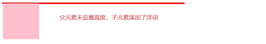
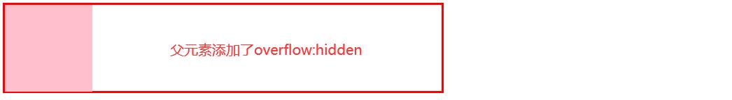
2. 计算BFC的高度时,浮动元素也参与计算
(应用:可以解释为什么高度塌陷可以用overflow:hidden等方法解决
<head>
    <style>
        .wrapper{width:500px;border:2px solid red;}
        .content{width: 100px;height: 100px;background: pink;float: left;}
    </style>
</head>
<body>
    <div class="wrapper">
        <div class="content"></div>
    </div>
</body>
<head>
    <style>
        .wrapper{width:500px;border:2px solid red;}
        .content{width: 100px;height: 100px;background: pink;float: left;}
    </style>
</head>
<body>
    <div class="wrapper">
        <div class="content"></div>
    </div>
</body>
3. BFC的区域不会与float box发生重叠
(应用:自适应两栏布局或者三栏布局<圣杯布局和双飞翼布局>)
###问题案例上面的一个元素浮动,下面的一个元素没有浮动,那么会发生重叠,原因是因为浮动之后不占据位置,所以后面的元素会上去。
当给下面的元素添加了float/overflow/display的时候就不重叠了,原因是因为给了这些声明之后,就触发的下面的元素为BFC,而BFC里面规定了,BFC区域不会与浮动盒子发生重叠。
如果既要BFC的区域不会与float box发生重叠,又要右边的容器自适应。
(1)、overflow:hidden/auto/scroll;
(2)、display:flex/inline-flex
(注:如果是display:inline-flex需要添加一个width:calc(100%-左边的宽度))
案例1:自适应两栏
<style>
        	body{margin: 0; padding: 0;}
			.left{width: 200px;height: 200px; background: skyblue;float: left;}
			.right{height: 200px; background: yellow;display: flex;}
			/* .left{width: 300px;height: 300px; background: red;float: left;}
			.right{height: 600px; background: yellow;overflow: hidden;} */
</style>
<body>
    <div class="left">我是左边固定</div>
    <div class="right">我是自适应</div>
</body>

三栏布局
方法1:在布局是left center right 不变的情况下,用calc去实现(用不到BFC的地方,但是可以实现自适应三栏)
<style>
        .left{ width: 100px; height: 100px; background: gray; float: left;}
        .center{ height: 100px;width: calc(100% - 200px);background: yellow;float: left; }
        .right{width: 100px;height: 100px;background: blue;float: right; }
 </style>
<body>
    <div class="left">左边</div>
    <div class="center">中间</div>
    <div class="right">下边</div>
</body>
方法2:在布局是left center right 不变的情况下,用BFC+定位去实现
<style>
.left{width: 100px;height: 200px;background: red;float: left;}
.center{height: 400px;background: yellow;overflow: hidden;margin-right: 200px;}
.right{width: 200px;height: 300px;background: deeppink;position: absolute;right: 0;top: 0;}
 </style>
<body>
    <div class="box">左边</div>
    <div class="center">中间</div>
    <div class="right">下边</div>
</body>
方法3:结构left right center 用BFC去实现
<style>
.left{width: 100px;height: 200px;background: red;float: left;}
.right{width: 200px;height: 300px;background: deeppink; float: right;}
.center{height: 400px;background: yellow;overflow: hidden;}
 </style>
<body>
    <div class="box">左边</div>
    <div class="right">下边</div>
    <div class="center">中间</div>
</body>

(此外还有其他的方式实现自适应三栏如(圣杯布局、双飞翼布局),详解在我的另一篇博文中讲到)
4. BFC内部的Box会在垂直方向,一个接一个的放置。
5. 每个元素的margin box的左边会与包含块border box的左边相接触(对于从左到右的格式化,否则相反),即使存在浮动也会如此。
<head>
		<meta charset="utf-8">
		<title></title>
		<style type="text/css">
        body,p,h3{margin: 0; padding: 0;}
        div{height: 500px; background: #000;border-left: 20px solid skyblue;}
        p{width: 200px;height: 200px;background: yellow;}
        h3{width: 800px;height: 300px;background: green;margin-left: 30px;float: left;}
		</style>
	</head>
	<body>
		 <div>
			 <p></p>
			 <h3></h3>
		 </div>
	</body>
</html>

6.BFC就是页面上的一个独立容器,容器里面的元素不会影响到外面的元素。
四、总结:其实以上的几个例子都体现了BFC布局规则第六条:
- BFC就是页面上的一个隔离的独立容器,容器里面的子元素不会影响到外面的元素。反之也如此。
因为BFC内部的元素和外部的元素绝对不会互相影响,因此,当BFC外部存在浮动时,它不应该影响BFC内部Box的布局,BFC会通过变窄,而不与浮动有重叠。
同样的,当BFC内部有浮动时,为了不影响外部元素的布局,BFC计算高度时会包括浮动的高度。 避免margin重叠也是这样的一个道理


 855
855


 被折叠的 条评论
为什么被折叠?
被折叠的 条评论
为什么被折叠?
 到【灌水乐园】发言


