


数据可视化
对于数据信息,我们都不陌生,但是如何将制作好的数据信息以多样的图标形式加载在网页中,我们多半束手无策。但是实训老师却给我们指明了数据可视化的方向。
普通统计图
对于普通的数据统计图,
highcharts无疑是很好的使用网站,
让数据可视化更简单。官网提供了详细的示例,
包括英文与中文使用教程以及API文档。
同样方便的是,
它是一个完全开源的网站。


这里还有各式代码供你查阅

效果图

完整代码
(数据均为自设,代码很长,建议看官网,仅作存档)
<template>
  <div class="real_time">
    <!-- 第一行 -->
    <div class="first">
      <!-- 无症状确诊-->
      <div id="wu_container" style="height:300px"></div>
       <!-- 治愈率-->
      <div id="zhi_container" style="height:300px"></div>
      <div>
        <!-- 确认城市top10 -->
        <div id="city_container" style="height:300px"></div>
      </div>
    </div>
    <!-- 第二行 -->
    <div class="second">
      <div id="qz_container" style="height:300px"></div>
    </div>
  </div>
</template>

<script>
export default {
  mounted() {
    // Build the chart
Highcharts.chart('wu_container', {
	chart: {
		plotBackgroundColor: null,
		plotBorderWidth: null,
		plotShadow: false,
		type: 'pie'
	},
	title: {
		text: '确诊、无症状人数'
	},
	tooltip: {
		pointFormat: '{series.name}: <b>{point.percentage:.1f}%</b>'
	},
	plotOptions: {
		pie: {
			allowPointSelect: true,
			cursor: 'pointer',
			dataLabels: {
				enabled: false
			},
			showInLegend: true
		}
	},
	series: [{
		name: 'Brands',
		colorByPoint: true,
		data: [{
			name: '确诊',
			y: 61.41,
			sliced: true,
			selected: true
		}, {
			name: '无症状',
			y: 7.05
		}]
	}]
});
    //新冠疫情治愈人数
    var chart = Highcharts.chart('zhi_container', {
	title: {
		text: '新冠肺炎治愈人数图'
	},
	subtitle: {
		text: '数据来源:丁香园'
	},
	yAxis: {
		title: {
			text: '治愈人数'
		}
	},
	legend: {
		layout: 'vertical',
		align: 'right',
		verticalAlign: 'middle'
	},
	plotOptions: {
		series: {
			label: {
				connectorAllowed: false
			},
			pointStart: 2
		}
	},
	series: [{
		name: '治愈人数',
		data: [43934, 52503, 57177, 69658, 97031, 119931, 137133, 154175]
	}],
	responsive: {
		rules: [{
			condition: {
				maxWidth: 500
			},
			chartOptions: {
				legend: {
					layout: 'horizontal',
					align: 'center',
					verticalAlign: 'bottom'
				}
			}
		}]
	}
});
    // 全国确诊病例城市top10
    var chart = Highcharts.chart('city_container',{
        chart: {
            type: 'column'
        },
        title: {
            text: '全国确诊病例城市top10'
        },
        subtitle: {
            text: '数据来源: WorldClimate.com'
        },
        xAxis: {
            categories: [
                '一月','二月','三月','四月','五月','六月','七月','八月','九月','十月','十一月','十二月'
            ],
            crosshair: true
        },
        yAxis: {
            min: 0,
            title: {
                text: '降雨量 (mm)'
            }
        },
        tooltip: {
            // head + 每个 point + footer 拼接成完整的 table
            headerFormat: '<span style="font-size:10px">{point.key}</span><table>',
            pointFormat: '<tr><td style="color:{series.color};padding:0">{series.name}: </td>' +
            '<td style="padding:0"><b>{point.y:.1f} mm</b></td></tr>',
            footerFormat: '</table>',
            shared: true,
            useHTML: true
        },
        plotOptions: {
            column: {
                borderWidth: 0
            }
        },
        series: [{
            name: '东京',
            data: [49.9, 71.5, 106.4, 129.2, 144.0, 176.0, 135.6, 148.5, 216.4, 194.1, 95.6, 54.4]
        }]
    });
    // 全国新增病例
    var chart = Highcharts.chart("qz_container", {
      chart: {
        type: "line",
      },
      title: {
        text: "全国新增确诊病例",
      },
      subtitle: {
        text: "数据来源: WorldClimate.com",
      },
      xAxis: {
        categories: [
          "一月",
          "二月",
          "三月",
          "四月",
          "五月",
          "六月",
          "七月",
          "八月",
          "九月",
          "十月",
          "十一月",
          "十二月",
        ],
      },
      yAxis: {
        title: {
          text: "气温 (°C)",
        },
      },
      plotOptions: {
        line: {
          dataLabels: {
            // 开启数据标签
            enabled: true,
          },
          // 关闭鼠标跟踪,对应的提示框、点击事件会失效
          enableMouseTracking: false,
        },
      },
      series: [
        {
          name: "东京",
          data: [
            7.0,
            6.9,
            9.5,
            14.5,
            18.4,
            21.5,
            25.2,
            26.5,
            23.3,
            18.3,
            13.9,
            9.6,
          ],
        },
        {
          name: "伦敦",
          data: [
            3.9,
            4.2,
            5.7,
            8.5,
            11.9,
            15.2,
            17.0,
            16.6,
            14.2,
            10.3,
            6.6,
            4.8,
          ],
        },
      ],
    });
  },
};
</script>

<style scoped>
/*  第一行 */
.real_time > .first {
  display: flex;
  text-align: center;
}
.real_time > .first > div {
  flex: 1;
}
/* 第二行 */
.real_time > .second {
  text-align: center;
}
</style>
地图可视化
同样使用highcharts,导入JS库
 <!--  导入highcharts -->
    <script src="https://img.hcharts.cn/highcharts/highcharts.js"></script>
    <script src="https://img.hcharts.cn/highmaps/modules/map.js"></script>
    <script src="https://data.jianshukeji.com/geochina/china.js"></script>
    <script src="https://data.jianshukeji.com/geochina/shanghai.js"></script>
    <script src="https://data.jianshukeji.com/geochina/jiangxi.js"></script>
    loadJiangxiMap(){
      // 1. 获取地图数据
      let mapdata = Highcharts.maps['cn/jiangxi'];
      // 2. 渲染地图
      let map = Highcharts.mapChart('map_jiangxi', {
        title:{
          text:"江西疫情分布"
        },
        colorAxis: {
          min: 0,
          max: 20,
          minColor: "#F5FFFA",
          maxColor: "#FF4500",
        },
        series: [{
          mapData: mapdata,
          data:[
            { name:"景德镇", value:4 },
            { name:"南昌", value:2 },
            { name:"上饶", value:10 },
            { name:"赣州", value:10 },
            { name:"萍乡", value:2 },
            { name:"抚州", value:2 },
            { name:"吉安", value:10 },
            { name:"宜春", value:10 },
            { name:"新余", value:2 }
          ],
          joinBy:"name",
          dataLabels:{
            enabled:true,
            color:"#fff",
            style:{"fontSize":"10px","fontWeight":"thin"},
            format:`{point.name}`
          }
        }]
      });
    }
  },
  created() {
    // 加载数据,并且将数据更新到data中的变量中
  },
  // 数据绑定之后 vue实例-> 虚拟dom -> 数据绑定 -> 渲染地图
  mounted() {
    // 1. 加载中国地图
    this.loadChinaMap();
    // 2. 加载上海地图
    this.loadShanghaiMap();
    this.loadJiangxiMap();


  },
};
</script>

<style scoped>
#map,
#map_shanghai,#map_jiangxi{
  height: 600px;
}
</style>
效果图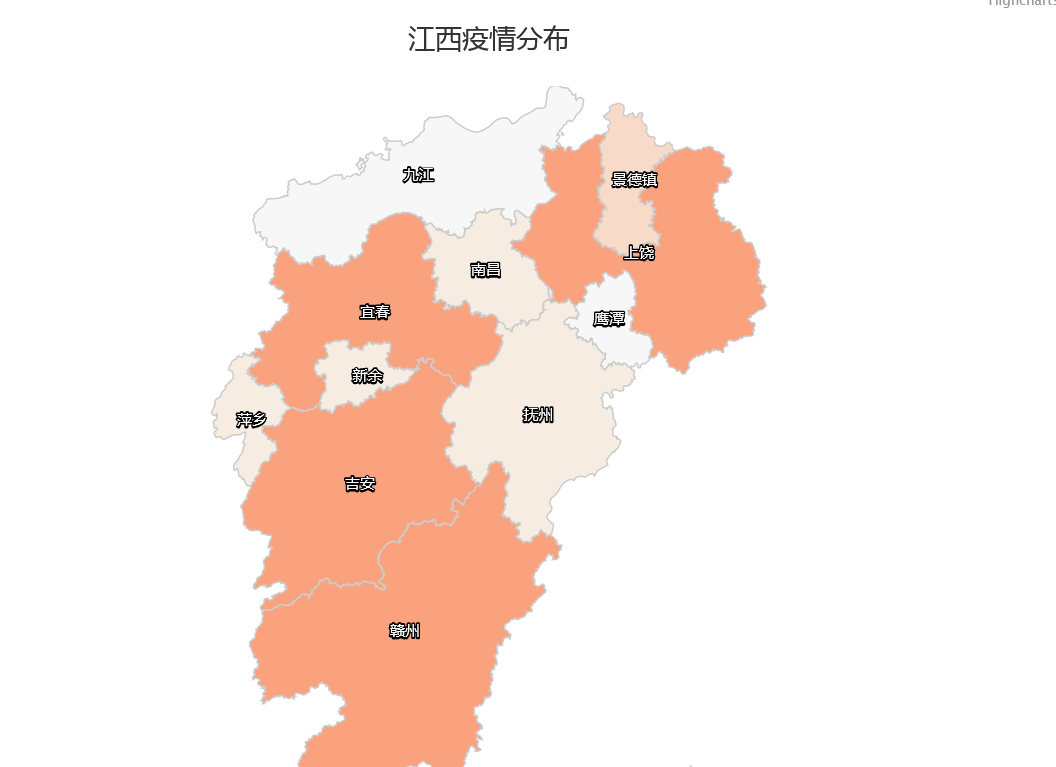
通过本次学习,我学会了如何把数据用图表信息显示出来。
同时也学会利用开发工具来实现自己的网页效果。


 1258
1258

 被折叠的 条评论
为什么被折叠?
被折叠的 条评论
为什么被折叠?
 到【灌水乐园】发言


