


<!DOCTYPE html>
<html>

    <head>
        <meta charset="UTF-8">
        <title>实现三个div,固定左右两边的div宽为200,中间的div宽度自适应的四种方法</title>
        <style type="text/css">
            html,
            body {
                width: 100%;
                height: 100%;
                margin: 0;
                padding: 0;
                color: #fff;
                text-align: center;
                line-height: 100px;
            }

            .clear:after {
                content: "";
                display: block;
                height: 0;
                clear: both;
            }
            /*float法*/

            .left {
                float: left;
                width: 200px;
                height: 100px;
                background: Red;
            }

            .right {
                float: right;
                width: 200px;
                height: 100px;
                background: green;
            }

            .center {
                margin-left: 200px;
                margin-right: 20px;
                height: 100px;
                background: blue;
            }
            /*position*/

            .position {
                position: relative;
                margin-bottom: 100px;
            }

            .left2 {
                position: absolute;
                left: 0;
                top: 0;
                width: 200px;
                height: 100px;
                background: Red;
            }

            .right2 {
                position: absolute;
                right: 0;
                top: 0;
                width: 200px;
                height: 100px;
                background: green;
            }

            .center2 {
                position: absolute;
                left: 200px;
                right: 200px;
                top: 0;
                background: blue;
            }
            /*table*/

            .table {
                display: table;
                width: 100%;
            }

            .table .child {
                display: table-cell;
            }

            .left3 {
                width: 200px;
                height: 100px;
                background: Red;
            }

            .right3 {
                width: 200px;
                height: 100px;
                background: green;
            }

            .center3 {
                height: 100px;
                background: blue;
            }
            /*flex*/

            .flex {
                display: box;
                display: -webkit-box;
                display: -moz-box;
            }

            .left4 {
                width: 200px;
                height: 100px;
                background: Red;
            }

            .right4 {
                width: 200px;
                height: 100px;
                background: green;
            }

            .center4 {
                box-flex: 1;
                -webkit-box-flex: 1;
                -moz-box-flex: 1;
                background: blue;
            }
        </style>
    </head>

    <body>
        <div class="clear">
            <div class="left">float法</div>
            <div class="right">float法</div>
            <div class="center">float法</div>
        </div>
        <br />
        <div class="position clear">
            <div class="left2">position法</div>
            <div class="right2">position法</div>
            <div class="center2">position法</div>
        </div>
        <br />
        <div class="table clear">
            <div class="left3 child">table法</div>
            <div class="center3 child">table法</div>
            <div class="right3 child">table法</div>
        </div>
        <br />
        <div class="flex clear">
            <div class="left4 child">flex法</div>
            <div class="center4 child">flex法</div>
            <div class="right4 child">flex法</div>
        </div>
    </body>

</html>
效果图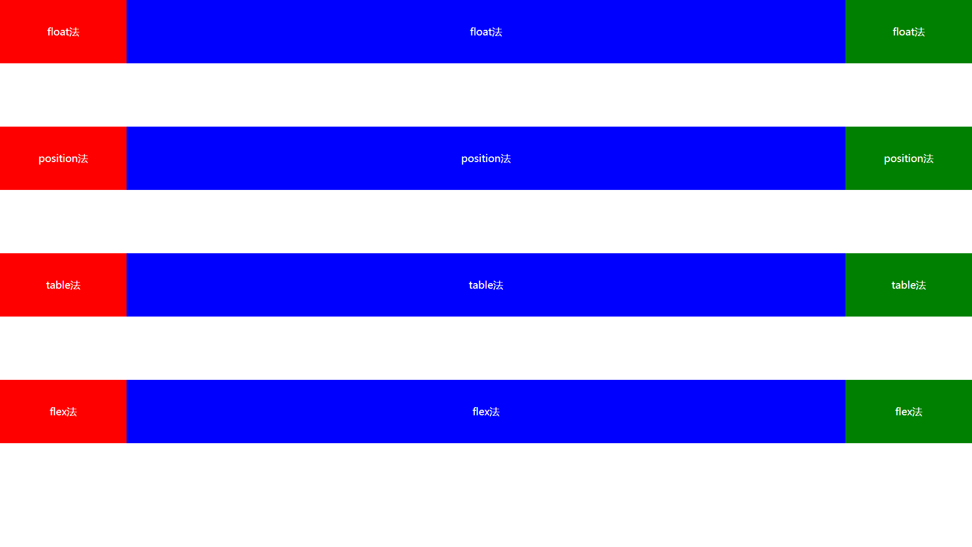


 405
405


 被折叠的 条评论
为什么被折叠?
被折叠的 条评论
为什么被折叠?
 到【灌水乐园】发言


