Attributes
| 参数 | 说明 | 类型 | 可选值 | 默认值 |
|---|
| percentage | 百分比(必填) | number | 0-100 | 0 |
| type | 进度条类型 | string | line/circle | line |
| stroke-width | 进度条的宽度,单位px | number | —— | 6 |
| text-inside | 进度条显示文字内置在进度条内(只在type=line时可用) | boolean | —— | false |
| status | 进度条当前状态 | string | success/exception | —— |
| color | 进度条背景色(会覆盖status状态颜色) | string | —— | ‘’ |
| width | 环形进度条画布宽度(只在type为circle时可用) | number | | 126 |
| show-text | 是否显示进度条文字内容 | boolean | —— | true |
用例代码
<template>
<div>
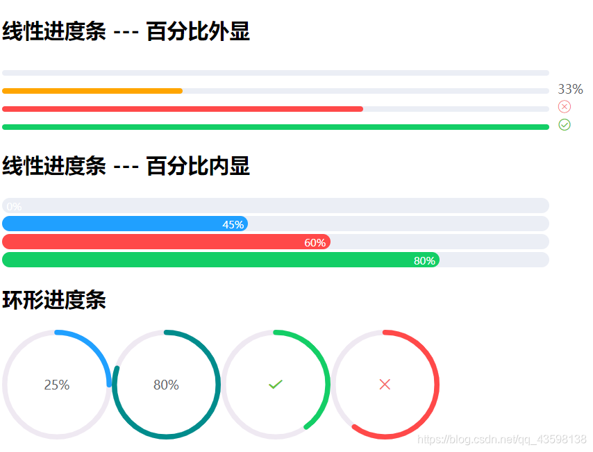
<h2>线性进度条 --- 百分比外显</h2>
<d-progress :percentage="0" :show-text="false"></d-progress>
<d-progress :percentage="33" color="orange"></d-progress>
<d-progress :percentage="66" status="exception"></d-progress>
<d-progress :percentage="100" status="success"></d-progress>
<h2>线性进度条 --- 百分比内显</h2>
<d-progress :stroke-width="18" :percentage="0" :text-inside="true"></d-progress>
<d-progress :stroke-width="18" :percentage="45" :text-inside="true"></d-progress>
<d-progress :stroke-width="18" :percentage="60" :text-inside="true" status="exception"></d-progress>
<d-progress :stroke-width="18" :percentage="80" :text-inside="true" status="success"></d-progress>
<h2>环形进度条</h2>
<d-progress :percentage="25" type="circle"></d-progress>
<d-progress :percentage="80" type="circle" color="#008c8c"></d-progress>
<d-progress :percentage="40" type="circle" status="success"></d-progress>
<d-progress :percentage="60" type="circle" status="exception"></d-progress>
</div>
</template>
<script>
import DProgress from "./Progress";
export default {
components: {
DProgress,
}
}
</script>
组件代码
<template>
<div class="progress" :class="[status?`is-${status}`:'',`progress--${type}`]">
<div class="progress-bar" v-if="type === 'line'">
<div class="progress-bar__outer" :style="{height: strokeWidth+'px'}">
<div class="progress-bar__inner" :style="barStyle">
<div class="progress-bar__innerText" v-if="textInside && showText">{{ percentage+'%' }}</div>
</div>
</div>
</div>
<div class="progress-circle" :style="{width: width+'px',height: width+'px'}" v-else>
<svg viewBox="0 0 100 100">
<path :d="trackPath"
fill="none"
:stroke-width="relativeStrokeWidth"
stroke="#efe9f2"/>
<path :d="trackPath"
fill="none"
:stroke-width="relativeStrokeWidth"
:stroke="stroke"
:style="circlePathStyle"
stroke-linecap="round"/>
</svg>
</div>
<div v-if="!textInside && showText" class="progress__text" :style="{fontSize: progressTextSize+'px'}">
<template v-if="!status">
{{ percentage+'%' }}
</template>
<i v-else class="icon" :class="iconClass"></i>
</div>
</div>
</template>
<script>
export default {
props: {
type: {
type: String,
default: 'line',
validator: val => ['circle', 'line'].includes(val)
},
strokeWidth: {
type: Number,
default: 6
},
percentage: {
type: Number,
required: true,
default: 0,
validator: val => val >= 0 && val <= 100
},
status: {
type: String
},
textInside: {
type: Boolean,
default: false
},
showText: {
type: Boolean,
default: true
},
color: {
type: String
},
width: {
type: Number,
default: 126
}
},
computed: {
progressTextSize() {
return 12 + this.strokeWidth * 0.4;
},
stroke() {
if (this.color){
return this.color;
}
let color;
switch (this.status) {
case 'success':
color = '#13ce66';
break;
case 'exception':
color = '#ff4949';
break;
default:
color = '#20a0ff';
}
return color;
},
barStyle() {
return {
width: this.percentage + '%',
backgroundColor: this.stroke
}
},
iconClass() {
if (this.type === 'line') {
return this.status === 'success'
? 'icon-circle-success'
: 'icon-circle-cancel';
} else {
return this.status === 'success'
? 'icon-success'
: 'icon-cancel';
}
},
trackPath() {
const radius = 50 - this.relativeStrokeWidth / 2;
return `
M 50 50
m 0 -${radius}
a ${radius} ${radius} 0 1 1 0 ${radius * 2}
a ${radius} ${radius} 0 1 1 0 -${radius * 2}`;
},
relativeStrokeWidth() {
return this.strokeWidth * 100 / this.width;
},
perimeter() {
const radius = 50 - this.relativeStrokeWidth / 2;
return 2 * Math.PI * radius;
},
circlePathStyle() {
const perimeter = this.perimeter;
return {
strokeDasharray: `${perimeter}px,${perimeter}px`,
strokeDashoffset: (1 - this.percentage / 100) * perimeter + 'px'
}
}
}
}
</script>
<style>
@font-face {
font-family: 'icon';
src: url('icon/iconfont.ttf') format('woff2'),
url('./icon/iconfont.woff') format('woff'),
url('./icon/iconfont.woff2') format('truetype');
}
.icon {
font-family: 'icon' !important;
font-size: 16px;
font-style: normal;
}
.icon-circle-success::before {
content: '\e605';
}
.icon-circle-cancel::before {
content: '\e615';
}
.icon-success::before {
content: '\e72e';
}
.icon-cancel::before {
content: '\e625';
}
.progress.is-success .progress__text{
color: #67c23a;
}
.progress.is-exception .progress__text{
color: #f56c6c;
}
.progress-bar {
display: inline-block;
box-sizing: border-box;
width: 100%;
padding-right: 50px;
margin-right: -50px;
}
.progress-bar__outer {
border-radius: 100px;
background-color: #ebeef5;
}
.progress-bar__inner {
width: 60px;
height: 100%;
border-radius: 100px;
transition: width .6s ease;
text-align: right;
line-height: 1;
}
.progress-bar__innerText{
display: inline-block;
color: #fff;
font-size: 12px;
margin: 0 5px;
vertical-align: middle;
}
.progress__text {
display: inline-block;
margin-left: 10px;
color: #606266;
}
.progress--circle{
display: inline-block;
position: relative;
}
.progress--circle .progress__text{
position: absolute;
top: 50%;
transform: translateY(-50%);
width: 100%;
text-align: center;
margin-left: 0;
}
</style>


 本文介绍了如何使用Vue封装一个进度条组件,包括线性和环形两种类型,支持多种样式和状态定制。组件包含percentage、type、stroke-width等属性,并提供了丰富的用例展示,如不同颜色、状态的文字内外显示等。同时,代码展示了组件内部的计算逻辑和样式实现。


 扫一扫
扫一扫
 845
845

 被折叠的 条评论
为什么被折叠?
被折叠的 条评论
为什么被折叠?
 到【灌水乐园】发言


