


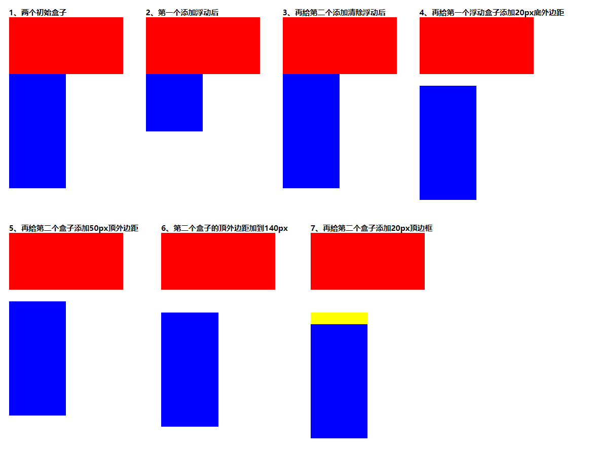
上下排列清除浮动
clear:left/right/both;
*结论:添加clear的盒子的顶边框(border-top)将会低于在它之前的任何浮动盒子的底外边距(margin-bottom),同时浮动的盒子依然是脱离文档流的。
分析
可以注意到,图5给第二个盒子添加50px的顶外边距时,并没有发生常规的margin合并问题,而当顶外边距增加到图6的140px时,才下移了一些距离,这个距离是20px,是140px减去盒子一的高度100px以及其地外边距20px得到的。
还有一个需要强调的是,clear只能清除添加了clear属性的元素之前的浮动
“clear on an element only clears the floats before it in document order. It doesn’t clear floats after it.”
嵌套排列清除浮动
解决方案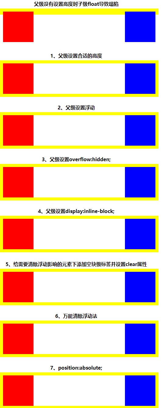
- 父级添加高度
我们知道float塌陷是指当容器的高度为auto,且容器的内容中有浮动(float为left或right)的元素的情况下,容器的高度不能自动伸长以适应内容的高度,使得内容溢出到容器外面而影响甚至破坏布局的现象。因此,只要我们给父级元素添加一个合适的高度就可以这个问题了。
*缺点:需要高度自适应时不灵活
- 触发BFC,改变父级的渲染规则
我们知道BFC布局规则中有一个是:
计算BFC高度时,浮动元素也参与计算。因此我们可以在父级元素中设置触发BFC的条件即可。BFC思维导图(1) position: absolute/fixed;
(2) display: inline-block; *缺点:inline-block会产生问题,如换行空格以及左右margin
(3) float: left/right; *缺点:使整体浮动,影响布局
(4) overflow: hidden; *缺点:无法显示要溢出的元素(如定位)
- clear: left/right/both;
(1) 给需要清除浮动影响的元素下添加空块级标签并设置clear属性
*缺点:代码冗余;语义化差
(2) :after伪元素
*缺点:ie6-7不支持伪元素:after
关于IE本人目前还没有涉及,故到此为止。另,附上代码:
<!DOCTYPE html>
<html lang="en">
    <head>
        <meta charset="UTF-8">
        <meta name="viewport" content="width=device-width, initial-scale=1.0">
        <title>float上下排列</title>
        <style>
            *{margin: 0; padding: 0;}
            .fl{float: left; margin: 20px;}

            .R1 .box1{width: 200px; height: 100px; background: red;}
            .R1 .box2{width: 100px; height: 200px; background: blue;}

            .R2 .box1{width: 200px; height: 100px; background: red; float: left;}
            .R2 .box2{width: 100px; height: 200px; background: blue;}

            .R3 .box1{width: 200px; height: 100px; background: red; float: left;}
            .R3 .box2{width: 100px; height: 200px; background: blue; clear: left;}

            .R4 .box1{width: 200px; height: 100px; background: red; float: left; margin-bottom: 20px;}
            .R4 .box2{width: 100px; height: 200px; background: blue; clear: left;}

            .R5 .box1{width: 200px; height: 100px; background: red; float: left; margin-bottom: 20px;}
            .R5 .box2{width: 100px; height: 200px; background: blue; clear: both; margin-top: 50px;}

            .R6 .box1{width: 200px; height: 100px; background: red; float: left; margin-bottom: 20px;}
            .R6 .box2{width: 100px; height: 200px; background: blue; clear: both; margin-top: 140px;}

            .R7 .box1{width: 200px; height: 100px; background: red; float: left; margin-bottom: 20px;}
            .R7 .box2{width: 100px; height: 200px; background: blue; clear: both; margin-top: 140px; border-top: 20px solid yellow;}
        </style>
    </head>
    <body>
        <div class="R1 fl">
            <h5>1、两个初始盒子</h5>
            <div class="box1"></div>
            <div class="box2"></div>
        </div>

        <div class="R2 fl">
            <h5>2、第一个添加浮动后</h5>
            <div class="box1"></div>
            <div class="box2"></div>
        </div>

        <div class="R3 fl">
            <h5>3、再給第二个添加清除浮动后</h5>
            <div class="box1"></div>
            <div class="box2"></div>
        </div>

        <div class="R4 fl">
            <h5>4、再給第一个浮动盒子添加20px底外边距</h5>
            <div class="box1"></div>
            <div class="box2"></div>
        </div>

        <div class="R5 fl">
            <h5>5、再給第二个盒子添加50px顶外边距</h5>
            <div class="box1"></div>
            <div class="box2"></div>
        </div>

        <div class="R6 fl">
            <h5>6、第二个盒子的顶外边距加到140px</h5>
            <div class="box1"></div>
            <div class="box2"></div>
        </div>

        <div class="R7 fl">
            <h5>7、再給第二个盒子添加20px顶边框</h5>
            <div class="box1"></div>
            <div class="box2"></div>
        </div>
    </body>
</html>
<!DOCTYPE html>
<html lang="en">
    <head>
        <meta charset="UTF-8">
        <meta name="viewport" content="width=device-width, initial-scale=1.0">
        <title>float嵌套排列</title>
        <style>
            *{margin: 0; padding: 0;}
            h4{width: 500px; height: 30px; text-align: center; line-height: 30px;}
            div.R1{margin-bottom: 120px;}
            div.R2{margin-bottom: 20px;}
            h4.H4{margin-top: 140px;}
            div.R4{margin-bottom: 20px;}
            div.R5{margin-bottom: 20px;}
            div.R6{margin-bottom: 20px;}
            div.R7{margin-bottom: 20px;}


            .R1{width: 500px; border: 10px solid yellow;}
            .R1 .box1{width: 100px; height: 100px; background: red; float: left;}
            .R1 .box2{width: 100px; height: 100px; background: blue; float: right;}

            .R2{width: 500px; border: 10px solid yellow; height: 100px;}
            .R2 .box1{width: 100px; height: 100px; background: red; float: left;}
            .R2 .box2{width: 100px; height: 100px; background: blue; float: right;}

            .R3{width: 500px; border: 10px solid yellow; float: left;}
            .R3 .box1{width: 100px; height: 100px; background: red; float: left;}
            .R3 .box2{width: 100px; height: 100px; background: blue; float: right;}

            .R4{width: 500px; border: 10px solid yellow; overflow: hidden;}
            .R4 .box1{width: 100px; height: 100px; background: red; float: left;}
            .R4 .box2{width: 100px; height: 100px; background: blue; float: right;}

            .R5{width: 500px; border: 10px solid yellow; display: inline-block;}
            .R5 .box1{width: 100px; height: 100px; background: red; float: left;}
            .R5 .box2{width: 100px; height: 100px; background: blue; float: right;}

            .R6{width: 500px; border: 10px solid yellow;}
            .R6 .box1{width: 100px; height: 100px; background: red; float: left;}
            .R6 .box2{width: 100px; height: 100px; background: blue; float: right;}
            .R6 .box3{width: 0; height: 0; clear: both;}

            .R7{width: 500px; border: 10px solid yellow;}
            .R7 .box1{width: 100px; height: 100px; background: red; float: left;}
            .R7 .box2{width: 100px; height: 100px; background: blue; float: right;}
            .R7:after{content: "."; display: block; width: 0; height: 0; clear: both; overflow: hidden; visibility: hidden;}

            .R8{width: 500px; border: 10px solid yellow; position: absolute;}
            .R8 .box1{width: 100px; height: 100px; background: red; float: left;}
            .R8 .box2{width: 100px; height: 100px; background: blue; float: right;}
        </style>
    </head>
    <body>
        <h4>父级没有设置高度时子级float导致塌陷</h4>
        <div class="R1">
            <div class="box1"></div>
            <div class="box2"></div>
        </div>

        <h4>1、父级设置合适的高度</h4>
        <div class="R2">
            <div class="box1"></div>
            <div class="box2"></div>
        </div>

        <h4>2、父级设置浮动</h4>
        <div class="R3">
            <div class="box1"></div>
            <div class="box2"></div>
        </div>

        <h4 class="H4">3、父级设置overflow:hidden;</h4>
        <div class="R4">
            <div class="box1"></div>
            <div class="box2"></div>
        </div>

        <h4>4、父级设置display:inline-block;</h4>
        <div class="R5">
            <div class="box1"></div>
            <div class="box2"></div>
        </div>

        <h4>5、给需要清除浮动影响的元素下添加空块级标签并设置clear属性</h4>
        <div class="R6">
            <div class="box1"></div>
            <div class="box2"></div>
            <div class="box3"></div>
        </div>

        <h4>6、万能清除浮动法</h4>
        <div class="R7">
            <div class="box1"></div>
            <div class="box2"></div>
        </div>

        <h4>7、position:absolute;</h4>
        <div class="R8">
            <div class="box1"></div>
            <div class="box2"></div>
        </div>
    </body>
</html>


 552
552


 被折叠的 条评论
为什么被折叠?
被折叠的 条评论
为什么被折叠?
 到【灌水乐园】发言


