


 本文详细介绍了如何使用HTML和CSS来仿制QQ邮箱的登录界面,包括布局、header、footer以及content的各个部分,特别是内容区的三个主要元素:左边文字、中间图片和右边表格的编写。适合前端初学者学习。
1.布局
写之前应该大体有一个布局的思路| header 高度:60 |
|---|
| content (文本 图片 表格) 居中 |
| footer 高度::40 |
2.编写框架部分
<!DOCTYPE html>
<html>
    <meta charset="utf-8">
    <title>登录qq邮箱</title>
    <style type="text/css">
        *{

            padding:0;
            margin:0;
        }
        .header{

            height:60px;
            width:100%;
            background:blue;
        }
        .content{

            width:1100px;
            height:500px;
            margin:auto;
            margin-top:80px;
            background:pink;
        }
        .footer{

            position: fixed;
            bottom:0;
            left:0;
            right:0;
            height:40px;
            background:yellow;
        }
    </style>
    <body>
        <div class="header">
            header
        </div>
        <div class="content">
            content
        </div>
        <div class="footer">
            footer
        </div>
    </body>
</html>
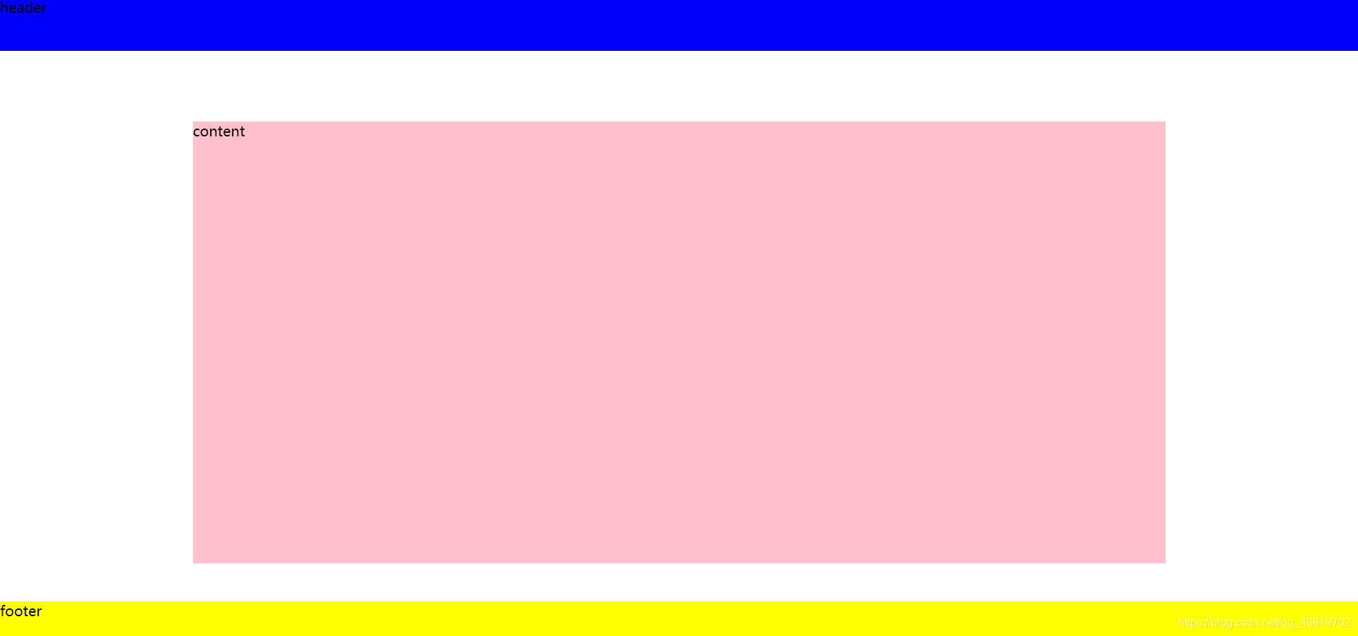
完成后的效果就是这个样子,当然中间content宽度不一定如此,后面添加文字图片后可以适当加减宽度。
3.编写header代码
css如下 body{
font-size:12px;
}
.header{
height:60px;
width:100%;
line-height:60px;
background: #eff4fa;
border-bottom:1px solid #d6dfea;
}
.header img{
width:200px;
height:56px;
margin-left:20px;
}
.header nav{
text-align: right;
margin-top:-80px;
margin-right:40px;
letter-spacing: 0.5px;
}
.header nav a{
color:#1d5494;
text-decoration: none;
}
.header nav a:hover{
text-decoration: underline;
}
html如下
        <div class="header">
            <img src="tubiao.png">
            <nav>
                <a href="#">基本版</a> |
                <a href="#">English</a> |
                <a href="#">手机版</a> |
                <a href="#">企业邮箱</a>
            </nav>
        </div>
header没什么难度,说一下nav和img为什么没用float浮动,因为缩小后宽度不够,nav会被挤到下面的块中,布局就很混乱了。
4.编写footer代码
css如下 .footer{
position: fixed;
bottom:0;
left:0;
right:0;
height:40px;
line-height:40px;
border-top:1px solid #d6dfea;
background:#eff4fa;
text-align: center;
color:#b6b6b6;
letter-spacing: 0.5px;
}
.footer a{
color:#1d5494;
text-decoration: none;
}
.footer a:hover{
text-decoration: underline;
}
html如下
        <div class="footer">
                <p><a href="#">关于腾讯</a> | <a href="#">服务条款</a> | <a href="#">隐私政策</a> | <a href="#">客服中心</a> | <a href="#">联系我们</a> | <a href="#">帮助中心</a> | ©1998 - 2019 Tencent Inc. All Rights Reserved.</p>
        </div>
footer比header更简单,用到的知识也是header中有的。但是这里说一个问题,原版footer虽然也是fixed位置,也就是说总在当前浏览器页面底部,不过原版在缩小到footer顶到content的时候就不会在实现总在浏览器底部,而是增长滚动条了。这个问题我当前能力没有解决,在这里提出来一下。不过看这篇博客的应该也是html css初学者吧,所以也可以不太在意
 最低0.47元/天 解锁文章


 扫一扫
扫一扫


 3994
3994

 被折叠的 条评论
为什么被折叠?
被折叠的 条评论
为什么被折叠?
 到【灌水乐园】发言


