


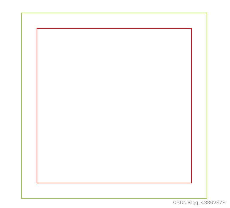
一、使用弹性布局
align-items: center;设置flex子项在垂直方向上居中;justify-content: center;设置flex子项在水平方向上居中。
<div class="box1">
    <div class="box2"></div>
</div>
.box1 {
width: 600px;
height: 600px;
border: 2px solid yellowgreen;
/* 使用弹性布局实现子元素居中 */
display: flex;
align-items: center;
justify-content: center;
}
.box2 {
width: 500px;
height: 500px;
border: 2px solid red;
}
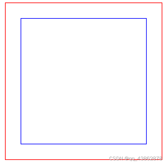
二、使用绝对定位配合偏移
设置子元素绝对定位:top: 50%;left:50%后,可以看见界面上子元素左上角位于父元素的中心点上;此时需要偏移设置:transform: translate(-50%, -50%),此处的-50%是以子元素的中心点作为对其点的,实现的效果是元素在X轴方向上左移自身宽度的50%,在Y轴方向上上移自身高度的50%,从而达到真实的水平垂直居中效果。
<div class="box2">
    <div class="box3"></div>
</div>
.box2 {
width: 500px;
height: 500px;
border: 2px solid red;
position: relative;
}
.box3 {
width: 400px;
height: 400px;
border: 2px solid blue;
/* 绝对定位配合偏移实现居中 */
position: absolute;
top: 50%;
left: 50%;
transform: translate(-50%, -50%);
}
三、使用绝对定位配合外边距
<div class="box2">
    <div class="box4"></div>
</div>
.box2 {
width: 500px;
height: 500px;
border: 2px solid red;
}
.box4 {
width: 300px;
height: 300px;
border: 2px solid yellow;
/*将四个定位属性的值都设置为0实现水平垂直居中 */
position: absolute;
top: 0;
left: 0;
bottom: 0;
right: 0;
margin: auto;
}
四、使用网格布局
<div class="box4">
    <div class="box5"></div>
</div>
.box4 {
width: 300px;
height: 300px;
border: 2px solid yellow;
/*使用网格布局实现内部元素居中 */
display: grid;
align-items: center;
justify-content: center;
}
.box5 {
width: 200px;
height: 200px;
border: 2px solid green;
}


 5337
5337


 被折叠的 条评论
为什么被折叠?
被折叠的 条评论
为什么被折叠?
 到【灌水乐园】发言


