


Loading动画
1、效果图:
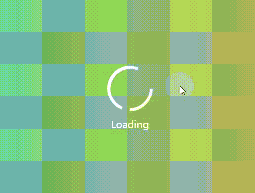
2、原理:
利用定位将两个div,重叠在一起,再利用border-bottom-color: transparent这个CSS样式,将div的一部分边框变成透明,最后分别为两个div添加不同的动画效果就可以了。

3、代码
<!DOCTYPE html>
<html lang="en">
<head>
    <meta charset="UTF-8">
    <meta name="viewport" content="width=device-width, initial-scale=1.0">
    <meta http-equiv="X-UA-Compatible" content="ie=edge">
    <title>Document</title>
    <style>
        *{
            margin: 0;
            padding: 0;
        }
        body{
            width: 100vw;
            height: 100vh;
            background: linear-gradient(to right,#22c1c3, #fdbb2d);
            display: flex;
            align-items: center;
            justify-content: center;
        }
        .container{
            width: 200px;
            height: 200px;
            display: flex;
            align-items: center;
            justify-content: center;
            position: relative;
            /* border: 1px solid white; */
        }
        .container > p{
            position: absolute;
            bottom: 15px;
            color: white;
            font-size: 20px;
            user-select: none;
        }
        .circle1{
            width: 80px;
            height: 80px;
            border: 6px solid white;
            border-radius: 50%;
            border-left-color: transparent;
            border-bottom-color: transparent;
            z-index: 999;
            animation-name: circleAnimation;
            animation-duration: 3s;
            animation-iteration-count: infinite;
            animation-timing-function: linear;
        }
        .circle2{
            width: 80px;
            height: 80px;
            border: 6px solid white;
            border-radius: 50%;
            border-right-color: transparent;
            border-left-color: transparent;
            position: absolute;
            animation-name: circleAnimation;
            animation-duration: 1.5s;
            animation-iteration-count: infinite;
            animation-timing-function: linear;
        }
        @keyframes circleAnimation{
            to{
                transform: rotate(360deg);
            }
        }
    </style>
</head>
<body>
    <div class="container">
        <div class="circle1"></div>
        <div class="circle2"></div>
        <p>Loading</p>
    </div>
</body>
</html>
还有一些其他的动画效果,放在了我的GitHub上面,偶尔会更新,喜欢的阔以给个小星星!GitHub地址:https://github.com/Jin0811/CSS-Animation.git


 406
406


 被折叠的 条评论
为什么被折叠?
被折叠的 条评论
为什么被折叠?
 到【灌水乐园】发言


