仅使用HTML+CSS制作一个动态简版魔方.
1.软件使用到HBuilder X .
2.使用到CSS3动画.
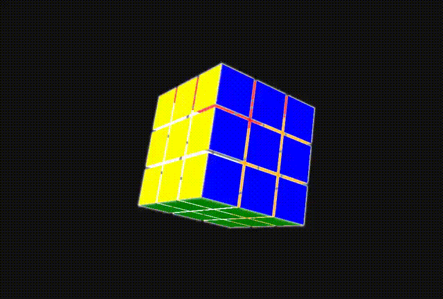
…实现效果如下:
… 其代码如下:
魔方
	<style type="text/css">

		* {
			padding: 0;
			margin: 0;
		}
		html,body {
			width: 100%;
			height: 100%;

		}

		body {
			perspective: 1000px;
			background-color: #111111;
		}


		@keyframes mask{
			0%{
				transform:   rotateX(10deg)rotateY(0deg) rotateZ(10deg);
			}
			50% {
				/* transform: translate3d(0px,0px,300px); */
				/* transform:   rotateX(0deg)rotateY(180deg) rotateZ(0deg) translate3d(300px,300px,300px); */
			}
			100%{
				transform:   rotateX(0deg)rotateY(3600deg) rotateZ(0deg);
			}
		}


		.mofang {
			width: 100%;
			height: 100%;
			background-color: #111111;
			position: relative;
			/* transform-style: preserve-3d; */
			overflow: hidden;
		}
		.mofang_list {
			position: absolute;
			top: 0;
			transform-style: preserve-3d;
			left: 0;
			right: 0;
			bottom: 0;
			margin: auto;
			width: 80px;
			height: 80px;
			/* background-color: lawngreen; */
			animation: mask 80s linear;
			animation-iteration-count: infinite;
			/* position: relative; */
			transform: rotateX(0deg) rotateY(30deg) rotateZ(20deg);
		}
		.mofang_list>div {
			position: absolute;
			top: 0px;
			left: 0px;
			width: 100%;
			height: 100%;
			box-shadow: 0px 0px 5px 1px white;
		}
		.mofang_list>div:nth-child(1) {
			animation-name: mask1;
			animation-duration: 8s;
			animation-iteration-count: infinite;
			animation-direction: alternate;
		}

		@keyframes mask1 {
			0%{
				transform: translate3d(0px,0px,120px);
			}
			100%{
				transform: translate3d(0px,0px,200px);
			}
		}

		.mofang_list>div:nth-child(2) {
			animation-name: mask2;
			animation-duration: 8s;
			animation-iteration-count: infinite;
			animation-direction: alternate;
		}

		@keyframes mask2 {
			0%{
				transform: translate3d(80px,0px,120px);
			}
			100%{
				transform: translate3d(160px,0px,200px);
			}
		}

		.mofang_list>div:nth-child(3) {
			animation-name: mask3;
			animation-duration: 8s;
			animation-iteration-count: infinite;
			animation-direction: alternate;
		}

		@keyframes mask3 {
			0%{
				transform: translate3d(-80px,0px,120px);
			}
			100%{
				transform: translate3d(-160px,0px,200px);
			}
		}

		.mofang_list>div:nth-child(4) {
			animation-name: mask4;
			animation-duration: 8s;
			animation-iteration-count: infinite;
			animation-direction: alternate;
		}

		@keyframes mask4 {
			0%{
				transform: translate3d(-80px,80px,120px);
			}
			100%{
				transform: translate3d(-160px,160px,200px);
			}
		}

		.mofang_list>div:nth-child(5) {
			animation-name: mask5;
			animation-duration: 8s;
			animation-iteration-count: infinite;
			animation-direction: alternate;
		}

		@keyframes mask5 {
			0%{
				transform: translate3d(-80px,-80px,120px);
			}
			100%{
				transform: translate3d(-160px,-160px,200px);
			}
		}

		.mofang_list>div:nth-child(6) {
			animation-name: mask6;
			animation-duration: 8s;
			animation-iteration-count: infinite;
			animation-direction: alternate;
		}

		@keyframes mask6 {
			0%{
				transform: translate3d(0px,80px,120px);
			}
			100%{
				transform: translate3d(0px,160px,200px);
			}
		}

		.mofang_list>div:nth-child(7) {
			animation-name: mask7;
			animation-duration: 8s;
			animation-iteration-count: infinite;
			animation-direction: alternate;
		}

		@keyframes mask7 {
			0%{
				transform: translate3d(80px,-80px,120px);
			}
			100%{
				transform: translate3d(160px,-160px,200px);
			}
		}

		.mofang_list>div:nth-child(8) {
			animation-name: mask8;
			animation-duration: 8s;
			animation-iteration-count: infinite;
			animation-direction: alternate;
		}

		@keyframes mask8 {
			0%{
				transform: translate3d(0px,-80px,120px);
			}
			100%{
				transform: translate3d(0px,-160px,200px);
			}
		}

		.mofang_list>div:nth-child(9) {
			animation-name: mask9;
			animation-duration: 8s;
			animation-iteration-count: infinite;
			animation-direction: alternate;
		}

		@keyframes mask9 {
			0%{
				transform: translate3d(80px,80px,120px);
			}
			100%{
				transform: translate3d(160px,160px,200px);
			}
		}


		.mofang_list>div:nth-child(10) {
			animation-name: mask10;
			animation-duration: 8s;
			animation-iteration-count: infinite;
			animation-direction: alternate;
		}

		@keyframes mask10 {
			0%{
				transform: rotateX(270deg) translate3d(0px,0px,120px);
			}
			100%{
				transform: rotateX(270deg) translate3d(0px,0px,200px);
			}
		}


		.mofang_list>div:nth-child(11) {
			animation-name: mask11;
			animation-duration: 8s;
			animation-iteration-count: infinite;
			animation-direction: alternate;
		}

		@keyframes mask11 {
			0%{
				transform: rotateX(270deg) translate3d(80px,0px,120px);
			}
			100%{
				transform: rotateX(270deg) translate3d(160px,0px,200px);
			}
		}


		.mofang_list>div:nth-child(12) {
			animation-name: mask12;
			animation-duration: 8s;
			animation-iteration-count: infinite;
			animation-direction: alternate;
		}

		@keyframes mask12 {
			0%{
				transform: rotateX(270deg) translate3d(-80px,0px,120px);
			}
			100%{
				transform: rotateX(270deg) translate3d(-160px,0px,200px);
			}
		}


		.mofang_list>div:nth-child(13) {
			animation-name: mask13;
			animation-duration: 8s;
			animation-iteration-count: infinite;
			animation-direction: alternate;
		}

		@keyframes mask13 {
			0%{
				transform: rotateX(270deg) translate3d(-80px,80px,120px);
			}
			100%{
				transform: rotateX(270deg) translate3d(-160px,160px,200px);
			}
		}


		.mofang_list>div:nth-child(14) {
			animation-name: mask14;
			animation-duration: 8s;
			animation-iteration-count: infinite;
			animation-direction: alternate;
		}

		@keyframes mask14 {
			0%{
				transform: rotateX(270deg) translate3d(-80px,-80px,120px);
			}
			100%{
				transform: rotateX(270deg) translate3d(-160px,-160px,200px);
			}
		}


		.mofang_list>div:nth-child(15) {
			animation-name: mask15;
			animation-duration: 8s;
			animation-iteration-count: infinite;
			animation-direction: alternate;
		}

		@keyframes mask15 {
			0%{
				transform: rotateX(270deg) translate3d(0px,80px,120px);
			}
			100%{
				transform: rotateX(270deg) translate3d(0px,160px,200px);
			}
		}
		.mofang_list>div:nth-child(16) {
			animation-name: mask16;
			animation-duration: 8s;
			animation-iteration-count: infinite;
			animation-direction: alternate;
		}

		@keyframes mask16 {
			0%{
				transform: rotateX(270deg) translate3d(80px,-80px,120px);
			}
			100%{
				transform: rotateX(270deg) translate3d(160px,-160px,200px);
			}
		}

		.mofang_list>div:nth-child(17) {
			animation-name: mask17;
			animation-duration: 8s;
			animation-iteration-count: infinite;
			animation-direction: alternate;
		}

		@keyframes mask17 {
			0%{
				transform: rotateX(270deg) translate3d(0px,-80px,120px);
			}
			100%{
				transform: rotateX(270deg) translate3d(0px,-160px,200px);
			}
		}

		.mofang_list>div:nth-child(18) {
			animation-name: mask18;
			animation-duration: 8s;
			animation-iteration-count: infinite;
			animation-direction: alternate;
		}

		@keyframes mask18 {
			0%{
				transform: rotateX(270deg) translate3d(80px,80px,120px);
			}
			100%{
				transform: rotateX(270deg) translate3d(160px,160px,200px);
			}
		}


		.mofang_list>div:nth-child(19) {
			animation-name: mask19;
			animation-duration: 8s;
			animation-iteration-count: infinite;
			animation-direction: alternate;
		}

		@keyframes mask19 {
			0%{
				transform: rotateX(90deg) translate3d(0px,0px,120px);
			}
			100%{
				transform: rotateX(90deg) translate3d(0px,0px,200px);
			}
		}

		.mofang_list>div:nth-child(20) {
			animation-name: mask20;
			animation-duration: 8s;
			animation-iteration-count: infinite;
			animation-direction: alternate;
		}

		@keyframes mask20 {
			0%{
				transform: rotateX(90deg) translate3d(80px,0px,120px);
			}
			100%{
				transform: rotateX(90deg) translate3d(160px,0px,200px);
			}
		}

		.mofang_list>div:nth-child(21) {
			animation-name: mask21;
			animation-duration: 8s;
			animation-iteration-count: infinite;
			animation-direction: alternate;
		}

		@keyframes mask21 {
			0%{
				transform: rotateX(90deg) translate3d(-80px,0px,120px);
			}
			100%{
				transform: rotateX(90deg) translate3d(-160px,0px,200px);
			}
		}

		.mofang_list>div:nth-child(22) {
			animation-name: mask22;
			animation-duration: 8s;
			animation-iteration-count: infinite;
			animation-direction: alternate;
		}

		@keyframes mask22 {
			0%{
				transform: rotateX(90deg) translate3d(-80px,80px,120px);
			}
			100%{
				transform: rotateX(90deg) translate3d(-160px,160px,200px);
			}
		}

		.mofang_list>div:nth-child(23) {
			animation-name: mask23;
			animation-duration: 8s;
			animation-iteration-count: infinite;
			animation-direction: alternate;
		}

		@keyframes mask23 {
			0%{
				transform: rotateX(90deg) translate3d(-80px,-80px,120px);
			}
			100%{
				transform: rotateX(90deg) translate3d(-160px,-160px,200px);
			}
		}

		.mofang_list>div:nth-child(24) {
			animation-name: mask24;
			animation-duration: 8s;
			animation-iteration-count: infinite;
			animation-direction: alternate;
		}

		@keyframes mask24 {
			0%{
				transform: rotateX(90deg) translate3d(0px,80px,120px);
			}
			100%{
				transform: rotateX(90deg) translate3d(0px,160px,200px);
			}
		}
		.mofang_list>div:nth-child(25) {
			animation-name: mask25;
			animation-duration: 8s;
			animation-iteration-count: infinite;
			animation-direction: alternate;
		}

		@keyframes mask25 {
			0%{
				transform: rotateX(90deg) translate3d(80px,-80px,120px);
			}
			100%{
				transform: rotateX(90deg) translate3d(160px,-160px,200px);
			}
		}

		.mofang_list>div:nth-child(26) {
			animation-name: mask26;
			animation-duration: 8s;
			animation-iteration-count: infinite;
			animation-direction: alternate;
		}

		@keyframes mask26 {
			0%{
				transform: rotateX(90deg) translate3d(0px,-80px,120px);
			}
			100%{
				transform: rotateX(90deg) translate3d(0px,-160px,200px);
			}
		}

		.mofang_list>div:nth-child(27) {
			animation-name: mask27;
			animation-duration: 8s;
			animation-iteration-count: infinite;
			animation-direction: alternate;
		}

		@keyframes mask27 {
			0%{
				transform: rotateX(90deg) translate3d(80px,80px,120px);
			}
			100%{
				transform: rotateX(90deg) translate3d(160px,160px,200px);
			}
		}


		.mofang_list>div:nth-child(28) {
			animation-name: mask28;
			animation-duration: 8s;
			animation-iteration-count: infinite;
			animation-direction: alternate;
		}

		@keyframes mask28 {
			0%{
				transform: rotateX(180deg) translate3d(0px,0px,120px);
			}
			100%{
				transform: rotateX(180deg) translate3d(0px,0px,200px);
			}
		}

		.mofang_list>div:nth-child(29) {
			animation-name: mask29;
			animation-duration: 8s;
			animation-iteration-count: infinite;
			animation-direction: alternate;
		}

		@keyframes mask29 {
			0%{
				transform: rotateX(180deg) translate3d(80px,0px,120px);
			}
			100%{
				transform: rotateX(180deg) translate3d(160px,0px,200px);
			}
		}

		.mofang_list>div:nth-child(30) {
			animation-name: mask30;
			animation-duration: 8s;
			animation-iteration-count: infinite;
			animation-direction: alternate;
		}

		@keyframes mask30 {
			0%{
				transform: rotateX(180deg) translate3d(-80px,0px,120px);
			}
			100%{
				transform: rotateX(180deg) translate3d(-160px,0px,200px);
			}
		}

		.mofang_list>div:nth-child(31) {
			animation-name: mask31;
			animation-duration: 8s;
			animation-iteration-count: infinite;
			animation-direction: alternate;
		}

		@keyframes mask31 {
			0%{
				transform: rotateX(180deg) translate3d(-80px,80px,120px);
			}
			100%{
				transform: rotateX(180deg) translate3d(-160px,160px,200px);
			}
		}

		.mofang_list>div:nth-child(32) {
			animation-name: mask32;
			animation-duration: 8s;
			animation-iteration-count: infinite;
			animation-direction: alternate;
		}

		@keyframes mask32 {
			0%{
				transform: rotateX(180deg) translate3d(-80px,-80px,120px);
			}
			100%{
				transform: rotateX(180deg) translate3d(-160px,-160px,200px);
			}
		}

		.mofang_list>div:nth-child(33) {
			animation-name: mask33;
			animation-duration: 8s;
			animation-iteration-count: infinite;
			animation-direction: alternate;
		}

		@keyframes mask33 {
			0%{
				transform: rotateX(180deg) translate3d(0px,80px,120px);
			}
			100%{
				transform: rotateX(180deg) translate3d(0px,160px,200px);
			}
		}
		.mofang_list>div:nth-child(34) {
			animation-name: mask34;
			animation-duration: 8s;
			animation-iteration-count: infinite;
			animation-direction: alternate;
		}

		@keyframes mask34 {
			0%{
				transform: rotateX(180deg) translate3d(80px,-80px,120px);
			}
			100%{
				transform: rotateX(180deg) translate3d(160px,-160px,200px);
			}
		}

		.mofang_list>div:nth-child(35) {
			animation-name: mask35;
			animation-duration: 8s;
			animation-iteration-count: infinite;
			animation-direction: alternate;
		}

		@keyframes mask35 {
			0%{
				transform: rotateX(180deg) translate3d(0px,-80px,120px);
			}
			100%{
				transform: rotateX(180deg) translate3d(0px,-160px,200px);
			}
		}

		.mofang_list>div:nth-child(36) {
			animation-name: mask36;
			animation-duration: 8s;
			animation-iteration-count: infinite;
			animation-direction: alternate;
		}

		@keyframes mask36 {
			0%{
				transform: rotateX(180deg) translate3d(80px,80px,120px);
			}
			100%{
				transform: rotateX(180deg) translate3d(160px,160px,200px);
			}
		}


		.mofang_list>div:nth-child(37) {
			animation-name: mask37;
			animation-duration: 8s;
			animation-iteration-count: infinite;
			animation-direction: alternate;
		}

		@keyframes mask37 {
			0%{
				transform: rotateY(90deg) translate3d(0px,0px,120px);
			}
			100%{
				transform: rotateY(90deg) translate3d(0px,0px,200px);
			}
		}

		.mofang_list>div:nth-child(38) {
			animation-name: mask38;
			animation-duration: 8s;
			animation-iteration-count: infinite;
			animation-direction: alternate;
		}

		@keyframes mask38 {
			0%{
				transform: rotateY(90deg) translate3d(80px,0px,120px);
			}
			100%{
				transform: rotateY(90deg) translate3d(160px,0px,200px);
			}
		}

		.mofang_list>div:nth-child(39) {
			animation-name: mask39;
			animation-duration: 8s;
			animation-iteration-count: infinite;
			animation-direction: alternate;
		}

		@keyframes mask39 {
			0%{
				transform: rotateY(90deg) translate3d(-80px,0px,120px);
			}
			100%{
				transform: rotateY(90deg) translate3d(-160px,0px,200px);
			}
		}

		.mofang_list>div:nth-child(40) {
			animation-name: mask40;
			animation-duration: 8s;
			animation-iteration-count: infinite;
			animation-direction: alternate;
		}

		@keyframes mask40 {
			0%{
				transform: rotateY(90deg) translate3d(-80px,80px,120px);
			}
			100%{
				transform: rotateY(90deg) translate3d(-160px,160px,200px);
			}
		}

		.mofang_list>div:nth-child(41) {
			animation-name: mask41;
			animation-duration: 8s;
			animation-iteration-count: infinite;
			animation-direction: alternate;
		}

		@keyframes mask41 {
			0%{
				transform: rotateY(90deg) translate3d(-80px,-80px,120px);
			}
			100%{
				transform: rotateY(90deg) translate3d(-160px,-160px,200px);
			}
		}

		.mofang_list>div:nth-child(42) {
			animation-name: mask42;
			animation-duration: 8s;
			animation-iteration-count: infinite;
			animation-direction: alternate;
		}

		@keyframes mask42 {
			0%{
				transform: rotateY(90deg) translate3d(0px,80px,120px);
			}
			100%{
				transform: rotateY(90deg) translate3d(0px,160px,200px);
			}
		}
		.mofang_list>div:nth-child(43) {
			animation-name: mask43;
			animation-duration: 8s;
			animation-iteration-count: infinite;
			animation-direction: alternate;
		}

		@keyframes mask43 {
			0%{
				transform: rotateY(90deg) translate3d(80px,-80px,120px);
			}
			100%{
				transform: rotateY(90deg) translate3d(160px,-160px,200px);
			}
		}

		.mofang_list>div:nth-child(44) {
			animation-name: mask44;
			animation-duration: 8s;
			animation-iteration-count: infinite;
			animation-direction: alternate;
		}

		@keyframes mask44 {
			0%{
				transform: rotateY(90deg) translate3d(0px,-80px,120px);
			}
			100%{
				transform: rotateY(90deg) translate3d(0px,-160px,200px);
			}
		}

		.mofang_list>div:nth-child(45) {
			animation-name: mask45;
			animation-duration: 8s;
			animation-iteration-count: infinite;
			animation-direction: alternate;
		}

		@keyframes mask45 {
			0%{
				transform: rotateY(90deg) translate3d(80px,80px,120px);
			}
			100%{
				transform: rotateY(90deg) translate3d(160px,160px,200px);
			}
		}


		.mofang_list>div:nth-child(46) {
			animation-name: mask46;
			animation-duration: 8s;
			animation-iteration-count: infinite;
			animation-direction: alternate;
		}

		@keyframes mask46 {
			0%{
				transform: rotateY(-90deg) translate3d(0px,0px,120px);
			}
			100%{
				transform: rotateY(-90deg) translate3d(0px,0px,200px);
			}
		}

		.mofang_list>div:nth-child(47) {
			animation-name: mask47;
			animation-duration: 8s;
			animation-iteration-count: infinite;
			animation-direction: alternate;
		}

		@keyframes mask47 {
			0%{
				transform: rotateY(-90deg) translate3d(80px,0px,120px);
			}
			100%{
				transform: rotateY(-90deg) translate3d(160px,0px,200px);
			}
		}

		.mofang_list>div:nth-child(48) {
			animation-name: mask48;
			animation-duration: 8s;
			animation-iteration-count: infinite;
			animation-direction: alternate;
		}

		@keyframes mask48 {
			0%{
				transform: rotateY(-90deg) translate3d(-80px,0px,120px);
			}
			100%{
				transform: rotateY(-90deg) translate3d(-160px,0px,200px);
			}
		}

		.mofang_list>div:nth-child(49) {
			animation-name: mask49;
			animation-duration: 8s;
			animation-iteration-count: infinite;
			animation-direction: alternate;
		}

		@keyframes mask49 {
			0%{
				transform: rotateY(-90deg) translate3d(-80px,80px,120px);
			}
			100%{
				transform: rotateY(-90deg) translate3d(-160px,160px,200px);
			}
		}

		.mofang_list>div:nth-child(50) {
			animation-name: mask50;
			animation-duration: 8s;
			animation-iteration-count: infinite;
			animation-direction: alternate;
		}

		@keyframes mask50 {
			0%{
				transform: rotateY(-90deg) translate3d(-80px,-80px,120px);
			}
			100%{
				transform: rotateY(-90deg) translate3d(-160px,-160px,200px);
			}
		}

		.mofang_list>div:nth-child(51) {
			animation-name: mask51;
			animation-duration: 8s;
			animation-iteration-count: infinite;
			animation-direction: alternate;
		}

		@keyframes mask51 {
			0%{
				transform: rotateY(-90deg) translate3d(0px,80px,120px);
			}
			100%{
				transform: rotateY(-90deg) translate3d(0px,160px,200px);
			}
		}
		.mofang_list>div:nth-child(52) {
			animation-name: mask52;
			animation-duration: 8s;
			animation-iteration-count: infinite;
			animation-direction: alternate;
		}

		@keyframes mask52 {
			0%{
				transform: rotateY(-90deg) translate3d(80px,-80px,120px);
			}
			100%{
				transform: rotateY(-90deg) translate3d(160px,-160px,200px);
			}
		}

		.mofang_list>div:nth-child(53) {
			animation-name: mask53;
			animation-duration: 8s;
			animation-iteration-count: infinite;
			animation-direction: alternate;
		}

		@keyframes mask53 {
			0%{
				transform: rotateY(-90deg) translate3d(0px,-80px,120px);
			}
			100%{
				transform: rotateY(-90deg) translate3d(0px,-160px,200px);
			}
		}

		.mofang_list>div:nth-child(54) {
			animation-name: mask54;
			animation-duration: 8s;
			animation-iteration-count: infinite;
			animation-direction: alternate;
		}

		@keyframes mask54 {
			0%{
				transform: rotateY(-90deg) translate3d(80px,80px,120px);
			}
			100%{
				transform: rotateY(-90deg) translate3d(160px,160px,200px);
			}
		}


		.mofang .mofang_list>div:nth-child(1) {
			width: 100%;
			height: 100%;
			background-color: blue;
			transform: translate3d(0px,0px,120px);
		}
		.mofang .mofang_list>div:nth-child(2) {
			width: 100%;
			height: 100%;
			background-color: blue;
			transform: translate3d(80px,0px,120px);
		}
		.mofang .mofang_list>div:nth-child(3) {
			width: 100%;
			height: 100%;
			background-color: blue;
			transform: translate3d(-80px,0px,120px);
		}
		.mofang .mofang_list>div:nth-child(4) {
			width: 100%;
			height: 100%;
			background-color: blue;
			transform: translate3d(-80px,80px,120px);
		}
		.mofang .mofang_list>div:nth-child(5) {
			width: 100%;
			height: 100%;
			background-color: blue;
			transform: translate3d(-80px,-80px,120px);
		}
		.mofang .mofang_list>div:nth-child(6) {
			width: 100%;
			height: 100%;
			background-color: blue;
			transform: translate3d(0px,80px,120px);
		}
		.mofang .mofang_list>div:nth-child(7) {
			width: 100%;
			height: 100%;
			background-color: blue;
			transform: translate3d(80px,-80px,120px);
		}
		.mofang .mofang_list>div:nth-child(8) {
			width: 100%;
			height: 100%;
			background-color: blue;
			transform: translate3d(0px,-80px,120px);
		}
		.mofang .mofang_list>div:nth-child(9) {
			width: 100%;
			height: 100%;
			background-color: blue;
			transform: translate3d(80px,80px,120px);
		}


		.mofang .mofang_list>div:nth-child(10) {
			width: 100%;
			height: 100%;
			background-color: green;
			transform:rotateX(270deg) translate3d(0px,0px,120px);
		}
		.mofang .mofang_list>div:nth-child(11) {
			width: 100%;
			height: 100%;
			background-color: green;
			transform:rotateX(270deg) translate3d(80px,0px,120px);
		}
		.mofang .mofang_list>div:nth-child(12) {
			width: 100%;
			height: 100%;
			background-color: green;
			transform:rotateX(270deg) translate3d(-80px,0px,120px);
		}
		.mofang .mofang_list>div:nth-child(13) {
			width: 100%;
			height: 100%;
			background-color: green;
			transform:rotateX(270deg) translate3d(-80px,80px,120px);
		}
		.mofang .mofang_list>div:nth-child(14) {
			width: 100%;
			height: 100%;
			background-color: green;
			transform:rotateX(270deg) translate3d(-80px,-80px,120px);
		}
		.mofang .mofang_list>div:nth-child(15) {
			width: 100%;
			height: 100%;
			background-color: green;
			transform:rotateX(270deg) translate3d(0px,80px,120px);
		}
		.mofang .mofang_list>div:nth-child(16) {
			width: 100%;
			height: 100%;
			background-color: green;
			transform:rotateX(270deg) translate3d(80px,-80px,120px);
		}
		.mofang .mofang_list>div:nth-child(17) {
			width: 100%;
			height: 100%;
			background-color: green;
			transform:rotateX(270deg) translate3d(0px,-80px,120px);
		}
		.mofang .mofang_list>div:nth-child(18) {
			width: 100%;
			height: 100%;
			background-color: green;
			transform:rotateX(270deg) translate3d(80px,80px,120px);
		}


		.mofang .mofang_list>div:nth-child(19) {
			width: 100%;
			height: 100%;
			background-color: red;
			transform:rotateX(90deg) translate3d(0px,0px,120px);
		}
		.mofang .mofang_list>div:nth-child(20) {
			width: 100%;
			height: 100%;
			background-color: red;
			transform:rotateX(90deg) translate3d(80px,0px,120px);
		}
		.mofang .mofang_list>div:nth-child(21) {
			width: 100%;
			height: 100%;
			background-color: red;
			transform:rotateX(90deg) translate3d(-80px,0px,120px);
		}
		.mofang .mofang_list>div:nth-child(22) {
			width: 100%;
			height: 100%;
			background-color: red;
			transform:rotateX(90deg) translate3d(-80px,80px,120px);
		}
		.mofang .mofang_list>div:nth-child(23) {
			width: 100%;
			height: 100%;
			background-color: red;
			transform:rotateX(90deg) translate3d(-80px,-80px,120px);
		}
		.mofang .mofang_list>div:nth-child(24) {
			width: 100%;
			height: 100%;
			background-color: red;
			transform:rotateX(90deg) translate3d(0px,80px,120px);
		}
		.mofang .mofang_list>div:nth-child(25) {
			width: 100%;
			height: 100%;
			background-color: red;
			transform:rotateX(90deg) translate3d(80px,-80px,120px);
		}
		.mofang .mofang_list>div:nth-child(26) {
			width: 100%;
			height: 100%;
			background-color: red;
			transform:rotateX(90deg) translate3d(0px,-80px,120px);
		}
		.mofang .mofang_list>div:nth-child(27) {
			width: 100%;
			height: 100%;
			background-color: red;
			transform:rotateX(90deg) translate3d(80px,80px,120px);
		}

		.mofang .mofang_list>div:nth-child(28) {
			width: 100%;
			height: 100%;
			background-color: white;
			transform:rotateY(180deg) translate3d(0px,0px,120px);
		}
		.mofang .mofang_list>div:nth-child(29) {
			width: 100%;
			height: 100%;
			background-color: white;
			transform:rotateY(180deg) translate3d(80px,0px,120px);
		}
		.mofang .mofang_list>div:nth-child(30) {
			width: 100%;
			height: 100%;
			background-color: white;
			transform:rotateY(180deg) translate3d(-80px,0px,120px);
		}
		.mofang .mofang_list>div:nth-child(31) {
			width: 100%;
			height: 100%;
			background-color: white;
			transform:rotateY(180deg) translate3d(-80px,80px,120px);
		}
		.mofang .mofang_list>div:nth-child(32) {
			width: 100%;
			height: 100%;
			background-color: white;
			transform:rotateY(180deg) translate3d(-80px,-80px,120px);
		}
		.mofang .mofang_list>div:nth-child(33) {
			width: 100%;
			height: 100%;
			background-color: white;
			transform:rotateY(180deg) translate3d(0px,80px,120px);
		}
		.mofang .mofang_list>div:nth-child(34) {
			width: 100%;
			height: 100%;
			background-color: white;
			transform:rotateY(180deg) translate3d(80px,-80px,120px);
		}
		.mofang .mofang_list>div:nth-child(35) {
			width: 100%;
			height: 100%;
			background-color: white;
			transform:rotateY(180deg) translate3d(0px,-80px,120px);
		}
		.mofang .mofang_list>div:nth-child(36) {
			width: 100%;
			height: 100%;
			background-color: white;
			transform:rotateY(180deg) translate3d(80px,80px,120px);
		}


		.mofang .mofang_list>div:nth-child(37) {
			width: 100%;
			height: 100%;
			background-color: orange;
			transform:rotateY(90deg) translate3d(0px,0px,120px);
		}
		.mofang .mofang_list>div:nth-child(38) {
			width: 100%;
			height: 100%;
			background-color: orange;
			transform:rotateY(90deg) translate3d(80px,0px,120px);
		}
		.mofang .mofang_list>div:nth-child(39) {
			width: 100%;
			height: 100%;
			background-color: orange;
			transform:rotateY(90deg) translate3d(-80px,0px,120px);
		}
		.mofang .mofang_list>div:nth-child(40) {
			width: 100%;
			height: 100%;
			background-color: orange;
			transform:rotateY(90deg) translate3d(-80px,80px,120px);
		}
		.mofang .mofang_list>div:nth-child(41) {
			width: 100%;
			height: 100%;
			background-color: orange;
			transform:rotateY(90deg) translate3d(-80px,-80px,120px);
		}
		.mofang .mofang_list>div:nth-child(42) {
			width: 100%;
			height: 100%;
			background-color: orange;
			transform:rotateY(90deg) translate3d(0px,80px,120px);
		}
		.mofang .mofang_list>div:nth-child(43) {
			width: 100%;
			height: 100%;
			background-color: orange;
			transform:rotateY(90deg) translate3d(80px,-80px,120px);
		}
		.mofang .mofang_list>div:nth-child(44) {
			width: 100%;
			height: 100%;
			background-color: orange;
			transform:rotateY(90deg) translate3d(0px,-80px,120px);
		}
		.mofang .mofang_list>div:nth-child(45) {
			width: 100%;
			height: 100%;
			background-color: orange;
			transform:rotateY(90deg) translate3d(80px,80px,120px);
		}


		.mofang .mofang_list>div:nth-child(46) {
			width: 100%;
			height: 100%;
			background-color: yellow;
			transform:rotateY(-90deg) translate3d(0px,0px,120px);
		}
		.mofang .mofang_list>div:nth-child(47) {
			width: 100%;
			height: 100%;
			background-color: yellow;
			transform:rotateY(-90deg) translate3d(80px,0px,120px);
		}
		.mofang .mofang_list>div:nth-child(48) {
			width: 100%;
			height: 100%;
			background-color: yellow;
			transform:rotateY(-90deg) translate3d(-80px,0px,120px);
		}
		.mofang .mofang_list>div:nth-child(49) {
			width: 100%;
			height: 100%;
			background-color: yellow;
			transform:rotateY(-90deg) translate3d(-80px,80px,120px);
		}
		.mofang .mofang_list>div:nth-child(50) {
			width: 100%;
			height: 100%;
			background-color: yellow;
			transform:rotateY(-90deg) translate3d(-80px,-80px,120px);
		}
		.mofang .mofang_list>div:nth-child(51) {
			width: 100%;
			height: 100%;
			background-color: yellow;
			transform:rotateY(-90deg) translate3d(0px,80px,120px);
		}
		.mofang .mofang_list>div:nth-child(52) {
			width: 100%;
			height: 100%;
			background-color: yellow;
			transform:rotateY(-90deg) translate3d(80px,-80px,120px);
		}
		.mofang .mofang_list>div:nth-child(53) {
			width: 100%;
			height: 100%;
			background-color: yellow;
			transform:rotateY(-90deg) translate3d(0px,-80px,120px);
		}
		.mofang .mofang_list>div:nth-child(54) {
			width: 100%;
			height: 100%;
			background-color: yellow;
			transform:rotateY(-90deg) translate3d(80px,80px,120px);
		}
	</style>
</head>
<body>
	<div class="mofang">
		<div class="mofang_list">
			<div></div>
			<div></div>
			<div></div>
			<div></div>
			<div></div>
			<div></div>
			<div></div>
			<div></div>
			<div></div>
			<div></div>
			<div></div>
			<div></div>
			<div></div>
			<div></div>
			<div></div>
			<div></div>
			<div></div>
			<div></div>
			<div></div>
			<div></div>
			<div></div>
			<div></div>
			<div></div>
			<div></div>
			<div></div>
			<div></div>
			<div></div>
			<div></div>
			<div></div>
			<div></div>
			<div></div>
			<div></div>
			<div></div>
			<div></div>
			<div></div>
			<div></div>
			<div></div>
			<div></div>
			<div></div>
			<div></div>
			<div></div>
			<div></div>
			<div></div>
			<div></div>
			<div></div>
			<div></div>
			<div></div>
			<div></div>
			<div></div>
			<div></div>
			<div></div>
			<div></div>
			<div></div>
			<div></div>
		</div>
	</div>

</body>


 7760
7760


 被折叠的 条评论
为什么被折叠?
被折叠的 条评论
为什么被折叠?
 到【灌水乐园】发言


