


首先固定屏幕尺寸,不允许缩放。
方法一:
设计稿按照
vue中index.html页面,添加js 使屏幕比例设置为固定 1920px*1080px
<!DOCTYPE html>
<html lang="en">

<head>
    <meta charset="UTF-8">
    <link rel="icon" href="/favicon.ico">
    <meta name="viewport" content="width=device-width, initial-scale=1.0">
    <title>Vite App</title>
    <script>
        window.onload = function () {
            var ratioY = window.innerHeight / 1080;
            var ratioX = window.innerWidth / 1920;
            var ratio = ratioY > ratioX ? ratioX : ratioY;
            document.body.style.transform = "scale(" + ratio + ")";
            window.onresize = () => {
                var ratioY = window.innerHeight / 1080;
                var ratioX = window.innerWidth / 1920;
                var ratio = ratioY > ratioX ? ratioX : ratioY;
                document.body.style.transform = "scale(" + ratio + ")"
            };
        }
    </script>
</head>

<body>
    <div id="app"></div>
    <script type="module" src="/src/main.ts"></script>
</body>

</html>
其次css设置固定的宽高
base.css
html {
  display: flex;
  align-items: center;
  justify-content: center;
  width: 100%;
  height: 100%;
}
html,
body {
  padding: 0;
  margin: 0;
  border: 0;
}
body {
  min-width: 1920px !important;
  min-height: 1080px !important;
  max-width: 1920px !important;
  max-height: 1080px !important;
}
#app {
  background: #000c15;
}
方法二:
在项目最外层 定义一个公共的页面,包裹项目内容:
<template>
  <div
    class="ScreenAdapter"
    :style="style"
  >
    <slot />
  </div>
</template>
<script>
import { reactive, ref } from 'vue';
export default {
    setup() {
        const designWidth = ref(1920);
        const designHeight = ref(1080);
        let style = reactive({
            width: designWidth.value + 'px',
            height: designHeight.value + 'px',
            transform: 'scale(1) translate(-50%, -50%)'
        })
        function setScale() {
            let scale = document.documentElement.clientWidth / document.documentElement.clientHeight < designWidth.value / designHeight.value ?
            (document.documentElement.clientWidth / designWidth.value):
            (document.documentElement.clientHeight / designHeight.value);
            style.transform = `scale(${scale}) translate(-50%, -50%)`
        }
        setScale()
        window.onresize = function() {
            setScale()
        }

        return {
            style
        }
    },
}
</script>
<style lang="less" scoped>
.ScreenAdapter {
  transform-origin: 0 0;
  position: absolute;
  left: 50%;
  top: 50%;
  transition: 0.3s;
}
</style>
然后再 app.vue中 报错其他页面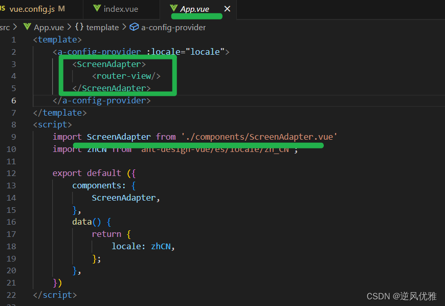
<template>

        <ScreenAdapter>
            <router-view/>
        </ScreenAdapter>

</template>
<script>
    import ScreenAdapter from './components/ScreenAdapter.vue'


    export default ({
        components: {
            ScreenAdapter,
        },

    })
</script>


 扫一扫
扫一扫


 被折叠的 条评论
为什么被折叠?
被折叠的 条评论
为什么被折叠?
 到【灌水乐园】发言


