<template>
<div class="circle">
<svg viewBox="0 0 100 100">
<path d="M 50 50 m -50 0 a 50 50 0 1 1 100 0 a 50 50 0 1 1 -100 0 z" id="circle" />
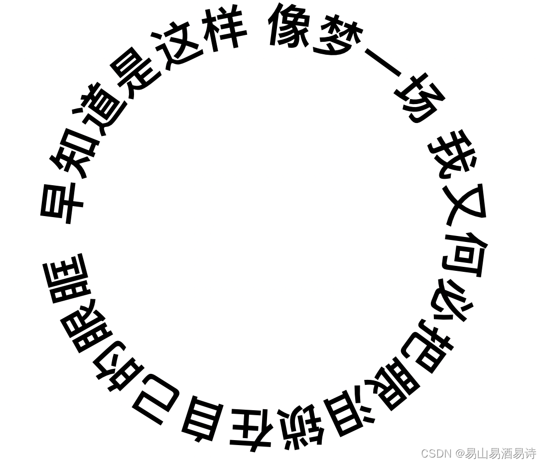
<text><textPath xlink:href="#circle">早知道是这样 像梦一场 我又何必把眼泪锁在自己的眼眶 </textPath></text>
</svg>
</div>
</template>
<script>
export default {
mounted() {},
methods: {},
};
</script>
<style>
body {
background: none;
font: bold 78% Helvetica, sans-serif;
}
.circle {
width: 30em;
height: 30em;
margin: 4em auto 0;
}
.circle svg {
display: block;
overflow: visible;
transition: 10s;
}
.circle svg:hover {
transform: rotate(-2turn);
}
.circle path {
fill: none;
}
</style>


 305
305


 被折叠的 条评论
为什么被折叠?
被折叠的 条评论
为什么被折叠?
 到【灌水乐园】发言


