功能实现:
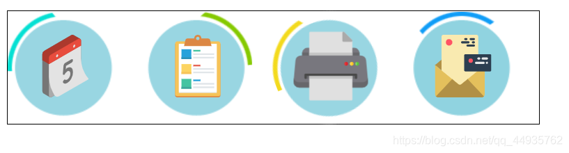
示例图片
代码:
<!DOCTYPE html>
<html lang="en">
<head>
<meta charset="UTF-8">
<meta http-equiv="X-UA-Compatible" content="IE=edge">
<meta name="viewport" content="width=device-width, initial-scale=1.0">
<title>过渡效果实战2</title>
<style>
* {
margin: 0;
padding: 0;
}
.box {
width: 508px;
height: 107px;
border: 1px solid black;
margin: 40px auto;
}
.box ul {
list-style: none;
}
.box ul li {
float: left;
width: 107px;
height: 107px;
margin-right: 20px;
position: relative;
}
.box ul li::before {
content: "";
display: block;
width: 107px;
height: 107px;
transform: rotate(0);
transition: transform 1s ease 0s;
}
.box ul li:nth-child(1)::before {
background-image: url(../images/a_1.png);
}
.box ul li:nth-child(2)::before {
background-image: url(../images/a_2.png);
}
.box ul li:nth-child(3)::before {
background-image: url(../images/a_3.png);
}
.box ul li:nth-child(4)::before {
background-image: url(../images/a_4.png);
}
.box ul li img {
position: absolute;
width: 60px;
height: 60px;
margin-top: -85px;
margin-left: 25px;
transition:transform 1s ease 0s ;
}
.box ul li:hover::before {
transform: rotate(360deg);
}
.box ul li:hover img {
transform: scale(1.2);
}
</style>
</head>
<body>
<div class="box">
<ul>
<li><img src="../images/icon1.svg"></li>
<li><img src="../images/icon2.svg"></li>
<li><img src="../images/icon3.svg"></li>
<li><img src="../images/icon4.svg"></li>
</ul>
</div>
</body>
</html>


 7032
7032


 被折叠的 条评论
为什么被折叠?
被折叠的 条评论
为什么被折叠?
 到【灌水乐园】发言


