


子组件完整代码:
<template>
  <div style="position: relative">
    <div @click="clickTable" ref="Getclick">
      <q-btn outline color="white" text-color="black" class="collect_icon"
        ><i class="material-icons Down_icon" style="font-size:20px">{{
          showOptions ? "arrow_drop_up" : "arrow_drop_down"
        }}</i></q-btn
      >
      <div class="my-table" v-if="showOptions" style="position: absolute; top: 32px">
        <q-table
          :data="data"
          :columns="columns"
          row-key="name"
          @row-click.stop="handleRowClick"
        />
      </div>
    </div>
    <div class="q-pa-md" style="position: absolute; top: 0">
      <div class="row">
        <!-- clearable -->
        <q-select
          outlined
          :disable="Whether"
          :value="model"
          use-input
          hide-selected
          fill-input
          input-debounce="0"
          :options="options"
          @filter="filterFn"
          @input-value="setModel"
          @focus="showOptions = false"
        >
          <template v-slot:no-option>
            <q-item>
              <q-item-section class="text-grey"> 暂无数据 </q-item-section>
            </q-item>
          </template>
          <template v-slot:append>
            <q-icon
              v-if="model !== null"
              style="margin-top: 5px; float: right"
              class="cursor-pointer"
              name="clear"
              @click.stop="model = null"
            />
          </template>
        </q-select>
      </div>
    </div>
  </div>
</template>
<script>
const stringOptions = ["Google", "Facebook"].reduce((acc, opt) => {
  for (let i = 1; i <= 5; i++) {
    acc.push(opt + " " + i);
  }
  return acc;
}, []);
export default {
  props: {
    value: {
      type: String,
      default: null,
    },
    columns: {
      type: Array,
      required: true,
    },
    Whether: {
      type: Boolean,
      required: false,
      default: false,
    },
  },
  data() {
    return {
      showOptions: false,

      data: [
        {
          name: "Gingerbread",
          calories: 356,
          fat: 16.0,
          carbs: 49,
          protein: 3.9,
          sodium: 327,
          calcium: "7%",
          iron: "16%",
        },

        {
          name: "Lollipop",
          calories: 392,
          fat: 0.2,
          carbs: 98,
          protein: 0,
          sodium: 38,
          calcium: "0%",
          iron: "2%",
        },
      ],
      Showor: false,
      model: null,
      options: stringOptions,
    };
  },
  watch: {
    value(newValue) {
      this.model = newValue;
    },
    model(newModel) {
      this.$emit("input", newModel);
    },
  },
  mounted() {
    document.addEventListener(
      "click",
      (e) => {
        let variable = this.$refs.Getclick;
        if (!variable?.contains(e.target)) {
          this.showOptions = false;
        }
      },
      true
    );
  },
  methods: {
    clickTable() {
      this.showOptions = !this.showOptions;
    },
    handleRowClick(row, column, event) {
      console.log(column, ">>");
      this.model = column.name;
      this.showOptions = false
    },
    filterFn(val, update, abort) {
      update(() => {
        const needle = val.toLocaleLowerCase();
        this.options = stringOptions.filter(
          (v) => v.toLocaleLowerCase().indexOf(needle) > -1
        );
      });
    },
    setModel(val) {
      this.model = val;
    },
  },
};
</script>
<style lang="scss" scoped>
.collect_icon {
  position: absolute;
  z-index: 99;
  top: 0;
  height: 32px;
  width: 30px;
}
::v-deep .q-field--outlined .q-field__control {
  padding: 0 0 0 35px;
  width: 150px;
}
::v-deep .q-select__dropdown-icon {
  display: none;
}
::v-deep .q-btn__wrapper {
  padding: 4px;
}
::v-deep .q-field__marginal {
  height: 32px;
}
::v-deep .q-field--auto-height .q-field__native {
  min-height: 16px;
  height: 32px;
}
::v-deep .q-field--auto-height .q-field__control,
.q-field--auto-height .q-field__native {
  min-height: 16px;
  height: 32px;
}
.q-btn {
  padding: 0;
}
.my-table {
  position: absolute;
  z-index: 999;
  width: 400px;
}
.my-table th {
  background-color: #fafafa;
}
.my-table td,
.my-table th {
  color: #000;
  text-align: center;
  border: 1px solid #e8e8e8;
}
::v-deep .q-field__append {
  padding-left: 0;
}
::v-deep .q-pa-md {
  padding: 0;
}
</style>
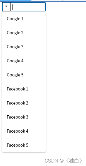
效果图:


 224
224


 被折叠的 条评论
为什么被折叠?
被折叠的 条评论
为什么被折叠?
 到【灌水乐园】发言


