


1、不允许选择文本
user-select: none;
2、一行代码即可将页面置于灰色模式。
filter: grayscale(1);
3、响应式图片
img {
max-width: 100%;
height: auto;
}
4、全屏背景图像
.bg {
background-image: url('background.jpg');
background-size: cover;
background-position: center;
height: 100vh;
}
5、向图像添加覆盖
.bg {
position: relative;
}
.bg::after {
content: '';
position: absolute;
top: 0;
left: 0;
width: 100%;
height: 100%;
background-color: rgba(0, 0, 0, 0.5); /* black with 50% opacity */
}
6、确保图像适合其容器而不会变形 :使用“object-fit”。
.fit-image {
width: 100%;
height: 200px;
object-fit: cover; /* or contain, fill, etc. */
}
7、更改内联 SVG 的颜色:使用 currentColor
.icon {
fill: currentColor;
}
.icon-container {
color: #ff6347;
}
8、创建旋转了90°的四边形:使用“clip-path”
.clip-path {
clip-path: polygon(50% 0%, 100% 50%, 50% 100%, 0% 50%);
background-color: #3498db;
width: 200px;
height: 200px;
}
9、改进视频演示
(1)poster属性可以与 < video > 元素一起使用来显示图像,直到用户播放视频。
(2)preload 属性可加快视频文件的加载速度,实现更流畅的播放。
<video controls poster="image.png" width="500" preload="auto">
  <source src="video.mp4" type="video/mp4 />
</video>
10、将文本显示为下标和上标
H<sub>2</sub>O<sup>2</sup>
展示: H2O2
11、创建下载链接
使用带有 < a > 元素的 download 属性来指定当用户单击链接时,应下载而不是导航到链接的资源。
<a href="document.pdf" download="document.pdf"> Download PDF </a>
12、自定义样式属性(变量)
可以定义和使用自定义属性,以更轻松地设置主题和维护。
:root{
    --main-color: #3498db;
  }

  h1{
    color: var(--main-color);
  }
13、占位符文本样式
设置输入字段内占位符文本的样式。
::placeholder {
   color: #999;
   font-style: italic;
}
14、vw 可变字体大小
根据视口宽度调整字体大小,从而实现更具响应性的排版。
body {
   font-size: calc(16px + 1vw);
}
15、~波浪号合并兄弟姐妹
选择 < h2> 后面的所有兄弟元素 < p > 元素。
h2 ~ p{
    color: blue;
  }
16、选择偶数和奇数元素
使用 :nth-child 伪类设置替代元素的样式。
li:nth-child(even) {
    background-color: #f2f2f2;
}

li:nth-child(odd) {
    background-color: #e6e6e6;
}
17、CSS :is() 选择器
使用 :is() 伪类简化复杂的选择器。
:is(h1, h2, h3) {
    color: blue;
}
18、首字母大写字母
使用initial-letter 设置块级元素的第一个字母的样式。
p::first-letter {
  font-size: 2em;
}
19、仅使用CSS去除图像的背景

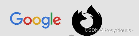
我们可以使用 mix-blend-mode CSS 属性。在本例中是一个 img 元素。该属性具有以下值:
normal, multiply, screen, overlay, darken, lighten,
color-dodge, color-burn, difference, exclusion, hue, saturation, color, luminosity.
(1)彩色图像中删除白色背景
.blend-multiply{
  mix-blend-mode:multiply;
}
(2)黑色图像中删除白色背景
.burn-color{
  mix-blend-mode:color-burn;
}
最终结果如下所示
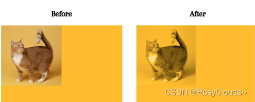
(3)设置元素内容与其背景的混合
<div>
  <img src="cat.jpg" alt="cat" />
</div>
// css样式
div {
  width: 600px;
  height: 400px;
  background-color: rgb(255, 187, 0);
}
img {
  width: 300px;
  height: 300px;
  mix-blend-mode: luminosity;
}
20、仅在需要的地方 向 PNG 添加阴影
要向元素添加阴影,我们通常使用 CSS 属性 box-shadow。
img {
  width: 250px;
  box-shadow: 15px 15px 15px #555;
}
向 PNG 中的实际图像部分添加阴影,而不包括透明背景。
img {
  width: 250px;
  filter: drop-shadow(15px 15px 15px #555)
}
21、使用CSS翻转图像
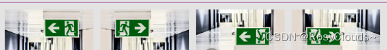
img:nth-of-type(2) {
  transform: scaleX(-1); /* flip verticlally */
}

img:nth-of-type(3) {
  transform: scaleY(-1); /* flip horizontaly */
}

img:nth-of-type(4) {
  transform: scale(-1); /* flip in both verticlally and horizontaly */
}
也可以使用 CSS 中的rotate() 属性将图像旋转到任意角度
img {
  transform: rotate(45deg);
}
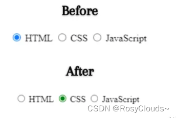
22、当涉及到复选框和单选按钮等输入时,accent-color可自定义颜色属性来更改输入的默认颜色
<form>
   <input type="radio" id="html" />
   <label for="html">HTML</label>
   <input type="radio" id="css" />
   <label for="css">CSS</label>
   <input type="radio" id="js" />
   <label for="js">JavaScript</label>
</form>

// css 样式
input {
  accent-color: green;
}
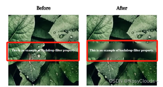
23、background-filter属性,可对元素后面的区域应用滤镜效果(模糊效果)
<div class="container">
  <div class="box">
     <p>This is an example of backdrop-filter property.</p>
  </div>
</div>

// css 样式
.container {
  display: flex;
  align-items: center;
  justify-content: center;
  height: 350px;
  width: 350px;
  background: url(img.webp) no-repeat center;
}
.box {
  padding: 10px;
  font-weight: bold;
  color: white;
  background-color: transparent;
  backdrop-filter: blur(10px);
}
24、处理定位时,可以使用 inset 属性,而不是使用 top、right、bottom、left 属性。
div {
  position: absolute;
  top: 20px;
  right: 25px;
  left: 16px;
  bottom: 23px;
}

/*You can write the above property as*/
div {
  position: absolute;
  inset: 20px 25px 16px 23px;
}
25、HTML 中“iframe”标签可嵌入外部内容,例如网页或视频
<iframe src="https://www.example.com" width="500" height="300"></iframe>
26、解决图片底部多余5px间距问题
方案一:更改其父元素的font-size:0px
方案二:增加img display:block的样式
方案三:增加img的样式vertical-align:bottom
方案四:增加父元素的样式line-height:5px


 326
326

 被折叠的 条评论
为什么被折叠?
被折叠的 条评论
为什么被折叠?
 到【灌水乐园】发言


