


在页面中实现自定义头部导航的组件,如果仅是单个页面中需要自定义可在页面的json文件中配置"navigationStyle": “custom”,如果是项目中所有页面都想使用自定义的组件,可在app.json的window中全局配置"navigationStyle": “custom”。
先分析头部导航的组成,可参考图1
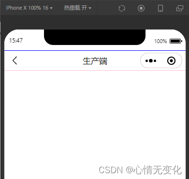
其组成主要包含两部分:状态栏、导航区域,下面分别说说这两部分的高度如何获取。
1、获取状态栏高度
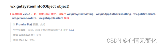
对于不同的机型而言,状态栏的高度是有所差异的,可通过wx.getSystemInfo来获取,但需要注意的是该接口在基础库2.20.1后就停止维护,需要改用wx.getWindowInfo获取。
(1)使用wx.getSystemInfo获取示例代码
wx.getSystemInfo({
    success: (res) => {
        this.setData({
            statusBarHeight: res.statusBarHeight
        })
    }
})
(2)使用wx.getWindowInfo示例代码
 constres = wx.getWindowInfo()
 this.setData({
   statusBarHeight: res.statusBarHeight
 })
2、导航区域高度
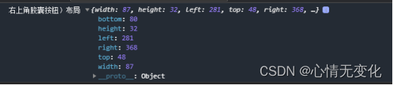
(1)导航区域的高度可自己定义,但考虑到右侧胶囊,为使得标题位置垂直居中,因而导航区域的高度实际也需要计算得出。其公式为:导航区域的高度 = 胶囊的高度 + 胶囊距离状态栏的高度 * 2。
// 获取菜单按钮(右上角胶囊按钮)的布局位置信息。坐标信息以屏幕左上角为原点。
const rect = wx.getMenuButtonBoundingClientRect()
console.log('右上角胶囊按钮)布局', rect);
// 获取菜单按钮(右上角胶囊按钮)的布局位置信息。坐标信息以屏幕左上角为原点。
const rect = wx.getMenuButtonBoundingClientRect()
console.log('右上角胶囊按钮)布局', rect);
wx.getSystemInfo({
  success: (res) => {
    this.setData({
      navBarHeight: rect.bottom - rect.top + (rect.top - res.statusBarHeight) * 2,
	// navBarHeight: rect.height + (rect.top - res.statusBarHeight) * 2,
    })
  }
})
(2)考虑到胶囊位置,因而导航栏区域可自定义的宽度需减去胶囊的宽度,使用padding-right的方式占用胶囊的宽,注意需要设置为box-sizing: border-box,懂得都懂。

// 获取菜单按钮(右上角胶囊按钮)的布局位置信息。坐标信息以屏幕左上角为原点。
 const rect = wx.getMenuButtonBoundingClientRect()
 console.log('右上角胶囊按钮)布局', rect);
 wx.getSystemInfo({
   success: (res) => {
     this.setData({
       innerPaddingRight: `padding-right:${res.windowWidth - rect.left}px`,
     })
   }
 })
(3)剩余的宽度你就可以自由发挥了。
以下是组件参考代码
index.xml
<view class="weui-navigation-bar {{extClass}}">
  <view class="status-bar" style="height: {{statusBarHeight}}px; color: {{color}}; background: {{background}}"></view>
  <view class="weui-navigation-bar__inner" style="height: {{navBarHeight}}px; color: {{color}}; background: {{background}}; {{displayStyle}}; {{innerPaddingRight}}">
    <view class='weui-navigation-bar__left' style="{{leftWidth}}">
      <block wx:if="{{back}}">
        <view class="navigation-bar__buttons" bindtap="back">
          <view class="navigation-bar__button navigation-bar__btn_goback" hover-class="active"></view>
        </view>
      </block>
      <block wx:else>
        <slot name="left"></slot>
      </block>
    </view>

    <view class='weui-navigation-bar__center'>
      <view wx:if="{{loading}}" class="weui-navigation-bar__loading" aria-role="alert">
        <view class="weui-loading" style="width:{{size.width}}rpx;height:{{size.height}}rpx;" aria-role="img" aria-label="加载中"></view>
      </view>
      <block wx:if="{{title}}">
        <text>{{title}}</text>
      </block>
      <block wx:else>
        <slot name="center"></slot>
      </block>
    </view>
    <view class='weui-navigation-bar__right'>
      <slot name="right"></slot>
    </view>
  </view>
</view>
index.wxss
.weui-navigation-bar {
  overflow: hidden;
  color: rgba(0, 0, 0, .9);
  width: 100vw;
}
.status-bar{
  width: 100%;
}
.weui-navigation-bar__placeholder {
  background: #f7f7f7;
  position: relative;
}
.weui-navigation-bar__inner, .weui-navigation-bar__inner .weui-navigation-bar__left {
  display: flex;
  align-items: center;
  flex-direction: row;
}
.weui-navigation-bar__inner {
  position: relative;
  padding-right: 95px;
  width: 100vw;
  box-sizing: border-box;
  padding-top: env(safe-area-inset-top);
}
.weui-navigation-bar__inner .weui-navigation-bar__left {
  position: relative;
  width: 95px;
  padding-left: 16px;
  box-sizing: border-box;
}
.weui-navigation-bar__btn_goback_wrapper {
  padding: 11px 18px 11px 16px;
  margin: -11px -18px -11px -16px;
}
.weui-navigation-bar__inner .weui-navigation-bar__left .navigation-bar__btn_goback {
  font-size: 12px;
  width: 12px;
  height: 24px;
  background: url("data:image/svg+xml;charset=utf8,%3Csvg xmlns='http://www.w3.org/2000/svg' width='12' height='24' viewBox='0 0 12 24'%3E %3Cpath fill-opacity='.9' fill-rule='evenodd' d='M10 19.438L8.955 20.5l-7.666-7.79a1.02 1.02 0 0 1 0-1.42L8.955 3.5 10 4.563 2.682 12 10 19.438z'/%3E%3C/svg%3E") no-repeat 50% 50%;
  background-size: cover;
}
.weui-navigation-bar__inner .weui-navigation-bar__center {
  font-size: 17px;
  text-align: center;
  position: relative;
  flex: 1;
  display: flex;
  flex-direction: column;
  align-items: center;
  justify-content: center;
  font-weight: bold;
}
@media(prefers-color-scheme: dark) {
  .weui-navigation-bar {
    color: hsla(0, 0%, 100%, .8);
  }
  .weui-navigation-bar__inner {
    background-color: #1f1f1f;
  }
}
index.js
Component({
    options: {
      multipleSlots: true // 在组件定义时的选项中启用多slot支持
    },
    /**
     * 组件的属性列表
     */
    properties: {
      extClass: {
        type: String,
        value: ''
      },
      title: {
        type: String,
        value: ''
      },
      background: {
        type: String,
        value: '#fff'
      },
      color: {
        type: String,
        value: '#000'
      },
      back: {
        type: Boolean,
        value: true
      },
      loading: {
        type: Boolean,
        value: false
      },
      animated: {
        // 显示隐藏的时候opacity动画效果
        type: Boolean,
        value: true
      },
      show: {
        // 显示隐藏导航,隐藏的时候navigation-bar的高度占位还在
        type: Boolean,
        value: true,
        observer: '_showChange'
      },
      // back为true的时候,返回的页面深度
      delta: {
        type: Number,
        value: 1
      }
    },
    /**
     * 组件的初始数据
     */
    data: {
      displayStyle: '',
      statusBarHeight: 20
    },
    attached() {
      // 获取菜单按钮(右上角胶囊按钮)的布局位置信息。坐标信息以屏幕左上角为原点。
      const rect = wx.getMenuButtonBoundingClientRect()
      // console.log('右上角胶囊按钮)布局', rect);
      wx.getSystemInfo({
        success: (res) => {
          this.setData({
            innerPaddingRight: `padding-right:${res.windowWidth - rect.left}px`,
            leftWidth: `width:${res.windowWidth - rect.left}px`,
            // navBarHeight: rect.bottom + rect.top  - res.statusBarHeight,  //84px
            navBarHeight: rect.bottom - rect.top + (rect.top - res.statusBarHeight) * 2, //40px
            statusBarHeight: res.statusBarHeight //44px
          })
        }
      })
    },
    /**
     * 组件的方法列表
     */
    methods: {
      _showChange(show) {
        const animated = this.data.animated
        let displayStyle = ''
        if (animated) {
          displayStyle = `opacity: ${show ? '1' : '0'};transition: opacity 0.5s;`
        } else {
          displayStyle = `display: ${show ? '' : 'none'}`
        }
        this.setData({
          displayStyle
        })
      },
      back() {
        const data = this.data
        if (data.delta) {
          wx.navigateBack({
            delta: data.delta
          })
        }
        this.triggerEvent('back', { delta: data.delta }, {})
      }
    }
  })
index.json
{
  "component": true,
  "usingComponents": {}
}
在页面中使用该组件
page.json
{
  "usingComponents": {
    "zxm-navigation-bar": "/components/zxm-navigation-bar" //该成你所放组件的路径哟
  },
  "navigationStyle": "custom",
  "disableScroll": true
}
page.wxml
<view>
  <zxm-navigation-bar title="标题"></zxm-navigation-bar>
</view>
代码也可前往这里下载


 5964
5964


 被折叠的 条评论
为什么被折叠?
被折叠的 条评论
为什么被折叠?
 到【灌水乐园】发言


