<!DOCTYPE html>
<html lang="en">
<head>
<meta charset="UTF-8" />
<title>旋转的星球</title>
<style type="text/css">
.box {
position: absolute;
width: 139px;
height: 139px;
border: 1px solid #348DE8;
border-radius: 50%;
top: 0;
bottom: 0;
left: 0;
right: 0;
margin: auto;
}
.sunline {
height: 93px;
width: 93px;
border-radius: 50%;
background-image: linear-gradient(180deg, rgba(109, 158, 254, 0.1) 0%, rgba(3, 94, 240, 0.1) 100%);
background-clip: border-box;
padding-top: 19px;
padding-right: 19px;
padding-bottom: 19px;
padding-left: 19px;
position: absolute;
top: 0;
bottom: 0;
left: 0;
right: 0;
margin: auto;
}
.earthline1 {
position: absolute;
right: 0;
top: 50%;
width: 139px;
height: 139px;
margin: -69.5px -0px 0 0;
border-radius: 50%;
transform: rotate(125deg);
display: flex;
}
.earthline2 {
position: absolute;
right: 0;
top: 50%;
width: 139px;
height: 139px;
margin: -69.5px -0px 0 0;
border: 1px solid rgb(52 141 232 / 0%);
border-radius: 50%;
transform: rotate(230deg);
display: flex;
}
.earthline3 {
position: absolute;
right: 0;
top: 50%;
width: 139px;
height: 139px;
margin: -69.5px -0px 0 0;
border: 1px solid rgb(52 141 232 / 0%);
border-radius: 50%;
transform: rotate(340deg);
display: flex;
}
.sun {
width: 93.6px;
height: 93.26px;
margin: auto;
font-size: 14px;
font-weight: bold;
line-height: 93.26px;
text-align: center;
color: #FFFFFF;
background: linear-gradient(180deg, #6D9EFE 0%, #035EF0 100%);
border-radius: 50%;
}
.box .moon2 {
position: absolute;
left: 0;
top: 50%;
width: 6px;
height: 6px;
margin: -3px 0 0 -3px;
background: linear-gradient(180deg, #6D9EFE 0%, #035EF0 100%);
border-radius: 50%;
}
.box .moon1 {
position: absolute;
left: 0;
top: 50%;
width: 6px;
height: 6px;
margin: -3px 0 0 -3px;
background: linear-gradient(180deg, #6D9EFE 0%, #035EF0 100%);
border-radius: 50%;
}
.box .moon {
position: absolute;
left: 0;
top: 50%;
width: 6px;
height: 6px;
margin: -3px 0 0 -3px;
background: linear-gradient(180deg, #6D9EFE 0%, #035EF0 100%);
border-radius: 50%;
}
.max-box{
width:218px;
height:218px;
border:6px solid #E9F1FE;
border-radius:50%;
position: relative;
}
.wmd1{
position: absolute;
right: 0;
top: 50%;
width:218px;
height:218px;
margin: -109px -0px 0 0;
border-radius: 50%;
transform: rotate(230deg);
display: flex;
}
.wmd2{
position: absolute;
right: 0;
top: 50%;
width:218px;
height:218px;
margin: -109px -0px 0 0;
border-radius: 50%;
transform: rotate(340deg);
display: flex;
}
.wmd3{
position: absolute;
right: 0;
top: 50%;
width:218px;
height:218px;
margin: -109px -0px 0 0;
border-radius: 50%;
transform: rotate(125deg);
display: flex;
}
.wmd1 .child{
position: absolute;
left: 0;
top: 50%;
width: 63px;
height: 63px;
margin: -31.5px 0 0 -31.5px;
background: #E6EFFE;
border-radius: 50%;
text-align:center;
}
.wmd2 .child{
position: absolute;
left: 0;
top: 50%;
width: 63px;
height: 63px;
margin: -31.5px 0 0 -31.5px;
background: #E6EFFE;
border-radius: 50%;
text-align:center;
}
.wmd3 .child{
position: absolute;
left: 0;
top: 50%;
width: 63px;
height: 63px;
margin: -31.5px 0 0 -31.5px;
background: #E6EFFE;
border-radius: 50%;
text-align:center;
}
.child-count{
font-size: 14px;
color: #6386F2;
}
.child-name{
font-size: 14px;
font-weight: bold;
color: #6386F2;
}
.item-child{
display: flex;
flex-direction: column;
align-items: center;
justify-content: center;
width: 63px;
height: 63px;
}
.wmd1 .item-child{
transform: rotate(131deg);
}
.wmd2 .item-child{
transform: rotate(19deg);
}
.wmd3 .item-child{
transform: rotate(235deg);
}
@keyframes rotate {
100% {
transform: rotate(360deg);
}
}
</style>
</head>
<body>
<div class="max-box">
<div class="box">
<div class="sunline">
<div class="sun">
海关缉私局
</div>
</div>
<div class="earthline1">
<div class="moon"></div>
</div>
<div class="earthline2">
<div class="moon1"></div>
</div>
<div class="earthline3">
<div class="moon2"></div>
</div>
</div>
<div class="wmd1">
<div class="child">
<div class="item-child">
<div class="child-name">
检察院
</div>
<div class="child-count">
3456
</div>
</div>
</div>
</div>
<div class="wmd2">
<div class="child">
<div class="item-child">
<div class="child-name">
检察院
</div>
<div class="child-count">
3456
</div>
</div>
</div>
</div>
<div class="wmd3">
<div class="child">
<div class="item-child">
<div class="child-name">
检察院
</div>
<div class="child-count">
3456
</div>
</div>
</div>
</div>
</div>
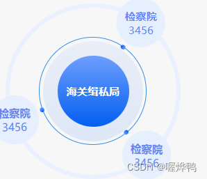
<strong>【简要介绍】</strong>
<p>旋转的星球主要通过rotate()旋转函数来实现。实际上,蓝色的地球和黑色的月球并没有发生旋转,只是其父级旋转形成的视觉上的旋转效果</p>
</body>
</html>
<!DOCTYPE html>
<html lang="en">
<head>
<meta charset="UTF-8">
<title>旋转的星球</title>
<style type="text/css">
.box {
transform: scale(0.5);
position: relative;
padding: 1px;
height: 300px;
width: 300px;
}
.sunline {
position: relative;
height: 400px;
width: 400px;
border: 2px solid black;
border-radius: 50%;
margin: 50px 0 0 50px;
display: flex;
}
.earthline1{position: absolute;
right: 0;
top: 50%;
height: 200px;
width: 200px;
margin: -100px -100px 0 0;
border: 1px solid black;
border-radius: 50%;
transform: rotate(145deg);
display: flex;}
.earthline2{position: absolute;
right: 0;
top: 50%;
height: 200px;
width: 200px;
margin: -100px -100px 0 0;
border: 1px solid black;
border-radius: 50%;
transform: rotate(245deg);
display: flex;}
.sun {
height: 100px;
width: 100px;
margin: auto;
background-color: red;
border-radius: 50%;
box-shadow: 5px 5px 10px red, -5px -5px 10px red, 5px -5px 10px red, -5px 5px 10px red;
}
.earthline {
position: absolute;
right: 0;
top: 50%;
height: 200px;
width: 200px;
margin: -100px -100px 0 0;
border: 1px solid black;
border-radius: 50%;
display: flex;
}
.earthline .earth {
margin: auto;
height: 50px;
width: 50px;
background-color: blue;
border-radius: 50%;
}
.earthline .moon {
position: absolute;
left: 0;
top: 50%;
height: 20px;
width: 20px;
margin: -10px 0 0 -10px;
background-color: black;
border-radius: 50%;
}
.earthline1 .earth {
margin: auto;
height: 50px;
width: 50px;
background-color: blue;
border-radius: 50%;
}
.earthline1 .moon {
position: absolute;
left: 0;
top: 50%;
height: 20px;
width: 20px;
margin: -10px 0 0 -10px;
background-color: black;
border-radius: 50%;
}
.earthline2 .earth {
margin: auto;
height: 50px;
width: 50px;
background-color: blue;
border-radius: 50%;
}
.earthline2 .moon {
position: absolute;
left: 0;
top: 50%;
height: 20px;
width: 20px;
margin: -10px 0 0 -10px;
background-color: black;
border-radius: 50%;
}
@keyframes rotate {
100% {
transform: rotate(360deg);
}
}
</style>
</head>
<body>
<div class="box">
<div class="sunline">
<div class="sun"></div>
<div class="earthline">
<div class="earth"></div>
<div class="moon"></div>
</div>
<div class="earthline1">
<div class="earth"></div>
<div class="moon"></div>
</div>
<div class="earthline2">
<div class="earth"></div>
<div class="moon"></div>
</div>
</div>
</div>
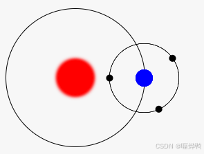
<strong>【简要介绍】</strong>
<p>旋转的星球主要通过rotate()旋转函数来实现。实际上,蓝色的地球和黑色的月球并没有发生旋转,只是其父级旋转形成的视觉上的旋转效果</p>
</body>
</html>


 1987
1987

 被折叠的 条评论
为什么被折叠?
被折叠的 条评论
为什么被折叠?
 到【灌水乐园】发言


