


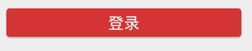
未点击前:
点击后:
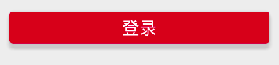
可以看出点击后,颜色变得更加高亮了(你也可以设置为别的颜色,效果更加明显)
由于我们很多按钮都需要这种样式,所以我们把这种按钮的样式放在styles.xml中,方便重复使用
第一步:在res/drawable文件夹下定义两种不同状态下的按钮的形状
在文件夹上鼠标右键—>new drawable resource file—>RootElement选择Shape

btn_n.xml
<?xml version="1.0" encoding="utf-8"?>
<shape xmlns:android="http://schemas.android.com/apk/res/android"
    android:shape="rectangle">
    <!--设置整个按钮颜色-->
    <solid android:color="#D43433"></solid>
    <!--设置边角弧度-->
    <corners android:radius="4dp"></corners>
</shape>
btn_h.xml
<?xml version="1.0" encoding="utf-8"?>
<shape xmlns:android="http://schemas.android.com/apk/res/android"
    android:shape="rectangle">
    <solid android:color="#C80F1F"></solid>
    <corners android:radius="4dp"></corners>
</shape>
这两个xml主要的不同就在于btn_h.xml的color更高亮一点
第二步:在res/drawable文件夹下定义selector,来确定在哪些状态下使用什么drawable
在文件夹上鼠标右键—>new drawable resource file—>RootElement选择Selector
btn_selector.xml
<?xml version="1.0" encoding="utf-8"?>
<selector xmlns:android="http://schemas.android.com/apk/res/android">
    <!--View高亮状态-->
    <!--
         state_focused:如果在对象具有输入焦点(例如当用户选择文本输入时)时应使用此项目
         state_pressed:如果在按下对象(例如触摸/点按某按钮)时应使用此项目
         state_selected:如果在使用定向控件浏览(例如使用方向键浏览列表)的情况下,对象为当前用户选择时应使用此项目
    -->
    state_pressed:
    <item android:drawable="@drawable/btn_h" android:state_focused="true"></item>
    <item android:drawable="@drawable/btn_h" android:state_pressed="true"></item>
    <item android:drawable="@drawable/btn_h" android:state_selected="true"></item>
    <!--View普通状态-->
    <item android:drawable="@drawable/btn_n"></item>
</selector>
第三步:在values/styles.xml中定义按钮具体的样式,并将backgroud设置为我们上一步定义的selector
styles.xml
 <!--自定义按钮-->
    <style name="btn_submit">
        <item name="android:layout_width">match_parent</item>
        <item name="android:layout_height">@dimen/btnHeight</item>
        <item name="android:textColor">@android:color/white</item>
        <item name="android:textSize">@dimen/textSize</item>
        <item name="android:gravity">center</item>
        <item name="android:layout_marginLeft">@dimen/marginSize</item>
        <item name="android:layout_marginRight">@dimen/marginSize</item>
        <item name="android:background">@drawable/btn_selector</item>
    </style>
第四步:在layout文件中通过style调用就行了
    <Button
        style="@style/btn_submit"
        android:layout_marginTop="@dimen/marginSize"
        android:text="登 录" />


 470
470


 被折叠的 条评论
为什么被折叠?
被折叠的 条评论
为什么被折叠?
 到【灌水乐园】发言


