


 该文章介绍了如何结合CSS的锥形渐变和SVG元素来创建环形进度条,包括设置圆弧效果、渐变颜色和动态进度更新。通过调整SVG的stroke-dasharray、stroke-dashoffset和stroke-linecap属性,可以实现不同样式的效果。同时,利用JavaScript处理组件的尺寸变化和动画效果。
css锥形渐变结合SVG实现环形进度条
准备:
-
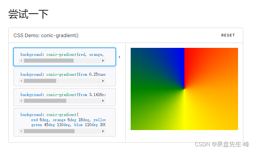
锥形渐变
MDN:https://developer.mozilla.org/zh-CN/docs/Web/CSS/gradient/conic-gradient
-
mask(遮罩)
mask 允许使用者通过遮罩或者裁切特定区域的图片的方式来隐藏一个元素的部分或者全部可见区域。
MDN:https://developer.mozilla.org/zh-CN/docs/Web/CSS/mask -
SVG使用
这里自定义SVG是为了做进度条的圆弧效果,如果不要圆弧效果只通过锥形渐变加遮罩也能实现环形进度,但是结合svg后修改变量stroke-linecap的值两种效果都可以实现
效果如下:

<svg xmlns="http://www.w3.org/2000/svg" width="100%" height="100%">
      <circle
        id="circle"
        cx="160"
        cy="160"
        r="150"
        stroke="green"
        stroke-dasharray="942"
        stroke-linecap="round"
        stroke-dashoffset="80"
        stroke-width="20"
        fill="transparent"
        transform="rotate(-90, 160, 160)"
      ></circle>
</svg>
demo
JS:
import { useEffect, useRef, useState } from 'react';
import styles from './index.less';
interface RingGradientChartParams {
  barWidth?: number; // 圆弧宽度
  percent?: number; // 百分比占比 注意范围(0-100)
  colorSteps?: string[]; // 柱条渐变颜色
  backgroundColor?: string; // 背景色
}

const IndexPage: React.FC<RingGradientChartParams> = (
  props: RingGradientChartParams,
) => {
  const {
    barWidth = 10,
    percent = 0,
    colorSteps = ['rgba(0, 216, 249, 0)', 'rgba(0, 216, 249, 1)'],
    backgroundColor = 'rgba(0, 216, 249, 0.3)',
  } = props;

  const chartRef = useRef<HTMLDivElement>(null);
  const [svgUrl, setSvgUrl] = useState<string>(); // 转为base64
  const [svgString, setSvgString] = useState<string>('');  // svg字符串
  const [boxSize, setBoxSize] = useState<number>(200); // 盒子尺寸

  useEffect(() => {
    const resizeObserver = new ResizeObserver((entries) => {
      for (const entry of entries) {
        if (entry.contentBoxSize) {
          // Firefox implements `contentBoxSize` as a single content rect, rather than an array
          const contentBoxSize = Array.isArray(entry.contentBoxSize)
            ? entry.contentBoxSize[0]
            : entry.contentBoxSize;
          const { inlineSize, blockSize } = contentBoxSize;
          // 取最小值
          setBoxSize(Math.min(inlineSize, blockSize));
        }
      }
    });
    if (chartRef.current) {
      resizeObserver.observe(chartRef.current);
    }
  }, []);

  useEffect(() => {
    // 实际占比
    const proportion = percent < 0 ? 0 : percent > 100 ? 100 : percent;

    // 半径
    const radius = boxSize / 2 - barWidth / 2;

    // 旋转角度
    // const rotate =
    //   Math.asin(barWidth / 2 / (2 * (radius - barWidth / 2))) * (180 / Math.PI);

    const svgStr = `
      <svg xmlns="http://www.w3.org/2000/svg" width="${boxSize}" height="${boxSize}">
        <circle
            id="circle"
            cx="${boxSize / 2}"
            cy="${boxSize / 2}"
            r="${radius}"
            stroke="green"
            stroke-dasharray="${2 * Math.PI * radius}"
            stroke-linecap="round"
            stroke-dashoffset="${2 * Math.PI * radius * (1 - proportion / 100)}"
            stroke-width="${barWidth}"
            fill="transparent"
            transform="rotate(${-90}, ${boxSize / 2}, ${boxSize / 2})"
        >
        <animate
            attributeType="XML"
            attributeName="stroke-dashoffset"
            from="${2 * Math.PI * radius}"
            to="${2 * Math.PI * radius * (1 - proportion / 100)}"
            dur="1s"
        />
        </circle>
      </svg>
    `;
    setSvgString(svgStr);
  }, [boxSize, barWidth, percent]);

  useEffect(() => {
    const base64 = window.btoa(svgString);
    setSvgUrl(`data:image/svg+xml;base64,${base64}`);
  }, [svgString]);
  return (
    <div
      className={styles.ringGradient}
      ref={chartRef}
      style={
        {
          '--mask': `url(${svgUrl})`,
          '--gradient': `conic-gradient(
        ${colorSteps[0]} 0%,
        ${colorSteps[1]} ${percent + 2}%,
        transparent ${percent + 2}%
      )`,
          '--bgColor': backgroundColor,
          '--barWidth': `${barWidth}px`,
        } as React.CSSProperties
      }
    >
      <div className={styles.gradientBar}></div>
    </div>
  );
};
export default IndexPage;
css:
.ringGradient {
  width: 100%;
  height: 100%;
  border-radius: 50%;
  box-shadow: inset 0 0 0 var(--barWidth) var(--bgColor);
}
.gradientBar {
  width: 100%;
  height: 100%;
  border-radius: 50%;
  background: var(--gradient);
  -webkit-mask-image: var(--mask);
  mask-image: var(--mask);
}
最后效果图:

最后:有问题欢迎评论指正!!!


 扫一扫
扫一扫


 被折叠的 条评论
为什么被折叠?
被折叠的 条评论
为什么被折叠?
 到【灌水乐园】发言


