


表格
- 表格和边框属性
- 表格表头
总结
在表格中tr是一行td是一个单元格
同时还可以有表头th
caption 定义表格标题
colgroup col 组合使用 定义表格列的属性
thead tbody tfoot 组合使用 分开表格 有页眉(表格中的)和页尾(表格中的) 和主体部分的内容
还可以合并单元格 colspan rowspan
单元格边框
HTML 表格
表格由 <table> 标签来定义。每个表格均有若干行(由 <tr> 标签定义),每行被分割为若干单元格(由 <td> 标签定义)。字母 td 指表格数据(table data),即数据单元格的内容。数据单元格可以包含文本、图片、列表、段落、表单、水平线、表格等等。
表格实例
<table border="1">
    <tr>
        <td>row 1, cell 1</td>
        <td>row 1, cell 2</td>
    </tr>
    <tr>
        <td>row 2, cell 1</td>
        <td>row 2, cell 2</td>
    </tr>
</table>
HTML表格和边框属性
如果不定义边框属性,表格将不显示边框。有时这很有用,但是大多数时候,我们希望显示边框。
使用边框属性来显示一个带有边框的表格:
使用边框属性border=“1” 来 显示一个带有边框的表格
<table border="1">
    <tr>
        <td>Row 1, cell 1</td>
        <td>Row 1, cell 2</td>
    </tr>
</table>
HTML表格表头
表格的表头使用 标签进行定义。
大多数浏览器会把表头显示为粗体居中的文本:
<table border="1">
    <tr>
        <th>Header 1</th>
        <th>Header 2</th>
    </tr>
    <tr>
        <td>row 1, cell 1</td>
        <td>row 1, cell 2</td>
    </tr>
    <tr>
        <td>row 2, cell 1</td>
        <td>row 2, cell 2</td>
    </tr>
</table>
更多实例
1.没有边框的表格
border不写默认没有边框,border=“0” 也是没有边框
<!DOCTYPE html>
<html>
<head>
<meta charset="utf-8">
<title>菜鸟教程(runoob.com)</title>
</head>
<body>

<h4>这个表格没有边框:</h4>
<table>
<tr>
  <td>100</td>
  <td>200</td>
  <td>300</td>
</tr>
<tr>
  <td>400</td>
  <td>500</td>
  <td>600</td>
</tr>
</table>

<h4>这个表格没有边框:</h4>
<table border="0">
<tr>
  <td>100</td>
  <td>200</td>
  <td>300</td>
</tr>
<tr>
  <td>400</td>
  <td>500</td>
  <td>600</td>
</tr>
</table>

</body>
</html>
2.表格中的表头(Heading)
- 水平标题 水平表头
- 垂直标题 垂直表头
<!DOCTYPE html>
<html>
<head>
<meta charset="utf-8">
<title>菜鸟教程(runoob.com)</title>
</head>
<body>

<h4>水平标题:</h4>
<table border="1">
<tr>
  <th>Name</th>
  <th>Telephone</th>
  <th>Telephone</th>
</tr>
<tr>
  <td>Bill Gates</td>
  <td>555 77 854</td>
  <td>555 77 855</td>
</tr>
</table>

<h4>垂直标题:</h4>
<table border="1">
<tr>
  <th>First Name:</th>
  <td>Bill Gates</td>
</tr>
<tr>
  <th>Telephone:</th>
  <td>555 77 854</td>
</tr>
<tr>
  <th>Telephone:</th>
  <td>555 77 855</td>
</tr>
</table>

</body>
</html>
3.带有标题的表格
使用 <caption> 标签可以使表格带有标题
<!DOCTYPE html>
<html>
<head>
<meta charset="utf-8">
<title>菜鸟教程(runoob.com)</title>
</head>
<body>

<table border="1">
  <caption>Monthly savings</caption>
  <tr>
    <th>Month</th>
    <th>Savings</th>
  </tr>
  <tr>
    <td>January</td>
    <td>$100</td>
  </tr>
  <tr>
    <td>February</td>
    <td>$50</td>
  </tr>
</table>

</body>
</html>
4.跨行或跨列的表格单元格
<!DOCTYPE html>
<html>
<head>
<meta charset="utf-8">
<title>菜鸟教程(runoob.com)</title>
</head>
<body>

<h4>单元格跨两列:</h4>
<table border="1">
<tr>
  <th>Name</th>
  <th colspan="2">Telephone</th>
</tr>
<tr>
  <td>Bill Gates</td>
  <td>555 77 854</td>
  <td>555 77 855</td>
</tr>
</table>

<h4>单元格跨两行:</h4>
<table border="1">
<tr>
  <th>First Name:</th>
  <td>Bill Gates</td>
</tr>
<tr>
  <th rowspan="2">Telephone:</th>
  <td>555 77 854</td>
</tr>
<tr>
  <td>555 77 855</td>
</tr>
</table>

</body>
</html>
5.表格内的标签
表格内含有段落标签p 表格标签
列表等
<!DOCTYPE html>
<html>
<head>
<meta charset="utf-8">
<title>菜鸟教程(runoob.com)</title>
</head>
<body>

<table border="1">
<tr>
  <td>
   <p>这是一个段落</p>
   <p>这是另一个段落</p>
  </td>
  <td>这个单元格包含一个表格:
   <table border="1">
   <tr>
     <td>A</td>
     <td>B</td>
   </tr>
   <tr>
     <td>C</td>
     <td>D</td>
   </tr>
   </table>
  </td>
</tr>
<tr>
  <td>这个单元格包含一个列表
   <ul>
    <li>apples</li>
    <li>bananas</li>
    <li>pineapples</li>
   </ul>
  </td>
  <td>HELLO</td>
</tr>
</table>

</body>
</html>
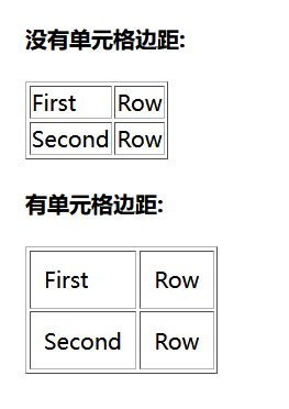
6.单元格边距
<!DOCTYPE html>
<html>
<head>
<meta charset="utf-8">
<title>菜鸟教程(runoob.com)</title>
</head>
<body>

<h4>没有单元格边距:</h4>
<table border="1">
<tr>
  <td>First</td>
  <td>Row</td>
</tr>
<tr>
  <td>Second</td>
  <td>Row</td>
</tr>
</table>

<h4>有单元格边距:</h4>
<table border="1"
cellpadding="10">
<tr>
  <td>First</td>
  <td>Row</td>
</tr>
<tr>
  <td>Second</td>
  <td>Row</td>
</tr>
</table>

</body>
</html>
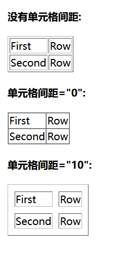
7.单元格间距
<!DOCTYPE html>
<html>
<head>
<meta charset="utf-8">
<title>菜鸟教程(runoob.com)</title>
</head>
<body>

<h4>没有单元格间距:</h4>
<table border="1">
<tr>
  <td>First</td>
  <td>Row</td>
</tr>
<tr>
  <td>Second</td>
  <td>Row</td>
</tr>
</table>

<h4>单元格间距="0":</h4>
<table border="1" cellspacing="0">
<tr>
  <td>First</td>
  <td>Row</td>
</tr>
<tr>
  <td>Second</td>
  <td>Row</td>
</tr>
</table>

<h4>单元格间距="10":</h4>
<table border="1" cellspacing="10">
<tr>
  <td>First</td>
  <td>Row</td>
</tr>
<tr>
  <td>Second</td>
  <td>Row</td>
</tr>
</table>

</body>
</html>
表格标签<table>
标签定义及使用说明

<table> 标签定义 HTML 表格

一个 HTML 表格包括 <table> 元素,一个或多个 <tr>、<th> 以及 <td> 元素。

<tr> 元素定义表格行,<th> 元素定义表头,<td> 元素定义表格单元。

更复杂的 HTML 表格也可能包括 <caption>、<col>、<colgroup>、<thead>、<tfoot> 以及 <tbody> 元素。
<table>标签的属性
在 HTML5 中,仅支持 “border” 属性,并且只允许使用值 “1” 或 “”。
已废弃属性:
- align
- bgcolor
- cellpadding
- cellspacing
- frame
- rules
- summary
- width
表头单元格标签<th>
标签定义及使用说明

<th> 标签定义 HTML 表格中的表头单元格。

HTML 表格有两种单元格类型:

    表头单元格 - 包含头部信息(由 <th> 元素创建)
    标准单元格 - 包含数据(由 <td> 元素创建)

<th> 元素中的文本通常呈现为粗体并且居中。

<td> 元素中的文本通常是普通的左对齐文本。
<th>标签的属性
html5 支持:
- colspan 值:number 规定表头单元格可横跨的列数。
- headers 值:header_id 规定与表头单元格相关联的一个或多个表头单元格。
- rowspan 值: number 规定表头单元格可横跨的行数。
- scope 规定表头单元格是否是行、列、行组或列组的头部。
colspan
所有主流浏览器都支持 colspan 属性。
跨列表头
注意:只有 Firefox 支持 colspan=“0”,该值有特殊的含义(请看下面的"属性值"表格)。
语法:<th colspan="number">
规定表头单元格应该横跨的列数。注意: colspan=“0” 告知浏览器使单元格横跨到列组 (colgroup) 的最后一列。
<table border="1">
 <tr>
   <th colspan="2">Monthly Savings</th>
 </tr>
 <tr>
   <td>January</td>
   <td>$100</td>
 </tr>
 <tr>
   <td>February</td>
   <td>$80</td>
 </tr>
</table>
headers
headers 属性在普通的 Web 浏览器中没有视觉效果,但可以通过屏幕阅读器使用。
<!DOCTYPE html>
<html>
<head>
<meta charset="utf-8">
<title>菜鸟教程(runoob.com)</title>
</head>
<body>

<table border="1">
 <tr>
   <th id="name" colspan="2">Name</th>
 </tr>
 <tr>
   <th headers="name">Firsname</th>
   <th headers="name">Lastname</th>
 </tr>
</table>

</body>
</html>
rowspan
rowspan 属性定义表头单元格应该横跨的行数。 跨行表头
<table border="1">
<tr>
  <th>Month</th>
  <th>Savings</th>
  <th rowspan="3">Savings for holiday!</th>
</tr>
<tr>
  <td>January</td>
  <td>$100</td>
</tr>
<tr>
  <td>February</td>
  <td>$80</td>
</tr>
</table>
scope
scope 属性在普通的 Web 浏览器中没有视觉效果,但可以通过屏幕阅读器使用。
<table border="1">
<tr>
  <th></th>
  <th scope="col">Month</th>
  <th scope="col">Savings</th>
</tr>
<tr>
  <td>1</td>
  <td>January</td>
  <td>$100</td>
</tr>
<tr>
  <td>2</td>
  <td>February</td>
  <td>$80</td>
</tr>
</table>
<tr>标签
tr标签所有属性都不可用
<!DOCTYPE html>
<html>
<head>
<meta charset="utf-8">
<title>菜鸟教程(runoob.com)</title>
</head>
<body>

<table border="1">
<tr>
  <th>Month</th>
  <th>Savings</th>
</tr>
<tr>
  <td>January</td>
  <td>$100</td>
</tr>
<tr>
  <td>February</td>
  <td>$80</td>
</tr>
</table>

</body>
</html>
<td> 标签
标签定义及使用说明

<td> 标签定义 HTML 表格中的标准单元格。

HTML 表格有两种单元格类型:

  表头单元格 - 包含头部信息(由 <th> 元素创建)
  标准单元格 - 包含数据(由 <td> 元素创建)

<th> 元素中的文本通常呈现为粗体并且居中。

<td> 元素中的文本通常是普通的左对齐文本。
提示和注释
提示:如果需要将内容横跨多个行或列,请使用 colspan 和 rowspan 属性!
html5可用属性:
- colspan number 规定单元格可横跨的列数。
- headers header_id 规定与单元格相关联的一个或多个表头单元格。
- rowspan number 设置单元格可纵跨的行数。
这些属性跟th中属性用法相同
<caption> 标签
所有属性均不可用
<table border="1">
<caption>Monthly savings</caption>
<tr>
  <th>Month</th>
  <th>Savings</th>
</tr>
<tr>
  <td>January</td>
  <td>$100</td>
</tr>
</table>
标签定义及使用说明

<caption> 标签定义表格的标题。

<caption> 标签必须直接放置到 <table> 标签之后。

您只能对每个表格定义一个标题。

提示:通常这个标题会被居中于表格之上。然而,CSS 属性 "text-align" 和 "caption-side" 能用来设置标题的对齐方式和显示位置。
<colgroup> 标签
<table border="1">
  <colgroup>
    <col span="2" style="background-color:red">
    <col style="background-color:yellow">
  </colgroup>
  <tr>
    <th>ISBN</th>
    <th>Title</th>
    <th>Price</th>
  </tr>
  <tr>
    <td>3476896</td>
    <td>My first HTML</td>
    <td>$53</td>
  </tr>
</table>
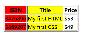
<colgroup> 标签用于对表格中的列进行组合,以便对其进行格式化。

通过使用 <colgroup> 标签,可以向整个列应用样式,而不需要重复为每个单元格或每一行设置样式。

注释:只能在 <table> 元素之内,在任何一个 <caption> 元素之后,在任何一个 <thead>、<tbody>、<tfoot>、<tr> 元素之前使用 <colgroup> 标签。

提示:如果想对 <colgroup> 中的某列定义不同的属性,请在 <colgroup> 标签内使用 <col> 标签。
<colgroup> span 属性
<table border="1">
  <colgroup span="2" style="background:red"></colgroup>
  <tr>
    <th>ISBN</th>
    <th>Title</th>
    <th>Price</th>
  </tr>
  <tr>
    <td>3476896</td>
    <td>My first HTML</td>
    <td>$53</td>
  </tr>
  <tr>
    <td>5869207</td>
    <td>My first CSS</td>
    <td>$49</td>
  </tr>
</table>
<col> 标签
标签规定了 元素内部的每一列的列属性。
通过使用 标签,可以向整个列应用样式,而不需要重复为每个单元格或每一行设置样式。
<thead> <tbody> <tfoot>标签
<table border="1">
  <thead>
    <tr>
      <th>Month</th>
      <th>Savings</th>
    </tr>
  </thead>
  <tfoot>
    <tr>
      <td>Sum</td>
      <td>$180</td>
    </tr>
  </tfoot>
  <tbody>
    <tr>
      <td>January</td>
      <td>$100</td>
    </tr>
    <tr>
      <td>February</td>
      <td>$80</td>
    </tr>
  </tbody>
</table>
标签定义及使用说明

<thead> 标签用于组合 HTML 表格的表头内容。

<thead> 元素应该与 <tbody> 和 <tfoot> 元素结合起来使用,用来规定表格的各个部分(表头、主体、页脚)。

通过使用这些元素,使浏览器有能力支持独立于表格表头和表格页脚的表格主体滚动。当包含多个页面的长的表格被打印时,表格的表头和页脚可被打印在包含表格数据的每张页面上。

<thead> 标签必须被用在以下情境中:作为 <table> 元素的子元素,出现在 <caption>、<colgroup> 元素之后,<tbody>、 <tfoot> 和 <tr> 元素之前。
提示和注释
注释:<thead> 元素内部必须包含一个或者多个 <tr> 标签。

提示:<thead>、<tbody> 和 <tfoot> 元素默认不会影响表格的布局。不过,您可以使用 CSS 来为这些元素定义样式,从而改变表格的外观。
CSS表格
使用 CSS 可以使 HTML 表格更美观。
实例:

<!DOCTYPE html>
<html>
<head>
<meta charset="utf-8">
<title>菜鸟教程(runoob.com)</title>
<style>
#customers
{
	font-family:"Trebuchet MS", Arial, Helvetica, sans-serif;
	width:100%;
	border-collapse:collapse;
}
#customers td, #customers th
{
	font-size:1em;
	border:1px solid #98bf21;
	padding:3px 7px 2px 7px;
}
#customers th
{
	font-size:1.1em;
	text-align:left;
	padding-top:5px;
	padding-bottom:4px;
	background-color:#A7C942;
	color:#ffffff;
}
#customers tr.alt td
{
	color:#000000;
	background-color:#EAF2D3;
}
</style>
</head>

<body>
<table id="customers">
<tr>
  <th>Company</th>
  <th>Contact</th>
  <th>Country</th>
</tr>
<tr>
<td>Alfreds Futterkiste</td>
<td>Maria Anders</td>
<td>Germany</td>
</tr>
<tr class="alt">
<td>Berglunds snabbköp</td>
<td>Christina Berglund</td>
<td>Sweden</td>
</tr>
<tr>
<td>Centro comercial Moctezuma</td>
<td>Francisco Chang</td>
<td>Mexico</td>
</tr>
<tr class="alt">
<td>Ernst Handel</td>
<td>Roland Mendel</td>
<td>Austria</td>
</tr>
<tr>
<td>Island Trading</td>
<td>Helen Bennett</td>
<td>UK</td>
</tr>
<tr class="alt">
<td>Königlich Essen</td>
<td>Philip Cramer</td>
<td>Germany</td>
</tr>
<tr>
<td>Laughing Bacchus Winecellars</td>
<td>Yoshi Tannamuri</td>
<td>Canada</td>
</tr>
<tr class="alt">
<td>Magazzini Alimentari Riuniti</td>
<td>Giovanni Rovelli</td>
<td>Italy</td>
</tr>
<tr>
<td>North/South</td>
<td>Simon Crowther</td>
<td>UK</td>
</tr>
<tr class="alt">
<td>Paris spécialités</td>
<td>Marie Bertrand</td>
<td>France</td>
</tr>
</table>
</body>
</html>
设置表格标题的位置

<!DOCTYPE html>
<html>
<head>
<meta charset="utf-8">
<title>菜鸟教程(runoob.com)</title>
<style>
caption {caption-side:bottom;}
</style>
</head>

<body>

<table border="1">
<caption>Table 1.1 Customers</caption>
<tr>
  <th>Company</th>
  <th>Contact</th>
  <th>Country</th>
</tr>
<tr>
<td>Alfreds Futterkiste</td>
<td>Maria Anders</td>
<td>Germany</td>
</tr>
<tr>
<td>Berglunds snabbköp</td>
<td>Christina Berglund</td>
<td>Sweden</td>
</tr>
<tr>
<td>Centro comercial Moctezuma</td>
<td>Francisco Chang</td>
<td>Mexico</td>
</tr>
<tr>
<td>Ernst Handel</td>
<td>Roland Mendel</td>
<td>Austria</td>
</tr>
<tr>
<td>Island Trading</td>
<td>Helen Bennett</td>
<td>UK</td>
</tr>
<tr>
<td>Magazzini Alimentari Riuniti</td>
<td>Giovanni Rovelli</td>
<td>Italy</td>
</tr>
<tr>
<td>North/South</td>
<td>Simon Crowther</td>
<td>UK</td>
</tr>
</table>

<p><b>注意:</b>如果 !DOCTYPE 指定 IE 8 支持 caption-side 属性 .</p>
</body>
</html>
内联框架
HTML Iframe
在网页中显示网页
<iframe src="URL"></iframe>
URL 指向隔离页面的位置。
Iframe - 设置高度和宽度
height 和 width 属性用于规定 iframe 的高度和宽度。
属性值的默认单位是像素,但也可以用百分比来设定(比如 “80%”)。
实例
内联框架的属性frameborder
规定是否显示框架周围的边框。
内联框架有没有框,1就有,0就没有
<iframe frameborder="value">
,sandbox 属性将会启用一系列对行内框架中内容的额外限制。
sandbox 属性的值既可以是一个空字符串(应用所有的限制),也可以是空格分隔的预定义值列表(将移除特定的限制)。
 ## scrolling
定义和用法
scrolling 属性规定是否在 iframe 中显示滚动条。
默认地,如果内容超出了 iframe,滚动条就会出现在 iframe 中。
<iframe scrolling="value">
auto 	在需要的情况下出现滚动条(默认值)。
yes 	始终显示滚动条(即使不需要)。
no 	从不显示滚动条(即使需要)。
H5 新属性 seamless
定义和用法
seamless 属性属于逻辑属性。
当设置该属性后,它规定了 <iframe> 看上去像是包含文档的一部分(无边框或滚动条)。
<iframe seamless>
<iframe src="demo_iframe.htm" seamless></iframe>
srcdoc
就是把html文档放在这个属性里面
带有 srcdoc 属性的 <iframe>:
<iframe srcdoc="<p>Hello world!</p>" src="demo_iframe_srcdoc.htm"></iframe>
定义和用法

srcdoc 属性规定页面的 HTML 内容显示在行内框架中。

提示:该属性与 sandbox 和 seamless 属性一同使用。

如果浏览器不支持 srcdoc 属性,则将覆盖在 src 属性(若已设置)中规定的内容。

如果浏览器不支持 srcdoc 属性,则相应地会显示在 src 属性(若已设置)中规定的文件。
浮动
CSS Float(浮动)
CSS 的 Float(浮动),会使元素向左或向右移动,其周围的元素也会重新排列。
Float(浮动),往往是用于图像,但它在布局时一样非常有用。
元素怎样浮动
元素的水平方向浮动,意味着元素只能左右移动而不能上下移动。
一个浮动元素会尽量向左或向右移动,直到它的外边缘碰到包含框或另一个浮动框的边框为止。
浮动元素之后的元素将围绕它。
浮动元素之前的元素将不会受到影响。
如果图像是右浮动,下面的文本流将环绕在它左边:
<!DOCTYPE html>
<html>
<head>
<meta charset="utf-8">
<title>菜鸟教程(runoob.com)</title>
<style>
img
{
	float:left;
}
</style>
</head>

<body>
<p>在下面的段落中,我们添加了一个 <b>float:right</b> 的图片。导致图片将会浮动在段落的右边。</p>
<p>
<img src="logocss.gif" width="95" height="84" />
这是一些文本。这是一些文本。这是一些文本。
这是一些文本。这是一些文本。这是一些文本。
这是一些文本。这是一些文本。这是一些文本。
这是一些文本。这是一些文本。这是一些文本。
这是一些文本。这是一些文本。这是一些文本。
这是一些文本。这是一些文本。这是一些文本。
这是一些文本。这是一些文本。这是一些文本。
这是一些文本。这是一些文本。这是一些文本。
这是一些文本。这是一些文本。这是一些文本。
这是一些文本。这是一些文本。这是一些文本。
</p>
</body>

</html>
彼此相邻的浮动元素
如果你把几个浮动的元素放到一起,如果有空间的话,它们将彼此相邻。
在这里,我们对图片廊使用 float 属性:
<!DOCTYPE html>
<html>
<head>
<meta charset="utf-8">
<title>菜鸟教程(runoob.com)</title>
<style>
.thumbnail
{
	float:left;
	width:110px;
	height:90px;
	margin:5px;
}
</style>
</head>

<body>
<h3>图片库</h3>
<p>试着调整窗口,看看当图片没有足够的空间会发生什么。</p>
<img class="thumbnail" src="/images/klematis_small.jpg" width="107" height="90">
<img class="thumbnail" src="/images/klematis2_small.jpg" width="107" height="80">
<img class="thumbnail" src="/images/klematis3_small.jpg" width="116" height="90">
<img class="thumbnail" src="/images/klematis4_small.jpg" width="120" height="90">
</body>
</html>
为图像添加边框和边距并浮动到段落的右侧
让我们为图像添加边框和边距并浮动到段落的右侧
<!DOCTYPE html>
<html>
<head>
<meta charset="utf-8">
<title>菜鸟教程(runoob.com)</title>
<style>
img
{
	float:right;
	border:1px dotted black;
	margin:0px 0px 15px 20px;
}
</style>
</head>

<body>
<p>
	在下面的段落中,图像将向右浮动。黑色虚线边界添加到图像。
我们还添加了边缘的0 px的顶部和右侧 margin,15 px底部margin,和20 px左侧的margin的图像。使得文本远离图片:</p>
<p>
<img src="logocss.gif" width="95" height="84" />
This is some text. This is some text. This is some text.
This is some text. This is some text. This is some text.
This is some text. This is some text. This is some text.
This is some text. This is some text. This is some text.
This is some text. This is some text. This is some text.
This is some text. This is some text. This is some text.
This is some text. This is some text. This is some text.
This is some text. This is some text. This is some text.
This is some text. This is some text. This is some text.
This is some text. This is some text. This is some text.
</p>
</body>

</html>
标题和图片向右侧浮动
让标题和图片向右侧浮动。
<!DOCTYPE html>
<html>
<head>
<meta charset="utf-8">
<title>菜鸟教程(runoob.com)</title>
<style>
div
{
	float:right;
	width:120px;
	margin:0 0 15px 20px;
	padding:15px;
	border:1px solid black;
	text-align:center;
}
</style>
</head>

<body>
<div>
<img src="logocss.gif" width="95" height="84" /><br>
CSS is fun!
</div>
<p>
This is some text. This is some text. This is some text.
This is some text. This is some text. This is some text.
This is some text. This is some text. This is some text.
This is some text. This is some text. This is some text.
This is some text. This is some text. This is some text.
This is some text. This is some text. This is some text.
This is some text. This is some text. This is some text.
This is some text. This is some text. This is some text.
This is some text. This is some text. This is some text.
This is some text. This is some text. This is some text.
This is some text. This is some text. This is some text.
This is some text. This is some text. This is some text.
This is some text. This is some text. This is some text.
</p>

<p>
	在上面的段落中,div元素是120像素宽,它包含了图像。
	div元素会向右浮动。
	Margins 被添加到div使得文本远离div。
	Borders和padding被添加到div框架的图片和标题中
</p>
</body>

</html>
让段落的第一个字母浮动到左侧
改变样式,让段落的第一个字母浮动到左侧。
<!DOCTYPE html>
<html>
<head>
<meta charset="utf-8">
<title>菜鸟教程(runoob.com)</title>
<style>
span
{
	float:left;
	width:1.2em;
	font-size:400%;
	font-family:algerian,courier;
	line-height:80%;
}
</style>
</head>

<body>
<p>
<span>这</span>是一些文本。
这是一些文本。这是一些文本。
这是一些文本。这是一些文本。这是一些文本。
这是一些文本。这是一些文本。这是一些文本。
这是一些文本。这是一些文本。这是一些文本。
这是一些文本。这是一些文本。这是一些文本。
这是一些文本。这是一些文本。这是一些文本。
这是一些文本。这是一些文本。这是一些文本。
</p>

<p>
在上面的段落中, 第一个字嵌入在span 元素中。
这个 span 元素的宽度是当前字体大小的1.2倍。
这个 span 元素是当前字体的400%(相当大), line-height 为80%。
文字的字体为"Algerian"。
</p>

</body>
</html>
创建一个没有表格的网页
<!DOCTYPE html>
<html>
<head>
<meta charset="utf-8">
<title>菜鸟教程(runoob.com)</title>
<style>
* {
    box-sizing: border-box;
}
body {
    margin: 0;
}
.header {
    background-color: #2196F3;
    color: white;
    text-align: center;
    padding: 15px;
}
.footer {
    background-color: #444;
    color: white;
    padding: 15px;
}
.topmenu {
    list-style-type: none;
    margin: 0;
    padding: 0;
    overflow: hidden;
    background-color: #777;
}
.topmenu li {
    float: left;
}
.topmenu li a {
    display: inline-block;
    color: white;
    text-align: center;
    padding: 16px;
    text-decoration: none;
}
.topmenu li a:hover {
    background-color: #222;
}
.topmenu li a.active {
    color: white;
    background-color: #4CAF50;
}
.column {
    float: left;
    padding: 15px;
}
.clearfix::after {
    content: "";
    clear: both;
    display: table;
}
.sidemenu {
    width: 25%;
}
.content {
    width: 75%;
}
.sidemenu ul {
    list-style-type: none;
    margin: 0;
    padding: 0;
}
.sidemenu li a {
    margin-bottom: 4px;
    display: block;
    padding: 8px;
    background-color: #eee;
    text-decoration: none;
    color: #666;
}
.sidemenu li a:hover {
    background-color: #555;
    color: white;
}
.sidemenu li a.active {
    background-color: #008CBA;
    color: white;
}
</style>
</head>
<body>

<ul class="topmenu">
  <li><a href="#home" class="active">主页</a></li>
  <li><a href="#news">新闻</a></li>
  <li><a href="#contact">联系我们</a></li>
  <li><a href="#about">关于我们</a></li>
</ul>

<div class="clearfix">
  <div class="column sidemenu">
    <ul>
      <li><a href="#flight">The Flight</a></li>
      <li><a href="#city" class="active">The City</a></li>
      <li><a href="#island">The Island</a></li>
      <li><a href="#food">The Food</a></li>
      <li><a href="#people">The People</a></li>
      <li><a href="#history">The History</a></li>
      <li><a href="#oceans">The Oceans</a></li>
    </ul>
  </div>

  <div class="column content">
    <div class="header">
      <h1>The City</h1>
    </div>
    <h1>Chania</h1>
    <p>Chania is the capital of the Chania region on the island of Crete. The city can be divided in two parts, the old town and the modern city.</p>
    <p>You will learn more about responsive web pages in a later chapter.</p>
  </div>
</div>

<div class="footer">
  <p>底部文本</p>
</div>

</body>
</html>
定位
CSS Position(定位)
position 属性指定了元素的定位类型。
position 属性的五个值:
static
relative
fixed
absolute
sticky
元素可以使用的顶部,底部,左侧和右侧属性定位。然而,这些属性无法工作,除非是先设定position属性。他们也有不同的工作方式,这取决于定位方法。
static定位
HTML 元素的默认值,即没有定位,遵循正常的文档流对象。
静态定位的元素不会受到 top, bottom, left, right影响。
fixed定位
元素的位置相对于浏览器窗口是固定位置。
即使窗口是滚动的它也不会移动:
注意: Fixed 定位在 IE7 和 IE8 下需要描述 !DOCTYPE 才能支持。
Fixed定位使元素的位置与文档流无关,因此不占据空间。
Fixed定位的元素和其他元素重叠
relative定位
相对定位元素的定位是相对其正常位置。
移动相对定位元素,但它原本所占的空间不会改变。
相对定位元素经常被用来作为绝对定位元素的容器块。
absolute 定位
绝对定位的元素的位置相对于最近的已定位父元素,如果元素没有已定位的父元素,那么它的位置相对于<html>:
absolute 定位使元素的位置与文档流无关,因此不占据空间。
absolute 定位的元素和其他元素重叠。
sticky 定位
sticky 英文字面意思是粘,粘贴,所以可以把它称之为粘性定位。

position: sticky; 基于用户的滚动位置来定位。

粘性定位的元素是依赖于用户的滚动,在 position:relative 与 position:fixed 定位之间切换。

它的行为就像 position:relative; 而当页面滚动超出目标区域时,它的表现就像 position:fixed;,它会固定在目标位置。

元素定位表现为在跨越特定阈值前为相对定位,之后为固定定位。

这个特定阈值指的是 top, right, bottom 或 left 之一,换言之,指定 top, right, bottom 或 left 四个阈值其中之一,才可使粘性定位生效。否则其行为与相对定位相同。

注意: Internet Explorer, Edge 15 及更早 IE 版本不支持 sticky 定位。 Safari 需要使用 -webkit- prefix (查看以下实例)。
重叠的元素
元素的定位与文档流无关,所以它们可以覆盖页面上的其它元素
z-index属性指定了一个元素的堆叠顺序(哪个元素应该放在前面,或后面)
一个元素可以有正数或负数的堆叠顺序:
具有更高堆叠顺序的元素总是在较低的堆叠顺序元素的前面。
注意: 如果两个定位元素重叠,没有指定z - index,最后定位在HTML代码中的元素将被显示在最前面。
剪裁元素的外形
此示例演示如何设置元素的外形。该元素被剪裁成这种形状,并显示出来。
<!DOCTYPE html>
<html>
<head>
<meta charset="utf-8">
<title>菜鸟教程(runoob.com)</title>
<style>
img
{
	position:absolute;
	clip:rect(0px,60px,200px,0px);
}
</style>
</head>

<body>
<img src="w3css.gif" width="100" height="140" />
</body>
</html>
使用滚动条显示元素溢出的内容
<!DOCTYPE html>
<html>
<head>
<meta charset="utf-8">
<title>菜鸟教程(runoob.com)</title>
<style>
div.ex1 {
    background-color: lightblue;
    width: 110px;
    height: 110px;
    overflow: scroll;
}

div.ex2 {
    background-color: lightblue;
    width: 110px;
    height: 110px;
    overflow: hidden;
}

div.ex3 {
    background-color: lightblue;
    width: 110px;
    height: 110px;
    overflow: auto;
}

div.ex4 {
    background-color: lightblue;
    width: 110px;
    height: 110px;
    overflow: visible;
}
</style>
</head>
<body>
<h1>overflow 属性</h1>

<p>如果元素中的内容超出了给定的宽度和高度属性,overflow 属性可以确定是否显示滚动条等行为。</p>

<h2>overflow: scroll:</h2>
<div class="ex1">菜鸟教程 -- 学的不仅是技术,更是梦想!!!菜鸟教程 -- 学的不仅是技术,更是梦想!!!菜鸟教程 -- 学的不仅是技术,更是梦想!!!菜鸟教程 -- 学的不仅是技术,更是梦想!!!</div>

<h2>overflow: hidden:</h2>
<div class="ex2">菜鸟教程 -- 学的不仅是技术,更是梦想!!!菜鸟教程 -- 学的不仅是技术,更是梦想!!!菜鸟教程 -- 学的不仅是技术,更是梦想!!!菜鸟教程 -- 学的不仅是技术,更是梦想!!!</div>

<h2>overflow: auto:</h2>
<div class="ex3">菜鸟教程 -- 学的不仅是技术,更是梦想!!!菜鸟教程 -- 学的不仅是技术,更是梦想!!!菜鸟教程 -- 学的不仅是技术,更是梦想!!!菜鸟教程 -- 学的不仅是技术,更是梦想!!!</div>

<h2>overflow: visible (默认):</h2>
<div class="ex4">菜鸟教程 -- 学的不仅是技术,更是梦想!!!菜鸟教程 -- 学的不仅是技术,更是梦想!!!菜鸟教程 -- 学的不仅是技术,更是梦想!!!菜鸟教程 -- 学的不仅是技术,更是梦想!!!</div>

</body>
</html>
更改光标
改变光标放在 上面的状态
<!DOCTYPE html>
<html>
<head>
<meta charset="utf-8">
<title>菜鸟教程(runoob.com)</title>
</head>
<body>
<p>请把鼠标移动到单词上,可以看到鼠标指针发生变化:</p>
<span style="cursor:auto">auto</span><br>
<span style="cursor:crosshair">crosshair</span><br>
<span style="cursor:default">default</span><br>
<span style="cursor:e-resize">e-resize</span><br>
<span style="cursor:help">help</span><br>
<span style="cursor:move">move</span><br>
<span style="cursor:n-resize">n-resize</span><br>
<span style="cursor:ne-resize">ne-resize</span><br>
<span style="cursor:nw-resize">nw-resize</span><br>
<span style="cursor:pointer">pointer</span><br>
<span style="cursor:progress">progress</span><br>
<span style="cursor:s-resize">s-resize</span><br>
<span style="cursor:se-resize">se-resize</span><br>
<span style="cursor:sw-resize">sw-resize</span><br>
<span style="cursor:text">text</span><br>
<span style="cursor:w-resize">w-resize</span><br>
<span style="cursor:wait">wait</span><br>
</body>
</html>


 473
473


 被折叠的 条评论
为什么被折叠?
被折叠的 条评论
为什么被折叠?
 到【灌水乐园】发言


