


A tale of two viewports — part one
写在开头
大三苦逼计算机学生,倔脾气硬生生瞎翻译了一篇红宝书上推荐过的文章,非专业。还要吐槽这个CSDN的markdown编辑器排版的时候好多误触啊,别的地方就没有,很头疼。
====================================================================
A tale of two viewports — part one
In this mini-series I will explain how viewports and the widths of various important elements work, such as the <html> element, as well as the window and the screen.
在这个小的系列文章里,我将会解释视窗和一些重要元素的宽度的工作原理,比如说<html>元素以及窗口和显示器。
This page is about the desktop browsers, and its sole purpose is to set the stage for a similar discussion of the mobile browsers. Most web developers will already intuitively understand most desktop concepts. On mobile we’ll find the same concepts, but more complicated, and a prior discussion on terms everybody already knows will greatly help your understanding of the mobile browsers.
这篇文章的内容主要是关于电脑浏览器的,而其唯一目的就是为了下一篇类似的关于手机浏览器的文章做铺垫。大多数的web开发商早已直观的理解多数电脑概念。我们将会在下一篇文章中看到一样的概念,但是更加复杂,因此一个先导性的文章会帮助大家更好的理解手机浏览器
Concept: device pixels and CSS pixels
概念:设备像素和CSS像素
The first concept you need to understand is CSS pixels, and the difference with device pixels.
你首先需要了解的概念就是CSS像素,及其与设备像素之间的区别。
Device pixels are the kind of pixels we intuitively assume to be “right.” These pixels give the formal resolution of whichever device you’re working on, and can (in general) be read out from screen.width/height.
设备像素是我们可以直观理解的。这些像素给了你使用的设备正式的分辨率,并且通常可以在屏幕外读取。
If you give a certain element a width: 128px, and your monitor is 1024px wide, and you maximise your browser screen, the element would fit on your monitor eight times (roughly; let’s ignore the tricky bits for now).
如果你确定一个元素的宽度为128px,而你的显示器为1024px,同时你最大化了你的浏览器,这个元素将可以填充你的显示器8次。(大致的,让我们先忽略严格的bits)
If the user zooms, however, this calculation is going to change. If the user zooms to 200%, your element with width: 128px will fit only four times on his 1024px wide monitor.
但是如果用户缩放了界面,这个数字就要改变了。如果用户放大到200%,你的宽度为128px的元素将会仅仅匹配四次1024px的显示器。
Zooming as implemented in modern browsers consists of nothing more than “stretching up” pixels. That is, the width of the element is not changed from 128 to 256 pixels; instead the actual pixels are doubled in size. Formally, the element still has a width of 128 CSS pixels, even though it happens to take the space of 256 device pixels.
在现代浏览器进行缩放包括的不过是拉伸像素。也就是并非元素从128变成256px,而是实际像素在数量上翻倍而已。正式的说,这个元素的宽度还是128px,尽管它占据的空间是256设备像素。
In other words, zooming to 200% makes one CSS pixel grow to four times the size of one device pixels. (Two times the width, two times the height, yields four times in total).
换句话说,缩放到200%让一CSS像素变成一设备像素的四倍大。
A few images will clarify the concept. Here are four pixels on 100% zoom level. Nothing much to see here; CSS pixels fully overlap with device pixels.
下面的一些图片将会阐明这些概念。这里有四像素充满屏幕。CSS像素和设备像素完全重合。

Now let’s zoom out. The CSS pixels start to shrink, meaning that one device pixel now overlaps several CSS pixels.
现在让我们缩放。CSS像素开始减小,意味着一个设备像素可以覆盖多个CSS像素。

If you zoom in, the opposite happens. The CSS pixels start to grow, and now one CSS pixels overlaps several device pixels.
如果你继续放大,相反的事情发生了。CSS像素开始增大,现在一个CSS像素可以覆盖多个设备像素。

The point here is that you are only interested in CSS pixels. It’s those pixels that dictate how your style sheet is rendered.
这里的关键点是你只关心CSS像素。正是CSS像素决定了你的样式表的呈现。
Device pixels are almost entirely useless to you. Not to the user; the user will zoom the page in or out until he can comfortably read it. However, that zooming level doesn’t matter to you. The browser will automatically make sure that your CSS layout is stretched up or squeezed in.
对你来说设备像素几乎是完全无用的。对用户来说不是这样,他们会放大或者缩小界面直到可以舒适的浏览界面。但是缩放的程度不取决于你。浏览器将会自动的确保CSS像素是拉伸的或者是压缩的。
100% zoom
I started the example by assuming a zoom level of 100%. It’s time to define that slightly more strictly:At zoom level 100% one CSS pixel is exactly equal to one device pixel.
我将用一个例子讲清楚不缩放的样式。稍微严格一点的定义:在不缩放时CSS像素完全等于设备像素。
The concept of 100% zoom is very useful in the explanations that are going to follow, but you shouldn’t overly worry about it in your daily work. On desktop you will generally test your sites in 100% zoom, but even if the user zooms in or out the magic of CSS pixels will make sure that your layout retains the same ratios.
100%缩放这个概念对于解释后面的文章是非常有用的,但是你不用在平时的工作中担心这个。你通常会在100%缩放的情况下测试你的代码,但是即使用户缩放或放大界面,CSS像素还会确保你的样式保留原来的比例。
Screen size
屏幕大小
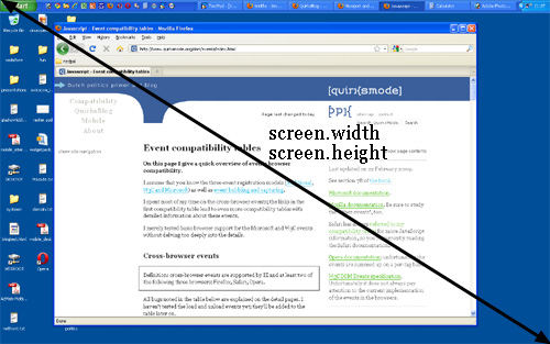
Let’s take a look at some practical measurements. We’ll start with screen.width and screen.height. They contain the total width and height of the user’s screen. These dimensions are measured in device pixels because they never change: they’re a feature of the monitor, and not of the browser.
让我们看一看这些实用措施。首先从screen.width 和 screen.height开始。二者含有用户显示器的全部高度和宽度,这些尺寸由设备像素决定,因为他们从不改变:他们是显示器的特性,而不是浏览器的。
Fun! But what do we do with this information?
很好!但是这个信息对我们来说有什么用呢?
Basically, nothing. The user’s monitor size is unimportant to us — well, unless you want to measure it for use in a web statistics database.
基本上说没有。用户的显示器大小对我们来说不重要——除非你想用web上的统计数据来计算它。
Window size
窗口大小
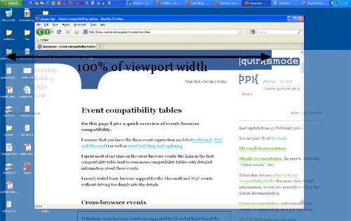
Instead, what you want to know is the inner dimensions of the browser window. That tells you exactly how much space the user currently has available for your CSS layout. You can find these dimensions in window.innerWidth and window.innerHeight.
相反,你想知道是浏览器窗口的尺寸。这可以精确的告诉你现在用户有多大空间提供给你的CSS布局。你可以在window.innerWidth 和 window.innerHeight 找到这些尺寸信息。
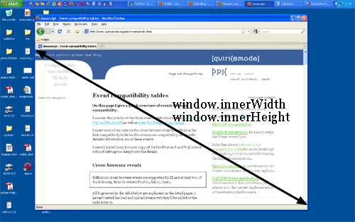
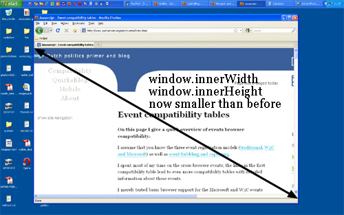
Obviously, the inner width of the window is measured in CSS pixels. You need to know how much of your layout you can squeeze into the browser window, and that amount decreases as the user zooms in. So if the user zooms in you get less available space in the window, and window.innerWidth/Height reflect that by decreasing.
很显然,这些内部宽度的测量单位是CSS像素。你需要知道你的布局压缩多少才可以适应浏览器窗口。所以如果用户压缩界面,这两个属性通过减小来告知你。
(The exception here is Opera, where window.innerWidth/Height do not decrease when the user zooms in: they’re measured in device pixels. This is annoying on desktop, but fatal on mobile, as we’ll see later.)
(这有一个例外就是Opera,当用户压缩界面时它的window.innerWidth/Height 不会减小:它的测量单位是设备像素。对于电脑来说这很不友好,但是对手机来说是个福音,我们将在接下来见到。)
Note that the measured widths and heights include the scrollbars. They, too, are considered part of the inner window. (This is mostly for historical reasons.)
记住宽高是包括旁边的滚动条的。滚动条也被认为是window内的一部分。(由于部分历史原因)
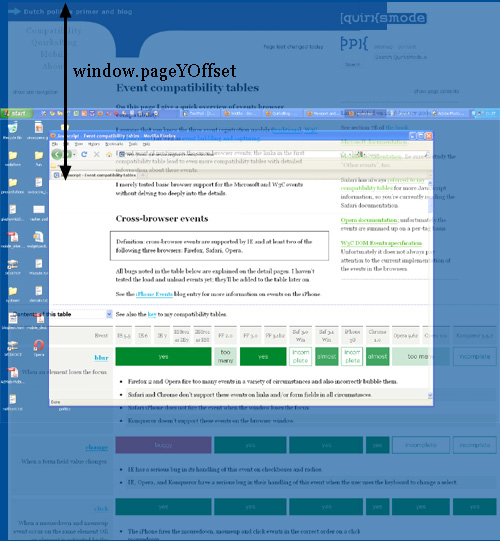
Scrolling offset
滚动偏移量
window.pageXOffset and window.pageYOffset, contain the horizontal and vertical scrolling offsets of the document. Thus you can find out how much the user has scrolled.
window.pageXOffset 和 window.pageYOffset 包含了相对与document的水平和竖直的滚动偏移量,因此你可以发现用户滚动了多少。
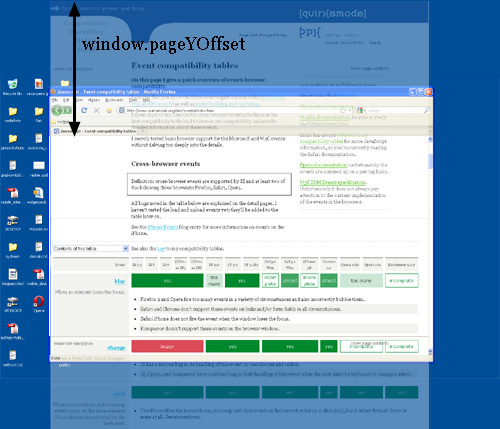
These properties are measured in CSS pixels, too. You want to know how much of the document has already been scrolled up, whatever zoom state it’s in.
这些特性也是由CSS像素衡量的。不管他处于什么缩放状态,你想要知道document移动了多少。
In theory, if the user scrolls up and then zooms in, window.pageX/YOffset will change. However, the browsers try to keep web pages consistent by keeping the same element at the top of the visible page when the user zooms. That doesn’t always work perfectly, but it means that in practice window.pageX/YOffset doesn’t really change: the number of CSS pixels that have been scrolled out of the window remains (roughly) the same.
从理论上来讲,如果用户移动或者缩放了,window.pageX/YOffset 将会改变。但是当用户缩放时,浏览器通过保证相同元素在可视界面的顶部来尽力保持web界面的一致性。但这不总是奏效的。这意味着实际上偏移量没有改变:被滚动出视窗的CSS像素的数值保持不变。
Concept: the viewport
概念:视窗
Before we continue with more JavaScript properties we have to introduce another concept: the viewport.
The function of the viewport is to constrain the <html> element, which is the uppermost containing block of your site.
在我们介绍更多JS特性前,我们先来介绍另一个概念:视窗。视窗的元素是用来限制<html>元素的。
That may sound a bit vague, so here’s a practical example. Suppose you have a liquid layout and one of your sidebars has width: 10%. Now the sidebar neatly grows and shrinks as you resize the browser window. But exactly how does that work?
这可能听起来有点怪,因此这里提供了一个实例。想象一下你有一个流畅的布局并且你的其中一个侧边栏有10%的宽度。现在这个宽度整齐的随着浏览器窗口放大或者缩小。但是这是怎么工作的呢?
Technically, what happens is that the sidebar gets 10% of the width of its parent. Let’s say that’s the <body> (and that you haven’t given it a width). So the question becomes which width the <body> has.
技术上讲,发生的是侧边栏从父级元素获得了10%的宽度。我们可以说这是<body>元素。所以问题变成了<body>的宽度是多少。
Normally, all block-level elements take 100% of the width of their parent (there are exceptions, but let’s ignore them for now). So the <body> is as wide as its parent, the <html> element.
通常,所以块级元素占据父级元素100%的宽度(有例外,那是行级块元素)。所以<body>和其父级元素<html>一样宽。
And how wide is the <html> element? Why, it’s as wide as the browser window. That’s why your sidebar with width: 10% will span 10% of the entire browser window. All web developers intuitively know and use this fact.
那么<html>元素多宽呢?为什么这么问,这个和浏览器窗口一样宽啊。这就是为什么你的侧边栏10%的宽度会占据整个浏览器的10%。所有的web开发商都直觉的了解并且应用了这个事实。
What you may not know is how this works in theory. In theory, the width of the <html> element is restricted by the width of the viewport. The <html> element takes 100% of the width of that viewport.
你或许不知道这个理论的工作原理。从理论上讲,<html>元素的宽度是由视窗严格定义的。其占据100%的视窗宽度。
The viewport, in turn, is exactly equal to the browser window: it’s been defined as such. The viewport is not an HTML construct, so you cannot influence it by CSS. It just has the width and height of the browser window — on desktop. On mobile it’s quite a bit more complicated.
反过来,视窗和浏览器窗口一样大:类似的定义。视窗不是HTML的结构,所以你不能通过CSS来改变它。在电脑上它只是有浏览器的宽度和高度。在手机上则有一些复杂。
Consequences
结果
This state of affairs has some curious consequences. You can see one of them right here on this site. Scroll all the way up to the top, and zoom in two or three steps so that the content of this site spills out of the browser window.
这样的描述让事情有了一些奇特的结果。你可以在这个网站上看到这些。在页面顶部,放大两三步,让这个网站的内容溢出浏览器界面。
Now scroll to the right, and you’ll see that the blue bar at the top of the site doesn’t line up properly any more.
现在移动到页面最右端,你将会看到这个在页面顶部的蓝色的边不能很好的对齐。
This behaviour is a consequence of how the viewport is defined. I gave the blue bar at the top a width: 100%. 100% of what? Of the <html> element, which is as wide as the viewport, which is as wide as the browser window.
这个现象是视窗定义的结果。我定义了这个蓝色的边宽度为100%,也就是和<html>元素,和浏览器窗口一样大。
Point is: while this works fine at 100% zoom, now that we’ve zoomed in the viewport has become smaller than the total width of my site. In itself that doesn’t matter, the content now spills out of the <html> element, but that element has overflow: visible, which means that the spilled-out content will be shown in any case.
需要指出:尽管在不增缩时工作良好,但是我们已经缩小视图到比我们的网站宽度小。对它自己来说这无所谓,这个内容现在已经溢出<html>元素了,但是这个元素已经超出可视范围,就意味着溢出的元素可能以任意情况显示。
But the blue bar doesn’t spill out. I gave it a width: 100%, after all, and the browsers obey by giving it the width of the viewport. They don’t care that that width is now too narrow.
但是蓝色的侧边栏没有溢出。毕竟我定义了它100%宽度,而且浏览器遵守宽度规则。它可不管现在宽度过于小了。
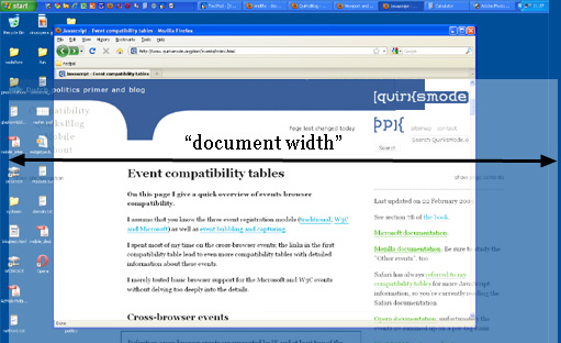
document width
文档宽度
What I really need to know is how wide the total content of the page is, including the bits that “stick out.” As far as I know it’s not possible to find that value (well, unless you calculate the individual widths and margins of all elements on the page, but that’s error-prone, to put it mildly).
我真正需要知道的是整个页面内容的宽度,包括“突出”来的部分。尽管我知道找到这个值很难。(好啦~,不要和我较真了,除非你愿意计算页面所有独立元素的宽度和边缘,而且这样子很容易算错。)
I am starting to believe that we need a JavaScript property pair that gives what I’ll call the “document width” (in CSS pixels, obviously).
我开始相信我们需要一个JS属性对来记录“文档宽度”。(当然是用CSS像素)
And if we’re really feeling funky, why not also expose this value to CSS? I’d love to be able to make the width: 100% of my blue bar dependent on the document width, and not the <html> element’s width. (This is bound to be tricky, though, and I wouldn’t be surprised if it’s impossible to implement.)
是不是感觉很怪,为什么我们不把这个值也传给CSS?我很愿意根据文档宽度来定义我的蓝色侧边栏宽度,而不是<html>元素。(这取决于是否为严格模式,而且不能这么实施我一点也不意外。)
Browser vendors, what do you think?
浏览器供应商,你们怎么看?
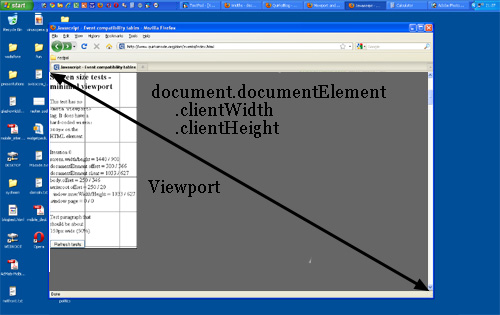
Measuring the viewport
测量视窗
You might want to know the dimensions of the viewport. They can be found in document.documentElement.clientWidth and -Height.
你可能想知道视窗的尺寸,可以在document.documentElement.clientWidth and -Height里找到。
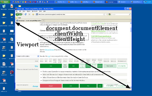
If you know your DOM, you know that document.documentElement is in fact the <html> element: the root element of any HTML document. However, the viewport is one level higher, so to speak; it’s the element that contains the <html> element. That might matter if you give the <html> element a width. (I don’t recommend that, by the way, but it’s possible.)
如果你知道DOM,你就会知道document.documentElement 实际上就是<html>元素:根元素就是所有HTML元素。但是视窗是更高级的,可以这么说,这是一种包含<html>元素的元素。如果你给了html元素一个宽度这就很重要了。(我不建议这么做,但顺便说一句这么做是可以的)
In that situation document.documentElement.clientWidth and -Height still gives the dimensions of the viewport, and not of the <html> element. (This is a special rule that goes only for this element only for this property pair. In all other cases the actual width of the element is used.)
在这种情况下document.documentElement.clientWidth and -Height 定义了视窗的尺寸,并且不是<html>元素。(这是一个特殊的规则仅适应这一个元素仅在这个属性下。所有其他情况真正的元素宽度还是被使用的。)
So document.documentElement.clientWidth and -Height always gives the viewport dimensions, regardless of the dimensions of the <html> element.
所以document.documentElement.clientWidth and -Height 总是定义视窗的尺寸,不管<html>尺寸如何。
Two property pairs
两个属性对
But aren’t the dimensions of the viewport width also given by window.innerWidth/Height? Well, yes and no.
但是是不是视窗的尺寸总是由window.innerWidth/Height定义呢?
There’s a formal difference between the two property pairs: document.documentElement.clientWidth and -Height doesn’t include the scrollbar, while window.innerWidth/Height does. That’s mostly a nitpick, though.
还有很多正式的不同在两个属性对之间:document.documentElement.clientWidth and -Height不包括侧边栏,而window.innerWidth/Height 包含。尽管这可以说是吹毛求疵。
The fact that we have two property pairs is a holdover from the Browser Wars. Back then Netscape only supported window.innerWidth/Height and IE only document.documentElement.clientWidth and -Height. Since then all other browsers started to support clientWidth/Height, but IE didn’t pick up window.innerWidth/Height.
事实上在浏览器大战中我们有了两个属性对控制相同信息。在那时网景只支持window.innerWidth/Height,而IE只支持document.documentElement.clientWidth and -Height 。自此所有其他浏览器仅支持clientWidth/Height,但是IE还是不肯使用window.innerWidth/Height。
Having two property pairs available is a minor nuisance on desktop — but it turns out to be a blessing on mobile, as we’ll see.
在电脑上有两种可用属性有一点讨厌——但是反过来是对于手机用户来说是个福音,让我们继续看后面。
Measuring the <html> element
测量<html>元素
So clientWidth/Height gives the viewport dimensions in all cases. But where can we find the dimensions of the <html> element itself? They’re stored in document.documentElement.offsetWidth and -Height.
所以clientWidth/Height可以在任何情况下定义视窗尺寸。但是我们在哪才能找到<html>元素本身的尺寸呢。他们存储在document.documentElement.offsetWidth and -Height.

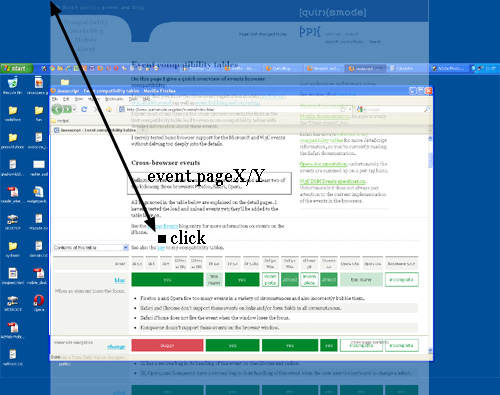
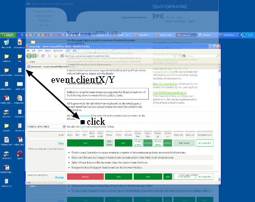
Event coordinates
事件坐标
Then there are the event coordinates. When a mouse event occurs, no less than five property pairs are exposed to give you information about the exact place of the event. For our discussion three of them are important:
这里有一些坐标。当鼠标点击事件发生时,至少有五个属性对在给你提供精确位置的信息。对我们这篇文章来说其中三个属性对是重要的。
- pageX/Y gives the coordinates relative to the <html> element in CSS pixels.
- pageX/Y用CSS像素定义了相对<html>元素的坐标。
- clientX/Y gives the coordinates relative to the viewport in CSS pixels.
- clientX/Y用CSS像素定义了相对视窗的坐标。
- screenX/Y gives the coordinates relative to the screen in device pixels.
- screenX/Y用设备像素定义了相对屏幕的坐标。
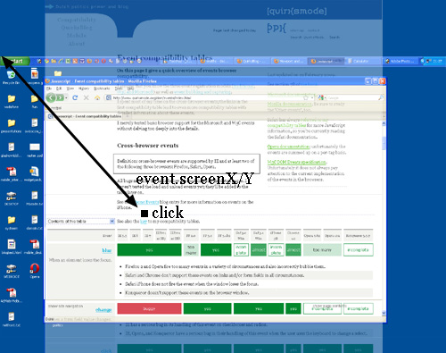
You’ll use pageX/Y 90% of the time; usually you want to know the event position relative to the document. The other 10% of the time you’ll use clientX/Y. You never ever need to know the event coordinates relative to the screen.
在90%的时间里你会使用pageX/Y;通常你会想要知道事件相对文档的位置。其余10%你会使用clientX/Y。你从来不会需要了解事件相对屏幕的坐标。
Media queries
媒体提问
Finally, some words about media queries. The idea is very simple: you can define special CSS rules that are executed only if the width of the page is larger than, equal to, or smaller than a certain size. For instance:
最后,一些关于媒体查询的话。想法非常简单:你可以定义特殊的CSS规则在页面放大或缩小时执行。例如:
div.sidebar {
	width: 300px;
}

@media all and (max-width: 400px) {
	// styles assigned when width is smaller than 400px;
	div.sidebar {
		width: 100px;
	}
}
Now the sidebar is 300px wide, except when the width is smaller than 400px, in which case the sidebar becomes 100px wide.
现在侧边栏有300px宽,当宽度小于400px时,侧边栏会变成100px宽。
The question is of course: which width are we measuring here?
这里有一个困惑的问题:我们测量的是哪个宽度?
There are two relevant media queries: width/height and device-width/device-height.
这里有两种相对的媒体查询: width/height and device-width/device-height.
- width/height uses the same values as documentElement .clientWidth/Height (the viewport, in other words). It works with CSS pixels.
- width/height使用和documentElement .clientWidth/Height相同的值(换句话说也就是视窗大小)用的是CSS像素。
- device-width/device-height uses the same values as screen.width/height (the screen, in other words). It works with device pixels.
- device-width/device-height 使用和screen.width/height 相同的值(说人话就是显示屏大小)。用的是设备像素。
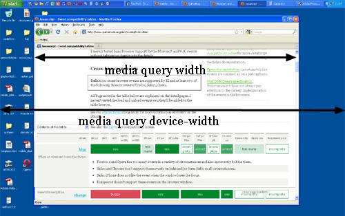
Which should you use? That’s a no-brainer: width, of course. Web developers are not interested in the device width; it’s the width of the browser window that counts.
你应该使用哪个呢?毫无疑问:width。Web开发商对设备宽度不感兴趣;重要的是浏览器窗口宽度。
So use width and forget device-width — on desktop. As we’ll see, the situation is much more messy on mobile.
所以在电脑上使用width并且忘掉设备宽度。我们会看到,在手机上情形会更加混乱。
Conclusion
总结
That concludes our foray into the desktop browsers’ behaviour. The second part of this series ports these concepts to mobile and highlights some important differences with the desktop.
这就结束了我们对桌面浏览器行为的探索。系列文章的第二部分会移植这些概念到手机浏览器,并且着重讲述二者的重要不同点。


 907
907


 被折叠的 条评论
为什么被折叠?
被折叠的 条评论
为什么被折叠?
 到【灌水乐园】发言


