


目录
第一章 前言
在前端开发的世界里,Ant Design 是一个响当当的名字。它的 Tab 组件功能强大,界面美观,几乎成为了行业标准。但由于最近使用的过程中发现一个问题,在使用了多个tab的时候,屏幕分辨率变化,会造成tab抖动现象(网上也有许多解决方法,但是小编没解决)。于时,小编以antd为模板,挑战了一下,看看用原生代码能不能打造出一个既炫酷又实用的 Tab 组件!从而直接去掉造成抖动的动画效果。废话不多说,直接上源代码!!
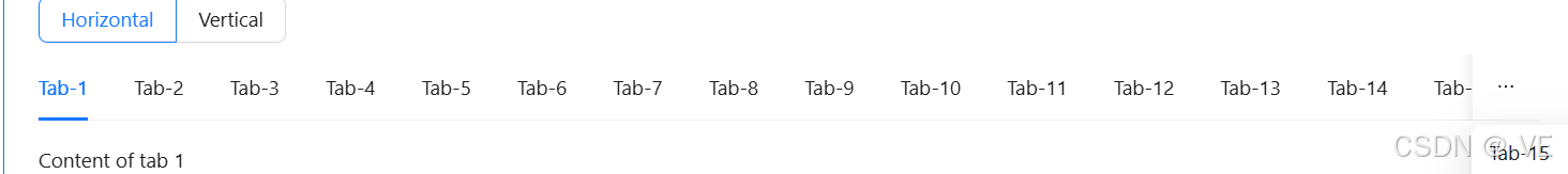
- 实现效果大致展示:

- 每一个配置项目的效果看antd官网即可,基本上一致:
Ant Design Vue — An enterprise-class UI components based on Ant Design and Vue.js
- 区别(该省略号功能小编直接删除了,因为他是找出小编项目闪动的原因):
第二章 源代码(cv即可用)
2.1 搭建基础结构
- 小编这里直接放的组件的源代码了,有问题可以留言/看代码解释
- 其他技术支持文章:
2.1.1 html
- Tab 组件的核心是"标签页"和"内容区域"
<template>
  // 标签页
  // 1、tabPosition控制tab位置的配置项
  <div class="tabs" :class="`tabs-${tabPosition}`">
    // 注意这些动态样式,都是针对性的,如果tabPosition位置变化,边框的样式一样需要调整
    <div
      class="custom-tabs"
      :style="{
        fontSize: fontSize[size],
        borderTop: tabPosition === 'bottom' && tabBorder ? '1px solid #dadada' : '',
        borderBottom: tabPosition === 'top' && tabBorder ? '1px solid #dadada' : '',
        borderLeft: tabPosition === 'right' && tabBorder ? '1px solid #dadada' : '',
        borderRight: tabPosition === 'left' && tabBorder ? '1px solid #dadada' : ''
      }"
    >
      // centered 控制tab居中的样式
      <div :class="['tabs-header', { 'tabs-center': centered }]">
        // 以下提供了两种样式,line和card的
        <div
          v-for="pane in list"
          :key="pane.key"
          :class="[
            'tab-item',
            {
              active: activeKeyVal === pane.key,
              disabled: pane.disabled,
              'tab-animated': animated,
              'line-border-top':
                activeKeyVal === pane.key && tabPosition === 'bottom' && tabType === 'line',
              'line-border-bottom':
                activeKeyVal === pane.key && tabPosition === 'top' && tabType === 'line',
              'line-border-left':
                activeKeyVal === pane.key && tabPosition === 'right' && tabType === 'line',
              'line-border-right':
                activeKeyVal === pane.key && tabPosition === 'left' && tabType === 'line',
              'tab-card': tabType === 'card',
              'tab-card-active': activeKeyVal === pane.key && tabType === 'card',
              'card-border-top':
                activeKeyVal === pane.key && tabPosition === 'bottom' && tabType === 'card',
              'card-border-bottom':
                activeKeyVal === pane.key && tabPosition === 'top' && tabType === 'card',
              'card-border-left':
                activeKeyVal === pane.key && tabPosition === 'right' && tabType === 'card',
              'card-border-right':
                activeKeyVal === pane.key && tabPosition === 'left' && tabType === 'card'
            }
          ]"
          @click="handleClick(pane)"
          :style="{
            ...tabBarStyle,
            marginLeft: tabBarGutter + 'px'
          }"
        >
          // 默认只展示标题,如果有其他需求,支持插槽,自定义
          <slot name="tab" :pane="pane">{{ pane.title }}</slot>
          <!-- closable:控制单个标签是否可删除 -->
          <CloseOutlined
            class="closed"
            @click.stop="handleClose(pane)"
            v-show="
              pane.disabled !== true &&
              pane.closable !== false &&
              editable === true &&
              list.length > 1 &&
              activeKeyVal !== pane.key
            "
          />
        </div>
        <div class="tab-add" @click="handleAdd" v-if="editable">
          <PlusOutlined />
        </div>
      </div>
    </div>
    // 内容区域
    // 这里是展示内容的插槽,也也可以设置默认值什么的,小编这里是通过父组件有没有使用插槽控制是否展示内容
    <div class="tab-content">
      <div
        v-for="pane in list"
        :key="pane.key"
        :class="[
          { 'show-content': activeKey === pane.key, 'hide-content': activeKey !== pane.key }
        ]"
      >
        <slot name="content" :pane="pane"></slot>
      </div>
    </div>
  </div>
</template>
2.1.2 css
- 主要是让标签页看起来像 Ant Design 那样整齐美观
- 注意:这里面有样式是直接动态展示的,记得换掉:var(--main-6)
<style lang="less" scoped>
  .tabs {
    width: 100%;
    display: flex;
    flex-direction: column;
  }
  .custom-tabs {
    width: 100%;
    height: 44px;

    .tabs-header {
      width: 100%;
      height: 100%;
      display: flex;
      align-items: center;

      .tab-item {
        position: relative;

        .closed {
          position: absolute;
          top: 50%;
          right: 4px;
          margin-top: -7px;
          color: rgba(0, 0, 0, 0.45);
          display: none;
        }

        &:hover {
          .closed {
            display: block;
          }
        }

        &:first-child {
          margin-left: 0 !important;
        }
      }
    }

    .tabs-center {
      justify-content: center;

      .tab-item {
        flex: 1;
      }
    }

    .tab-item {
      height: 100%;
      cursor: pointer;
      padding: 0 5px;
      color: #000000e6;
      border-bottom: 3px solid transparent;
    }
  }

  // 卡片形式
  .tab-card {
    background-color: rgba(0, 0, 0, 0.02);
    border: 1px solid rgba(5, 5, 5, 0.06);
  }
  .tab-card.tab-item {
    border-bottom: 1px solid rgba(5, 5, 5, 0.06);
    gap: 5px;
  }
  .tab-card-active {
    background-color: #fff;
  }
  .tab-item.card-border-top {
    border-top-color: transparent;
  }
  .tab-item.card-border-bottom {
    border-bottom-color: transparent;
  }
  .tab-item.card-border-left {
    border-left-color: transparent;
  }
  .tab-item.card-border-right {
    border-right-color: transparent;
  }

  // 新增tab按钮
  .tab-add {
    width: 44px;
    height: 44px;
    display: flex;
    justify-content: center;
    align-items: center;
    cursor: pointer;
    border: 1px solid rgba(5, 5, 5, 0.06);
    color: rgba(0, 0, 0, 0.88);
  }

  // 动画
  .tab-item.tab-animated {
    transition: all 0.2s linear;
  }

  // 激活时样式
  .tab-item.active {
    color: var(--main-6);
    font-weight: bold;
  }
  // 激活边框样式
  .tab-item.line-border-top {
    border-top: 3px solid var(--main-6);
  }
  .tab-item.line-border-bottom {
    border-bottom: 3px solid var(--main-6);
  }
  .tab-item.line-border-left {
    border-left: 3px solid var(--main-6);
  }
  .tab-item.line-border-right {
    border-right: 3px solid var(--main-6);
  }

  // tab禁用
  .tab-item.disabled {
    color: rgba(0, 0, 0, 0.25);
    cursor: not-allowed;
  }

  // 控制内容展示
  .show-content {
    display: block;
  }

  .hide-content {
    display: none;
  }

  // 位置
  .tabs-top {
    flex-direction: column;
  }

  .tabs-bottom {
    flex-direction: column-reverse;
  }

  .tabs-left {
    flex-direction: row;

    .custom-tabs {
      width: 150px;
      height: 100%;

      .tabs-header {
        width: 150px;
        height: 100%;
        display: flex;
        flex-direction: column;
        flex-wrap: wrap;

        .tab-item {
          width: 150px;
          padding: 8px 0;
        }
      }

      .tabs-center {
        .tab-item {
          display: flex;
          justify-content: center;
        }
      }
    }

    .tab-content {
      flex: 1;
    }
  }

  .tabs-right {
    flex-direction: row-reverse;

    .custom-tabs {
      width: 150px;
      height: 100%;

      .tabs-header {
        width: 150px;
        height: 100%;
        display: flex;
        flex-direction: column;
        flex-wrap: wrap;

        .tab-item {
          width: 150px;
          padding: 8px 0;
        }
      }

      .tabs-center {
        .tab-item {
          display: flex;
          justify-content: center;
        }
      }
    }

    .tab-content {
      flex: 1;
    }
  }
</style>
2.2 实现具体功能
小编主要实现了以下功能,提供以下配置项目(类型下面代码也携带):
- list:tab列表
- activeKey:激活索引
- tabType:tab的两种形式
- tabPosition:tab的位置
- centered:是否居中,居中:每一个tab居中且均分
- size:字体大小
- tabBarStyle: tab bar样式,支持自定义
- tabBarGutter:间隙(小编设置的范围)
- tabBorder:tab边框:需要搭配 tabPosition展示 否则不生效
- animated:是否使用动画
- editable:是否可编辑, 注:激活标签不可删除,只剩一个标签也不可删除
为父组件调用提供了以下方法(具体参数看代码):
- change:activeKey 的变化触发
- tabClick:点击切换标签页触发
- add:添加标签触发
- delete:删除标签触发
<script setup name="XnCustomTabs">
  const props = defineProps({
    // tab列表
    list: {
      type: Array,
      required: true,
      default: () => [
        {
          key: 1,
          title: 'tab1'
        },
        {
          key: 2,
          title: 'tab2'
        },
        {
          key: 3,
          title: 'tab3'
        }
      ]
    },
    // 索引
    activeKey: {
      type: [String, Number],
      default: ''
    },
    // tab 的形式
    tabType: {
      type: String,
      default: 'line', // line, card
      validator: function (value) {
        return ['line', 'card'].includes(value)
      }
    },
    // tab与内容位置
    tabPosition: {
      type: String,
      default: 'top', // top, right, bottom, left
      validator: function (value) {
        return ['top', 'right', 'bottom', 'left'].includes(value)
      }
    },
    // tab 是否居中,居中:每一个tab居中且均分
    centered: {
      type: Boolean,
      default: false
    },
    // 字体大小
    size: {
      type: String,
      validator: function (value) {
        return ['small', 'middle', 'large'].includes(value)
      },
      default: 'middle'
    },
    // tab bar样式
    tabBarStyle: {
      type: Object,
      default: () => {}
    },
    // 间隙
    tabBarGutter: {
      type: Number,
      default: 0,
      validator: (value) => value >= 0 && value <= 100
    },
    // tab边框:需要搭配 tabPosition展示 否则不生效
    tabBorder: {
      type: Boolean,
      default: false
    },
    // 是否使用动画
    animated: {
      type: Boolean,
      default: true
    },
    // 是否可编辑, 注:激活标签不可删除,只剩一个标签也不可删除
    editable: {
      type: Boolean,
      default: false
    }
  })

  const emit = defineEmits(['change', 'tabClick', 'add', 'delete'])

  const activeKeyVal = ref(props.activeKey)
  const fontSize = {
    small: '12px',
    middle: '14px',
    large: '16px'
  }

  // 切换标签页
  const handleClick = (pane) => {
    if (pane.disabled) return
    emit('tabClick', pane.key)
  }

  // 添加标签
  const handleAdd = () => {
    emit('add', props.list)
  }

  // 删除标签
  const handleClose = (pane) => {
    const filterList = props.list.filter((item) => item.key !== pane.key)
    emit('delete', filterList, pane.key)
  }

  // 监听 activeKey 的变化
  watch(
    () => props.activeKey,
    (newVal) => {
      activeKeyVal.value = newVal
      emit('change', newVal)
    }
  )

  // 如果没有指定激活的标签页/初始化key不对,默认激活第一个
  onMounted(() => {
    const flag = props.list.some((item) => item.key === props.activeKey)
    if (!flag && props.list.length > 0) {
      activeKeyVal.value = props.list[0].key
    }
  })
</script>
2.3 使用
注意:由于小编要适配以前的以前的代码,这里是又做了一层二次封装,又再一次一个一个导入的,如果看了小编上面的技术支持文章其实是还有代码的优化空间的!!
<script setup name="XnNewTabs">
  import Tabs from '@/components/Tabs/index.vue'
  import tool from '@/utils/tool'

  const emit = defineEmits(['change', 'itemChange', 'tabClick', 'add', 'delete'])

  const props = defineProps({
    // 列表
    tabsList: {
      type: Array,
      default: () => [
        {
          activedIcon: `@/assets/images/things/thing/${tool.getStepColorImg(
            'step_basic_actived'
          )}.png`,
          icon: '@/assets/images/things/thing/step_basic.png',
          title: '基础信息',
          key: 1
        },
        {
          activedIcon: `@/assets/images/things/thing/${tool.getStepColorImg(
            'step_field_actived'
          )}.png`,
          icon: '@/assets/images/things/thing/step_field.png',
          title: '字段配置',
          key: 2
        },
        {
          activedIcon: `@/assets/images/things/thing/${tool.getStepColorImg(
            'step_form_actived'
          )}.png`,
          icon: '@/assets/images/things/thing/step_form.png',
          title: '表单配置',
          key: 3
        },
        {
          activedIcon: `@/assets/images/things/thing/${tool.getStepColorImg(
            'step_material_actived'
          )}.png`,
          icon: '@/assets/images/things/thing/step_material.png',
          title: '材料配置',
          key: 4
        },
        {
          activedIcon: `@/assets/images/things/thing/${tool.getStepColorImg(
            'step_situation_actived'
          )}.png`,
          icon: '@/assets/images/things/thing/step_situation.png',
          title: '情形配置',
          key: 5
        },
        {
          activedIcon: `@/assets/images/things/thing/${tool.getStepColorImg(
            'step_result_actived'
          )}.png`,
          icon: '@/assets/images/things/thing/step_result.png',
          title: '结果页配置',
          key: 6
        },
        {
          activedIcon: `@/assets/images/things/thing/${tool.getStepColorImg(
            'step_transact_actived'
          )}.png`,
          icon: '@/assets/images/things/thing/step_transact.png',
          title: '办理流程绑定',
          key: 7
        },
        {
          activedIcon: `@/assets/images/things/thing/${tool.getStepColorImg(
            'step_form_actived'
          )}.png`,
          icon: '@/assets/images/things/thing/step_form.png',
          title: '业务办理信息配置',
          key: 8
        },
        {
          activedIcon: `@/assets/images/things/thing/${tool.getStepColorImg(
            'step_message_actived'
          )}.png`,
          icon: '@/assets/images/things/thing/step_message.png',
          title: '消息通知管理',
          key: 9
        }
      ]
    },
    activeKey: {
      type: [String, Number],
      default: 1
    },
    type: {
      type: String,
      default: 'line'
    },
    tabPosition: {
      type: String,
      default: 'top', // top, right, bottom, left
      validator: function (value) {
        return ['top', 'right', 'bottom', 'left'].includes(value)
      }
    },
    centered: {
      type: Boolean,
      default: true
    },
    size: {
      type: String,
      validator: function (value) {
        return ['small', 'middle', 'large'].includes(value)
      },
      default: 'middle'
    },
    tabBarStyle: {
      type: Object,
      default: () => {}
    },
    tabBarGutter: {
      type: Number,
      default: 0,
      validator: (value) => value >= 0 && value <= 100
    },
    tabBorder: {
      type: Boolean,
      default: false
    },
    animated: {
      type: Boolean,
      default: true
    },
    editable: {
      type: Boolean,
      default: false
    }
  })

  const change = (key) => {
    emit('change', key)
  }

  const itemChange = (item) => {
    emit('itemChange', item)
  }

  const tabClick = (key) => {
    emit('tabClick', key)
  }
  const tabAdd = (list) => {
    emit('add', list)
  }
  const tabDelete = (list, key) => {
    emit('delete', list, key)
  }
</script>
<template>
  <Tabs
    :list="tabsList"
    :activeKey="activeKey"
    @change="change"
    @tabClick="tabClick"
    @add="tabAdd"
    @delete="tabDelete"
    :tabType="type"
    :tabPosition="tabPosition"
    :size="size"
    :tabBarStyle="tabBarStyle"
    :tabBarGutter="tabBarGutter"
    :tabBorder="tabBorder"
    :animated="animated"
    :editable="editable"
    :centered="centered"
    class="tabs"
  >
    <!-- 自定义tab如果设置了样式配置将有可能不生效 -->
    <template #tab="{ pane }">
      <div
        class="tab_item h-full"
        @click="itemChange(pane)"
        :style="{
          color: pane.key === activeKey ? 'var(--main-6)' : ''
        }"
      >
        <span class="tab_icon">
          <img :src="tool.getAssetsFile(pane.activedIcon)" alt="" v-if="pane.key === activeKey" />
          <img :src="tool.getAssetsFile(pane.icon)" alt="" v-else />
        </span>
        {{ pane.title }}
      </div>
    </template>
    <!-- <template #content="{ pane }">{{ pane.key }}</template> -->
  </Tabs>
</template>

<style lang="less" scoped>
  .tabs {
    .tab_item {
      display: flex;
      justify-content: center;
      align-items: center;

      .tab_icon {
        width: 32px;
        height: 32px;
        margin-right: 5px;
      }
    }
  }
</style>
第三章 总结
通过这次挑战,小编成功用原生代码实现了一个功能强大的 Tab 组件!尽管它可能没有 Ant Design 那么全面,但它的目前能实现的功能还是可以匹配的。更重要的是,我们在这个过程中掌握了一个新组件,将来不管在何处用到,都是可以节省不少的时间。
如果大家觉得这个组件还不够完美,欢迎评论区留言,小编也会根据有用的需求继续改进!最后,前端开发的魅力就在于可以不断优化和创新!
如果有用就一键三连吧!!!!


 扫一扫
扫一扫


 被折叠的 条评论
为什么被折叠?
被折叠的 条评论
为什么被折叠?
 到【灌水乐园】发言


