


 本文介绍网页设计中元素水平和垂直居中的多种方法,包括行内元素、块级元素的居中处理,以及利用CSS定位、Flexbox等技术实现复杂布局。
目录
一、水平居中
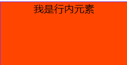
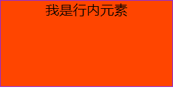
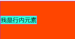
1.行内元素水平居中
(1)父元素是块级元素
- 直接给父元素设置text-align: center
   <style>
        .box{
            width: 200px;
            height: 100px;
            border: 1px solid blueviolet;
            background-color: orangered;
            text-align: center;
        }
    </style>

    <div class="box">
        <span>我是行内元素</span>
    </div>
(2)父元素不是块级元素
- 先将父元素设置成块级元素,再给父元素设置text-align: center
   <style>
        .box{
            display: block;
            width: 200px;
            height: 100px;
            border: 1px solid blueviolet;
            background-color: orangered;
            text-align: center;
        }
    </style>

    <span class="box">
        <span>我是行内元素</span>
    </span>
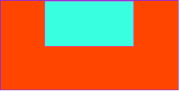
2.块级元素水平居中
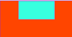
(1)已知块级元素的宽度和高度
- 需要谁居中,给其设置margin: 0 auto
<style>
    .box{
       width: 200px;
       height: 100px;
       border: 1px solid blueviolet;
       background-color: orangered;
      }
    .boxes{
       width: 100px;
       height: 50px;
       border: 1px solid #e245c5;
       background-color: #37ffdf;
       margin: 0 auto;
      }
</style>

    <div class="box">
        <div class="boxes"></div>
    </div>
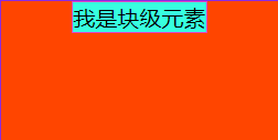
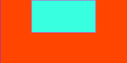
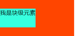
(2)未知块级元素的宽度和高度
- 默认子元素的宽度和高度和父元素一样,这时需要设置子元素为display: inline-block或display: inline。即将其转换成行级块/行内元素,给父元素设置text-align: center
<style>
    .box{
       width: 200px;
       height: 100px;
       border: 1px solid blueviolet;
       background-color: orangered;
       text-align: center;
      }
    .boxes{
       display: inline-block;
       border: 1px solid #e245c5;
       background-color: #37ffdf;
       margin: 0 auto;
      }
</style>

    <div class="box">
        <div class="boxes">我是块级元素</div>
    </div>
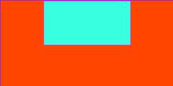
(3)使用定位属性(父相子绝)
- 首先设置父元素为相对定位,子元素为绝对定位
- 设置子元素left:50%,让子元素的左上角水平居中
- 设置子元素的margin-left:-元素宽度的一半或者设置transform:translateX(-50%)
<style>
     .box{
        position: relative;
        width: 200px;
        height: 100px;
        border: 1px solid blueviolet;
        background-color: orangered;
        text-align: center;
      }
     .boxes{
        width: 100px;
        height: 50px;
        position: absolute;
        border: 1px solid #e245c5;
        background-color: #37ffdf;
        left: 50%;
        margin-left: -50px;
      }
</style>

    <div class="box">
        <div class="boxes"></div>
    </div>
<style>
    .box{
       position: relative;
       width: 200px;
       height: 100px;
       border: 1px solid blueviolet;
       background-color: orangered;
       text-align: center;
     }
    .boxes{
       width: 100px;
       height: 50px;
       position: absolute;
       border: 1px solid #e245c5;
       background-color: #37ffdf;
       left: 50%;
       transform: translateX(-50%);
     }
</style>

    <div class="box">
        <div class="boxes"></div>
    </div>
(4)使用flexbox布局实现(宽度确不确定都可以)
- 给待处理的元素的父元素添加属性display: flex; justify-content: center;
<style>
   .box{
       width: 200px;
       height: 100px;
       border: 1px solid blueviolet;
       background-color: orangered;
       display: flex;
       justify-content: center;
      }
   .boxes{
       width: 100px;
       height: 50px;
       border: 1px solid #e245c5;
       background-color: #37ffdf;
      }
</style>

    <div class="box">
        <div class="boxes"></div>
    </div>
二、垂直居中
1.单行的行内元素垂直居中
设置单行行内元素的行高等于盒子的高即可
<style>
    .box{
        width: 200px;
        height: 100px;
        border: 1px solid blueviolet;
        background-color: orangered;
      }
    .id{
        height: 100px;
        line-height: 100px;
        border: 1px solid #e245c5;
        background-color: #37ffdf;
      }
</style>

    <div class="box">
        <span class="id">我是行内元素</span>
    </div>
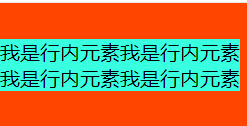
2.多行的行内元素垂直居中
- 给父元素设置display:table-cell和vertical-align:middle
<style>
     .box{
         display: table-cell;
         vertical-align: middle;
         width: 200px;
         height: 100px;
         background-color: orangered;
       }
     .id{
         background-color: #37ffdf;
       }
</style>

    <div class="box">
        <span class="id">我是行内元素我是行内元素我是行内元素我是行内元素</span>
    </div>
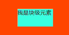
3.块级元素垂直居中
(1)使用定位属性(父相子绝)
- 首先设置父元素为相对定位,子元素为绝对定位
- 设置子元素top:50%,让子元素的左上角水平居中
- 设置子元素的margin-top:-元素宽度的一半或者设置transform:translateY(-50%)
<style>
    .box{
         width: 200px;
         height: 100px;
         background-color: orangered;
         position: relative;
        }
    .id{
         position: absolute;
         height: 50px;
         top: 50%;
         margin-top: -25px;
         background-color: #37ffdf;
        }
</style>

    <div class="box">
        <div class="id">我是块级元素</div>
    </div>
<style>
    .box{
         width: 200px;
         height: 100px;
         background-color: orangered;
         position: relative;
        }
    .id{
         position: absolute;
         height: 50px;
         top: 50%;
         transform: translateY(-50%);
         background-color: #37ffdf;
        }
</style>

    <div class="box">
        <div class="id">我是块级元素</div>
    </div>
(2)使用flexbox布局实现(宽度确不确定都可以)
- 给待处理的元素的父元素添加属性display: flex; align-items: center;
<style>
    .box{
         width: 200px;
         height: 100px;
         display: flex;
         align-items: center;
         background-color: orangered;
        }
    .id{
         height: 50px;
         background-color: #37ffdf;
        }
</style>

    <div class="box">
        <div class="id">我是块级元素</div>
    </div>

三、块级元素水平+垂直居中
1.已知宽度和高度的块级元素水平+垂直居中
方案一:
- 设置父元素为相对定位,
- 子元素设置绝对定位,top: 0;bottom: 0;left: 0;right: 0;margin: auto;
<style>
    .box{
         position: relative;
         width: 200px;
         height: 100px;
         background-color: orangered;
        }
    .id{
         position: absolute;
         top: 0;
         bottom: 0;
         left: 0;
         right: 0;
         width: 100px;
         height: 50px;
         margin: auto;
         background-color: #37ffdf;
        }
</style>

    <div class="box">
        <div class="id">我是块级元素</div>
    </div>
方案二:
- 设置父元素为相对定位,
- 子元素设置绝对定位,top: 50%;left: 50%;margin-top:-元素高度的一半;margin-left:-元素宽度的一半。
<style>
    .box{
         position: relative;
         width: 200px;
         height: 100px;
         background-color: orangered;
        }
    .id{
         position: absolute;
         top: 50%;
         left: 50%;
         width: 100px;
         height: 50px;
         margin-top: -25px;
         margin-left: -50px;
         background-color: #37ffdf;
        }
</style>

    <div class="box">
        <div class="id">我是块级元素</div>
    </div>
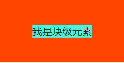
2.未知高度和宽度的块级元素水平+垂直居中
方案一:使用定位属性
- 设置父元素为相对定位,
- 子元素设置绝对定位,top: 50%;left: 50%;transform: translate(-50%,-50%);
<style>
    .box{
         position: relative;
         width: 200px;
         height: 100px;
         background-color: orangered;
        }
    .id{
         position: absolute;
         top: 50%;
         left: 50%;
         transform: translate(-50%,-50%);
         background-color: #37ffdf;
        }
</style>

    <div class="box">
        <div class="id">我是块级元素</div>
    </div>
方案二:使用flex布局实现
- 设置父元素为flex定位,display: flex; justify-content: center; align-items: center;
<style>
    .box{
         display: flex;
         justify-content: center;
         align-items: center;
         width: 200px;
         height: 100px;
         background-color: orangered;
        }
    .id{
         background-color: #37ffdf;
        }
</style>

    <div class="box">
        <div class="id">我是块级元素</div>
    </div>


 扫一扫
扫一扫


 485
485


 到【灌水乐园】发言


