布局
<view>
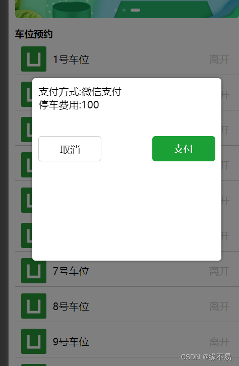
<view v-if="show" class="popup">
<view class="popup-box">
<view>支付方式:{{way}}</view>
<view>停车费用:{{money}}</view>
<view class="btn-box">
<view class="cancel btn" @click="cancel">取消</view>
<view class="confirm btn" @click="confirm">支付</view>
</view>
</view>
</view>
</view>
样式
.popup {
		width: 100%;
		height: 100%;
		position: fixed;
		top: 0;
		left: 0;
		background-color: rgba(0, 0, 0, 0.5);
		z-index: 9999;

		.popup-box {
			background-color: #fff;
			width: 80%;
			height: 40%;
			margin: 60% auto 0rpx; // 居中显示弹窗内容
			padding: 20rpx; // 添加一些内边距,使内容不会紧贴边缘
			border-radius: 10rpx; // 添加一些圆角,使内容更美观
			box-sizing: border-box; // 确保内边距不会影响内容宽度和高度
			overflow: auto; // 添加滚动条,如果内容超出弹窗框的高度
			box-shadow: 0 0 10rpx rgba(0, 0, 0, 0.5); // 添加一些阴影,使内容更突出

			.btn-box{
				display: flex; // 使用flex布局,使按钮水平排列
                justify-content: space-between; // 使按钮平均分布,两端对齐
				align-items: center;
				.btn{
					margin-top: 80rpx;
					width: 200rpx;
					height: 80rpx;
					line-height: 80rpx;
				}
				.cancel{
					background-color: #fff;
					color: #000;
					border-radius: 10rpx; // 添加一些圆角,使内容更美观
                    border: 1rpx solid #ccc; // 添加一些边框,使内容更突出
                    text-align: center;
				}
				.confirm{
                    background-color: #1BA035;
                    color: #fff; // 添加一些内边距,使内容不会紧贴边缘
                    border-radius: 10rpx; // 添加一些边框,使内容更突出
					text-align: center;
					}

			}
		}
	}
效果图


 1281
1281


 被折叠的 条评论
为什么被折叠?
被折叠的 条评论
为什么被折叠?
 到【灌水乐园】发言


