


这是一篇基于阅读vant源码以及实际开发后,对于UI组件开发流程进行总结的学习文档。下面将以Button组件的开发为例进行介绍。
1.Vant简介
Vant 是一个轻量、可靠的移动端组件库,目前 Vant 官方提供了 Vue 2 版本、Vue 3 版本和微信小程序版本,并由社区团队维护 React 版本和支付宝小程序版本。
特性
- 🚀 性能极佳,组件平均体积小于 1KB(min+gzip)
- 🚀 70+ 个高质量组件,覆盖移动端主流场景
- 🚀 零外部依赖,不依赖三方 npm 包
- 💪 使用 TypeScript 编写,提供完整的类型定义
- 💪 单元测试覆盖率超过 90%,提供稳定性保障
- 📖 提供丰富的中英文文档和组件示例
- 📖 提供 Sketch 和 Axure 设计资源
- 🍭 支持 Vue 2、Vue 3 和微信小程序
- 🍭 支持主题定制,内置 700+ 个主题变量
- 🍭 支持按需引入和 Tree Shaking
- 🍭 支持无障碍访问(持续改进中)
- 🍭 支持深色模式(从 Vant 4 开始支持)
- 🍭 支持服务器端渲染
- 🌍 支持国际化,内置 20+ 种语言包
2.组件结构
vant组件源码的主要结构如下图:
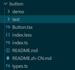
- demo:存放组件具体使用的示例页面
- test:单元测试文件
- Button.tsx:button组件的主要逻辑源码
- index.less:组件的样式
- index.ts:组件的入口文件
- types.ts:对组件中某些属性的类型进行限定
3.源码分析
源码:
import { withInstall } from '../utils';
import _Button from './Button'; // 导出组件选项对象

export const Button = withInstall(_Button); // 为组件选项对象挂载install方法
export default Button; // 导出组件选项
export { buttonProps } from './Button'; // 导出组件Props
export type { ButtonProps } from './Button'; // 导出Props类型
export type {
  ButtonType,
  ButtonSize,
  ButtonNativeType,
  ButtonIconPosition,
} from './types'; // 导出其他类型限定

declare module 'vue' { // 声明模块
  export interface GlobalComponents {
    VanButton: typeof Button;
  }
}
index.ts中导入了两个文件的内容,withInstall是一个工具方法,用于在导入组件时自动将install方法挂载到组件实例当中。Vue2.x版本中暴露的Vue.use函数以及3.x版本中实例方法app.use可以接收一个对象参数或install函数,传入对象时,实际上use方法会调用传入对象的install方法。因此在全局使用.use方法其实就是vue进行组件全局注册的过程。
export function withInstall<T extends Component>(options: T) {
  (options as Record<string, unknown>).install = (app: App) => {
    const { name } = options;
    if (name) {
      app.component(name, options);
      app.component(camelize(`-${name}`), options);
    }
  };

  return options as WithInstall<T>;
}
 use(plugin, ...options) { // use方法源码
                if (installedPlugins.has(plugin)) {
                    (process.env.NODE_ENV !== 'production') && warn(`Plugin has already been applied to target app.`);
                }
                else if (plugin && isFunction(plugin.install)) {
                    installedPlugins.add(plugin);
                    plugin.install(app, ...options);
                }
                else if (isFunction(plugin)) {
                    installedPlugins.add(plugin);
                    plugin(app, ...options);
                }
                else if ((process.env.NODE_ENV !== 'production')) {
                    warn(`A plugin must either be a function or an object with an "install" ` +
                        `function.`);
                }
                return app;
            },
知道了withInstall函数的作用,我们还需要明白_Button是什么。
以下代码用到了TSX语法,在此不对该语法做详细说明,感兴趣的小伙伴可以自行研究。
源码:
import {
  defineComponent,
  type PropType,
  type CSSProperties,
  type ExtractPropTypes,
} from 'vue';

// Utils
import {
  extend,
  numericProp,
  preventDefault,
  makeStringProp,
  createNamespace,
  BORDER_SURROUND,
} from '../utils';
import { useRoute, routeProps } from '../composables/use-route';

// Components
import { Icon } from '../icon';
import { Loading, LoadingType } from '../loading';

// Types
import {
  ButtonSize,
  ButtonType,
  ButtonNativeType,
  ButtonIconPosition,
} from './types';

const [name, bem] = createNamespace('button');

export const buttonProps = extend({}, routeProps, {
  tag: makeStringProp<keyof HTMLElementTagNameMap>('button'),
  text: String,
  icon: String,
  type: makeStringProp<ButtonType>('default'),
  size: makeStringProp<ButtonSize>('normal'),
  color: String,
  block: Boolean,
  plain: Boolean,
  round: Boolean,
  square: Boolean,
  loading: Boolean,
  hairline: Boolean,
  disabled: Boolean,
  iconPrefix: String,
  nativeType: makeStringProp<ButtonNativeType>('button'),
  loadingSize: numericProp,
  loadingText: String,
  loadingType: String as PropType<LoadingType>,
  iconPosition: makeStringProp<ButtonIconPosition>('left'),
});

export type ButtonProps = ExtractPropTypes<typeof buttonProps>;
export default defineComponent({
  name,

  props: buttonProps,

  emits: ['click'],

  setup(props, { emit, slots }) {
    const route = useRoute();

    const renderLoadingIcon = () => {
      if (slots.loading) {
        return slots.loading();
      }

      return (
        <Loading
          size={props.loadingSize}
          type={props.loadingType}
          class={bem('loading')}
        />
      );
    };

    const renderIcon = () => {
      if (props.loading) {
        return renderLoadingIcon();
      }

      if (slots.icon) {
        return <div class={bem('icon')}>{slots.icon()}</div>;
      }

      if (props.icon) {
        return (
          <Icon
            name={props.icon}
            class={bem('icon')}
            classPrefix={props.iconPrefix}
          />
        );
      }
    };

    const renderText = () => {
      let text;
      if (props.loading) {
        text = props.loadingText;
      } else {
        text = slots.default ? slots.default() : props.text;
      }

      if (text) {
        return <span class={bem('text')}>{text}</span>;
      }
    };

    const getStyle = () => {
      const { color, plain } = props;
      if (color) {
        const style: CSSProperties = {
          color: plain ? color : 'white',
        };

        if (!plain) {
          // Use background instead of backgroundColor to make linear-gradient work
          style.background = color;
        }

        // hide border when color is linear-gradient
        if (color.includes('gradient')) {
          style.border = 0;
        } else {
          style.borderColor = color;
        }

        return style;
      }
    };

    const onClick = (event: MouseEvent) => {
      if (props.loading) {
        preventDefault(event);
      } else if (!props.disabled) {
        emit('click', event);
        route();
      }
    };

    return () => { // 返回render函数
      const {
        tag,
        type,
        size,
        block,
        round,
        plain,
        square,
        loading,
        disabled,
        hairline,
        nativeType,
        iconPosition,
      } = props;

      const classes = [
        bem([
          type,
          size,
          {
            plain,
            block,
            round,
            square,
            loading,
            disabled,
            hairline,
          },
        ]),
        { [BORDER_SURROUND]: hairline },
      ];

      return (
        <tag
          type={nativeType}
          class={classes}
          style={getStyle()}
          disabled={disabled}
          onClick={onClick}
        >
          <div class={bem('content')}>
            {iconPosition === 'left' && renderIcon()}
            {renderText()}
            {iconPosition === 'right' && renderIcon()}
          </div>
        </tag>
      );
    };
  },
});
首先我们将注意力集中到export default defineComponent语句开始的位置,我们可以看到,defineComponent函数接收了一个对象,对Vue比较熟悉的小伙伴不会陌生,这个对象不就是我们平时用options API在.vue文件的script标签中写的组件配置项吗?确实如此。来看看defineComponent的返回值是什么:
function defineComponent(options) {
    return isFunction(options) ? { setup: options, name: options.name } : options;
}
该函数所做的事情其实很简单,判断传入的options是否是一个函数,如果是,将其包装成一个对象然后返回,如果不是,则直接返回对象本身。我们在index.ts文件中导入的就是这么一个对象。
到此,index.ts文件中执行的操作就很清晰了:
- 导入组件选项对象
- 在该对象上挂载install函数并导出。
到此为止,我们已经明白了index.ts中到底做了什么,但这仅仅只是开始,现在我们要开始探索组件到底是怎么通过Button.tsx构建出来的。在此之前,我们需要明白单文件组件SFC是怎么被vue编译出来的。

vue单文件组件模板将.vue文件分为了三层:1.template模板层 2.script脚本 3.style样式。其实真正原生的vue是这样使用的:
<!DOCTYPE html>
<html lang="en">

<head>
    <meta charset="UTF-8">
    <meta http-equiv="X-UA-Compatible" content="IE=edge">
    <meta name="viewport" content="width=device-width, initial-scale=1.0">
    <title>Document</title>
    <script src="https://unpkg.com/vue@3/dist/vue.global.js"></script>

</head>

<body>
    <div id="app">
        <child></child>
    </div>

</body>
<script>
    const { createApp } = Vue;
    const app = createApp({ // 创建一个vue实例
        template: `
            <div>HelloWorld</div>
        `,
    })
    // 给实例挂载一个组件
    app.component("child", {
        template: `
            <div>It is cool</div>
        `
    })
    app.mount("#app")
</script>
</html>
.vue文件中的template层其实就对应下面上面例子中我们传给createApp函数中对象的template属性。vue会将template中的代码解析成render函数,其包含以下步骤:
Vue的模板编译就是将template模板编译成render函数的过程。这个过程大致可以分成三个阶段:
- 解析阶段:将“HTML”模板解析成AST语法树;
- 优化阶段:从AST语法树中找出静态子树并进行标记(被标记的静态子树在虚拟dom比对时会被 忽略,从而提高虚拟dom比对的性能);
- 代码生成阶段:通过AST生成代码字符串,并最终生成render函数。
在Button.tsx文件中,setup函数最终的返回值是一个匿名函数,其实,这里返回的就是一个render函数,因为我们在定义组件时直接跳过了对于模板(template)的定义,render函数返回的是虚拟DOM节点,接收一个createElement参数,该参数是一个函数,用于创建VNode,TSX语法对创建VNode的操作在语法层面进行了简化,使得可以在TS当中直接书写HTML结构并作为createElement函数的返回值返回。
vue会根据render函数构建虚拟DOM,并在过程中加入对数据的劫持。数据改变时对虚拟DOM树进行维护,并通过diff算法进行同层比较,判断出需要更新的真实DOM结构。
现在我们明白了为什么即使我们没有定义任何的template,vue依然能够将我们想要的UI组件渲染出来。下面我们来看看Button组件的内部逻辑是怎么实现的。
这里导出了一些类型和工具函数,在这里不讨论其具体实现,下面对比较重要的内容进行简要说明。
import {
  defineComponent,
  type PropType,
  type CSSProperties,
  type ExtractPropTypes,
} from 'vue';

import {
  extend, // Object.assign方法的引用,用于浅拷贝和组合组件的props
  numericProp,
  preventDefault, // 阻止默认行为
  makeStringProp,
  createNamespace, // 创建一个命名空间,返回一个bem函数,根据组件名自动生成前缀并拼接完整的css类名
  BORDER_SURROUND,
} from '../utils';
下面定义了可以传递给组件的Props及其类型约束。
export const buttonProps = extend({}, routeProps, {
  tag: makeStringProp<keyof HTMLElementTagNameMap>('button'),
  text: String,
  icon: String,
  type: makeStringProp<ButtonType>('default'),
  size: makeStringProp<ButtonSize>('normal'),
  color: String,
  block: Boolean,
  plain: Boolean,
  round: Boolean,
  square: Boolean,
  loading: Boolean,
  hairline: Boolean,
  disabled: Boolean,
  iconPrefix: String,
  nativeType: makeStringProp<ButtonNativeType>('button'),
  loadingSize: numericProp,
  loadingText: String,
  loadingType: String as PropType<LoadingType>,
  iconPosition: makeStringProp<ButtonIconPosition>('left'),
});
下面是Button组件渲染逻辑的具体实现
export default defineComponent({
  name, // 组件名称

  props: buttonProps, // 之前声明的组件props

  emits: ['click'], // 重写click事件,将click事件作为组件的自定义事件

  setup(props, { emit, slots }) { // setup函数包含两个参数,实例props、context上下文对象,从context中解构出emit事件和slots插槽
    const route = useRoute(); // 创建路由对象


    /*
    	渲染加载图标,如果插槽中存在名为loading的插槽,则返回slots.loading(),否则返回固定的结构。
    */
    const renderLoadingIcon = () => {
      if (slots.loading) {
        return slots.loading();
      }

      return (
        <Loading
          size={props.loadingSize}
          type={props.loadingType}
          class={bem('loading')}
        />
      );
    };

    /*
    	渲染图标,如果插槽中存在名为icon的插槽,则返回slots.icon(),否则返回固定的结构。
    */
    const renderIcon = () => {
      if (props.loading) {
        return renderLoadingIcon();
      }

      if (slots.icon) {
        return <div class={bem('icon')}>{slots.icon()}</div>;
      }

      if (props.icon) {
        return (
          <Icon
            name={props.icon}
            class={bem('icon')}
            classPrefix={props.iconPrefix}
          />
        );
      }
    };

	 /*
    	渲染button内的文字,如果传给了button组件loading属性,则显示loadingText的文字,否则判断是否存在默认插槽,如果存在,button内容就是插槽内的文字,否则就是props中text的文字。
    */
    const renderText = () => {
      let text;
      if (props.loading) {
        text = props.loadingText;
      } else {
        text = slots.default ? slots.default() : props.text;
      }

      if (text) {
        return <span class={bem('text')}>{text}</span>;
      }
    };

	/*
    	这里根据传入的props生成指定的css样式并返回
    */

    const getStyle = () => {
      const { color, plain } = props;
      if (color) {
        const style: CSSProperties = {
          color: plain ? color : 'white',
        };

        if (!plain) {
          // Use background instead of backgroundColor to make linear-gradient work
          style.background = color;
        }

        // hide border when color is linear-gradient
        if (color.includes('gradient')) {
          style.border = 0;
        } else {
          style.borderColor = color;
        }

        return style;
      }
    };

	/*
    	为button点击绑定监听事件,如果传了loading,则阻止button的默认点击行为
    */

    const onClick = (event: MouseEvent) => {
      if (props.loading) {
        preventDefault(event);
      } else if (!props.disabled) {
        emit('click', event);
        route();
      }
    };

    return () => {

      // 解构出需要需要在生成button组件时需要用到的props
      const {
        tag,
        type,
        size,
        block,
        round,
        plain,
        square,
        loading,
        disabled,
        hairline,
        nativeType,
        iconPosition,
      } = props;


      // 生成css类名
      const classes = [
        bem([
          type,
          size,
          {
            plain,
            block,
            round,
            square,
            loading,
            disabled,
            hairline,
          },
        ]),
        { [BORDER_SURROUND]: hairline },
      ];

       // 返回button组件的虚拟DOM结构
      return (
        <tag
          type={nativeType}
          class={classes}
          style={getStyle()}
          disabled={disabled}
          onClick={onClick}
        >
          <div class={bem('content')}>
            {iconPosition === 'left' && renderIcon()} // 是否渲染图标
            {renderText()}
            {iconPosition === 'right' && renderIcon()} // 渲染图标
          </div>
        </tag>
      );
    };
  },
});
结语
组件开发与常规的页面开发不同,跳过了template层的定义,采用直接返回render函数结合TSX的语法的方式对组件结构进行定义。由于跳过了将template模板编译为render函数的过程,通常一个页面会包含很多的组件,页面的渲染将变得非常高效且直接。但这样的方式将view与model进行了高度的耦合,注定不适用于结构复杂的网页开发。但在HTML结构简单的组件开发中却优势明显,不同组件之间的复用和逻辑处理也变得十分简单和高效。


 扫一扫
扫一扫


 1864
1864

 被折叠的 条评论
为什么被折叠?
被折叠的 条评论
为什么被折叠?
 到【灌水乐园】发言


