


前言
vue 翻页时钟制作基于 kuan-vue-flip-clock 插件,由于插件的样式比较固定,所以想要改变其样式需要自定义
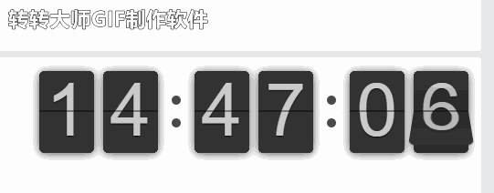
效果
实现
vue2第一种方法
1.安装依赖
npm i kuan-vue-flip-clock
2.vue单文件,我这里是局部注册
<template>
  <div class="test-clock-container">
    <flip-clock />
  </div>
</template>
<script>
import FlipClock from "kuan-vue-flip-clock";
export default {
  components: {
    FlipClock,
  },
};
</script>
<style lang="scss">
.test-clock-container {
  font: normal 14px "Helvetica Neue", Helvetica, sans-serif;
  user-select: none;
  text-shadow: 0 1px 0 rgba(0, 0, 0, 0.3);
  background: radial-gradient(ellipse at center, #969696 0%, #595959 100%);
  min-height: 100vh;
  display: flex;
  align-items: center;
  justify-content: center;
  width: 100%;
}
</style>
参考文档:kuan-vue-flip-clock - npm
vue2第二种方法
新建下面几个文件,我是放在一个文件夹里,展示的话就是FlipClock.vue
FlipClock.vue
<template>
  <div class="clock-container">
    <flip-item :total="2" :current="timeArr[0]"/>
    <flip-item :total="9" :current="timeArr[1]"/>
    <div class="colon"></div>
    <flip-item :total="5" :current="timeArr[2]"/>
    <flip-item :total="9" :current="timeArr[3]"/>
    <div class="colon"></div>
    <flip-item :total="5" :current="timeArr[4]"/>
    <flip-item :total="9" :current="timeArr[5]"/>
  </div>
</template>

<script>
import FlipItem from './FlipItem.vue'
import { getTimeArr } from './utils'

export default {
  components: {
    FlipItem
  },
  data() {
    return {
      timeArr: getTimeArr()
    }
  },
  mounted() {
    this.startTimer()
  },
  beforeDestroy() {
    this.stopTimer()
  },
  methods: {
    startTimer() {
      this.timer = setTimeout(() => {
        this.stopTimer()
        this.timeArr = getTimeArr()
        this.startTimer()
      }, 1000)
    },
    stopTimer() {
      clearTimeout(this.timer)
    }
  }
}
</script>

<style lang='scss' scoped>
.clock-container {
  display: flex;
  align-items: center;
}
.colon {
  height: 50px;
  padding: 0 10px;
  display: flex;
  justify-content: space-around;
  flex-direction: column;
  &::after,
  &::before {
    content: '';
    display: block;
    width: 10px;
    height: 10px;
    background: rgba(0, 0, 0, 0.7);
    border-radius: 50%;
  }
}
</style>
FlipItem.vue
<template>
  <div :class="{play: isPlay}">
    <ul class="flip">
      <li
        class="item"
        v-for="(item, key) in total + 1"
        :class="{active: current === key, before: key === before}"
        :key="item"
      >
        <div class="up">
          <div class="shadow"></div>
          <div class="inn">{{key}}</div>
        </div>
        <div class="down">
          <div class="shadow"></div>
          <div class="inn">{{key}}</div>
        </div>
      </li>
    </ul>
  </div>
</template>

<script>
export default {
  props: {
    total: {
      type: Number,
      default: 9
    },
    current: {
      type: Number,
      default: -1
    }
  },
  data() {
    return {
      before: this.total === this.current ? -1 : this.total,
      isPlay: false
    }
  },
  watch: {
    current(current, preCurrent) {
      this.before = preCurrent
      if (!this.isPlay) {
        this.isPlay = true
      }
    }
  }
}
</script>

<style lang="scss" scoped>
$width: 60px;
$height: 90px;
$fontSize: 80px;
$lineWidth: 3px;
$radius: 6px;

.flip {
  position: relative;
  margin: 5px;
  width: $width;
  height: $height;
  font-size: $fontSize;
  font-weight: bold;
  line-height: $height - $lineWidth;
  border-radius: $radius;
  box-shadow: 0 1px 10px rgba(0, 0, 0, 0.7);
  .item {
    list-style: none;
    z-index: 1;
    position: absolute;
    left: 0;
    top: 0;
    width: 100%;
    height: 100%;
    perspective: 200px;
    transition: opacity 0.3s;
    &.active {
      z-index: 2;
    }
    &:first-child {
      z-index: 2;
    }
    .up,
    .down {
      z-index: 1;
      position: absolute;
      left: 0;
      width: 100%;
      height: 50%;
      overflow: hidden;
    }
    .up {
      transform-origin: 50% 100%;
      top: 0;
      &:after {
        content: '';
        position: absolute;
        top: ($height - $lineWidth) / 2;
        left: 0;
        z-index: 5;
        width: 100%;
        height: $lineWidth;
        background-color: rgba(0, 0, 0, 0.4);
      }
    }
    .down {
      transform-origin: 50% 0%;
      bottom: 0;
      transition: opacity 0.3s;
    }
    .inn {
      position: absolute;
      left: 0;
      z-index: 1;
      width: 100%;
      height: 200%;
      color: #ccc;
      text-shadow: 0 1px 2px #000;
      text-align: center;
      background-color: #333;
      border-radius: $radius;
    }
    .up .inn {
      top: 0;
    }
    .down .inn {
      bottom: 0;
    }
  }
}
.play {
  .item {
    &.before {
      z-index: 3;
    }
    &.active {
      animation: asd 0.5s 0.5s linear both;
      z-index: 2;
    }
    &.before .up {
      z-index: 2;
      animation: turn-up 0.5s linear both;
    }
    &.active .down {
      z-index: 2;
      animation: turn-down 0.5s 0.5s linear both;
    }
  }
}

@keyframes turn-down {
  0% {
    transform: rotateX(90deg);
  }
  100% {
    transform: rotateX(0deg);
  }
}

@keyframes turn-up {
  0% {
    transform: rotateX(0deg);
  }
  100% {
    transform: rotateX(-90deg);
  }
}

@keyframes asd {
  0% {
    z-index: 2;
  }
  5% {
    z-index: 4;
  }
  100% {
    z-index: 4;
  }
}

.play {
  .shadow {
    position: absolute;
    width: 100%;
    height: 100%;
    z-index: 2;
  }
  .before .up .shadow {
    background: linear-gradient(rgba(0, 0, 0, 0.1) 0%, rgba(0, 0, 0, 1) 100%);
    animation: show 0.5s linear both;
  }
  .active .up .shadow {
    background: linear-gradient(rgba(0, 0, 0, 0.1) 0%, rgba(0, 0, 0, 1) 100%);
    animation: hide 0.5s 0.3s linear both;
  }
  .before .down .shadow {
    background: linear-gradient(rgba(0, 0, 0, 1) 0%, rgba(0, 0, 0, 0.1) 100%);
    animation: show 0.5s linear both;
  }
  .active .down .shadow {
    background: linear-gradient(rgba(0, 0, 0, 1) 0%, rgba(0, 0, 0, 0.1) 100%);
    animation: hide 0.5s 0.3s linear both;
  }
}

@keyframes show {
  0% {
    opacity: 0;
  }
  100% {
    opacity: 1;
  }
}

@keyframes hide {
  0% {
    opacity: 1;
  }
  100% {
    opacity: 0;
  }
}
</style>
index.js
import FlipClock from './FlipClock.vue'

export default FlipClock
utils.js
/**
 * @description: 剩余时间
 */
export function getTimeArr(now = new Date()) {
  // const Y = now.getFullYear()
  // const M = now.getMonth() + 1
  // const D = now.getDate()
  const h = now.getHours()
  const m = now.getMinutes()
  const s = now.getSeconds()
  return [
    // ...toArr(Y),
    // ...toArr(M),
    // ...toArr(D),
    ...toArr(h),
    ...toArr(m),
    ...toArr(s)
  ]
}

// 更换数组类型
function toArr(n) {
  return n >= 10 ? ('' + n).split('').map(item => Number(item)) : [0, n]
}
vue3中实现
新建下面几个文件,我是放在一个文件夹里,展示的话就是FlipClock.vue
FlipClock.vue
<template>
  <div class="clock-container">
    <flip-item :total="2" :current="timeArr[0]" />
    <flip-item :total="9" :current="timeArr[1]" />
    <div class="colon"></div>
    <flip-item :total="5" :current="timeArr[2]" />
    <flip-item :total="9" :current="timeArr[3]" />
    <div class="colon"></div>
    <flip-item :total="5" :current="timeArr[4]" />
    <flip-item :total="9" :current="timeArr[5]" />
  </div>
  <div></div>
</template>

<script setup>
import FlipItem from "./FlipItem.vue";
import { getTimeArr } from "./utils";
import { ref, onMounted, onBeforeUnmount } from "vue";

const timeArr = ref(getTimeArr());
var timer;

onMounted(() => {
  startTimer();
});

onBeforeUnmount(() => {
  stopTimer();
});

function startTimer() {
  console.log("启动定时器+++++++++++++++++++++++++++++");
  timer = setInterval(() => {
    // timeArr.value = getTimeArr(); // 使用 timeArr.value 更新值
    timeArr.value = getTimeArr();
    console.log("时间更新为:", timeArr.value);
  }, 1000);
}

function stopTimer() {
  console.log("停止定时器----------------------------");
  clearInterval(timer);
}
</script>
<style scoped>
.clock-container {
  display: flex;
  align-items: center;
}

.colon {
  height: 50px;
  padding: 0 10px;
  display: flex;
  justify-content: space-around;
  flex-direction: column;
}

.colon::after,
.colon::before {
  content: "";
  display: block;
  width: 10px;
  height: 10px;
  background: rgba(0, 0, 0, 0.7);
  border-radius: 50%;
}
</style>
FlipItem.vue
<template>
  <div :class="{ play: isPlay }">
    <ul class="flip">
      <li
        class="item"
        v-for="(item, key) in total + 1"
        :class="{ active: current == key, before: key == before }"
        :key="item"
      >
        <div class="up">
          <div class="shadow"></div>
          <div class="inn">{{ key }}</div>
        </div>
        <div class="down">
          <div class="shadow"></div>
          <div class="inn">{{ key }}</div>
        </div>
      </li>
    </ul>
  </div>
</template>

<script setup>
import { ref, watch, defineProps, computed } from "vue";
// const props = defineProps();

// const total = props.total;
// const current = props.current;
const total = 9;

const props = defineProps(["current"]);
const current = computed(() => {
  return props.current;
});
const before = ref(total === current.value ? -1 : total);
const isPlay = ref(false);
console.log(current, "fffffffffffff ");

// watch(current, (newValue, oldValue) => {
//   console.log('oldValue',current)
//   before.value = oldValue;
//   if (!isPlay.value) {
//     isPlay.value = true;
//   }
// });
// 监听 current 属性的变化
watch(
  () => props.current,
  (newValue, oldValue) => {
    console.log("current 属性的值发生了变化");
    before.value = oldValue;
    if (!isPlay.value) {
      isPlay.value = true;
    }
  }
);
// console.log(props)
// watch(current, (newValue, oldValue) => {
//   console.log('watch triggered!');
//   console.log('oldValue', newValue);
//   console.log('oldValue', oldValue);
//   before.value = oldValue;
//
//   if (!isPlay.value) {
//     isPlay.value = true;
//   }
// });
</script>

<style lang="scss" scoped>
$width: 60px;
$height: 90px;
$fontSize: 80px;
$lineWidth: 3px;
$radius: 6px;

.flip {
  position: relative;
  margin: 5px;
  width: $width;
  height: $height;
  font-size: $fontSize;
  font-weight: bold;
  line-height: $height - $lineWidth;
  border-radius: $radius;
  box-shadow: 0 1px 10px rgba(0, 0, 0, 0.7);
  .item {
    list-style: none;
    z-index: 1;
    position: absolute;
    left: 0;
    top: 0;
    width: 100%;
    height: 100%;
    perspective: 200px;
    transition: opacity 0.3s;
    &.active {
      z-index: 2;
    }
    &:first-child {
      z-index: 2;
    }
    .up,
    .down {
      z-index: 1;
      position: absolute;
      left: 0;
      width: 100%;
      height: 50%;
      overflow: hidden;
    }
    .up {
      transform-origin: 50% 100%;
      top: 0;
      &:after {
        content: "";
        position: absolute;
        .top: calc(($height - $lineWidth) / 2);
        left: 0;
        z-index: 5;
        width: 100%;
        height: $lineWidth;
        background-color: rgba(0, 0, 0, 0.4);
      }
    }
    .down {
      transform-origin: 50% 0%;
      bottom: 0;
      transition: opacity 0.3s;
    }
    .inn {
      position: absolute;
      left: 0;
      z-index: 1;
      width: 100%;
      height: 200%;
      color: #ccc;
      text-shadow: 0 1px 2px #000;
      text-align: center;
      background-color: #333;
      border-radius: $radius;
    }
    .up .inn {
      top: 0;
    }
    .down .inn {
      bottom: 0;
    }
  }
}
.play {
  .item {
    &.before {
      z-index: 3;
    }
    &.active {
      animation: asd 0.5s 0.5s linear both;
      z-index: 2;
    }
    &.before .up {
      z-index: 2;
      animation: turn-up 0.5s linear both;
    }
    &.active .down {
      z-index: 2;
      animation: turn-down 0.5s 0.5s linear both;
    }
  }
}

@keyframes turn-down {
  0% {
    transform: rotateX(90deg);
  }
  100% {
    transform: rotateX(0deg);
  }
}

@keyframes turn-up {
  0% {
    transform: rotateX(0deg);
  }
  100% {
    transform: rotateX(-90deg);
  }
}

@keyframes asd {
  0% {
    z-index: 2;
  }
  5% {
    z-index: 4;
  }
  100% {
    z-index: 4;
  }
}

.play {
  .shadow {
    position: absolute;
    width: 100%;
    height: 100%;
    z-index: 2;
  }
  .before .up .shadow {
    background: linear-gradient(rgba(0, 0, 0, 0.1) 0%, rgba(0, 0, 0, 1) 100%);
    animation: show 0.5s linear both;
  }
  .active .up .shadow {
    background: linear-gradient(rgba(0, 0, 0, 0.1) 0%, rgba(0, 0, 0, 1) 100%);
    animation: hide 0.5s 0.3s linear both;
  }
  .before .down .shadow {
    background: linear-gradient(rgba(0, 0, 0, 1) 0%, rgba(0, 0, 0, 0.1) 100%);
    animation: show 0.5s linear both;
  }
  .active .down .shadow {
    background: linear-gradient(rgba(0, 0, 0, 1) 0%, rgba(0, 0, 0, 0.1) 100%);
    animation: hide 0.5s 0.3s linear both;
  }
}

@keyframes show {
  0% {
    opacity: 0;
  }
  100% {
    opacity: 1;
  }
}

@keyframes hide {
  0% {
    opacity: 1;
  }
  100% {
    opacity: 0;
  }
}
</style>
utils.js
/**
 * @description: 剩余时间
 */
export function getTimeArr(now = new Date()) {
  // const Y = now.getFullYear()
  // const M = now.getMonth() + 1
  // const D = now.getDate()
  const h = now.getHours();
  const m = now.getMinutes();
  const s = now.getSeconds();
  return [
    // ...toArr(Y),
    // ...toArr(M),
    // ...toArr(D),
    ...toArr(h),
    ...toArr(m),
    ...toArr(s),
  ];
}

// 更换数组类型
function toArr(n) {
  return n >= 10 ? ("" + n).split("").map((item) => Number(item)) : [0, n];
}
下班~


 扫一扫
扫一扫


 7万+
7万+

 被折叠的 条评论
为什么被折叠?
被折叠的 条评论
为什么被折叠?
 到【灌水乐园】发言


