


1.实现三角形
<!DOCTYPE html>
<html lang="en">
<head>
    <meta charset="UTF-8">
    <title>Title</title>
    <style>
        .box{
            width: 0;
            height: 0;
            border-top: 10px solid black;
            border-left: 10px solid transparent ;
            border-right: 10px solid transparent;
            border-bottom: 10px solid transparent;
        }
    </style>
</head>
<body>
     <div class="box"></div>
</body>
</html>
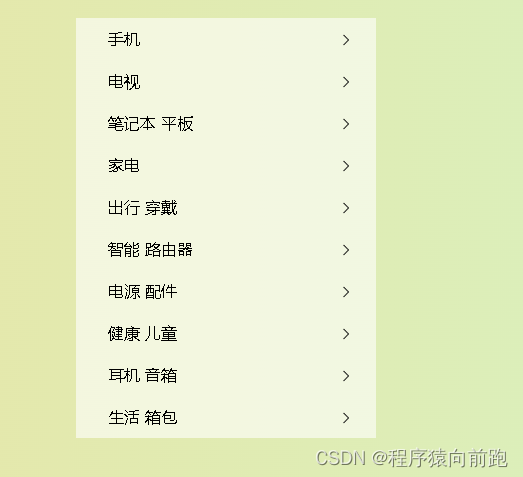
百度热榜样式
<!DOCTYPE html>
<html lang="en">
<head>
    <meta charset="UTF-8">
    <title>Title</title>
    <style>
        body,h3,ul{
            margin: 0px;
            padding: 0px;
        }
        .news{
            width: 360px;
            margin: 50px auto 0px;
            border: 1px solid #dddddd;
            padding: 15px;
        }
        .news h3{
            font-size: 20px;
            margin-bottom: 20px;
        }
        .news ul{
            list-style: none;
        }
        .news ul li{
            border-bottom: 1px dotted #ddd;
            height: 35px;
            line-height: 35px;
            font-size: 15px;
            color: #333;
        }
        .news ul li a{
            color: #333;
            text-decoration: none;
        }

        .news ul li a:hover{
            color: red;
        }
        .news ul li a span{
            margin-right: 10px;
            font-weight: bold;
        }

        .col1{
            color: red;
        }
        .col2{
            color: #ff5c55;
        }
        .col3{
            color: #ffa552;
        }
    </style>
</head>
<body>
<div class="news">
    <h3>百度新闻热榜</h3>
    <ul>
        <li><a href=""><span class="col1">1</span>元宵晚会</a></li>
        <li><a href=""><span class="col2">2</span>美国</a></li>
        <li><a href=""><span class="col3">3</span>中国航天</a></li>
        <li><a href=""><span class="col4">4</span>飞船</a></li>
        <li><a href=""><span class="col5">5</span>外星人是不是存在</a></li>
        <li><a href=""><span class="col6">6</span>hello我让开始</a></li>
        <li><a href=""><span class="col7">7</span>按时吃三</a></li>
        <li><a href=""><span class="col8">8</span>规范的撒监管科</a></li>
    </ul>
</div>
</body>
</html>
/* 第一个值指定图片的宽度,第二个值指定图片的高度 */
background-size: 50% auto
background-size: 3em 25%
background-size: auto 6px
background-size: auto auto
对于"text-indent:2em;"属性,只能加在块状元素上面,内联元素是不起作用的。
1.使用HTML:target=“_blank”,在新的页面中打开链接,形成父子界面的关系。
_blank – 在新窗口中打开链接
_parent – 在父窗体中打开链接
_self – 在当前窗体打开链接,此为默认值
_top – 在当前窗体打开链接,并替换当前的整个窗体(框架页)
<!DOCTYPE html>
<html lang="en">
<head>
    <meta charset="UTF-8">
    <title>Title</title>
    <style>
         body{
             background-image: linear-gradient(to right,#fbd787,#c6ffdd);
             margin: 0;
         }
         .menu{
             width: 300px;
             background-color: rgba(255,255,255,0.6);
             margin: 50px auto 0px;
         }
         ul{
             list-style: none;
             margin: 0;
             padding: 0;
         }
         a{
             text-decoration: none;
         }
         .menu ul{

         }
         .menu ul li{
             height: 42px;
             line-height: 42px;
         }
         .menu ul li a{
             display: block;
             text-indent: 2em;
             color: #000;
             background: url("images/right1.png") no-repeat 255px 15px;
             background-size: 10px;
         }
         .menu ul li a:hover{
             background-color: #ff6700;
             color: white;
             background-image: url("images/right2.png");
         }

    </style>
</head>
<body>
<div class="menu">
    <ul>
        <li><a href="" target="_blank">手机</a></li>
        <li><a href="" target="_blank">电视</a></li>
        <li><a href="" target="_blank">笔记本 平板</a></li>
        <li><a href="" target="_blank">家电</a></li>
        <li><a href="" target="_blank">出行 穿戴</a></li>
        <li><a href="" target="_blank">智能 路由器</a></li>
        <li><a href="" target="_blank">电源 配件</a></li>
        <li><a href="" target="_blank">健康 儿童</a></li>
        <li><a href="" target="_blank">耳机 音箱</a></li>
        <li><a href="" target="_blank">生活 箱包</a></li>
    </ul>
</div>
</body>
</html>
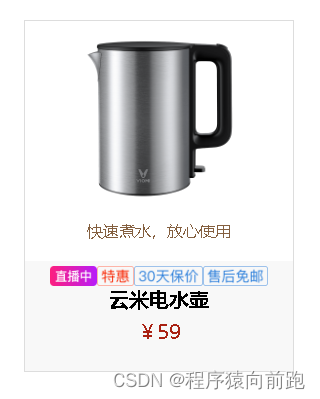
使用font-size:0解决设置inline-block引起的空白间隙问题
在进行页面布局的时候为了页面代码所谓整洁刻度,往往会设置缩进或是换行,但是元素display为inline-block或是inline时,行内元素虽然没有设置 margin值,这些换行或是缩进。还是会出现空白间隙。
<!DOCTYPE html>
<html lang="en">
<head>
    <meta charset="UTF-8">
    <title>Title</title>
    <style>
       body,p,h3{
           margin: 0;
       }
       a{
           text-decoration: none;
           display: block;
       }
       .product{
           width: 268px;
           margin: 50px auto 0;
           border: 1px solid #dddddd;
           text-align: center;
       }
       .product p.describe{
           color: #845f3f;
           font-size: 16px;
       }
       .product-text{
           height: 100px;
           background-color: #f8f8f8;
           margin-top: 20px;
           padding: 5px;
       }
       /* 去除图片空隙 */
       .product .product-text .product-mark{
           font-size: 0;
       }
       .product .product-text h3{
           font-size: 20px;
           font-width: 400;
           color: #000;
       }
       .product .product-text p {
           color: #a92112;
           font-size: 20px;
           margin-top: 5px;
       }
    </style>
</head>
<body>
    <div class="product">
        <a href="" target="_blank">
           <img src="images/kettle.png" alt="电水壶" width="195px">
            <p class="describe">快速煮水,放心使用</p>
            <div class="product-text">
                <div class="product-mark">
                    <img src="images/live.png" alt="直播中" height="20">
                    <img src="images/odds.png" alt="特惠" height="20">
                    <img src="images/30day.png" alt="30天保价" height="20">
                    <img src="images/server.png" alt="售后免邮" height="20">
                </div>
                <h3>云米电水壶</h3>
                <p>¥59</p>
            </div>
        </a>
    </div>
</body>
</html>
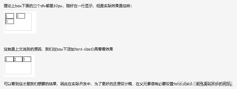
看别人的代码看到过font-size:0这个设置,不明白为何这样操作,后来研究一下才明白:这是像素级还原设计稿很有用的设置,因为元素节点有文本节点,在缩进代码时会占据宽度,这么说不好理解,演示如下:
<div class="box">
  <div>1</div>
  <div>2</div>
  <div>3</div>
</div>
.box{
  width: 90px;
  height: 60px;
  border: 1px solid #ccc;
}
.box div{
  display: inline-block;
  box-sizing: border-box;
  font-size: 14px;
  width: 30px;
  border: 1px solid ;
}
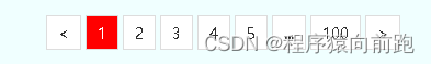
分页效果
<!DOCTYPE html>
<html lang="en">
<head>
<meta charset="UTF-8">
<title>Title</title>
<style>
body{
margin: 0;
}
.page{
width: 100%;
background-color: azure;
text-align: center;
font-size: 0;
padding: 20px 0;
}
.page a,.page span{
border: 1px solid #dddddd;
background-color: #ffffff;
display: inline-block;
height: 30px;
text-decoration: none;
line-height: 30px;
color: #333;
padding: 0 10px;
font-size: 14px;
margin: 0 2px;
}
.page span{
background-color: red;
color: white;
}
</style>
</head>
<body>
<div class="page">
<a href=" "><</a>
<span>1</span>
<a href=" ">2</a>
<a href=" ">3</a>
<a href=" ">4</a>
<a href=" ">5</a>
<a href=" ">...</a>
<a href=" ">100</a>
<a href=" ">></a>
</div>
</body>
</html>
注意 vertical-align 只对行内元素、行内块元素和表格单元格元素生效:不能用它垂直对齐块级元素。
小米商城
<!DOCTYPE html>
<html>
<head>
    <meta charset="utf-8">
    <title>小米商城右侧悬浮菜单</title>
    <link rel="stylesheet" href="iconfont/iconfont.css">
    <style type="text/css">
        body {
            background-color: #ddd;
            height: 2000px;
            margin: 0;
            padding: 0;
        }

        ul,
        p {
            margin: 0;
            padding: 0;
            list-style: none;
        }
        a {
            text-decoration: none;
        }
        .sidebar {
            width: 85px;
            /* height: 500px; */
            /* background-color: white; */
            position: fixed;
            /* 固定定位,相对于浏览器移动*/
            right: 20px;
            bottom: 100px;
        }

        .sidebar ul {
            /* border: 1px solid red; */
        }

        .sidebar ul li {
            border-bottom: 1px solid #ddd;
            width: 85px;
            height: 85px;
            background-color: white;
            position: relative;

        }

        .sidebar ul li:last-child {
            margin-top: 20px;
        }

        .sidebar ul li span {
            width: 85px;
            height: 50px;
            /* background-color: aquamarine; */
            display: block;
            font-size: 28px;
            color: #666;
            text-align: center;
            line-height: 50px;
        }

        .sidebar ul li p {
            font-size: 14px;
            text-align: center;
            color: #666;
        }

        .sidebar ul li:hover span,
        .sidebar ul li:hover p {
            color: hotpink;
        }

        .sidebar ul li .wxin {
            width: 100px;
            height: 100px;
            background: #fff;
            position: absolute;
            top: 0;
            left: -130px;
            padding: 15px;
            display: none;
        }

        .sidebar ul li:hover .wxin {
            display: block;
        }
    </style>
</head>
<body>
<div class="sidebar">
    <ul>
        <li>
            <a href="">
                <span class="iconfont icon-shouji"></span>
                <p>手机APP</p>
            </a>
            <div class="wxin">
                <img src="images/wx.png" alt="" width="100">
            </div>
        </li>
        <li>
            <a href="">
                <span class="iconfont icon-gerenzhongxin"></span>
                <p>个人中心</p>
            </a>
        </li>
        <li>
            <a href="">
                <span class="iconfont icon-shouhouwuyou"></span>
                <p>售后服务</p>
            </a>
        </li>
        <li>
            <a href="">
                <span class="iconfont icon-kefu"></span>
                <p>人工客服</p>
            </a>
        </li>
        <li>
            <a href="">
                <span class="iconfont icon-gouwuchekong"></span>
                <p>购物车</p>
            </a>
        </li>
        <li>
            <span class="iconfont icon-fanhuidingbu"></span>
            <p>回顶部</p>
        </li>
    </ul>
</div>
</body>
</html>

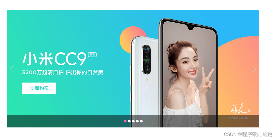
自动轮播图效果
<!DOCTYPE html>
<html>
<head>
    <meta charset="utf-8">
    <title>自动轮播图效果</title>
    <link rel="stylesheet" href="iconfont/iconfont.css">
    <style type="text/css">
         body ul{
             margin: 0;
             padding: 0;
         }
         ul{
             list-style: none;
         }
         .banner{
             width: 1000px;
             height: 466px;
             margin: 50px auto 0;
             background-color: aqua;
             position: relative;
             overflow: hidden;
         }
         .banner ul {
             /* border: 2px solid red; */
             width: 10000px;
             position: absolute;
             left: 0;
             top: 0;
         }

         .banner ul li {
             /* border: 2px solid #000; */
             width: 1000px;
             height: 466px;
             float: left;
         }
         .banner .prev,
         .banner .next {
             width: 41px;
             height: 69px;
             /* border: 2px solid red; */
             position: absolute;
             top: 50%;
             margin-top: -35px;
             background: url('images/icon-slides.png');
         }
         .banner .prev {
             left: 0;
             background-position:-83px 0;
         }
         .banner .next {
             right: 0;
             background-position:-125px 0;
         }
         .banner .prev:hover {
             background-position: 0 0;
         }

         .banner .next:hover {
             background-position: -42px 0;
         }
         .banner .button{
             width: 100%;
             height: 50px;
             background-color: rgba(0, 0, 0, 0.5);
             position: absolute;
             bottom: 0;
             left: 0;
             font-size: 0;/* 去除圆点之间的间隙 */
             text-align: center;
             line-height: 50px;
         }
         .banner .button span{
             width: 10px;
             height: 10px;
             background-color: white;
             display: inline-block;
             border-radius: 50%;
             margin: 0 3px;
             vertical-align: middle;
         }
         .button span.current{
             background-color: hotpink;
         }
    </style>
</head>
<body>
    <div class="banner">
        <ul>
            <li><img src="images/slide-1.png" alt=""></li>
            <li><img src="images/slide-2.png" alt=""></li>
            <li><img src="images/slide-3.png" alt=""></li>
            <li><img src="images/slide-4.png" alt=""></li>
            <li><img src="images/slide-5.png" alt=""></li>
        </ul>
        <div class="prev"></div>
        <div class="next"></div>
        <div class="button">
            <span class="current"></span>
            <span></span>
            <span></span>
            <span></span>
            <span></span>
        </div>
    </div>
</body>
</html>
二级下拉菜单效果
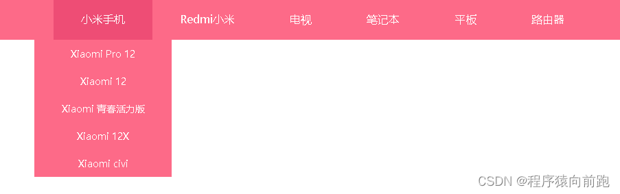
<!DOCTYPE html>
<html>
<head>
    <meta charset="utf-8">
    <title>自动轮播图效果</title>
    <link rel="stylesheet" href="iconfont/iconfont.css">
    <style type="text/css">
        body,ul{
            margin: 0;
            padding: 0;
        }
        ul{
            list-style: none;
        }
        a{
            text-decoration: none;
        }
        .clearfix::after {
            /* 清除ul标签的塌陷问题 */
            content: '';
            display: block;
            clear: both;
        }
        .menu{
            width: 100%;
            height: 60px;
            background-color: #fd6a88;
        }
        .menu .menu-con{
            width: 1000px;
            height: 60px;
            margin: 0 auto;
        }
        .menu .menu-con ul li{
            height: 60px;
            float: left;
            position: relative;
        }
        .menu .menu-con ul li a {
            display: block;
            height: 60px;
            color: white;
            padding: 0 40px;
            line-height: 60px;
            text-align: center;
        }
        .menu .menu-con ul li:hover {/* 如果此处悬停改为a标签,顶部悬浮效果会消失 */
            background-color: #ee4d75;
        }
        .menu .menu-con ul li div {
            width: 200px;
            /* height: 400px; */
            background-color: #fd6a88;
            position: absolute;
            left: 50%;
            margin-left: -100px;
            top: 60px;
            display: none;
        }

        .menu .menu-con ul li div a {
            height: 40px;
            line-height: 40px;
            padding: 0;
            font-size: 14px;
        }

        .menu .menu-con ul li div a:hover {
            background-color: #ee4d75;
        }
        .menu .menu-con ul li:hover div{
            display: block;
        }
    </style>
</head>
<body>
    <div class="menu">
    <div class="menu-con">
        <ul class="clearfix">
            <li>
                <a href="#">小米手机</a>
                <div>
                    <a href="">Xiaomi Pro 12</a><!-- 样式继承 -->
                    <a href="">Xiaomi 12</a>
                    <a href="">Xiaomi 青春活力版</a>
                    <a href="">Xiaomi 12X</a>
                    <a href="">Xiaomi civi</a>
                </div>
            </li>
            <li>
                <a href="#">Redmi小米</a>
                <div><a href="">Xiaomi Pro 12</a><!-- 样式继承 -->
                    <a href="">Xiaomi 12</a>
                    <a href="">Xiaomi 青春活力版</a>
                    <a href="">Xiaomi 12X</a>
                    <a href="">Xiaomi civi</a>
                </div>
            </li>
            <li>
                <a href="#">电视</a>
                <div><a href="">Xiaomi Pro 12</a><!-- 样式继承 -->
                    <a href="">Xiaomi 12</a>
                    <a href="">Xiaomi 青春活力版</a>
                    <a href="">Xiaomi 12X</a>
                    <a href="">Xiaomi civi</a>
                </div>
            </li>
            <li>
                <a href="#">笔记本</a>
                <div><a href="">Xiaomi Pro 12</a><!-- 样式继承 -->
                    <a href="">Xiaomi 12</a>
                    <a href="">Xiaomi 青春活力版</a>
                    <a href="">Xiaomi 12X</a>
                    <a href="">Xiaomi civi</a>
                </div>
            </li>
            <li>
                <a href="#">平板</a>
                <div><a href="">Xiaomi Pro 12</a><!-- 样式继承 -->
                    <a href="">Xiaomi 12</a>
                    <a href="">Xiaomi 青春活力版</a>
                    <a href="">Xiaomi 12X</a>
                    <a href="">Xiaomi civi</a>
                </div>
            </li>
            <li>
                <a href="#">路由器</a>
                <div><a href="">Xiaomi Pro 12</a><!-- 样式继承 -->
                    <a href="">Xiaomi 12</a>
                    <a href="">Xiaomi 青春活力版</a>
                    <a href="">Xiaomi 12X</a>
                    <a href="">Xiaomi civi</a>
                </div>
            </li>
        </ul>
    </div>
</div>
</body>
</html>
时间轴效果展示
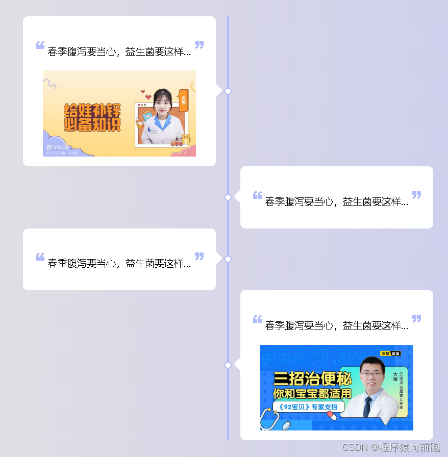
<!DOCTYPE html>
<html>
<head>
    <meta charset="utf-8">
    <title>自动轮播图效果</title>
    <link rel="stylesheet" href="iconfont/iconfont.css">
    <style type="text/css">
        body{
            margin: 0;
            padding: 0;
            background-image: linear-gradient(to right,#fdf1d8,#b2bcf9);
        }
        body,ul,li{
            margin: 0;
            padding: 0;
        }
        ul{
            list-style: none;
        }
        a{
            text-decoration: none;
        }
        .clearfix::after{/* 清除浮动 ,解决塌陷问题*/
            content: '';
            display: block;
            clear: both;
        }
        .time-axis{
            width: 804px;
            margin: 50px auto 0;
        }
        .time-axis .left{
            width: 400px;
            float: left;
            border-right: 4px solid #b1bbf9;
            position: relative;
        }
        .time-axis .right{
            width: 400px;
            float: right;
            border-left: 4px solid #b1bbf9;
            position: relative;
        }
        .time-axis .dot{
            width: 10px;
            height: 10px;
            background-color: #ffffff;
            display: block;
            border-radius: 100%;
            border: 2px solid #b1bbf9;
            position: absolute;
            top: 50%;
            margin-top: -7px;
        }
        .time-axis .left .dot{
            right: -9px;
        }
        .time-axis .right .dot{
            left: -9px;
        }
        .time-axis .jiantou{
            width: 32px;
            height: 32px;
            /* border: 1px solid red; */
            display: block;
            position: absolute;
            top: 50%;
            margin-top: -18px;
        }
        .time-axis .left .jiantou{
            background: url('images/r-jiantou.png');
            right: 0;
        }
        .time-axis .right .jiantou{
            background: url('images/l-jiantou.png');
            left: 0;
        }
        .time-axis .con{
            background-color: #ffffff;
            padding: 15px;
            border-radius: 10px;
            text-align: center;
        }
        .time-axis .left .con{
            margin-right: 22px;
        }
        .time-axis .right .con{
            margin-left: 22px;
        }
        .time-axis .con h3{
            font-weight: 400;
        }
        .time-axis .con h3 span{
            font-size: 38px;
            font-family: Arial;
            color: #b1bbf9;
            font-weight: 800;
        }

    </style>
</head>
<body>
<div class="time-axis clearfix">
    <div class="left">
        <span class="dot"></span>
        <span class="jiantou"></span>
        <div class="con">
            <h3><span>“</span> 春季腹泻要当心,益生菌要这样... <span>”</span></h3>
            <img src="images/axis01.jpg" alt="" width="300">
        </div>
    </div>
    <div class="right">
        <span class="dot"></span>
        <span class="jiantou"></span>
        <div class="con">
            <h3><span>“</span> 春季腹泻要当心,益生菌要这样... <span>”</span></h3>
        </div>
    </div>
    <div class="left">
        <span class="dot"></span>
        <span class="jiantou"></span>
        <div class="con">
            <h3><span>“</span> 春季腹泻要当心,益生菌要这样... <span>”</span></h3>
        </div>
    </div>
    <div class="right">
        <span class="dot"></span>
        <span class="jiantou"></span>
        <div class="con">
            <h3><span>“</span> 春季腹泻要当心,益生菌要这样... <span>”</span></h3>
            <img src="images/axis02.jpg" alt="" width="300">
        </div>
    </div>
</div>
</body>
</html>
border-spacing 属性设置相邻单元格的边框间的距离(仅用于"边框分离"模式)。
为表格设置合并边框模型:

table
{
    border-collapse:collapse;
}
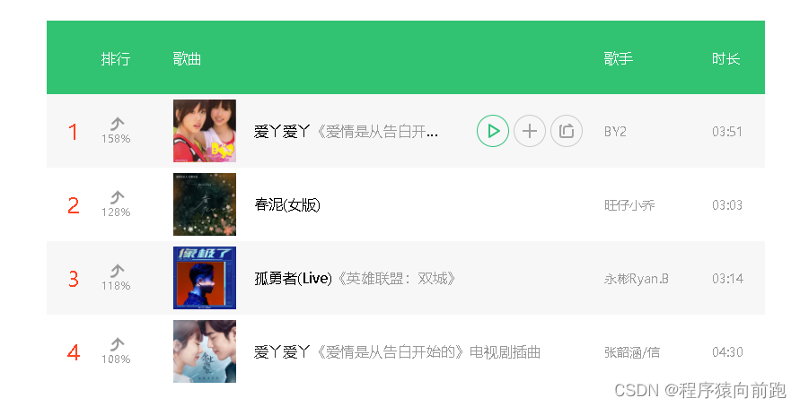
音乐排行榜效果
<!DOCTYPE html>
<html>
<head>
    <meta charset="utf-8">
    <title>音乐排行榜效果</title>
    <style type="text/css">
        body {
            margin: 0;
            padding: 0;
        }
        a{
            text-decoration: none;
        }
        .music-top {
            width: 800px;
            /* height: 700px; */
            /* border: 2px solid red; */
            margin: 50px auto 0;
        }

        table {
            width: 100%;
            /* border: 2px solid #000; */
            border-spacing: 0;
            border-collapse: collapse;
        }

        table tr th {
            /* border: 1px solid red; */
            height: 80px;
        }

        table tr td {
            /* border: 1px solid red; */
            height: 80px;
        }

        .col1 {
            /* background-color: red;*/
            width: 60px;
        }

        .col2 {
            /* background-color: aqua; */
            width: 80px;
        }

        .col3 {
            /* background-color: #000*/
            wid
        }

        .col4 {
            /* background-color: yellow;*/
            width: 120px;
        }

        .col5 {
            /* background-color: bisque; */
            width: 60px;
        }

        /* 表格奇数行 */
        table tr:nth-of-type(odd) {
            background-color: white;
        }

        /* 表格偶数行 */
        table tr:nth-of-type(even) {
            background-color: #f7f7f7;
        }

        table tr th {
            background-color: #31c272;
            color: #fff;
            font-size: 16px;
            font-weight: 400;
            text-align: left;
        }

        table tr td:nth-child(1) {
            font-size: 24px;
            color: #333;
            text-align: center;
        }

        table tr td:nth-child(1) span {
            color: #ff4222;
        }

        table tr td:nth-child(2) {
            font-size: 12px;
            color: #999;
        }

        table tr td:nth-child(2) img {
            display: block;
            margin-left: 10px;
        }

        table tr td:nth-child(4),
        table tr td:nth-child(5) {
            font-size: 14px;
            color: #999;
        }

        .con {
            height: 70px;
            /* border: 2px solid red; */
            position: relative;
        }

        .con .txt {
            height: 70px;
            /* width: 300px; */
            /* background-color: aquamarine; */
            position: absolute;
            left: 90px;
            top: 0;
            right: 0;
            /* 处理文字超出部分 */
            white-space: nowrap;
            overflow: hidden;
            text-overflow: ellipsis;
            line-height: 70px;
        }
        .con .txt a{
            color: #333;
        }

        .con .txt span {
            color: #999;
        }

        .con .button {
            width: 140px;
            height: 36px;
            /* border: 2px solid blue; */
            position: absolute;
            right: 0;
            top: 17px;
            display: none;
        }

        .con .button i {
            width: 36px;
            height: 36px;
            /* border: 1px solid red; */
            display: inline-block;
            background-image: url('images/icon-music.png');
        }

        .con .button i.play {}

        .con .button i.add {
            background-position: 0 -80px;
        }

        .con .button i.word {
            background-position: 0 -40px;
        }

        .con .button i.play:hover {
            background-position: -40px 0;
        }

        .con .button i.add:hover {
            background-position: -40px -80px;
        }

        .con .button i.word:hover {
            background-position: -40px -40px;
        }

        table tr:hover .con .button {
            display: block;
        }

        table tr:hover .con .txt {
            right: 180px;
        }
    </style>
</head>
<body>
<div class="music-top">
    <table>
        <colgroup>
            <col span="1" class="col1">
            <col span="1" class="col2">
            <col span="1" class="col3">
            <col span="1" class="col4">
            <col span="1" class="col5">
        </colgroup>
        <tr>
            <th></th>
            <th>排行</th>
            <th>歌曲</th>
            <th>歌手</th>
            <th>时长</th>
        </tr>
        <tr>
            <td><span>1</span></td>
            <td>
                <img src="images/up-jiantou.png" alt="">
                158%
            </td>
            <td>
                <div class="con">
                    <img src="images/music-img1.webp" alt="" height="70">
                    <div class="txt">爱丫爱丫<span>《爱情是从告白开始的》电视剧插曲</span></div>
                    <div class="button">
                        <i class="play"></i>
                        <i class="add"></i>
                        <i class="word"></i>
                    </div>
                </div>
            </td>
            <td>BY2</td>
            <td>03:51</td>
        </tr>
        <tr>
            <td><span>2</span></td>
            <td>
                <img src="images/up-jiantou.png" alt="">
                128%
            </td>
            <td>
                <div class="con">
                    <img src="images/music-img2.webp" alt="" height="70">
                    <div class="txt">春泥(女版)<span></span></div>
                    <div class="button">
                        <i class="play"></i>
                        <i class="add"></i>
                        <i class="word"></i>
                    </div>
                </div>
            </td>
            <td>旺仔小乔</td>
            <td>03:03</td>
        </tr>
        <tr>
            <td><span>3</span></td>
            <td>
                <img src="images/up-jiantou.png" alt="">
                118%
            </td>
            <td>
                <div class="con">
                    <img src="images/music-img3.webp" alt="" height="70">
                    <div class="txt">孤勇者(Live)<span>《英雄联盟:双城》</span></div>
                    <div class="button">
                        <i class="play"></i>
                        <i class="add"></i>
                        <i class="word"></i>
                    </div>
                </div>
            </td>
            <td>永彬Ryan.B</td>
            <td>03:14</td>
        </tr>
        <tr>
            <td><span>4</span></td>
            <td>
                <img src="images/up-jiantou.png" alt="">
                108%
            </td>
            <td>
                <div class="con">
                    <a href=""><img src="images/music-img4.webp" alt="" height="70"></a>
                    <div class="txt">
                        <a href="">
                            爱丫爱丫<span>《爱情是从告白开始的》电视剧插曲</span>
                        </a>
                    </div>
                    <div class="button">
                        <i class="play"></i>
                        <i class="add"></i>
                        <i class="word"></i>
                    </div>
                </div>
            </td>
            <td>张韶涵/信</td>
            <td>04:30</td>
        </tr>
    </table>
</div>
</body>
</html>
鼠标移入文字加载动画
<!DOCTYPE html>
<html>
<head>
<meta charset="utf-8">
<title>鼠标移入文字加载动画</title>
<style type="text/css">
body{
margin: 0;
padding: 0;
}
/* 清除浮动 */
.clearfix::after{
content: '';
display: block;
clear: both;
}
.box {
width: 1200px;
/* height: 370px; */
/* background-color: red; */
margin: 50px auto;
}
.box .item{
width: 280px;
height: 370px;
/* border: 1px solid blue; */
/* background-color: blue; */
float: left;
margin: 0 10px;
position: relative;
overflow: hidden;
}
/* 遮罩层 */
.item-mask{
width: 280px;
height: 370px;
background-color: rgba(0, 0, 0, 0);
position: absolute;
top: 0;
left: 0;
transition: background-color ease 2s;/* 动画过渡效果 */
}
.item:hover .item-mask{
background-color: rgba(0, 0, 0, 0.5);
}
.item .item-title{
/* border: 1px solid aqua; */
position: absolute;
top:-50px;
left: 20px;
color: white;
transition: top ease .5s;
}
.item:hover .item-title{
top: 250px;
}
.item .item-singer{
/* border: 1px solid blue; */
position: absolute;
top: 290px;
left: 0px;
color: #fff;
font-size: 14px;
transform: translateX(-100%);/* 刚好向左移动自身的宽度 */
transition: all ease .5s;
}
.item:hover .item-singer{
transform: translateX(25px);/* 右移25px */
}
.item .item-info{
/* border: 1px solid aqua; */
position: absolute;
/* top: 320px; */
left: 20px;
right: 20px;
font-size: 14px;
color:white;
top: 370px;
transition: top ease .5s;
}
.item:hover .item-info{
top: 320px;
}
</style>
</head>
<body>
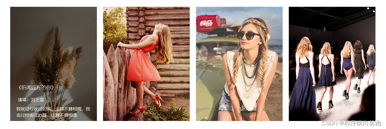
<div class="box clearfix">
<div class="item">
<img src="images/hover1.jpg" alt="" width="280">
<div class="item-mask"></div>
<div class="item-title">《听闻远方的你》</div>
<div class="item-singer">演唱:刘艺雯</div>
<div class="item-info">我吹过你吹过的风,这算不算相拥,我走过你走过的路,这算不算相逢</div>
</div>
<div class="item">
<img src="images/hover2.jpg" alt="" width="280">
<div class="item-mask"></div>
<div class="item-title">《听闻远方的你》</div>
<div class="item-singer">演唱:刘艺雯</div>
<div class="item-info">我吹过你吹过的风,这算不算相拥,我走过你走过的路,这算不算相逢</div>
</div>
<div class="item">
<img src="images/hover3.jpg" alt="" width="280">
<div class="item-mask"></div>
<div class="item-title">《听闻远方的你》</div>
<div class="item-singer">演唱:刘艺雯</div>
<div class="item-info">我吹过你吹过的风,这算不算相拥,我走过你走过的路,这算不算相逢</div>
</div>
<div class="item">
<img src="images/hover4.jpg" alt="" width="280">
<div class="item-mask"></div>
<div class="item-title">《听闻远方的你》</div>
<div class="item-singer">演唱:刘艺雯</div>
<div class="item-info">我吹过你吹过的风,这算不算相拥,我走过你走过的路,这算不算相逢</div>
</div>
</div>
</body>
</html>
鼠标悬停缩放效果
<!DOCTYPE html>
<html>
<head>
<meta charset="utf-8">
<title>鼠标悬停缩放效果</title>
<style type="text/css">
body {
margin: 0;
padding: 0;
}
.clearfix {
content: '';
display: block;
clear: both;
}
.flower {
width: 960px;
/* height: 300px; */
/* border: 2px solid red; */
margin: 100px auto 0;
}
.flower .item {
width: 300px;
height: 300px;
background-color: aqua;
float: left;
margin: 0 10px;
overflow: hidden;
position: relative;
}
.item img {
transition: transform ease .5s;
}
.item:hover img {
transform: scale(1.2);
}
.item .item-mask {
width: 300px;
height: 300px;
background-color: rgba(0, 0, 0, 0);
position: absolute;
top: 0;
left: 0;
transition: all ease .5s;
/* 怪异盒模型处理遮罩层偏移问题 也可通过定位解决 */
box-sizing: border-box;
/* 水平 垂直 阴影羽化 阴影大小 阴影颜色 */
box-shadow: 0 0 0 40px rgba(255, 255, 255, 0.5);
}
.item:hover .item-mask {
transform: scale(0.8);
background-color: rgba(0, 0, 0, 0.5);
border: 5px solid #fff;
}
.item .title {
/* border: 1px solid red; */
position: absolute;
top: 80px;
left: 40px;
right: 40px;
text-align: center;
font-size: 18px;
/* font-weight: 700; */
color: #fff;
transform: scale(1.2);
opacity: 0;
transition: all ease .5s;
}
.item:hover .title {
transform: scale(1);
opacity: 1;
}
.item .item-info {
/* border: 1px solid blue; */
position: absolute;
top: 110px;
left: 40px;
right: 40px;
color: #fff;
font-size: 14px;
transform: scale(1.2);
opacity: 0;
transition: all ease .5s;
}
.item:hover .item-info {
transform: scale(1);
opacity: 1;
}
</style>
</head>
<body>
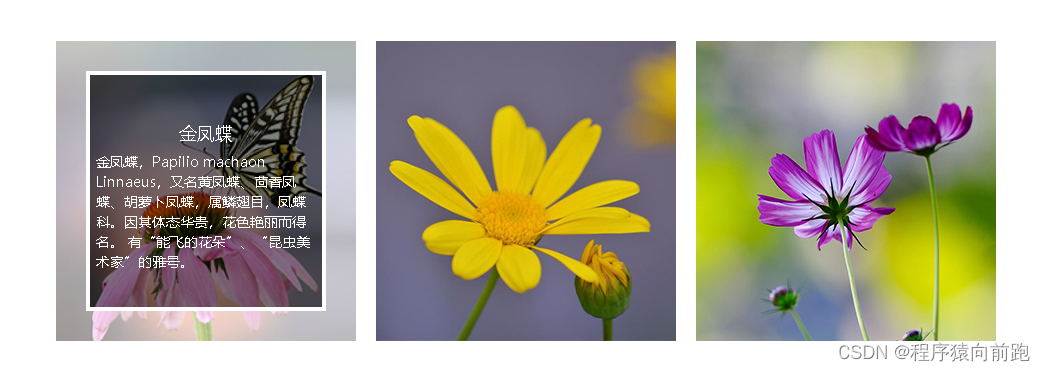
<div class="flower clearfix">
<div class="item">
<img src="images/scale1.jpg" alt="" width="300">
<div class="item-mask"></div>
<div class="title">金凤蝶</div>
<div class="item-info">金凤蝶,Papilio machaon Linnaeus,又名黄凤蝶、茴香凤蝶、胡萝卜凤蝶,属鳞翅目,凤蝶科。因其体态华贵,花色艳丽而得名。
有“能飞的花朵”、“昆虫美术家”的雅号。</div>
</div>
<div class="item">
<img src="images/scale2.jpg" alt="" width="300">
<div class="item-mask"></div>
<div class="title">金凤蝶</div>
<div class="item-info">金凤蝶,Papilio machaon Linnaeus,又名黄凤蝶、茴香凤蝶、胡萝卜凤蝶,属鳞翅目,凤蝶科。因其体态华贵,花色艳丽而得名。
有“能飞的花朵”、“昆虫美术家”的雅号。</div>
</div>
<div class="item">
<img src="images/scale3.jpg" alt="" width="300">
<div class="item-mask"></div>
<div class="title">金凤蝶</div>
<div class="item-info">金凤蝶,Papilio machaon Linnaeus,又名黄凤蝶、茴香凤蝶、胡萝卜凤蝶,属鳞翅目,凤蝶科。因其体态华贵,花色艳丽而得名。
有“能飞的花朵”、“昆虫美术家”的雅号。</div>
</div>
</div>
</body>
</html>
transform-origin属性取值为“关键字”
关键字 百分比 说明
top left 0 0 左上
top center 50% 0 靠上居中
top right 100% 0 右上
left center 0 50% 靠左居中
center center 50% 50% 正中
right center 100% 50% 靠右居中
bottom left 0 100% 左下
bottom center 50% 100% 靠下居中
bottom right 100% 100% 右下


 675
675


 被折叠的 条评论
为什么被折叠?
被折叠的 条评论
为什么被折叠?
 到【灌水乐园】发言


