


前端使用html+js+css实现一个弹出选择框
弹出一个选择框,支持用户取消和确认
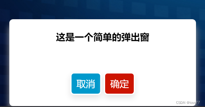
效果图:
index.html页面:
<div class="tip" id="tip">
  <p>这是一个简单的弹出窗</p>
  <button class="cancel" id="cancel">取消</button>
  <button class="ok" id="ok">确定</button>
</div>
index.js页面
let tip = document.getElementById("tip")
let ok = document.getElementById("ok")
let cancel = document.getElementById("cancel")
ok.onclick = () => {
  // 点击确认的操作,删除标签
  tip.remove()
}
cancel.onclick = () => {
  // 点击确认的操作,删除标签
  tip.remove()
}
``
index.css页面
.tip{
  width: 300px;
  height: 140px;
  background-color: #ffffff;
  border: 2px solid #ffffff;
  border-radius: 6px;
  padding: 15px 8px;
  text-align: center;
  display: inline-block;
  font-size: 15px;
  transition-duration: 0.4s;
  cursor: pointer;
  text-decoration: none;
  outline: none;
  font-weight: 600;
  background-color: #ffffff;
  color: #000000;
  box-shadow: 0px 10px 10px #a2a2a2;
  transition: all 1s;
}
.cancel{
  background-color: #0099CC;
  border-radius: 10px;
  border: 2px solid #ffffff;
  border-radius: 6px;
  padding: 5px 8px;
  text-align: center;
  display: inline-block;
  font-size: 15px;
  transition-duration: 0.4s;
  cursor: pointer;
  text-decoration: none;
  outline: none;
  font-weight: 400;
  box-shadow: 0px 5px 10px #e5e5e5;
  color: #ffffff;
  margin-top: 30px;
}
.ok{
  background-color: #cc1400;
  border-radius: 10px;
  border: 2px solid #ffffff;
  border-radius: 6px;
  padding: 5px 8px;
  text-align: center;
  display: inline-block;
  font-size: 15px;
  transition-duration: 0.4s;
  cursor: pointer;
  text-decoration: none;
  outline: none;
  font-weight: 400;
  box-shadow: 0px 5px 10px #e5e5e5;
  color: #ffffff;
  margin-top: 30px;
}
.cancel:hover {
  border: 2px solid #0099CC;
  background-color: #ffffff;
  color: #0099CC;
  font-weight: 700;
}
.ok:hover {
  border: 2px solid #cc1400;
  background-color: #ffffff;
  color: #cc1400;
  font-weight: 700;
}
.ok:active {
  background-color: #838383d8;
}
.cancel:active {
  background-color: #838383d8;
}
.ok:focus {
  outline: none;
}
.cancel:focus {
  outline: none;
}


 1507
1507


 被折叠的 条评论
为什么被折叠?
被折叠的 条评论
为什么被折叠?
 到【灌水乐园】发言


