


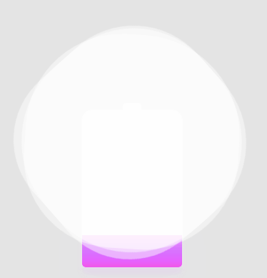
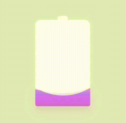
画个电池
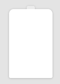
首先用css随便画一个电池
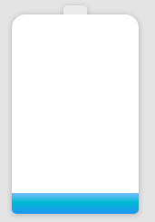
然后加入简单动画,用颜色填满
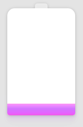
增加一点颜色变化
最后添加波浪
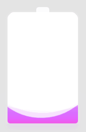
波浪通过障碍实现
代码如下
HTML
<div class="container">
    <div class="header"></div>
    <div class="battery">
    </div>
    <div class="battery-copy">
        <div class="g-wave"></div>
        <div class="g-wave"></div>
        <div class="g-wave"></div>
    </div>
</div>
CSS
html,
body {
  width: 100%;
  height: 100%;
  display: flex;
  background: #e4e4e4;
}

.container {
  position: relative;
  width: 140px;
  margin: auto;
}

.header {
  position: absolute;
  width: 26px;
  height: 10px;
  left: 50%;
  top: 0;
  transform: translate(-50%, -10px);
  border-radius: 5px 5px 0 0;
  background: rgba(255, 255, 255, 0.88);
}

.battery-copy {
  position: absolute;
  top: 0;
  left: 0;
  height: 220px;
  width: 140px;
  border-radius: 15px 15px 5px 5px;
  overflow: hidden;
}

.battery {
  position: relative;
  height: 220px;
  box-sizing: border-box;
  border-radius: 15px 15px 5px 5px;
  box-shadow: 0 0 5px 2px rgba(255, 255, 255, 0.22);
  background: #fff;
  z-index: 1;
}
.battery::after {
  content: "";
  position: absolute;
  left: 0;
  right: 0;
  bottom: 0;
  top: 80%;
  background: linear-gradient(to bottom, #7abcff 0%, #00BCD4 44%, #2196F3 100%);
  border-radius: 0px 0px 5px 5px;
  box-shadow: 0 14px 28px rgba(33, 150, 243, 0), 0 10px 10px rgba(9, 188, 215, 0.08);
  -webkit-animation: charging 10s linear infinite;
          animation: charging 10s linear infinite;
  filter: hue-rotate(90deg);
}

.g-wave {
  position: absolute;
  width: 300px;
  height: 300px;
  background: rgba(255, 255, 255, 0.8);
  border-radius: 45% 47% 44% 42%;
  bottom: 25px;
  left: 50%;
  transform: translate(-50%, 0);
  z-index: 1;
  -webkit-animation: move 10s linear infinite;
          animation: move 10s linear infinite;
}

.g-wave:nth-child(2) {
  border-radius: 38% 46% 43% 47%;
  transform: translate(-50%, 0) rotate(-135deg);
}

.g-wave:nth-child(3) {
  border-radius: 42% 46% 37% 40%;
  transform: translate(-50%, 0) rotate(135deg);
}

@-webkit-keyframes charging {
  50% {
    box-shadow: 0 14px 28px rgba(0, 150, 136, 0.83), 0px 4px 10px rgba(9, 188, 215, 0.4);
  }
  95% {
    top: 5%;
    filter: hue-rotate(0deg);
    border-radius: 0 0 5px 5px;
    box-shadow: 0 14px 28px rgba(4, 188, 213, 0.2), 0 10px 10px rgba(9, 188, 215, 0.08);
  }
  100% {
    top: 0%;
    filter: hue-rotate(0deg);
    border-radius: 15px 15px 5px 5px;
    box-shadow: 0 14px 28px rgba(4, 188, 213, 0), 0 10px 10px rgba(9, 188, 215, 0.4);
  }
}

@keyframes charging {
  50% {
    box-shadow: 0 14px 28px rgba(0, 150, 136, 0.83), 0px 4px 10px rgba(9, 188, 215, 0.4);
  }
  95% {
    top: 5%;
    filter: hue-rotate(0deg);
    border-radius: 0 0 5px 5px;
    box-shadow: 0 14px 28px rgba(4, 188, 213, 0.2), 0 10px 10px rgba(9, 188, 215, 0.08);
  }
  100% {
    top: 0%;
    filter: hue-rotate(0deg);
    border-radius: 15px 15px 5px 5px;
    box-shadow: 0 14px 28px rgba(4, 188, 213, 0), 0 10px 10px rgba(9, 188, 215, 0.4);
  }
}
@-webkit-keyframes move {
  100% {
    transform: translate(-50%, -160px) rotate(720deg);
  }
}
@keyframes move {
  100% {
    transform: translate(-50%, -160px) rotate(720deg);
  }
}
基本效果


 3765
3765


 被折叠的 条评论
为什么被折叠?
被折叠的 条评论
为什么被折叠?
 到【灌水乐园】发言


