


1. 打字效果
网页设计变得越来越有创意。在 CSS 动画的协调下,你的网页会像活的一样。在这个例子中,我们将使用 animation 和 @keyframes 属性去实现打字效果。
具体来说,在这个演示中,我们通过 steps() 属性来实现分割文本的效果。首先,你必须指定 step() 中传入的数量,在这个例子中就是文本的长度。
接着,第二步,我们使用 @keyframes 去声明什么时候开始执行动画。
如果你在文本 Typing effect for text 后面添加内容,而不改变 step() 中的数字,将不会产生这种效果。
这种效果并不是特别新鲜。然而,很多开发者却使用 JavaScript 库去实现,而不是使用 CSS。
<div class="typing">
    <div class="typing-effect">Typing effect for text</div>
</div>
.typing {
  height: 80vh;
  display: flex;
  align-items: center;
  justify-content: center;
}
.typing-effect {
  width: 22ch;
  white-space: nowrap;
  overflow: hidden;
  border-right: 3px solid;
  font-family: monospace;
  font-size: 2em;
  animation: typing 2s steps(22), effect .5s step-end infinite alternate;
}

@keyframes typing {
  from {
    width: 0;
  }
}

@keyframes effect {
  50% {
    border-color: transparent;
  }
}
2. 透明图片阴影效果
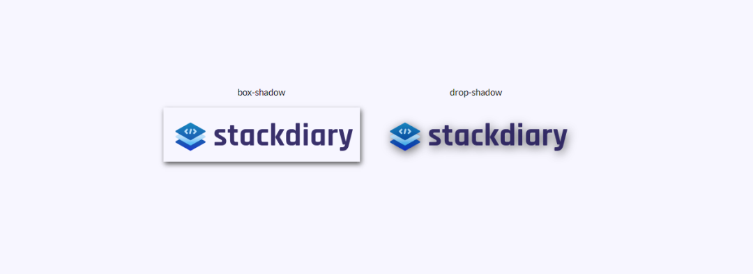
你是否使用过 box-shadow 为透明的图片添加阴影,却让其看起来像添加了一个边框一样?然而解决方案是使用 drop-shadow。
drop-shadow 的工作方式是,其遵循给给定图片的 Alpha 通道。因此阴影是基于图片的内部形状,而不是显示在图片外面。
<div class="transparent-shadow">
  <div class="margin-right">
    <div class="margin-bottom align-center">
      box-shadow
    </div>

    <img class="box-shadow" src="https://stackdiary.com/wp-content/uploads/2022/02/logo.png" alt="box-shadow example (transparent)">
  </div>

  <div>
    <div class="margin-bottom align-center">
      drop-shadow
    </div>

    <img class="drop-shadow" src="https://stackdiary.com/wp-content/uploads/2022/02/logo.png" alt="drop-shadow example (transparent)">
  </div>
</div>
.transparent-shadow {
  height: 80vh;
  display: flex;
  align-items: center;
  justify-content: center;
}

.margin-right {
  margin-right: 2em;
}

.margin-bottom {
  margin-bottom: 1em;
}

.align-center {
  text-align: center;
}

.box-shadow {
  box-shadow: 2px 4px 8px #3723a1;
}

.drop-shadow {
  filter: drop-shadow(2px 4px 8px #3723a1);
}
3. 自定义 Cursor
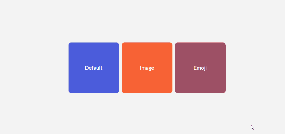
你不需要强迫你站点访问者使用独特的光标。至少,不是出于用户体验的目的。不过,关于 cursor 属性要说明的是,它可以让你展示图片,这相当于以照片的格式显示提示信息。
一些用户案例,包括比较两个不同的照片,你无需在视图窗口渲染这些照片。比如:cursor 属性可以用在你的设计中,节省空间。因为你可以在特定的 div 元素中锁定特定的光标,所以在此 div 这外可以无效。
目前尝试对图片的大小有限制,读者可以自行更改验证
<div class="custom-cursor">
  <div class="card">
    Default
  </div>

  <div class="card card-image-cursor">
    Image
  </div>

  <div class="card card-emoji-cursor">
    Emoji
  </div>
</div>
.custom-cursor {
  display: flex;
  height: 80vh;
  align-items: center;
  justify-content: center;
  background: #f3f3f3;
  padding: 0 10px;
}

.card {
    width: 200px;
    height: 200px;display: flex;
    align-items: center;
    justify-content: center;
    background-color: #D29A5A;
    margin-right: 10px;color: #fff;
    font-size: 1.4em;
    text-align: center;
  }

.card-image-cursor {
  background-color: #D11A5A;
  cursor: url("https://p1-juejin.byteimg.com/tos-cn-i-k3u1fbpfcp/0ac1d8cb2b1b46a384e986a7461df26a~tplv-k3u1fbpfcp-watermark.image?"), auto;
}

.card-emoji-cursor {
  background-color: #D29B22;
  cursor: url("data:image/svg+xml;utf8,<svg xmlns='http://www.w3.org/2000/svg'  width='48' height='48' viewport='0 0 100 100' style='fill:black;font-size:24px;'><text y='50%'>🚀</text></svg>"), auto;
}
4. 使用 attr() 展示 tooltip
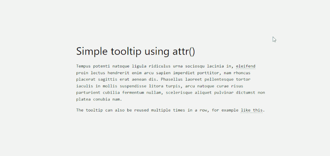
attr() 属性是我最近发现的,且是最得意的发现。我本打算为我的站点添加 tooltip 的功能,但是发现需要引入一个插件,这就引入了不必要的东西,让我的站点看起来臃肿。感谢的是,可以使用 attr() 来避免这种情况。
attr() 属性工作的方式很简单,我逐步解析一下:
我们使用 tooltip class 去标志哪个元素需要展示 tooltip 信息。然后为该元素添加你喜欢的样式,这个方便演示,我们使用了 dotted border-bottom 的样式。
接下来,我们创建一个 :before 伪元素,它将包含内容 content,指向特定的 attr()。这里指 attr(tooltip-data)。
接着,我们会创建一个 :hover 伪类,当用户鼠标移动道元素上时,它将设置 opacity 为 1。
此外,你可以包含自定义的样式。这取决于你设定的 tooltp 的数据,你也许需要调整其宽度或者边距。一旦你设定了 tooptip-data arrt() 类,你可以在你设计的其他部分应用。
<h1>
  HTML/CSS tooltip
</h1>
<p>
  Hover <span class="tooltip" tooltip-data="Tooltip Content">Here</span> to see the tooltip.
</p>
<p>
  You can also hover <span class="tooltip" tooltip-data="This is another Tooltip Content">here</span> to see another example.
</p>
.tooltip {
  position: relative;
  border-bottom: 1px dotted black;
}

.tooltip:before {
  content: attr(tooltip-data);
  position: absolute;
  width: 250px;
  background-color: #efba93;
  color: #fff;
  text-align: center;
  padding: 15px;
  line-height: 1.1;
  border-radius: 5px;
  z-index: 1;
  opacity: 0;
  transition: opacity .5s;
  bottom: 125%;
  left: 50%;
  margin-left: -60px;
  font-size: 0.70em;
  visibility: hidden;
}

.tooltip:after {
  content: "";
  position: absolute;
  bottom: 75%;
  left: 50%;
  margin-left: -5px;
  border-width: 5px;
  border-style: solid;
  opacity: 0;
  transition: opacity .5s;
  border-color: #000 transparent transparent transparent;
  visibility: hidden;
}

.tooltip:hover:before,
.tooltip:hover:after {
  opacity: 1;
  visibility: visible;
}
5. 纯 CSS 实现核算清单
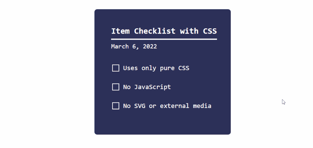
正如我开头所说的,CSS 正逐步成熟。这个动态清单的演示就是一个很好的例子。
我们使用 checkbox 输入类型,加上一个 :checked 伪类。当 :checked 返回 true 的情况时,我们使用 transform 属性更改状态。
你可以使用这种方法实现各种目标。比如,当用户点点击指定的复选框时候,切花到隐藏其内容。在输入 input 类型的单选和复选框使用,当然,这也可以应用到 和 元素。
<div class="checklist">
  <h2>Item Checklist with CSS</h2>
  <label>
    <input type="checkbox" name="" id="" />
    <i></i>
    <span>Item #1</span>
  </label>
  <label>
    <input type="checkbox" name="" id="" />
    <i></i>
    <span>Item #2</span>
  </label>
  <label>
    <input type="checkbox" name="" id="" />
    <i></i>
    <span>Item #3</span>
  </label>
</div>
.checklist {
    padding: 50px;
    position: relative;
    background: #043b3e;
    border-top: 50px solid #03a2f4;
}
.checklist h2 {
    color: #f3f3f3;
    font-size: 25px;
    padding: 10px 0;
    margin-left: 10px;
    display: inline-block;
    border-bottom: 4px solid #f3f3f3;
}
.checklist label {
    position: relative;
    display: block;
    margin: 40px 0;
    color: #fff;
    font-size: 24px;
    cursor: pointer;
}
.checklist input[type="checkbox"] {
    -webkit-appearance: none;
}
.checklist i {
    position: absolute;
    top: 2px;
    display: inline-block;
    width: 25px;
    height: 25px;
    border: 2px solid #fff;
}
.checklist input[type="checkbox"]:checked ~ i {
    top: 1px;
    height: 15px;
    width: 25px;
    border-top: none;
    border-right: none;
    transform: rotate(-45deg);
}
.checklist span {
    position: relative;
    left: 40px;
    transition: 0.5s;
}
.checklist span:before {
    content: '';
    position: absolute;
    top: 50%;
    left: 0;
    width: 100%;
    height: 1px;
    background: #fff;
    transform: translateY(-50%) scaleX(0);
    transform-origin: left;
    transition: transform 0.5s;
}
.checklist input[type="checkbox"]:checked ~ span:before {
    transform: translateY(-50%) scaleX(1);
    transform-origin: right;
    transition: transform 0.5s;
}
.checklist input[type="checkbox"]:checked ~ span {
    color: #154e6b;
}
6. 使用 :is() 和 :where() 添加元素样式
现代 CSS 框架运行的一种方式是通过使用条件逻辑选择器。换言之,:is() 和 :where() 属性可以用于同时设置多种设计元素的样式。但是,更重要的是,你可以使用这些属性去查询你需单独处理的元素。
下面的 CSS 片段是一个小案例,你可以通过 MDN 学习更多关于 :is() 和 :where() 的内容。
<h2 class="content-title">Header 2 <b>content title</span></h2>
/* this query will select the b element within a heading and change its color. */

:where(h2,h3,h4) > b {
  color: blue;
}

:is(h2):where(.content-title) {
  text-transform: uppercase;
}
7. 使用关键帧实现手风琴下拉效果
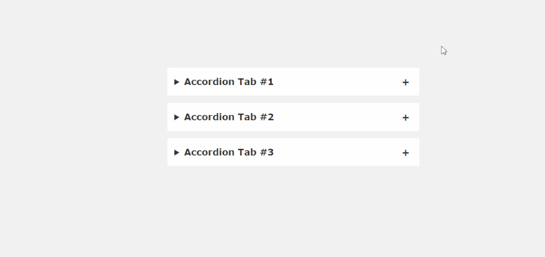
JavaScript 库,比如 jQuery, Cash 等,即使你想使用一个简单的缩放功能,你都要整个引入。幸运的是,很多 CSS 技巧能够避免这种引入。比如下面的手风琴片段代码。
如果你认真看下当下 web 设计的趋势,你会发现在登陆页面就会发现手风琴这种设计效果。这是一种简缩内容的方式,以节省设计空间。常见问题解答,产品功能,使用提示等功能,都可以放在手风琴内实现。下面是纯 CSS 代码片段对其的实践。
<main>
    <details open>
        <summary>Accordion Tab #1</summary>
        <div class="tab-content">
          <p>your text goes here</p>
        </div>
    </details>
    <details>
        <summary>Accordion Tab #2</summary>
        <div class="tab-content">
          <p>your text goes here</p>
        </div>
  </details>
  <details>
    <summary>Accordion Tab #3</summary>
    <div class="tab-content">
      <p>your text goes here</p>
    </div>
  </details>
</main>
/* .tab-content can be styled as you like */
main {
  max-width: 400px;
  margin: 0 auto;
}
p {
    text-align: justify;
    font-family: monospace;
    font-size: 13px;
}
summary {
  font-size: 1rem;
  font-weight: 600;
  background-color: #f3f3f3;
  color: #000;
  padding: 1rem;
  margin-bottom: 1rem;
  outline: none;
  border-radius: 0.25rem;
  cursor: pointer;
  position: relative;
}
details[open] summary ~ * {
  animation: sweep .5s ease-in-out;
}
@keyframes sweep {
  0%    {opacity: 0; margin-top: -10px}
  100%  {opacity: 1; margin-top: 0px}
}
details > summary::after {
  position: absolute;
  content: "+";
  right: 20px;
}
details[open] > summary::after {
  position: absolute;
  content: "-";
  right: 20px;
}
details > summary::-webkit-details-marker {
  display: none;
}
8. 侧边栏的 Hover 效果
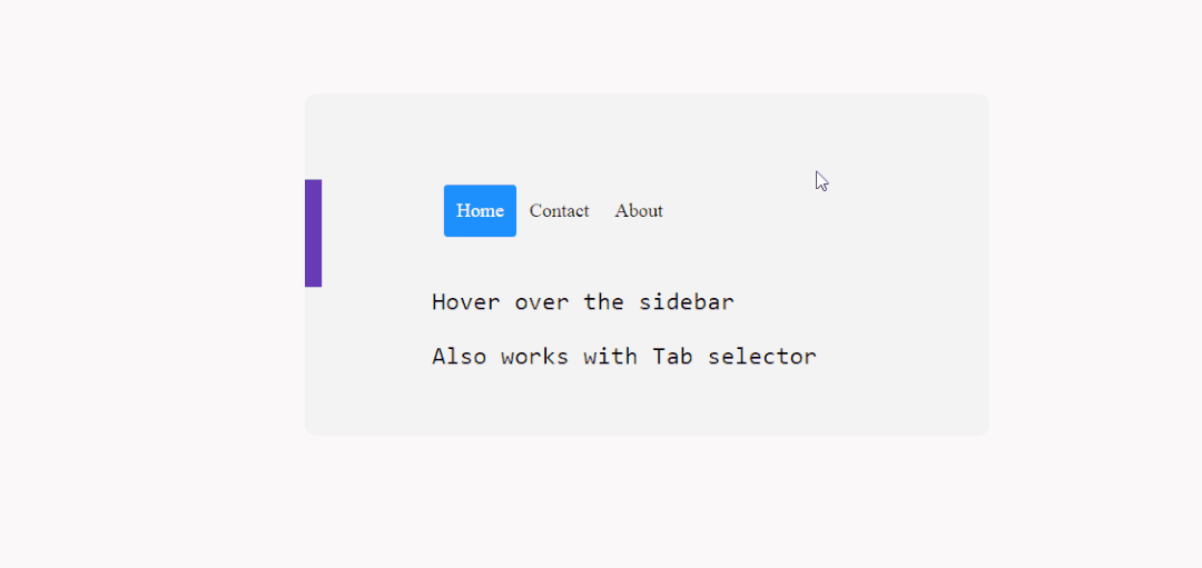
有没有可以使用 CSS 就可以实现一个动态 Hover 效果的侧边栏呢?当然,这得多亏 transform 和 :hover 属性。
为了兼容性,我在多种移动端中进行测试,感觉还不错。虽然这种效果在桌面中使用比在移动端中使用顺畅。在这个练习案例中,使用 position: sticky; 创建一个吸附的侧边栏,其工作的效果良好。
<div class="css-dynamic-sidebar">

  <nav>
    <a class="" href="#">Menu #1</a>
    <a class="" href="#">Menu #2</a>
    <a class="" href="#">Menu #3</a>
  </nav>

<div class="site-content">
  <p>Hover over the sidebar</p>
  <p>Also work with Tab selector (for accessibility)</p>
</div>
</div>
.css-dynamic-sidebar {
    overflow: hidden;
    position: relative;
    height: 15em;
    max-width: 15em;
    margin: auto;
}
.site-content {
    margin: auto;
}
nav {
    display: flex;
    flex-direction: column;
    position: absolute;
    right: 100%;
    padding: 1em;
    background-color: #f3f3f3;
    transform: translateX(1em);
    transition: 0.2s transform;
}
nav:hover,
nav:focus-within {
    transform: translateX(100%);
}
a {
    white-space: pre;
    color: black;
}
p {
    font-size: 2em;
    font-family: monospace;
    text-align: center;
}
9. 使用 first-letter 实现首字母大写
在 CSS 中,可以选择确定的 first-of-type 元素。在这个例子中,我们使用 ::first-letter 伪类去实现首字母大写的效果。这个类可以让我们更自由的添加样式。所以,你可以调整大写字母的样式以符合你的站点设计风格。
说到这个属性,你可以使用它干很多事。当特定元素在页面中第一次出现,我们可以使用 first-of-type 单独进行添加样式。但是,正如下面代码展示,尽管元素已经出现过,你依然可以使用在多个元素上。
<div class="content-section">
  <p>here we target the  wrapper and select the p element. then append first-of-type and target first-letter specifically. you can then reuse the same option in other parts of your design by changing the wrapper variable</p>
</div>
.content-section p:first-of-type::first-letter {
    color: #f3f3f3;
    float:  left;
    font-size: 4rem;
    line-height: 4vw;
    padding-right: 8px;
 /* border: 0.25em double; */
}
10. 使用 ::before 添加按钮的图标
每当我需要链接到外部其他资源的时候,我都会使用自定义的按钮来实现。准确来说,是一个添加图标的按钮。简单的谷歌搜索,你会发现很多 button generators ,但是我对可以随时使用的通用解决方案更感兴趣。
所以,为了实现这个目标,我为特定按钮创建了一个 :before 伪元素。需要声明的是,代码片段中的 content:“\0000a0”; 是 的 Unicode 转义。
你可以通过宽高属性来调整图标的尺寸,以更好适应按钮样式。
<div class="card">
  <div class="card-body">
    <a href="" target="_blank" class="btn btn-docu" rel="noopener">Documentation</a>
  </div>
</div>
.card .card-body .btn {
  display: block;
  width: 200px;
  height: 48px;
  line-height: 48px;
  background-color: blue;
  border-radius: 4px;
  text-align: center;
  color: #fff;
  font-weight: 700;
}
.card .card-body .btn-docu:before {
    content:"\0000a0";
    display:inline-flex;
    height:24px;
    width:24px;
    line-height:24px;
    margin:0px 10px 0px 0px;
    position:relative;
    top:0px;
    left:0px;
    background:url(https://stackdiary.com/docu.svg) no-repeat left center transparent;
    background-size:100% 100%;
}
字体超出用省略号表示
white-space: nowrap; // 禁止换行
text-overflow: ellipsis; // 隐藏溢出部分
overflow: hidden; // 使用省略号表示
鼠标进入向上移动10px
.special-item {
transform: perspective(1px) translateZ(0);
box-shadow: 0px 0px 10px #747474;
transition-duration: 0.7s;
transition-property: all;
transition-timing-function: ease-out;
}
.special-item:hover{
transform: translateY(-10px);
}
css动画
scroll-behavior: smooth;回到顶部的css过渡效果
animation: scroll 3s linear:/* 动画的时间线 */
animation-timeline: scroll();


 1万+
1万+


 被折叠的 条评论
为什么被折叠?
被折叠的 条评论
为什么被折叠?
 到【灌水乐园】发言


