


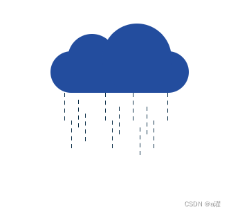
效果:
具体实现:
html
<div class="wuyun">
        <div class="yun">
            <div class=" yu yu1"></div>
            <div class=" yu yu2"></div>
            <div class=" yu yu3"></div>
            <div class=" yu yu4"></div>
            <div class=" yu yu5"></div>
            <div class=" yu yu6"></div>
            <div class=" yu yu7"></div>
            <div class=" yu yu8"></div>
            <div class=" yu yu9"></div>
            <div class=" yu yu10"></div>
            <div class=" yu yu11"></div>
            <div class=" yu yu12"></div>
        </div>
css代码
 .wuyun {
        margin-bottom: 400px;

    }
    .yun:after {
        content: "";
        width: 100px;
        height: 100px;
        border-radius: 50%;
        background-color: pink;
        position: absolute;
        top: -40px;
        right: 25px;
        animation: color 5s ease-in-out infinite;

    }
    .yun:before {
        content: "";
        width: 70px;
        height: 70px;
        border-radius: 50%;
        background-color: pink;
        position: absolute;
        top: -25px;
        left: 25px;
        animation: color 5s ease-in-out infinite;
    }
    .yun {
        width: 200px;
        height: 60px;
        border-radius: 50px;
        background-color: pink;
        margin: auto;
        margin-top: 300px;
        position: relative;
        animation: color 5s ease-in-out infinite;
    }
    @keyframes yu {
        0% {
            /* border-left: #fff 1px dashed; */
            border-left: #0b2e47 1px dashed;
            transform: scaleY(2);
        }
        40% {
            border-left: #0b2e47 1px dashed;
        }
        60% {
            border-left: #0b2e47 1px dashed;
            transform: translateY(20px);
            transform: scaleY(2);
        }
        80% {
            border-left: #0b2e47 1px dashed;
            transform: scaleY(2);
        }
        100% {
            /* border-left: #fff 1px dashed; */
            border-left: #fff 1px dashed;
            transform: scaleY(2);
        }
    }
@keyframes color {
        0% {
            background-color: rgb(209, 233, 237);
        }
        40% {
            background-color: rgb(119, 181, 232);
        }
        60% {
            background-color: #0a2e88;
        }
        80% {
            background-color: #0b2e47;
        }
        100% {
            background-color: rgb(209, 233, 237);
        }
    }
    @keyframes yunduo {
        100% {
            transform: translateX(200px);
        }
    }
     .yu {
        height: 20px;
        box-sizing: border-box;
        border-left: #0b2e47 1px dashed;
        position: absolute;
        bottom: -20px;
        animation: yu 5s ease-in-out infinite;
    }

    .yu1 {
        left: 20px;
        bottom: -30px;
    }

    .yu2 {
        left: 40px;
        bottom: -40px;
    }

    .yu3 {
        right: 30px;
        bottom: -30px;
    }

    .yu4 {
        right: 60px;
        bottom: -50px;
    }

    .yu5 {
        right: 80px;
        bottom: -30px;
    }

    .yu6 {
        right: 100px;
        bottom: -50px;
    }

    .yu7 {
        right: 110px;
        bottom: -70px;
    }

    .yu8 {
        right: 120px;
        bottom: -30px;
    }

    .yu9 {
        left: 50px;
        bottom: -60px;
    }

    .yu10 {
        right: 50px;
        bottom: -70px;
    }

    .yu11 {
        right: 70px;
        bottom: -80px;
    }

    .yu12 {
        left: 30px;
        bottom: -70px;
    }
这个办法绘制雨滴有点麻烦如果大家有什么其他方法,欢迎评论区讨论呀


 325
325


 被折叠的 条评论
为什么被折叠?
被折叠的 条评论
为什么被折叠?
 到【灌水乐园】发言


