


 本文详细介绍了CSS3的渐变色,包括线性渐变和径向渐变的用法,以及2D转换如平移、旋转、缩放和倾斜的应用。此外,还探讨了3D转换,如rotateX(), rotateY()和rotateZ()方法,用于创建丰富的3D视觉效果。"
122700515,9467366,GOLDENEYE: 1 渗透体验:过时但具挑战性的vulnhub靶场,"['安全', 'web安全', '渗透测试', '靶场']
本文详细介绍了CSS3的渐变色,包括线性渐变和径向渐变的用法,以及2D转换如平移、旋转、缩放和倾斜的应用。此外,还探讨了3D转换,如rotateX(), rotateY()和rotateZ()方法,用于创建丰富的3D视觉效果。"
122700515,9467366,GOLDENEYE: 1 渗透体验:过时但具挑战性的vulnhub靶场,"['安全', 'web安全', '渗透测试', '靶场']
一、渐变色
CSS渐变色(Gradient)是指在元素背景中使用两种或多种不同的颜色进行过渡,超过两个颜色可以形成更为细腻的渐变效果。常见的CSS渐变色有线性渐变和径向渐变。
1. 线性渐变:Linear Gradients 向下/向上/向左/向右/对角方向
/* 从上到下,蓝色渐变到红色 */
linear-gradient(blue, red);

/* 渐变轴为45度,从蓝色渐变到红色 */
linear-gradient(45deg, blue, red);

/* 从右下到左上、从蓝色渐变到红色 */
linear-gradient(to left top, blue, red);

/* 从下到上,从蓝色开始渐变、到高度40%位置是绿色渐变开始、最后以红色结束 */
linear-gradient(0deg, blue, green 40%, red);
线性渐变从一个颜色到另一个颜色沿着一条直线渐变,实现代码如下:
background: linear-gradient(direction, color-stop1, color-stop2, ...);其中,direction参数指定了线性渐变的方向,可以是to top、to bottom、to right、to left、to top left等等值;color-stop表示颜色变化节点,可以设置百分比值或距离值。
以下CSS代码定义了从左上到右下的渐变色背景:
<!DOCTYPE html>
<html>
<head>
<meta charset="utf-8">
<style>
#grad1 {
  height: 200px;;
background: linear-gradient(to bottom right, red, yellow);
}
</style>
</head>
<body>
<div id="grad1"></div>
</body>
</html>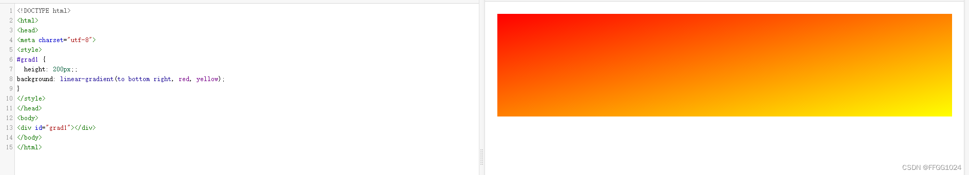
2. 径向渐变:Radial Gradients 由它们的中心定义
径向渐变从圆心开始,向外扩散渐变到整个元素边缘的一种渲染方法,实现代码如下:
background: radial-gradient(shape size at position, start-color, ..., last-color);其中,shape参数定义了渐变的形状,默认是ellipse(椭圆),可选值还有circle(圆形);size参数定义了颜色绘制的最远点位置,可选值有closest-side、farthest-side、closest-corner和farthest-corner;at position参数用于定义颜色圆心的坐标位置;start-color是渐变起点开始的颜色,last-colour是渐变结束的颜色,中间还可以设置其他颜色。
以下CSS代码定义了一个由中心向外的径向渐变:
<!DOCTYPE html>
<html>
<head>
<meta charset="utf-8">
<style>
#grad1 {
    height:300px;
	width:400px;
background: radial-gradient(circle at center, red, yellow);
}
</style>
</head>
<body>
<div id="grad1"></div>
</body>
</html>
<
 最低0.47元/天 解锁文章


 扫一扫
扫一扫


 3万+
3万+

 被折叠的 条评论
为什么被折叠?
被折叠的 条评论
为什么被折叠?
 到【灌水乐园】发言


