


弹性布局flex
目录
2.5容器属性(flex-direction和flex-wrap)
2.7项目常用属性(order,flex,align-self)
2.8flex-grow默认值为:0,用来决定项目有剩余空间的情况下是否放大默认不放大(如果设置了固定的宽度也会放大)
默认值为:1,用来决定项目在空间不足的情况下是否缩小,默认项目都是1,空间在不足时大家等比例缩小
注意如果设置了固定宽度也会缩小,如果flex-shrink设置为0即使空间不够,自身也不会缩小。
默认值为:auto,用于设置项目的宽度,当是默认值时,项目会保持默认宽度,或者以width为自身的宽度,
1.前言:
弹性布局又称为flex布局,由W3C推出的一种布局方式,优点体现在简便、完整、响应式地实现各种页面布局。而且已经得到所有主流浏览器的支持,它的出现意在取代“display+float+position”的布局形式,解决“display+float+position”所存在的不能自适应的问题,简而言之就是通过弹性布局可以实现屏幕自适应,不会应为屏幕的变化改变原有的布局。
2.学习开始
2.1初实现
实现弹性布局只需要在外层父容器设置display:flex即可
<body>
<div class="box"></div>
</body>


<!--css的相关代码-->
.body{
    display: flex;
}
此时的body就是flex容器而存在于body里面的所有子容器就是其容器成员,也称为flex项目,如代码中的box就是其flex项目
2.2相关内容

容器存在两根轴分别是水平主轴和垂直交叉轴,水平主轴开始的位置(与边框的交叉点)叫做main start,结束的位置叫做main end,交叉轴开始的位置叫做cross start结束的位置叫做cross end
2.3案例开始
未使用弹性布局前页面是由上到下排列(实现效果和代码如下)
<!--html-->
<body>
<div class="box">a</div>
<div class="box">b</div>
<div class="box">c</div>
</body>


<!--css-->
.box{
    width: 200px;
    height: 200px;
    background: #00f0f0;
    border: 2px solid black;
    font-size: 50px;
    text-align: center;
}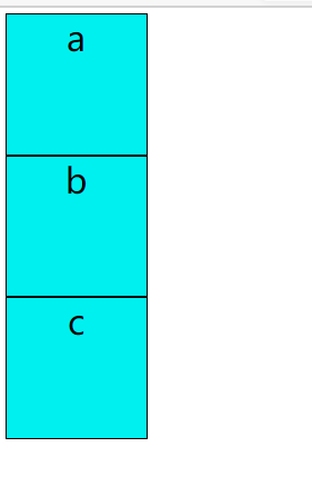
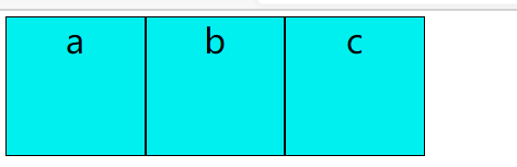
给body添加弹性布局最后就能实现从左至右布局从而取代原来的float浮动的功能(实现效果和代码如下)
body{
      display: flex;
  }
2.4常用功能
只需要在父容器中添加功能即可
2.4.1实现居中(justify-content:center)
body{
      display: flex;
    justify-content:center
  }
2.4.2靠右对齐(justify-content:flex-end)
body{
      display: flex;
    justify-content:flex-end
  }
2.4.3左右两端对齐且间距相等(justify-content:space-between)
body{
      display: flex;
    justify-content:space-between
  }
2.4.4项目之间的间距为左右两侧项目间距的二倍(justify-content:space-around)
body{
      display: flex;
    justify-content:space-around
  }
2.4.5项目之间的间距与项目与容器之间的间距相等(justify-content:space-evenly)
body{
      display: flex;
    justify-content:space-evenly
  }
2.4.6沿着交叉轴布局分布,设置为默认位置(align-items:flex-start)
body{
      display: flex;
    align-items:flex-start
  }
2.4.7沿着交叉轴居中布局分布(align-items:center)

2.4.8沿着交叉轴底部布局分布(align-items:flex-end)

2.4.9实现垂直水平居中(justify-content: center;align-items: center;)

2.5容器属性(flex-direction和flex-wrap)
2.5.1flex-direction:row(默认按行排列),如果是flex-direction:row-reverse(项目反转)


2.5.2flex-direction:column(垂直排列)和flex-direction:column-reverse(项目反转)


2.6flex-wrap
2.6.1默认值是nowrap,实现功能当盒子的总宽大于了父盒子的宽,在浮动布局情况下会掉下来,但是如果设置了flex-wrap:nowrap,项目会强行等分容器宽度且不换行。
<!--html-->
<body >
<div class="boxs">
<div class="box">a</div>
<div class="box">b</div>
<div class="box">c</div>
<div class="box">d</div>
<div class="box">e</div>
<div class="box">f</div>
</div>
</body>

<!--css-->
.boxs{
    width: 300px;
    height: 300px;
    display: flex;
    margin: 0px auto;
    flex-wrap: nowrap;
    background: #eeeeee;
}
.box{
    width: 60px;
    height: 50px;
    background: #00f0f0;
    border: 2px solid black;
    font-size: 20px;
    text-align: center;
}
2.6.2设置wrap,实现功能如果设置了flex-wrap:wrap,根据自身宽度进行排列,如果超出父容器宽度则会自然换行

2.7项目常用属性(order,flex,align-self)
2.7.1order用来决定排列顺序数值越小,排列越向前
原始排列 改变顺序后排列
<!--html--->
<body >
<div class="boxs">
<div class="box">a</div>
<div class="box">b</div>
<div class="box">c</div>
</div>
</body>

<!--css-->
.boxs{
    width: 300px;
    height: 300px;
    display: flex;
    margin: 0px auto;
    flex-wrap: wrap;
    background: #eeeeee;
}
.box{
    width: 60px;
    height: 50px;
    background: #00f0f0;
    border: 2px solid black;
    font-size: 20px;
    text-align: center;
}
.box:nth-child(1){
    order: 2;
}
.box:nth-child(2){
    order: 1;
}
.box:nth-child(3){
    order: 0;
}
2.7.2align-self让项目单个单独排列可用的属性(居中center、靠底端排列flex-end)
居中 靠底端排列
靠底端排列
<!--css-->
.boxs{
    width: 300px;
    height: 300px;
    display: flex;
    margin: 0px auto;
    flex-wrap: wrap;
    background: #eeeeee;
}
.box{
    width: 60px;
    height: 50px;
    background: #00f0f0;
    border: 2px solid black;
    font-size: 20px;
    text-align: center;
}
.box:nth-child(1){
   align-self: center;
}
.box:nth-child(2){
    align-self: flex-end;
}
2.7.3flex默认值为:0 1 auto,flex属性是flex-grow,flex-shrink与flex-basis三个属性的简写,用于定义项目放大,缩小与宽度。例如auto(1 1 auto)等分放大缩小,none(0 0 auto),不放大但等分缩小。
2.8flex-grow默认值为:0,用来决定项目有剩余空间的情况下是否放大默认不放大(如果设置了固定的宽度也会放大)
 前面两个设置值为1最后一个设置为默认值
  前面两个为默认值,最后一个设置为1
<!--第一个图的代码-->
.boxs{
    width: 300px;
    height: 300px;
    display: flex;
    margin: 0px auto;
    flex-wrap: wrap;
    background: #eeeeee;
}
.box{
    width: 60px;
    height: 50px;
    background: #00f0f0;
    border: 2px solid black;
    font-size: 20px;
    text-align: center;
}
.box:nth-child(1){
    flex-grow: 1;
}
.box:nth-child(2){
    flex-grow: 1;
}
}


<!--第二个图的代码-->
.boxs{
    width: 300px;
    height: 300px;
    display: flex;
    margin: 0px auto;
    flex-wrap: wrap;
    background: #eeeeee;
}
.box{
    width: 60px;
    height: 50px;
    background: #00f0f0;
    border: 2px solid black;
    font-size: 20px;
    text-align: center;
}
.box:nth-child(3){
    flex-grow: 1;
}
}
2.9flex-shrink
默认值为:1,用来决定项目在空间不足的情况下是否缩小,默认项目都是1,空间在不足时大家等比例缩小
注意如果设置了固定宽度也会缩小,如果flex-shrink设置为0即使空间不够,自身也不会缩小。
2.10flex-basis
默认值为:auto,用于设置项目的宽度,当是默认值时,项目会保持默认宽度,或者以width为自身的宽度,
当设置了flex-basis会覆盖width的属性。


 2100
2100


 被折叠的 条评论
为什么被折叠?
被折叠的 条评论
为什么被折叠?
 到【灌水乐园】发言


