


1、依赖下载
npm i lib-flexible -S
npm i px2rem-loader -D
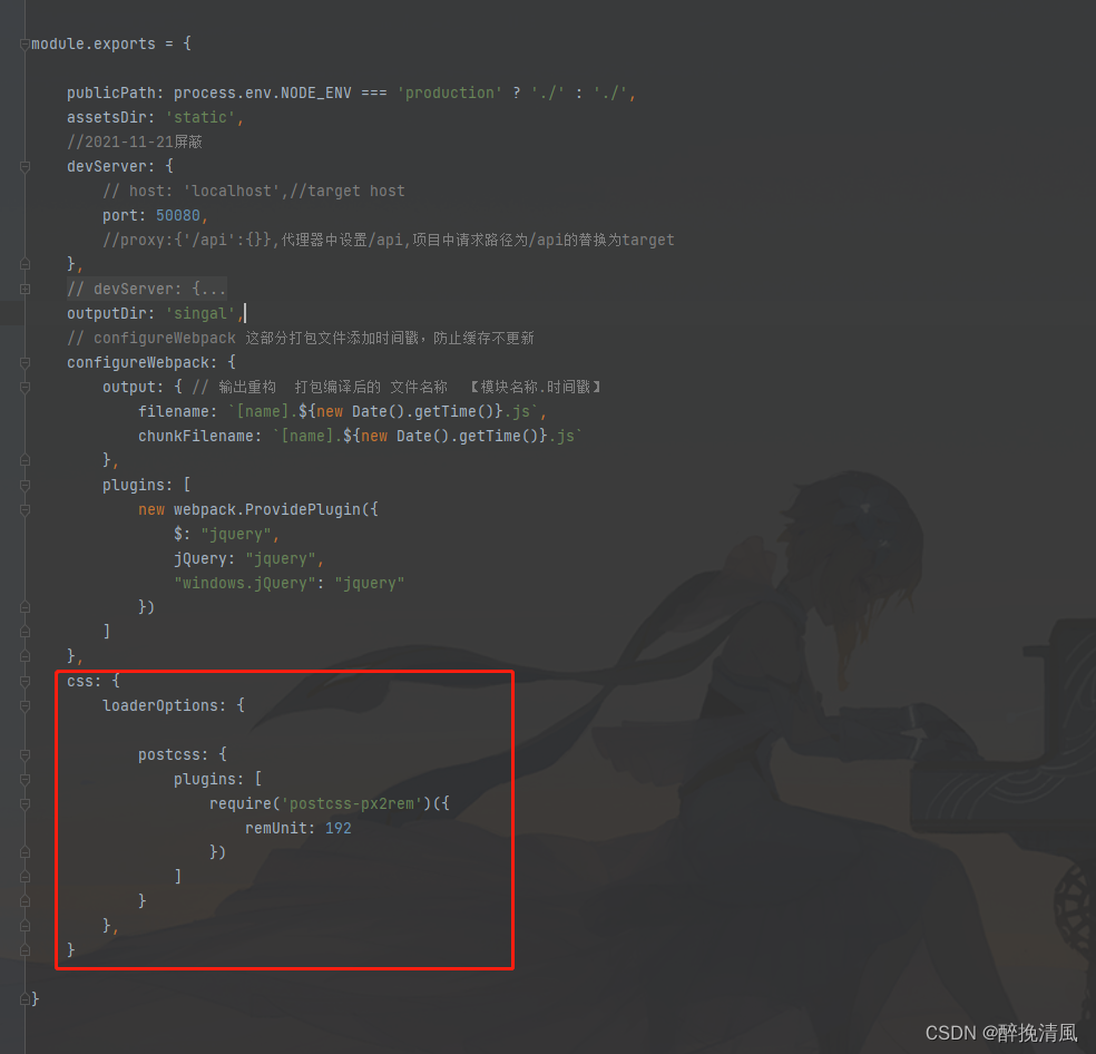
2、在vue.config.js配置
  css: {
    loaderOptions: {

      postcss: {
        plugins: [
          require('postcss-px2rem')({
            remUnit: 192
          })
        ]
      }
    },
  },
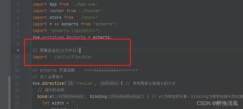
3、需要在main.js中引入flexible
- 到这里自适应已经生效了
- 这里还有一个问题,就是屏幕宽度大于540的时候,把屏幕宽度写死成540了
- 找到路径\node_modules\lib-flexible\flexible.js

选中的内容修改为
if (width / dpr > 540) { width = width * dpr; }
4、flexible这样做的话每次下载依赖都需要重新修改一次代码
这样做的话每次下载依赖都需要重新修改一次代码,所以,把这一个js文件复制下来
//flexible.js
;(function(win, lib) {
    var doc = win.document;
    var docEl = doc.documentElement;
    var metaEl = doc.querySelector('meta[name="viewport"]');
    var flexibleEl = doc.querySelector('meta[name="flexible"]');
    var dpr = 0;
    var scale = 0;
    var tid;
    var flexible = lib.flexible || (lib.flexible = {});

    if (metaEl) {
        console.warn('将根据已有的meta标签来设置缩放比例');
        var match = metaEl.getAttribute('content').match(/initial\-scale=([\d\.]+)/);
        if (match) {
            scale = parseFloat(match[1]);
            dpr = parseInt(1 / scale);
        }
    } else if (flexibleEl) {
        var content = flexibleEl.getAttribute('content');
        if (content) {
            var initialDpr = content.match(/initial\-dpr=([\d\.]+)/);
            var maximumDpr = content.match(/maximum\-dpr=([\d\.]+)/);
            if (initialDpr) {
                dpr = parseFloat(initialDpr[1]);
                scale = parseFloat((1 / dpr).toFixed(2));
            }
            if (maximumDpr) {
                dpr = parseFloat(maximumDpr[1]);
                scale = parseFloat((1 / dpr).toFixed(2));
            }
        }
    }

    if (!dpr && !scale) {
        var isAndroid = win.navigator.appVersion.match(/android/gi);
        var isIPhone = win.navigator.appVersion.match(/iphone/gi);
        var devicePixelRatio = win.devicePixelRatio;
        if (isIPhone) {
            // iOS下,对于2和3的屏,用2倍的方案,其余的用1倍方案
            if (devicePixelRatio >= 3 && (!dpr || dpr >= 3)) {
                dpr = 3;
            } else if (devicePixelRatio >= 2 && (!dpr || dpr >= 2)){
                dpr = 2;
            } else {
                dpr = 1;
            }
        } else {
            // 其他设备下,仍旧使用1倍的方案
            dpr = 1;
        }
        scale = 1 / dpr;
    }

    docEl.setAttribute('data-dpr', dpr);
    if (!metaEl) {
        metaEl = doc.createElement('meta');
        metaEl.setAttribute('name', 'viewport');
        metaEl.setAttribute('content', 'initial-scale=' + scale + ', maximum-scale=' + scale + ', minimum-scale=' + scale + ', user-scalable=no');
        if (docEl.firstElementChild) {
            docEl.firstElementChild.appendChild(metaEl);
        } else {
            var wrap = doc.createElement('div');
            wrap.appendChild(metaEl);
            doc.write(wrap.innerHTML);
        }
    }

    function refreshRem(){
        var width = docEl.getBoundingClientRect().width;
        if (width / dpr > 540) {
            width = width * dpr;
        }
        var rem = width / 10;
        docEl.style.fontSize = rem + 'px';
        flexible.rem = win.rem = rem;
    }

    win.addEventListener('resize', function() {
        clearTimeout(tid);
        tid = setTimeout(refreshRem, 300);
    }, false);
    win.addEventListener('pageshow', function(e) {
        if (e.persisted) {
            clearTimeout(tid);
            tid = setTimeout(refreshRem, 300);
        }
    }, false);

    if (doc.readyState === 'complete') {
        doc.body.style.fontSize = 12 * dpr + 'px';
    } else {
        doc.addEventListener('DOMContentLoaded', function(e) {
            doc.body.style.fontSize = 12 * dpr + 'px';
        }, false);
    }


    refreshRem();

    flexible.dpr = win.dpr = dpr;
    flexible.refreshRem = refreshRem;
    flexible.rem2px = function(d) {
        var val = parseFloat(d) * this.rem;
        if (typeof d === 'string' && d.match(/rem$/)) {
            val += 'px';
        }
        return val;
    }
    flexible.px2rem = function(d) {
        var val = parseFloat(d) / this.rem;
        if (typeof d === 'string' && d.match(/px$/)) {
            val += 'rem';
        }
        return val;
    }

})(window, window['lib'] || (window['lib'] = {}));
然后需要你自己建一个js文件,把复制的内容放在js文件里,然后再把这个js文件引入main.js中


 379
379


 被折叠的 条评论
为什么被折叠?
被折叠的 条评论
为什么被折叠?
 到【灌水乐园】发言


