


如图: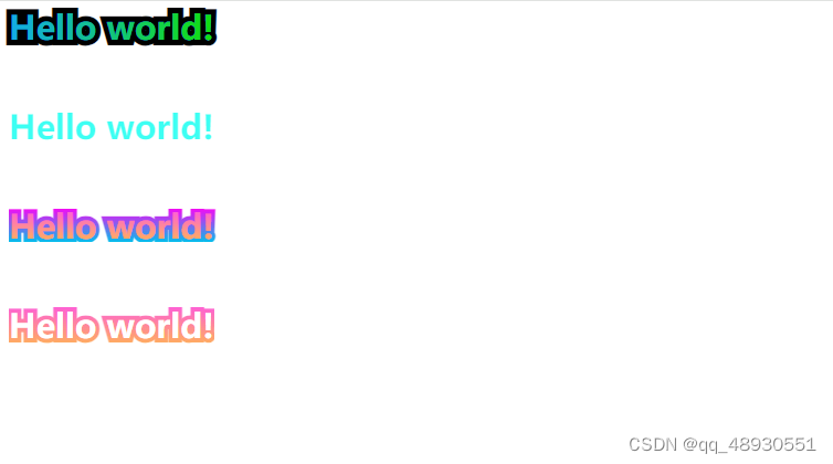
代码如下:
<!DOCTYPE html>
<html lang="en">

<head>
    <meta charset="UTF-8">
    <meta name="viewport" content="width=`, initial-scale=1.0">
    <title>渐变字体</title>
    <style>
        .box {
            display: flex;
            flex-direction: column;
            gap: 60px;
            justify-content: left;
        }

        .box>div {

            font-size: 30px;
            font-weight: 700;
            line-height: 30px;
        }

        /* 单色边框渐变字体  */
        .font {
            display: inline-block;
            font-size: 30px;
            font-weight: 700;
            position: relative;
            text-align: left;
            font-family: 'Roboto Condensed', sans-serif;

        }

        .font .stroke {
            -webkit-text-stroke: 10px #000;
        }

        .font .text {
            color: #13abe7;

            position: absolute;
            left: 0;
            top: 0;
            margin: auto;
        }

        .font .text::before {
            content: attr(text);
            position: absolute;
            left: 0;
            top: 0;

            color: #12df0b;
            -webkit-mask: linear-gradient(91.34deg, transparent, black);

        }

        /* 不带边框渐变字体 */
        .noborder {
            display: inline-block;

            background: linear-gradient(91.34deg, #3dfff3 19.81%, #9483ff 76.46%);
            background-size: contain;
            color: transparent;
            background-clip: text;
            /*兼容safari*/
            -webkit-background-clip: text;


        }

        /* 渐变边框渐变字体 */
        .bordergradient .text {
            -webkit-background-clip: text;
            background-clip: text;


            background-image: linear-gradient(180deg, #f30cf3 0%, #05beec 100%);
            color: #FE58E2;
            -webkit-text-stroke-color: transparent;
            -webkit-text-stroke-width: 8px;
            margin-bottom: 0;
            display: block;
            text-wrap: nowrap;


        }

        .bordergradient .text::before {
            content: attr(text);
            position: absolute;

            color: #FFB455;
            -webkit-mask: linear-gradient(180deg, transparent, black);
        }

        /* 渐变边框单色字体 */

        .text-gradient2 .text {
            -webkit-background-clip: text;
            background-clip: text;
            background-image: -webkit-gradient(linear, left top, left bottom, from(#FE58E2), to(#FFB455));
            background-image: linear-gradient(180deg, #FE58E2 0%, #FFB455 100%);
            color: #FFFFFF;
            -webkit-text-stroke-color: transparent;
            -webkit-text-stroke-width: 8px;
            margin-bottom: 0;
            text-align: center;
            text-wrap: nowrap;


        }
    </style>
</head>

<body>
    <div class="box">
        <!-- 单色边框渐变字体 -->
        <div class="font ">
            <span class="stroke">Hello world!</span>
            <span class="text " text="Hello world!">Hello world!</span>
        </div>
        <!-- 不带边框渐变字体 -->

        <div class="noborder">
            Hello world!
        </div>

        <!-- 渐变边框渐变字体 -->
        <div class=" bordergradient">
            <span class="text " text="Hello world!">Hello world!</span>
        </div>
        <!-- 渐变边框单色字体 -->
        <div class="text-gradient2">
            <span class="text " text="Hello world!">Hello world!</span>
        </div>
    </div>


</body>

</html>


 3249
3249

 被折叠的 条评论
为什么被折叠?
被折叠的 条评论
为什么被折叠?
 到【灌水乐园】发言


