前言:
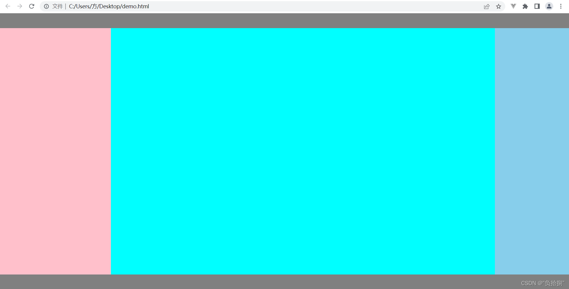
- 圣杯布局是一种很经典的布局方法,经典的float方式实现圣杯布局是通过左、中、右三层的包裹层设置左右padding来预留左右元素的位置,重难点是margin 负值;
- 而flex方法实现则简单得多,即给中间元素设置flex:1,接着写死左右元素宽度,最后利用order进行顺序排列
float方式
<!DOCTYPE html>
<html lang="en">
<head>
<meta charset="UTF-8">
<meta http-equiv="X-UA-Compatible" content="IE=edge">
<meta name="viewport" content="width=device-width, initial-scale=1.0">
<title>Document</title>
<style>
html body {
margin: 0;
padding: 0;
}
header{
width: 100%;
height: 40px;
background-color:gray;
}
footer{
width: 100%;
height: 40px;
background-color:gray;
}
.main {
height: calc(100vh - 80px);
padding-left: 300px;
padding-right: 200px;
}
.center {
width: 100%;
height: 100%;
background-color: aqua;
float: left;
}
.left {
width: 300px;
height: 100%;
background-color: pink;
float: left;
margin-left: -100%;
position: relative;
left: -300px;
}
.right {
width: 200px;
height: 100%;
background-color: skyblue;
float: left;
margin-left: -200px;
position: relative;
right: -200px;
}
</style>
</head>
<body>
<div>
<header></header>
<div class="main">
<div class="center"></div>
<div class="left"></div>
<div class="right"></div>
</div>
<footer></footer>
</div>
<script>
</script>
</body>
</html>
flex方式:
<!DOCTYPE html>
<html lang="en">
<head>
<meta charset="UTF-8">
<meta http-equiv="X-UA-Compatible" content="IE=edge">
<meta name="viewport" content="width=device-width, initial-scale=1.0">
<title>Document</title>
<style>
html body {
margin: 0;
padding: 0;
}
header{
width: 100%;
height: 40px;
background-color:gray;
}
footer{
width: 100%;
height: 40px;
background-color:gray;
}
.main {
height: calc(100vh - 80px);
display: flex;
}
.center {
width: 100%;
flex: 1;
order: 2;
background-color: aqua;
}
.left {
width: 300px;
order: 1;
background-color: pink;
}
.right {
width: 200px;
order: 3;
background-color: skyblue;
}
</style>
</head>
<body>
<div>
<header></header>
<div class="main">
<div class="center"></div>
<div class="left"></div>
<div class="right"></div>
</div>
<footer></footer>
</div>
<script>
</script>
</body>
</html>
效果:


 349
349


 被折叠的 条评论
为什么被折叠?
被折叠的 条评论
为什么被折叠?
 到【灌水乐园】发言


