


实现效果:
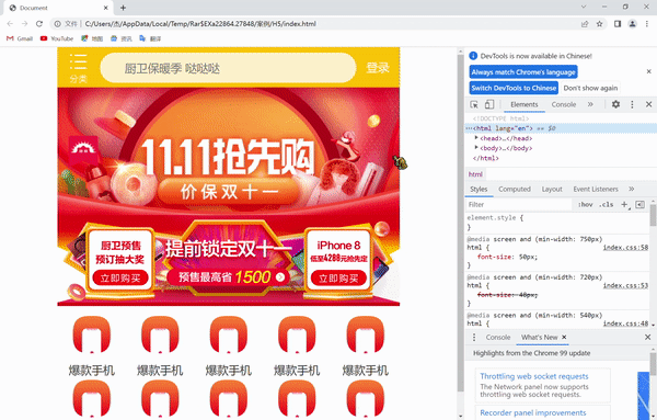
可以看到随着我们屏幕尺寸的不断变化,我们制作的移动端页面也能有一个自适应的效果,这就是rem适配布局的好处
这里我们主要是体现一个rem适配布局所以剩下的部分以同样方法搭建
1.技术选型
方案:采取单独制作移动页面方案
技术:布局采取rem适配布局(less+rem+媒体查询)
设计图:采用750px设计尺寸
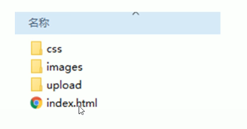
2.搭建相关文件夹结构
3.设置视口标签以及引入初始化样式
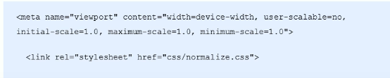
关于初始化样式normalize.css文件和案例用到的图片,大家在这个链接拿来就可以用
链接: link.
index.html:
<!DOCTYPE html>
<html lang="en">

<head>
    <meta charset="UTF-8">
    <meta name="viewport" content="width=device-width, initial-scale=1.0, maximum-scale=1.0, user-scalable=0" />
    <meta http-equiv="X-UA-Compatible" content="ie=edge">
    <link rel="stylesheet" href="css/normalize.css">
    <link rel="stylesheet" href="css/index.css">
    <title>Document</title>
</head>

<body>
    <!-- 顶部搜索框 -->
    <div class="search-content">
        <a href="#" class="classify"></a>
        <div class="search">
            <form action="">
                <input type="search" value="厨卫保暖季 哒哒哒">
            </form>
        </div>
        <a href="#" class="login">登录</a>
    </div>
    <!-- banner部分 -->
    <div class="banner">
        <img src="upload/banner.gif" alt="">
    </div>
    <!-- 广告部分 -->
    <div class="ad">
        <a href="#"><img src="upload/ad1.gif" alt=""></a>
        <a href="#"><img src="upload/ad2.gif" alt=""></a>
        <a href="#"><img src="upload/ad3.gif" alt=""></a>
    </div>
    <!-- nav模块 -->
    <nav>
        <a href="#">
            <img src="upload/nav1.png" alt="">
            <span>爆款手机</span>
        </a>
        <a href="#">
            <img src="upload/nav1.png" alt="">
            <span>爆款手机</span>
        </a>
        <a href="#">
            <img src="upload/nav1.png" alt="">
            <span>爆款手机</span>
        </a>
        <a href="#">
            <img src="upload/nav1.png" alt="">
            <span>爆款手机</span>
        </a>
        <a href="#">
            <img src="upload/nav1.png" alt="">
            <span>爆款手机</span>
        </a>
        <a href="#">
            <img src="upload/nav1.png" alt="">
            <span>爆款手机</span>
        </a>
        <a href="#">
            <img src="upload/nav1.png" alt="">
            <span>爆款手机</span>
        </a>
        <a href="#">
            <img src="upload/nav1.png" alt="">
            <span>爆款手机</span>
        </a>
        <a href="#">
            <img src="upload/nav1.png" alt="">
            <span>爆款手机</span>
        </a>
        <a href="#">
            <img src="upload/nav1.png" alt="">
            <span>爆款手机</span>
        </a>

    </nav>
</body>

</html>
4.设置公共common.less文件
1.新建common.less设置好最常见的屏幕尺寸,利用媒体查询设置不同的html字体大小,因为除了首页其他页面也需要
2.我们关心的尺寸有320px、360px、375px、384px、400px、414px、424px、480px、540px、720px、750px划分的份数
3.我们定为15等份(这个是自定义的)
4.因为我们pc端也可以打开我们苏宁移动端首页,我们默认html字体大小为50px,注意这句话写到最上面
commom.less:
// 设置常见的屏幕尺寸 修改里面的html文字大小
a {
    text-decoration: none;
}
// 一定要写到最上面
html {
    font-size: 50px;
}
// 我们此次定义的划分的份数 为 15
@no: 15;
// 320
@media screen and (min-width: 320px) {
    html {
        font-size: 320px / @no;
    }
}
// 360
@media screen and (min-width: 360px) {
    html {
        font-size: 360px / @no;
    }
}
// 375 iphone 678
@media screen and (min-width: 375px) {
    html {
        font-size: 375px / @no;
    }
}

// 384
@media screen and (min-width: 384px) {
    html {
        font-size: 384px / @no;
    }
}

// 400
@media screen and (min-width: 400px) {
    html {
        font-size: 400px / @no;
    }
}
// 414
@media screen and (min-width: 414px) {
    html {
        font-size: 414px / @no;
    }
}
// 424
@media screen and (min-width: 424px) {
    html {
        font-size: 424px / @no;
    }
}

// 480
@media screen and (min-width: 480px) {
    html {
        font-size: 480px / @no;
    }
}

// 540
@media screen and (min-width: 540px) {
    html {
        font-size: 540px / @no;
    }
}
// 720
@media screen and (min-width: 720px) {
    html {
        font-size: 720px / @no;
    }
}

// 750
@media screen and (min-width: 750px) {
    html {
        font-size: 750px / @no;
    }
}
通过easyLESS插件可直接转化成css文件
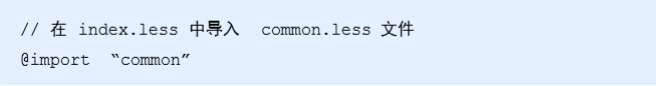
5.新建index.less文件
1.新建index.less这里面写首页的样式
2.将刚才设置好的common.less 引入到index.less里面语法如下∶
3.生成index.css 引入到index.html里面
index.less:
// 首页的样式less文件
@import "common";
// @import 导入的意思 可以把一个样式文件导入到另外一个样式文件里面
// link 是把一个 样式文件引入到 html页面里面
body {
    min-width: 320px;
    width: 15rem;
    margin: 0 auto;
    line-height: 1.5;
    font-family: Arial,Helvetica;
    background: #F2F2F2;
}
// 页面元素rem计算公式: 页面元素的px / html 字体大小 50
// search-content
@baseFont: 50;
.search-content {
    display: flex;
    position: fixed;
    top: 0;
    left: 50%;
    transform: translateX(-50%);
    width: 15rem;
    height: 88rem / @baseFont;
    background-color:#FFC001;
    .classify {
        width: 44rem / @baseFont;
        height: 70rem / @baseFont;
        margin: 11rem / @baseFont 25rem / @baseFont 7rem / @baseFont 24rem / @baseFont;
        background: url(../images/classify.png) no-repeat;
        // 背景缩放
        background-size: 44rem / @baseFont 70rem / @baseFont;
    }
    .search {
        flex: 1;
        input {
            outline: none;
            width: 100%;
            border: 0;
            height: 66rem / @baseFont;
            border-radius: 33rem / @baseFont;
            background-color:#FFF2CC;
            margin-top: 12rem / @baseFont;
            font-size: 25rem / @baseFont;
            padding-left: 55rem / @baseFont;
            color: #757575;
        }
    }
    .login {
        width: 75rem / @baseFont;
        height: 70rem / @baseFont;
        line-height: 70rem / @baseFont;
        margin: 10rem / @baseFont;
        font-size: 25rem / @baseFont;
        text-align: center;
        color: #fff;

    }
}

// banner
.banner {
    width: 750rem / @baseFont;
    height: 368rem / @baseFont;
    img {
        width: 100%;
        height: 100%;
    }
}
// ad
.ad {
    display: flex;
    a {
        flex: 1;
        img {
            width: 100%;
        }
    }
}
// nav
nav {
    width: 750rem / @baseFont;
    a {
        float: left;
        width: 150rem / @baseFont;
        height: 140rem / @baseFont;
        text-align: center;
        img {
            display: block;
            width: 82rem / @baseFont;
            height: 82rem / @baseFont;
            margin: 10rem / @baseFont auto 0;
        }
        span {
            font-size: 25rem / @baseFont;
            color: #333;
        }
    }
}


 703
703


 被折叠的 条评论
为什么被折叠?
被折叠的 条评论
为什么被折叠?
 到【灌水乐园】发言


