


一、input标签的外观属性
1.取消轮廓线 : outline: none;
2.取消边框 :border: none;
3.设置占位符样式 :input::placeholder
<!DOCTYPE html>
<html lang="en">
<head>
  <meta charset="UTF-8">
  <meta name="viewport" content="width=device-width, initial-scale=1.0">
  <title>扩展</title>
  <style>
    input,button{
      /* 取消轮廓线 */
      outline: none;
      /* 取消边框 */
      border: none;
      border: 1px solid pink;
    }
    /* 设置占位符样式 */
    input::placeholder{
      color: plum;
    }

  </style>
</head>
<body>
  <input type="text" >
  <button>按钮</button>
  <hr>
  <input type="text" placeholder="搜一搜">


</body>
</html>
效果展示:

二、鼠标类型:
1.鼠标状态常见属性值 :cursor
(1)default:默认值,通常是箭头
(2)pointer:小手效果,提示用户可以点击
(3)text:工字型,提示用户可以选择文字
(4)move:十字光标,提示用户可以移动
(5)zoom-in:鼠标形状:放大
(6)zoom-out:鼠标形状:缩小
(7)text:鼠标形状:文本
(8)not-allowed:鼠标形状:禁止
<!DOCTYPE html>
<html lang="en">
  <head>
    <meta charset="UTF-8" />
    <meta http-equiv="X-UA-Compatible" content="IE=edge" />
    <meta name="viewport" content="width=device-width, initial-scale=1.0" />
    <title>鼠标类型</title>
  </head>

  <body>
    <ul>
      <li style="cursor:default">鼠标默认值</li>
      <li style="cursor:pointer">鼠标小手</li>
      <li style="cursor:zoom-in">鼠标形状:放大</li>
      <li style="cursor:zoom-out">鼠标形状:缩小</li>
      <li style="cursor:move">鼠标形状:移动</li>
      <li style="cursor:text">鼠标形状:文本</li>
      <li style="cursor:not-allowed">鼠标形状-禁止</li>
    </ul>
  </body>
</html>
三、圆形和胶囊的画法
边框圆角 :
1.让盒子四个角变得圆润,增加页面细节,提升用户体验
2.
属性名:border-radius
3.常见取值:数字+px 、百分比
4.赋值规则:从左上角开始赋值,然后顺时针赋值,没有赋值的看对角!
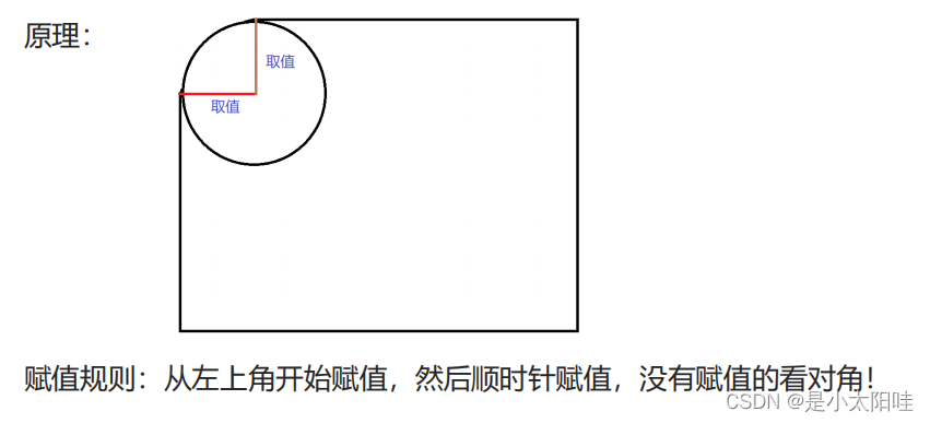
圆形:
2.圆形画法:
(1)盒子必须是正方形
(2)设置边框圆角为盒子宽高的一半 → border-radius:50%
胶囊按钮:
3.胶囊画法:
(1) 盒子要求是长方形
(2)设置 → border-radius:盒子高度的一半
4.代码展示:
<!DOCTYPE html>
<html lang="en">

<head>
  <meta charset="UTF-8" />
  <meta http-equiv="X-UA-Compatible" content="IE=edge" />
  <meta name="viewport" content="width=device-width, initial-scale=1.0" />
  <title>边框圆角-面试题</title>
  <style>
    .box {
      width: 100px;
      height: 100px;
      background-color: pink;
      border-radius: 10px 20px 30px 40px;
      text-align: center;
      line-height: 100px;
    }

    .one {
      width: 200px;
      height: 200px;
      background-color: aqua;
      border-radius: 50%;
      text-align: center;
      line-height: 200px;
    }

    .two {
      width: 200px;
      height: 100px;
      background-color: pink;
      border-radius: 50px;
      text-align: center;
      line-height: 100px;
    }
  </style>
</head>

<body>
  <div class="box">边框圆角</div>
  <div class="one">圆形</div>
  <div class="two">胶囊按钮</div>
</body>

</html>
效果展示:

四、 元素隐藏:
1.默认溢出可见:overflow: visible;
2.溢出隐藏: overflow: visible;
3.溢出后自动加滚动条:overflow: scroll;
4.元素隐藏,但是占位置 :visibility: hidden;
5.元素隐藏,不占位置 :display: none;

6.单行文本溢出显示省略号:
.one{
        width: 150px;
        height: 40px;
        font-size: 18px;
        background-color: burlywood;
        /* 1.让文本强制在一行显示 */
        white-space: nowrap;
        /* 默认值,自动换行 */
        /* white-space: normal; */
        /* 2.让超出部分隐藏 */
        overflow: hidden;
        /* 3.隐藏溢出省略号 */
        text-overflow: ellipsis;
        /* 单行文本溢出记得要给固定的宽度!!! */
      }
7.多行文本溢出:
.two{
        width: 200px;
        height: 50px;
        background-color: pink;
        font-size: 18px;
        overflow: hidden;
        text-overflow: ellipsis;
        /* 弹性盒子模型 */
        display: -webkit-box;
        /* 第几行显示省略号 */
        -webkit-line-clamp: 2;
        -webkit-box-orient: vertical;
        /* 多行文本溢出有兼容性问题,交给后端处理要给规定宽度 */
      }
五、元素整体透明度
1.场景:让某元素整体(包括内容)一起变透明
2.属性名:opacity :0~1之间的数字 (
0表示完全透明;1
表示完全不透明)
3.
注意点:
opacity会让元素整体透明,包括里面的内容,如:文字、子元素等……
4.代码展示:
<!DOCTYPE html>
<html lang="en">

<head>
  <meta charset="UTF-8" />
  <meta http-equiv="X-UA-Compatible" content="IE=edge" />
  <meta name="viewport" content="width=device-width, initial-scale=1.0" />
  <title>元素整体透明</title>
  <style>
    .box{
      width: 1000px;
      height: 300px;
    }

    .box1 {
      float: left;
      width: 300px;
      height: 300px;
      background-color: pink;
      /* 元素整体透明 */
      /* opacity 取值是0-1之间的数字,没有单位,1表示完全不透明,0表示完全透明
        文字和图片皆可变透明*/
      opacity: .5;
    }

    .box2 {
      float: left;
      width: 200px;
      height: 200px;
      background-color: aqua;
      background-color: rgba(0, 0, 0, .3);
      /* egba 文字和图片不会跟着变透明,只有背景色会变透明 */

    }
  </style>
</head>

<body>
  <div class="box">
    <div class="box1">
      <span>文字和图片都会发生变化的哦</span>
      <img src="../images/card_1.gif" alt="">
    </div>
    <div class="box2">你好鸭</div>
  </div>
</body>

</html>
效果展示:

六、细线合并:
1.作用:让相邻表格边框进行合并,得到细线边框效果
2.代码:border-collapse:collapse;
4.代码展示:
<!DOCTYPE html>
<html lang="en">
  <head>
    <meta charset="UTF-8" />
    <meta http-equiv="X-UA-Compatible" content="IE=edge" />
    <meta name="viewport" content="width=device-width, initial-scale=1.0" />
    <title>细线表格属性</title>
    <style>
      table{
        width: 500px;
        height: 200px;
        border: 1px solid #666;
        margin: 0 auto;
        /* 相邻线条合并 */
        border-collapse: collapse;
      }

      tr,
      td {
        border: 1px solid #000;
      }
    </style>
  </head>

  <body>
    <table>
      <tr>
        <td></td>
        <td></td>
        <td></td>
      </tr>
      <tr>
        <td></td>
        <td></td>
        <td></td>
      </tr>
      <tr>
        <td></td>
        <td></td>
        <td></td>
      </tr>
    </table>
  </body>
</html>

七、垂直居中对齐(vertical-align)
1.基线:浏览器文字类型元素排版中存在用于对齐的基线(baseline)


代码展示:
<!DOCTYPE html>
<html lang="en">
<head>
    <meta charset="UTF-8">
    <meta http-equiv="X-UA-Compatible" content="IE=edge">
    <meta name="viewport" content="width=device-width, initial-scale=1.0">
    <title>Document</title>
    <style>
        .box{
            border: 1px solid pink;
        }

        img{
            /* 1.基线对齐,默认效果 */
            vertical-align: baseline;

            /* 2.底线对齐 */
            vertical-align: bottom;

            /* 3.中线对齐 */
            vertical-align: middle;

            /* 4.上线对齐 */
            vertical-align: top;


        }
    </style>
</head>
<body>
    <div class="box">
        <img src="../lyf.jpg" alt="">女神刘亦菲
    </div>

</body>
</html>


 108
108

 被折叠的 条评论
为什么被折叠?
被折叠的 条评论
为什么被折叠?
 到【灌水乐园】发言


