


项目核心
弹性布局、媒体查询
项目图片访问链接:https://pan.baidu.com/s/15PEfxwd_RtHDSYL1D8zORg
提取码:1111
页面结构
<!-- 头部 -->
<div class="header">
<span>Meau</span>
<img src="./images/logo.png" alt="">
<ul>
<li>文章</li>
<li>素材</li>
<li>活动</li>
<li>素材</li>
<li>更多</li>
<li>活动</li>
<li>素材</li>
<li>更多</li>
</ul>
<a href="#">登录</a>
</div>
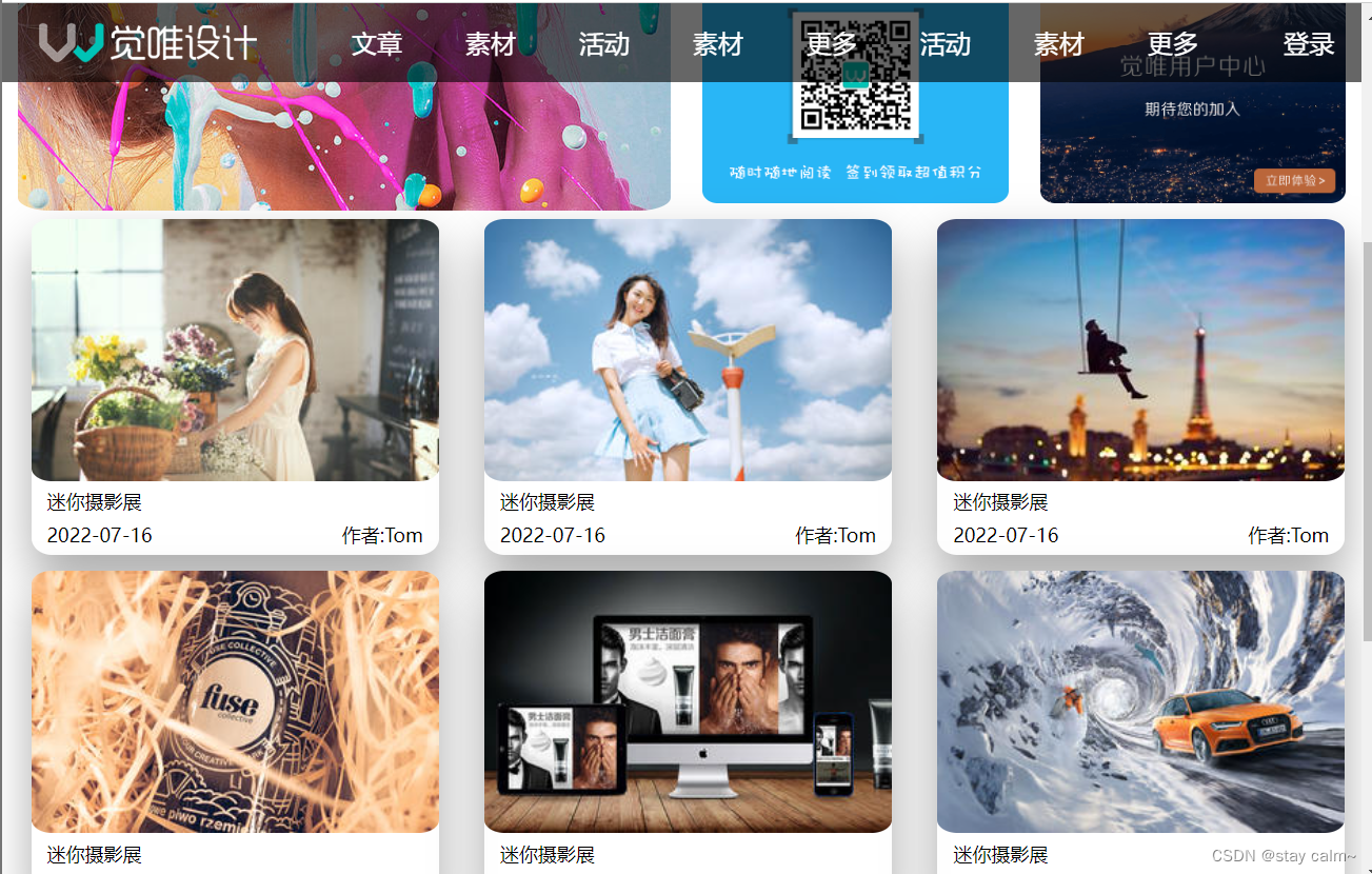
<div class="banner"></div>
<div class="pic">
<div class="top">
<img src="./images/swiper1.jpeg" alt="">
</div>
<div class="bottom">
<p><img src="./images/1.png" alt=""></p>
<p><img src="./images/2.png" alt=""></p>
</div>
</div>
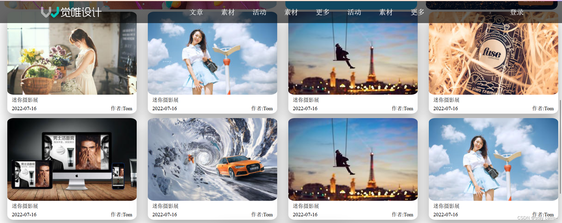
<div class="piclist">
<div>
<img src="./images/1.jpg" alt="稍后重新加载">
<p>迷你摄影展</p>
<p>
<span>2022-07-16</span>
<span>作者:Tom</span>
</p>
</div>
<div>
<img src="./images/2.jpg" alt="稍后重新加载">
<p>迷你摄影展</p>
<p>
<span>2022-07-16</span>
<span>作者:Tom</span>
</p>
</div>
<div>
<img src="./images/3.jpg" alt="稍后重新加载">
<p>迷你摄影展</p>
<p>
<span>2022-07-16</span>
<span>作者:Tom</span>
</p>
</div>
<div>
<img src="./images/4.jpg" alt="稍后重新加载">
<p>迷你摄影展</p>
<p>
<span>2022-07-16</span>
<span>作者:Tom</span>
</p>
</div>
<div>
<img src="./images/5.jpg" alt="稍后重新加载">
<p>迷你摄影展</p>
<p>
<span>2022-07-16</span>
<span>作者:Tom</span>
</p>
</div>
<div>
<img src="./images/6.jpg" alt="稍后重新加载">
<p>迷你摄影展</p>
<p>
<span>2022-07-16</span>
<span>作者:Tom</span>
</p>
</div>
<div>
<img src="./images/3.jpg" alt="稍后重新加载">
<p>迷你摄影展</p>
<p>
<span>2022-07-16</span>
<span>作者:Tom</span>
</p>
</div>
<div>
<img src="./images/2.jpg" alt="稍后重新加载">
<p>迷你摄影展</p>
<p>
<span>2022-07-16</span>
<span>作者:Tom</span>
</p>
</div>
<div>
<img src="./images/1.jpg" alt="稍后重新加载">
<p>迷你摄影展</p>
<p>
<span>2022-07-16</span>
<span>作者:Tom</span>
</p>
</div>
</div>
<div class="footer">
<p>COPYRIGHT©2022-07-16</p>
</div>页面样式
*{
    margin: 0;
    padding: 0;
}
body{
    overflow-x: hidden;
}
/* 解决图片三像素问题 */
img{
    display: block;
}
a{
    text-decoration: none;
}
li{
    list-style: none;
}
.header{
    width: 100%;
    display: flex;
    justify-content: space-around;
    height: 50px;
    background: rgba(0, 0, 0, 0.6);
    position: fixed;
    text-align: center;
    vertical-align: middle;
    line-height: 50px;
    color: white;
}
.header a{
    color: white;
}
.header ul{
    display: none;
}
.banner{
    height: 250px;
    width: 100%;
    background: url('../images/top-bg.png') center top no-repeat;
    background-size: cover;
    margin-bottom: 10px;
    background-color: #AB9777;
}
.pic .top{
    margin:5px 10px;
}
.pic img{
    width: 100%;
    border-radius: 5%;
}
.pic .bottom p{
    width: 50%;
    margin:5px 10px;
}
.pic .bottom{
    display: flex;
}
.piclist{
    width: 100%;
    margin-left:4px;
    display: flex;
    justify-content: space-around;
    flex-wrap: wrap;
}
.piclist div{
    border-radius: 5%;
    width: 94%;
    margin-bottom: 10px;
    /* 属性 水平 垂直 模糊度 延伸半径 颜色 内 */
    box-shadow: 0px 15px 30px rgba(0, 0, 0, 0.332);
    /* background-color: aquamarine; */
}
.piclist img{
    width: 100%;
    border-radius: 5%;
}
.piclist p{
    font-size: 12px;
    margin-top: 5px;
    margin-bottom: 5px;
    display: flex;
    justify-content: space-between;
    margin: 5px 10px;
}
@media screen and (max-width:768px) and (min-width:449px) {
    .piclist div{
        width: 48%;
        margin-bottom: 10px;
    }
}
@media screen and  (min-width:1024px) {
    .piclist div{
        width: 23%;
        margin-bottom: 10px;
    }
}
@media screen and (min-width:768px) and (max-width:1024px){
    .piclist div{
        width: 30%;
        margin-bottom: 10px;
    }
}
/* 大屏样式 */
@media screen and (min-width:768px){
    .header span{
        display: none;
    }
    .header ul {
        display: flex;
    }
    .header ul li{
        margin:0 20px;
    }
    .pic{
        display: flex;
    }
    .footer{
        height: 60px;
        line-height: 60px;
        text-align: center;
        background: rgba(0, 0, 0, 0.6);
        color: white;
    }
}
效果展示


 446
446


 被折叠的 条评论
为什么被折叠?
被折叠的 条评论
为什么被折叠?
 到【灌水乐园】发言


